
Product Page
The Product Page in the Renovate theme showcases detailed product information with a clean, customizable layout. It highlights images, descriptions, pricing, variants, and other key details, providing a seamless shopping experience for customers.
What Makes Renovate Product Page Stand Out?
-
Flexible Media Layouts: Choose from multiple media layouts like
thumbnails on the
left, right, or bottom.
- Option to use a stacked or slider layout.
- Rich Product Media Support: Showcase your items with images, videos, and even 3D models.
-
Built-In Conversion Boosters:
- Sticky Add to Cart bar (optional)
- Dynamic Checkout Button (Buy it Now) for faster purchases
- Stock Indicators to create urgency
- Trust badges and estimated delivery messages for reassurance
- Interactive Features: Image lightbox, variant swatches (color, size), and quantity pickers for an intuitive experience.
- Pickup Availability: Display pickup options on the product page to inform customers of local availability.
Customize Your Product Page
On the Product Page, you can configure how your product details are displayed, helping customers engage with your items and make purchases easily. Make sure the products are published on your online store before adjusting these settings.
- From your Shopify admin, go to Online Store → Themes.
- Click Customize on the Renovate theme.
- In the Theme Editor, use the drop-down page selector and choose Products → Default product.
- Adjust media layouts, product details, conversion boosters, badges, pickup options, and interactive features as desired.
- Click Save to apply your changes.
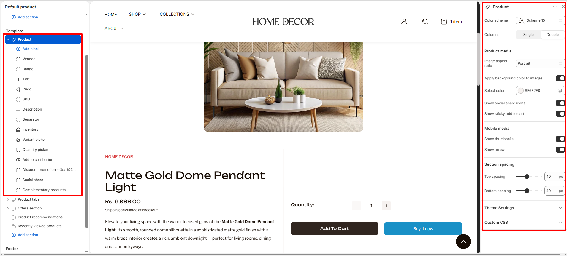
- Color Scheme: Select a color scheme to control the background and text colors of the product section.
- Columns: Choose between a Single or Double column layout for displaying product information alongside media.
-
Product Media:
- Image Aspect Ratio: Choose how your product images are displayed (e.g., Portrait, Square, Adapt, or Landscape).
- Apply Background Color to Images: Enable this to add a subtle background color behind your product media.
- Select Color: If background color is enabled, use this to pick the specific shade.
- Show Social Share Icons: Toggle to display social media sharing buttons directly on the product page.
- Show Sticky Add to Cart: Enable a sticky bar that remains visible as customers scroll, keeping the buy button within reach.
-
Mobile Media:
- Show Thumbnails: Toggle the visibility of image thumbnails on mobile devices.
- Show Arrow: Enable navigation arrows for product media on mobile screens.
-
Section Spacing:
- Top Spacing: Adjust the amount of white space above the section (in pixels).
- Bottom Spacing: Adjust the amount of white space below the section (in pixels).
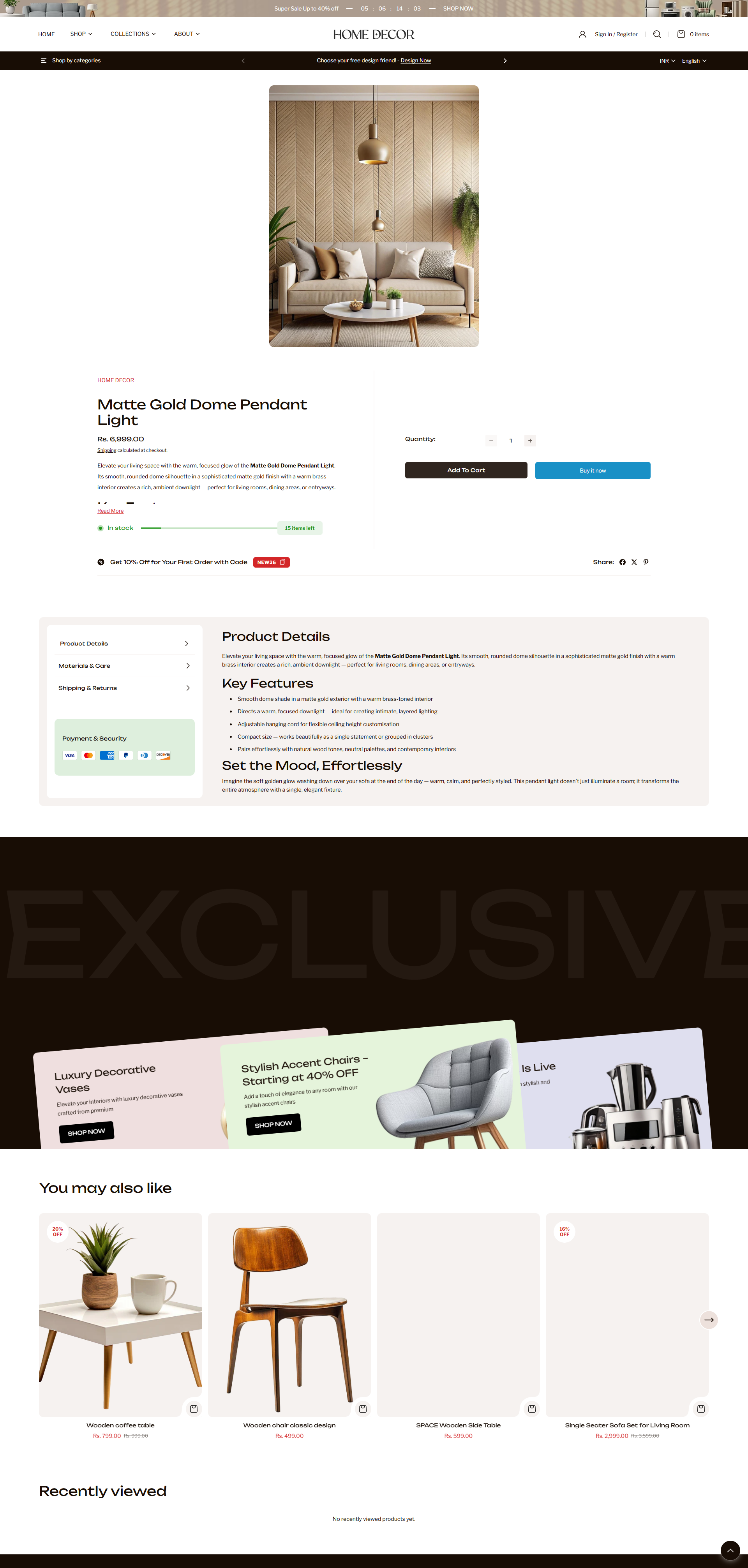
- Vendor: Displays the product's vendor or brand name.
- Badge: Shows product-specific badges like "Sale", "New", or custom labels.
- Title: Displays the product title prominently.
- Price: Shows the current price and compare-at price. Updates dynamically when variants are selected.
- SKU: Displays the unique Stock Keeping Unit for the selected variant.
- Description: Shows the main product description. You can adjust its position in the information stack.
- Separator: Adds a visual horizontal line to separate different information groups.
- Inventory: Displays current stock levels and can show low-stock
alerts to create urgency.
- In Stock Color: Set the color for available items.
- Low Stock Threshold: Define when the stock warning appears.
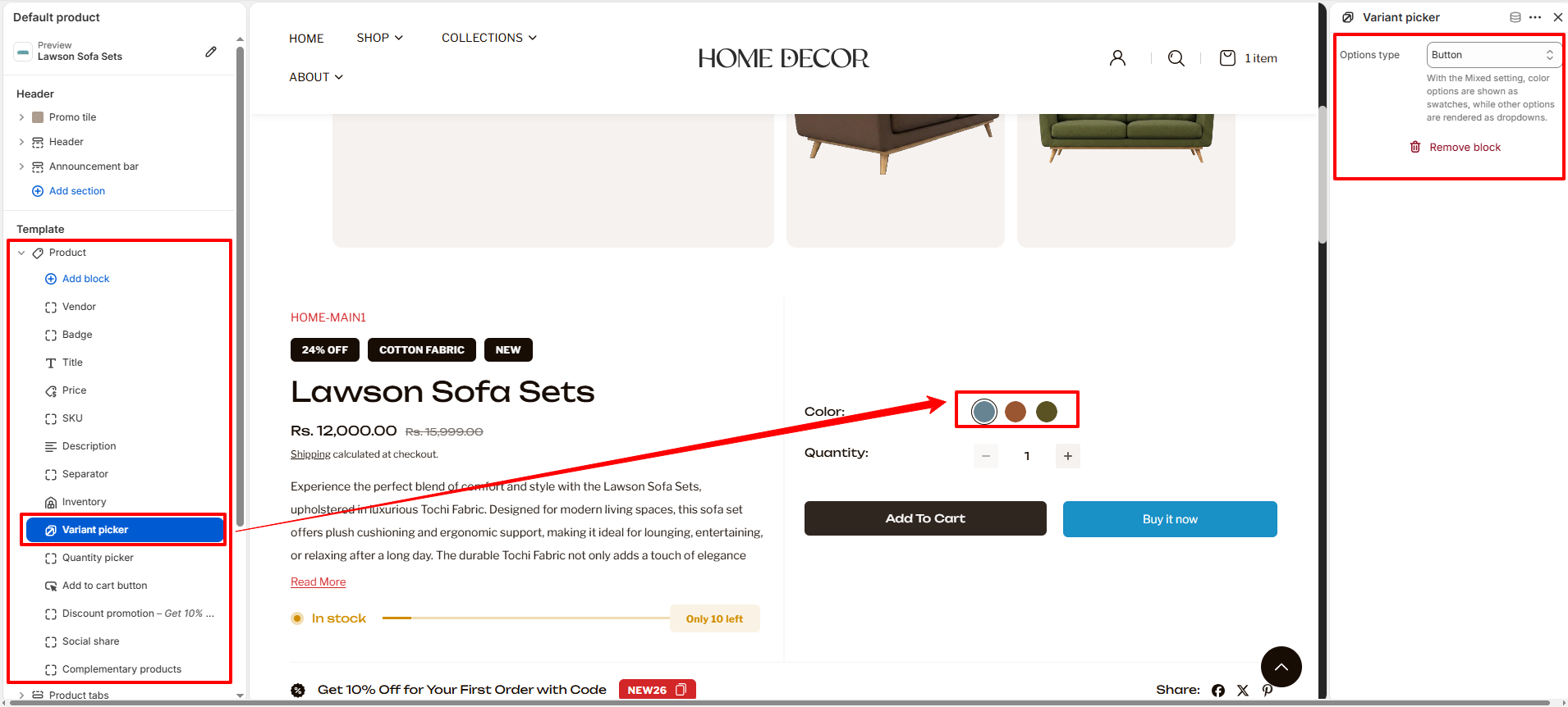
- Variant Picker: Allows customers to select product options like
color, size, or material.
- Options Type: Choose how your variants are displayed:
- Dropdown: All options appear in a standard dropdown menu.
- Button: All options appear as clickable buttons.
- Mixed: Color options are shown as visual swatches, while other options (like size) are rendered as dropdowns.
To learn how to set up and customize your color swatches, please refer to the Color Swatches Documentation.
- Options Type: Choose how your variants are displayed:
- Show Swatches: Enable color or image swatches for a better visual experience.
- Quantity Picker: Adds an input field for customers to choose how many units they want to buy.
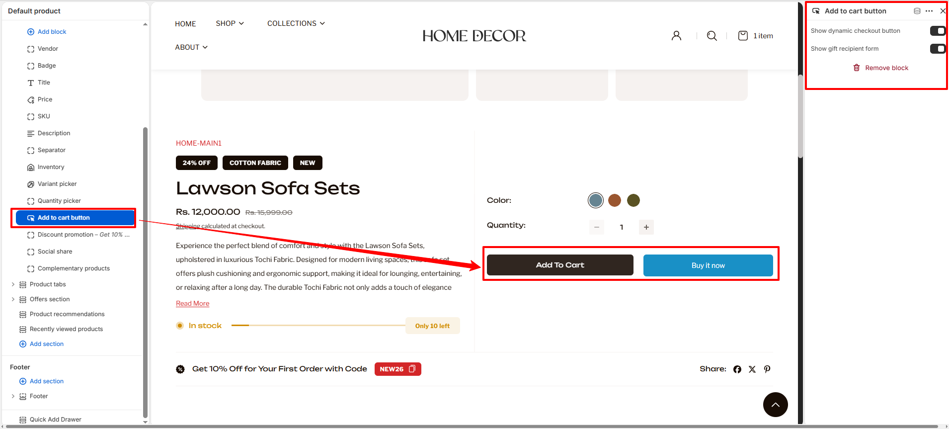
- Add to Cart Button: The primary call-to-action for your product page.
- Show Dynamic Checkout Button: Toggle this to show quick purchase buttons like Apple Pay, Google Pay, or "Buy it Now".
- Show Gift Recipient Form: Enable this if the product is a gift card, allowing customers to add recipient details and a message.
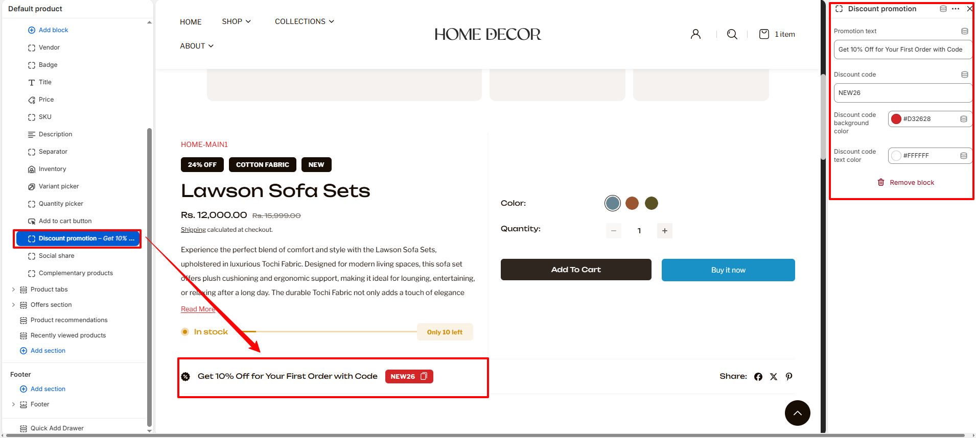
- Discount Promotion: Highlight special offers or coupon codes directly on
the product page.
- Promotion Text: Enter the message you want to display to customers (e.g., "Get 10% Off...").
- Discount Code: Enter the actual code that customers should use at checkout.
- Colors: Customize the Background and Text colors of the discount badge to make it stand out.
- Social Share: Adds buttons for customers to share the product on their social profiles.
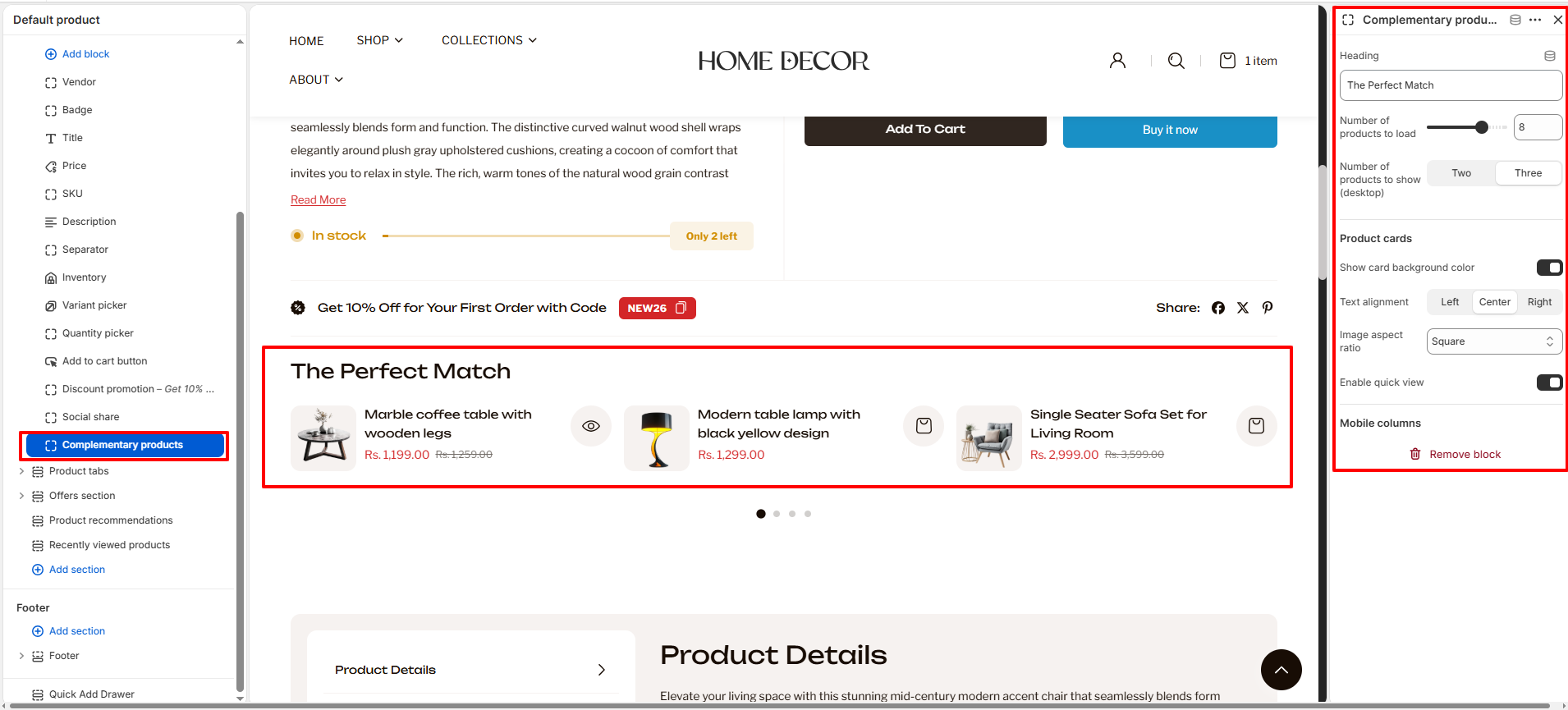
- Complementary Products: Recommend matching accessories or frequently
bought together items to increase your average order value.
- Heading: Enter a title for the section (e.g., "The Perfect Match").
- Number of products to load: Select the maximum number of products to pull for this section.
- Number of products to show (desktop): Choose how many products are visible at once on desktop (Two or Three).
- Product Cards Layout:
- Show card background color: Toggle to add a background shade to the product cards.
- Text alignment: Align the product info to the Left, Center, or Right.
- Image aspect ratio: Adjust the cropping of the product images.
- Enable quick view: Allow customers to view product details without leaving the page.
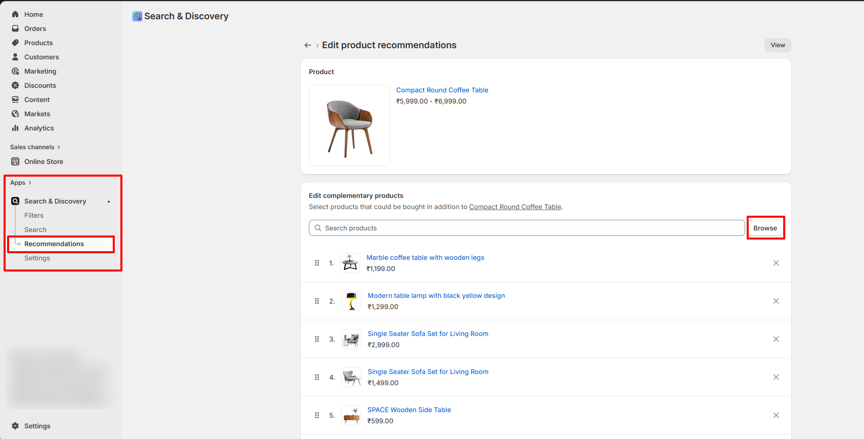
How to setup: Complementary products are managed via Shopify's free Search & Discovery app. Once installed, follow these steps:
- 1. Go to your Shopify Admin and open the Apps section.
- 2. Select the Search & Discovery app.
- 3. Navigate to the Recommendations feature within the app.
- 4. Search and select the products you want to add as complementary products.
- 5. Add the selected products as complementary items.
- 6. Click Save to apply your changes.
- Pickup Availability: Shows real-time information about local store pickup options.
- Size Chart: Displays a link or button that opens a popup guide for choosing the right size.
- Trust Badges: Display icons for secure payments, quality guarantees, or other trust-building certifications.
Section Settings
The Product section settings allow you to control the overall layout, media display, and interactive features of the product page.
Product Information Blocks
The Product section allows you to add and arrange various content blocks to display detailed information about your items. Each block can be moved and customized to fit your brand's storytelling.
FAQs
How can I hide the "Buy it Now" or dynamic checkout button?
The dynamic checkout button, also known as "Buy it Now," appears below the main Add to Cart button on product pages. It allows customers to instantly proceed to checkout with a single item.To disable this feature:
- Go to the Buy Block Settings in the product page.
- Toggle the dynamic checkout button off.
For more detailed instructions, refer to Shopify's guide on Adding and Removing Dynamic Checkout Buttons.
How can I display unique content for each product in the collapsible tab block?
You can personalize the collapsible tabs for each product by linking them to product text metafields. This allows you to showcase product-specific details such as care instructions, sizing information, materials, ingredients, or other unique attributes tailored to each item.
How do I add color swatches on product pages?
Absolutely! Renovate supports color swatches on product. If your product variants use the color swatch metafield, swatches will automatically appear on collection pages.
Learn more about setting up swatches here.