
Image With Text
The Image with Text section is designed to combine impactful imagery with structured content in a clean and visually balanced layout. It allows you to showcase a main image alongside heading, descriptive text, an optional icon, and a call-to-action button, making it ideal for highlighting brand messaging, featured collections, promotional content, or lifestyle-driven storytelling.
How to Add the Image With Text Section
- From your Shopify admin, go to Online Store → Themes.
- Click Customize on the Renovate theme.
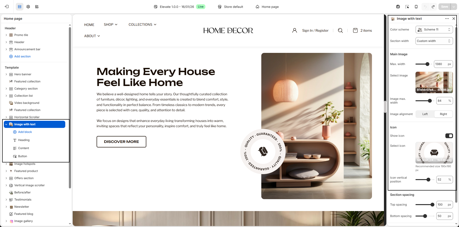
- In the Theme Editor, select the Image With Text section from the left sidebar.
- Adjust the settings, blocks, and layout options according to your preferences.
- Click Save to apply your changes.
How to Edit the Image With Text
- Color Scheme: Select a color scheme (for example, Scheme 11) to control the background, text, and overall visual style of the section.
-
Section Width:
Choose the layout width for the section.
- Custom Width: Allows the section to expand more freely for a wider and more visually impactful layout.
- Max. Width: Adjust the maximum width of the overall image area to control how large the image section appears within the layout.
- Container Width: Keeps the section aligned within the theme's standard content width for a structured appearance.
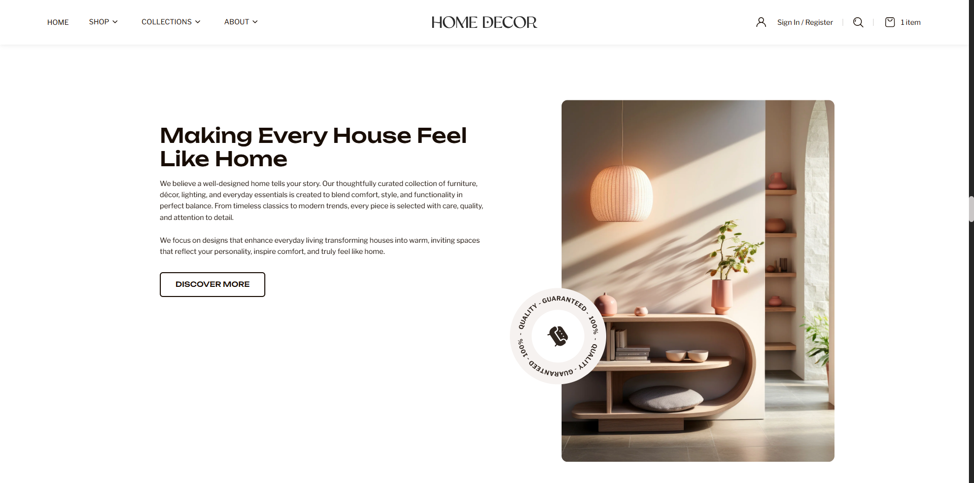
- Main Image: Upload the primary image you want to display in the section. This image is used to visually support the text content and can represent products, interiors, collections, or brand storytelling.
- Image Max. Width: Control the width of the main image itself. Increasing the value makes the image more prominent, while lower values create a more balanced text-to-image ratio.
- Image Alignment: Choose whether the image appears on the Left or Right side of the text content.
- Show Icon: Enable this option to display an additional decorative or branded icon over the image area for enhanced visual styling.
- Select Icon: Upload an icon image to display as a supporting visual element. This is ideal for trust badges, decorative accents, or branding highlights.
- Icon Vertical Position: Adjust the vertical placement of the icon to position it correctly over the image area based on your design preference.
-
Heading Block:
Use the heading block to add the main title for the section, such as a promotional
message, brand statement, or featured content heading.
- Heading: Enter the primary title text you want to display in the section.
- Font Size: Choose the heading size based on the visual importance of the title.
-
Content Block:
Use the content block to add descriptive text, brand messaging, promotional details, or
supporting information below the heading.
- Text: Enter the paragraph or descriptive content you want to display within the section.
-
Button Block:
Add a call-to-action button to guide customers toward a collection, product page, or any
important destination.
-
Button Type:
Choose the visual style of the button.
- Primary: Highlights the button with a stronger visual emphasis.
- Secondary: Displays a more subtle and minimal button style.
- Button Label: Enter the text you want to display on the button, such as Discover More, Shop Now, or Explore Collection.
- Button Link: Select the destination page, collection, or product where the button should redirect users when clicked.
-
Button Type:
Choose the visual style of the button.