
Before/After Section
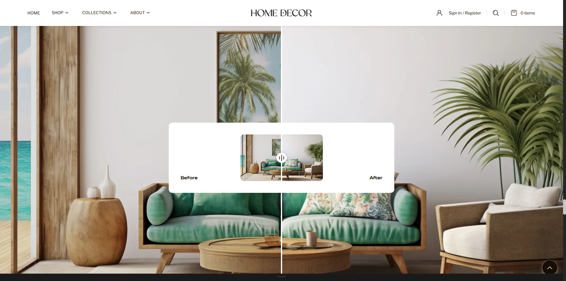
The Before/After Section allows you to showcase visual comparisons using an interactive image slider. This feature lets customers easily compare two images by dragging a slider across the screen, highlighting transformations, improvements, or differences in a clear and engaging way. It is ideal for demonstrating product results, design changes, makeovers, or any scenario where a side-by-side comparison enhances the visual storytelling and helps customers better understand the impact of your products or services.
How to Add the Before/after Section
- From your Shopify admin, go to Online Store → Themes.
- Click Customize on the Renovate theme.
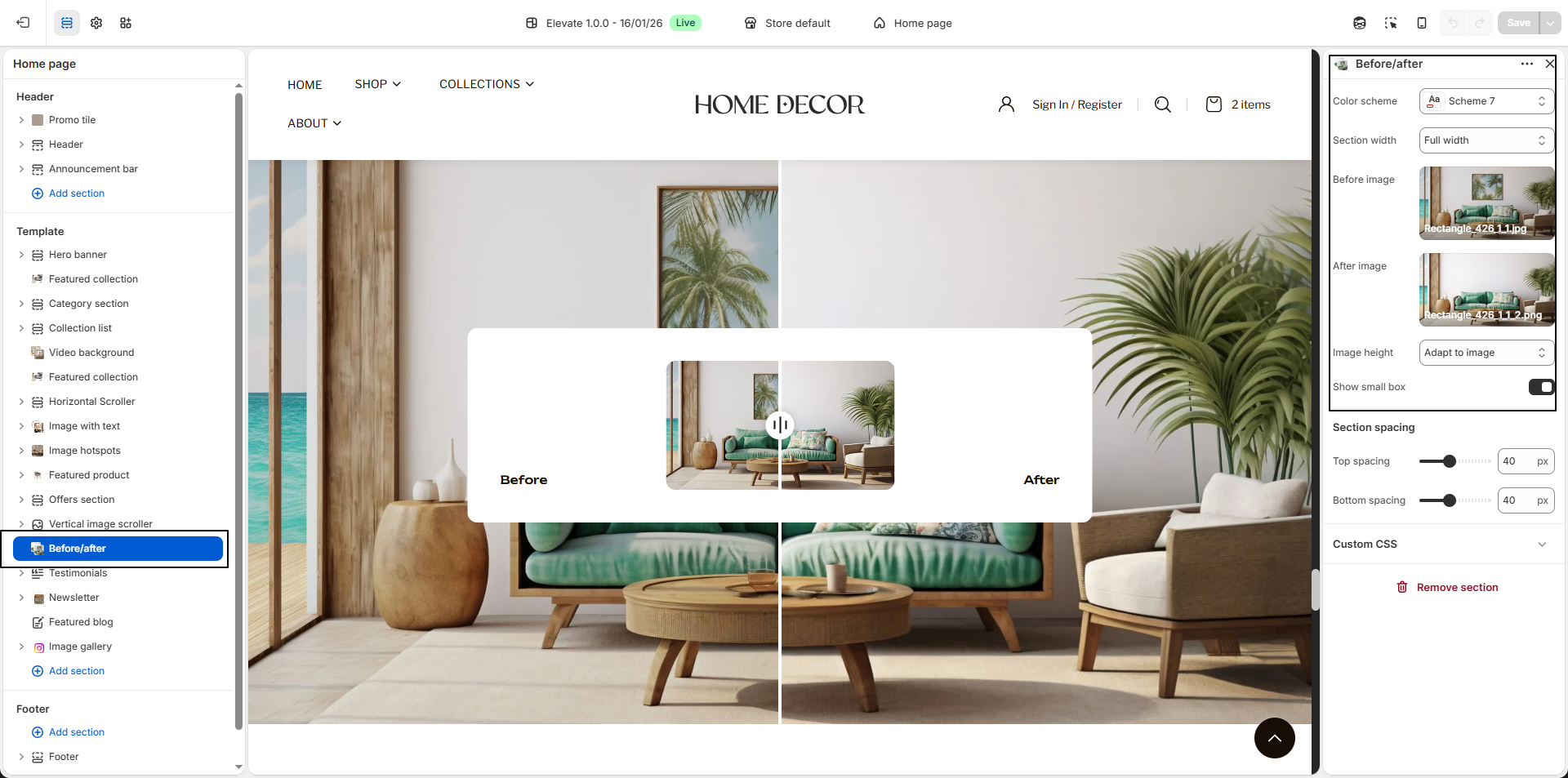
- In the Theme Editor, select the Before/after section from the left sidebar.
- Adjust the settings, blocks, and layout options according to your preferences.
- Click Save to apply your changes.
How To Edit the Before/After Section
- Color Scheme: Select a color scheme to control the background, text, and overall visual style of the section.
-
Section Width:
Choose how the section should be displayed across the page.
- Container Width: Keeps the section aligned within the theme's standard content width for a structured appearance.
- Full Width: Expands the section across the entire screen for a more immersive layout.
- Before Image: Upload the image that represents the “before†state. This image will appear on one side of the comparison slider.
- After Image: Upload the image that represents the “after†state. This image will appear on the opposite side of the comparison slider.
-
Image Height:
Choose how tall the comparison section should appear.
- Adapt to image: Displays images based on their original proportions.
- One Third of the Screen: Shows a compact section height.
- Half of the Screen: Displays the section at medium height.
- Two Thirds of the Screen: Provides a larger viewing area.
- Full Screen: Expands the section to fill the entire screen height.
- Adapt to Screen: Adjusts the height dynamically based on the screen size.
- Show Small Box: Enable this option to display a preview comparison box in the center, giving users an additional visual focus while interacting with the slider.