
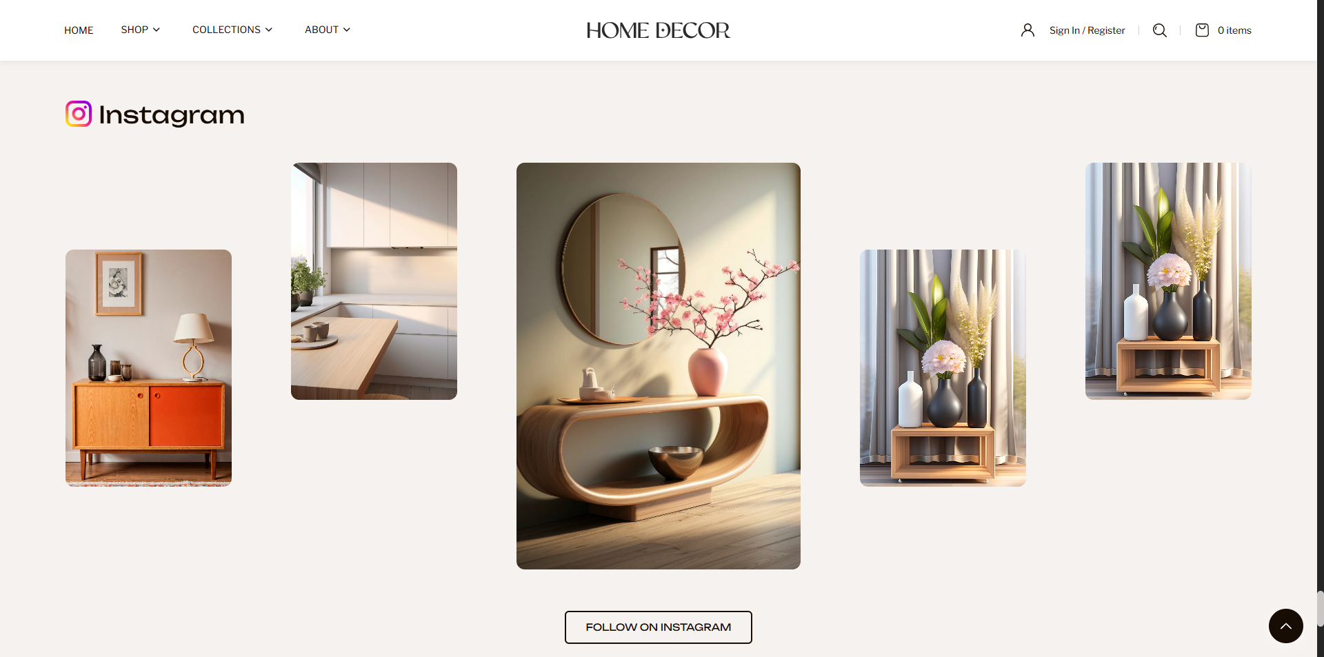
Image Gallery Section
The Image Gallery Section is designed to display a collection of images in a clean and modern grid layout, helping you visually showcase your brand, products, or social media content. This section is perfect for creating an Instagram-style gallery that enhances visual storytelling and user engagement. With customizable layout options, hover effects, and clickable images, you can guide users to explore more content or external links. The optional call-to-action button further encourages interaction, making this section both visually engaging and conversion-friendly.
How to Add the Image Gallery Section
- From your Shopify admin, go to Online Store → Themes.
- Click Customize on the Renovate theme.
- In the Theme Editor, select the Image Gallery section from the left sidebar.
- Adjust the settings, blocks, and layout options according to your preferences.
- Click Save to apply your changes.
How To Edit the Image Gallery Section
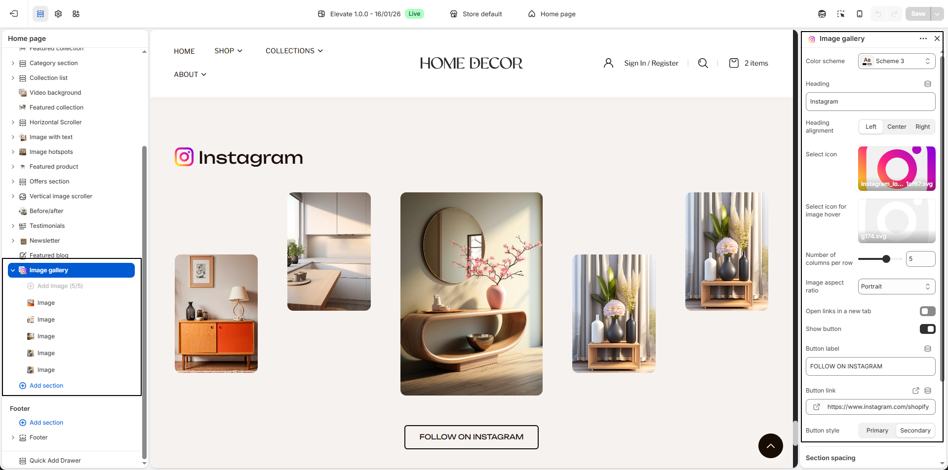
- Color Scheme: Select a color scheme to control the background, text, and overall visual style of the section.
- Heading: Enter the main heading for the section, such as Instagram, to introduce the gallery.
-
Heading Alignment:
Choose how the heading should be aligned within the section.
- Left: Aligns the heading to the left side.
- Center: Centers the heading.
- Right: Aligns the heading to the right side.
- Select Icon: Upload an icon (such as an Instagram logo) to display alongside the heading for better visual representation.
- Select Icon for Image Hover: Upload an icon that will appear when users hover over gallery images, adding an interactive effect.
- Number of Columns per Row: Adjust how many images appear in a single row to control the layout density.
-
Image Aspect Ratio:
Choose the shape and proportion of the gallery images.
- Portrait: Displays vertically oriented images.
- Square: Displays images in equal width and height.
- Adapt to image: Maintains the original image proportions.
- Open Links in a New Tab: Enable this option to open image links in a new browser tab when clicked.
-
Show Button:
Enable this option to display a call-to-action button below the gallery.
- Button Label: Enter the button text, such as FOLLOW ON INSTAGRAM.
- Button Link: Add the destination URL (for example, your Instagram profile).
- Button Style:
- Primary: Displays a prominent button style.
- Secondary: Displays a more subtle button style.
-
Image Blocks:
Use image blocks to add gallery images.
- Block Max. Width: Adjust the width of each image block.
- Block Position:
- Top: Aligns the image toward the top.
- Center: Centers the image vertically.
- Bottom: Aligns the image toward the bottom.
- Select Image: Upload the image you want to display.
- Image Link: Add a link to redirect users when the image is clicked.
- Multiple Images: You can add multiple image blocks to create a complete gallery layout.