Product Section
The Product Section in the Kinetic theme is designed to deliver a dynamic and premium shopping experience for activewear and sportswear stores. Easily customize product layouts, card styles, image presentation, spacing, and product details to create a clean, modern, and performance-focused storefront. With flexible display options and visually engaging product showcases, Kinetic helps customers explore products effortlessly while enhancing overall shopping experience and conversions.
What Makes the Kinetic Product Page Stand Out?
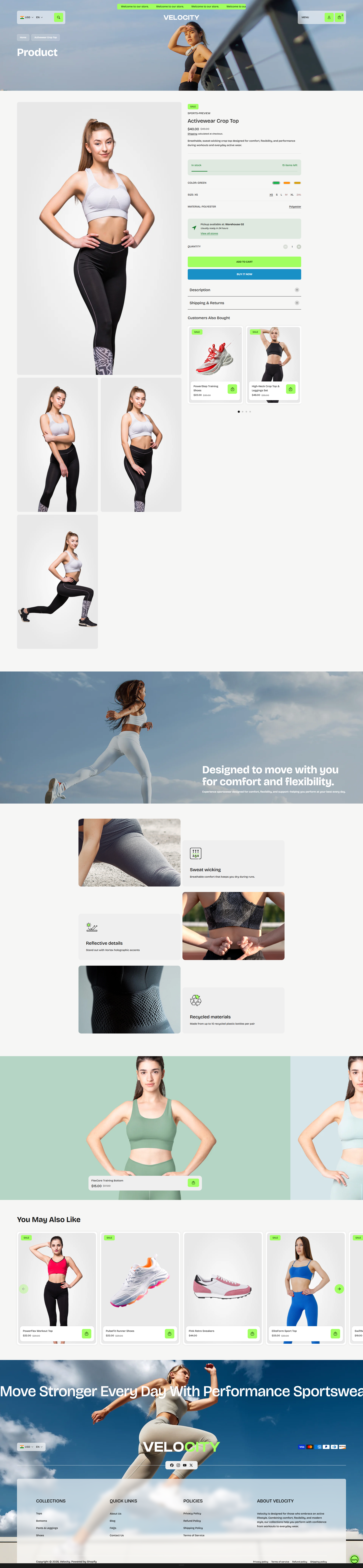
- Flexible Product Media Layout: Control how product media is displayed for a cleaner and more engaging shopping experience.
-
Sticky Shopping Experience:
Improve usability and conversions while customers browse product details.
- Enable Sticky Media: Keeps product images visible while scrolling through product information.
- Show Sticky Add to Cart: Displays a fixed Add to Cart action so customers can purchase quickly without scrolling back.
- Pickup Availability: Show local pickup availability directly on the product page so customers can easily check store pickup options.
- Complementary Products: Display related or recommended products to encourage additional purchases and improve cross-selling opportunities.
Customize Your Product Page
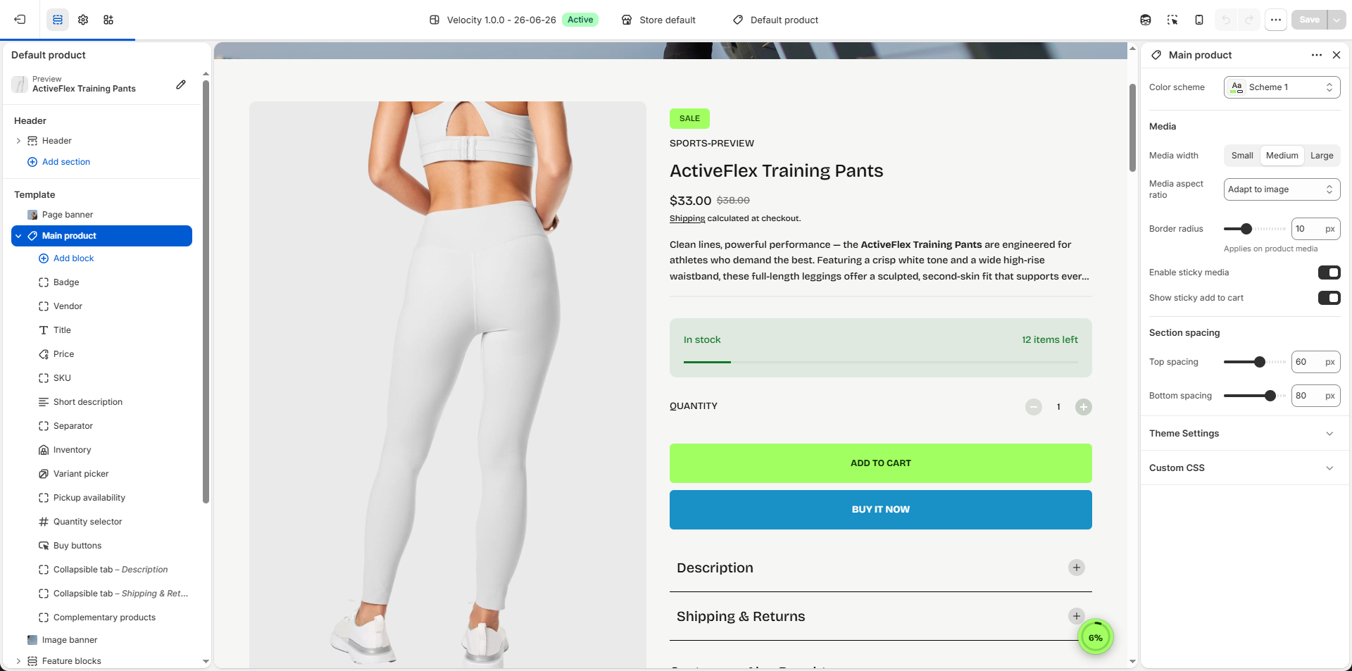
On the Product Page, you can configure how your product details are displayed, helping customers engage with your items and make purchases easily. Make sure the products are published on your online store before adjusting these settings.
- From your Shopify admin, go to Online Store → Themes.
- Click Customize on the Velocity theme.
- In the Theme Editor, use the drop-down page selector and choose Products → Default product.
- Adjust media layouts, product details, conversion boosters, badges, pickup options, and interactive features as desired.
- Click Save to apply your changes.
Settings Provided To Edit the Product Page
Review the provided information about media types to understand your options. Learn more about media types.
- Select Color: Choose a color scheme for the overall product section background and text styling.
- Media Width: Control the display width of product media.
- Small: Displays compact product media for more visible product information.
- Medium: Creates a balanced layout between media and content.
- Large: Expands product media for a more immersive shopping experience.
- Media Aspect Ratio: Define how product images are displayed.
- Adapt to Image: Maintains the original uploaded image proportions.
- Square: Displays product images in a consistent square format.
- Portrait: Displays taller images for a premium product presentation.
- Border Radius: Adjust the corner roundness applied to product media (e.g., 10px) for a softer and modern appearance.
- Enable Sticky Media: Keeps product images visible while customers scroll through product details.
- Show Sticky Add to Cart: Display a fixed Add to Cart button while scrolling to improve conversions and simplify purchasing.
Product Information Blocks:
In the Velocity theme, Blog Content Blocks help you showcase articles, updates, or stories in a visually engaging way. You can add text, images, videos, and links to highlight key information, making your blog easy to navigate and appealing to readers. These blocks allow you to structure content flexibly, keeping your posts organized and enhancing the overall reading experience.
- Vendor: Display the product vendor or brand name.
- Title: Show the product title prominently.
- Price: Display product pricing and compare-at pricing.
-
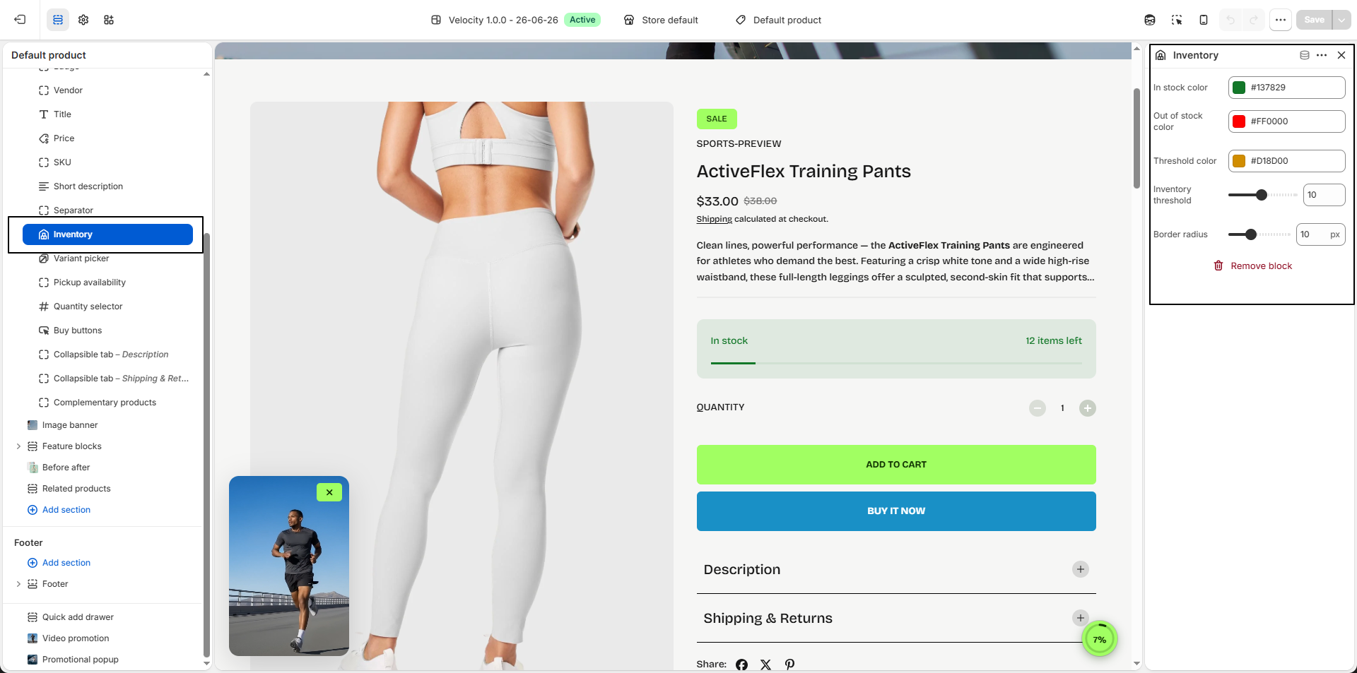
Inventory:
Display real-time product stock availability to help customers understand whether an item
is available, running low, or out of stock.
- Inventory Low Stock Threshold: Set the quantity limit at which the low stock warning should appear.
- In Stock Color: Choose the color used for the “In Stock” status label.
- Out Of Stock Color: Select the color used for products that are unavailable.
- Low Stock Color: Choose the color displayed when product inventory reaches the low stock threshold.
-
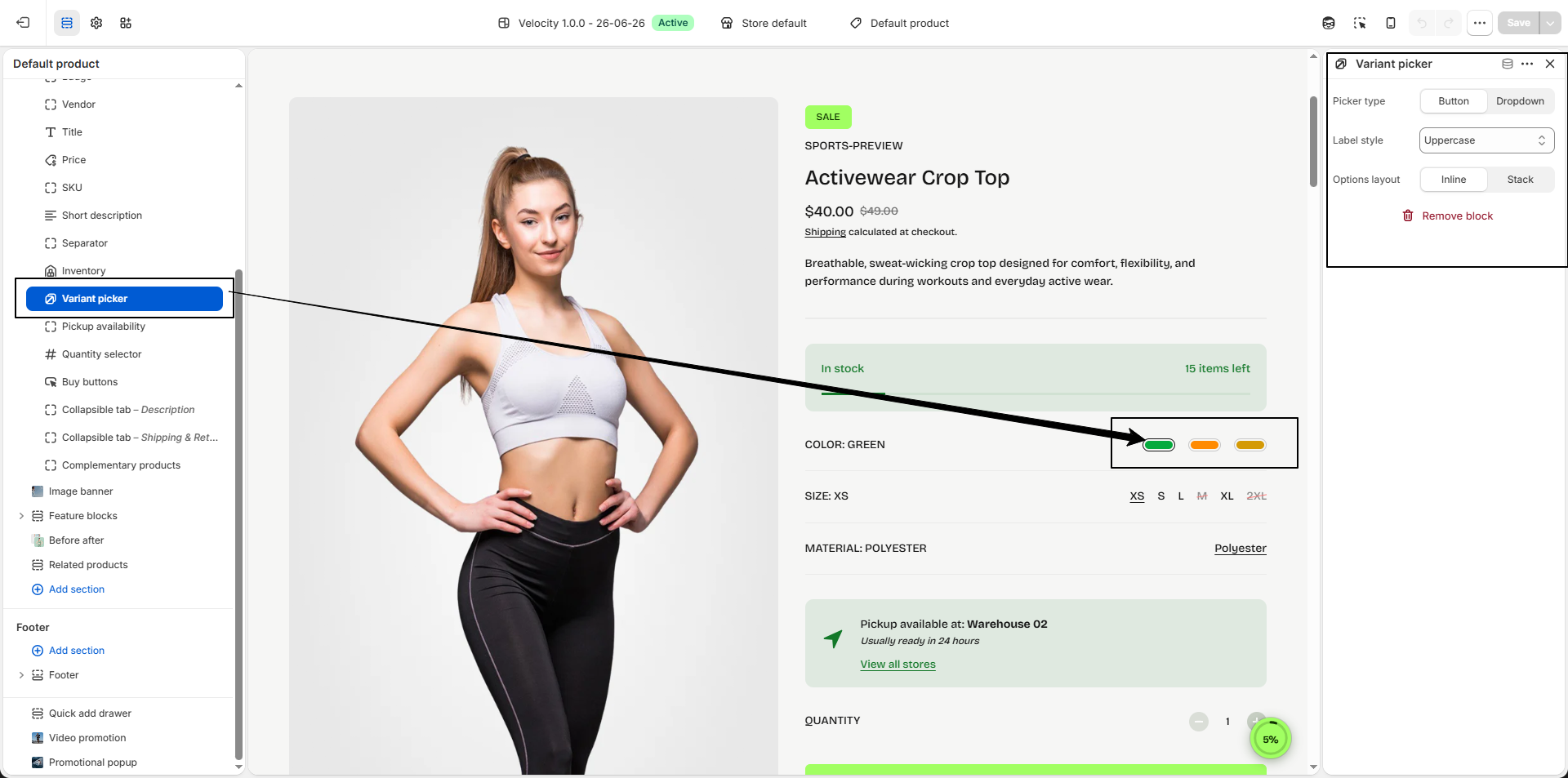
Variant Picker:
Allow customers to select product variants such as size, color, style, or other available
options directly from the product page.
-
Picker Type:
Control how product variants are displayed.
- Button: Display variant options as clickable buttons or swatches for faster selection and a more visual shopping experience.
- Dropdown: Display variant options inside a compact dropdown selector to keep the layout clean when products contain many choices.
-
Label Style:
Customize the appearance of variant option labels.
- Uppercase: Displays all option labels in uppercase letters for a bold appearance.
- Lowercase: Displays all option labels in lowercase letters for a softer look.
- Default: Uses the original capitalization entered in Shopify product options.
-
Options Layout:
Control how variant selections are arranged.
- Inline: Displays all variant options in a horizontal row for quick selection.
- Stack: Displays each option group vertically for improved readability.
-
Picker Type:
Control how product variants are displayed.
- Pickup Availability:Show local pickup availability information.
-
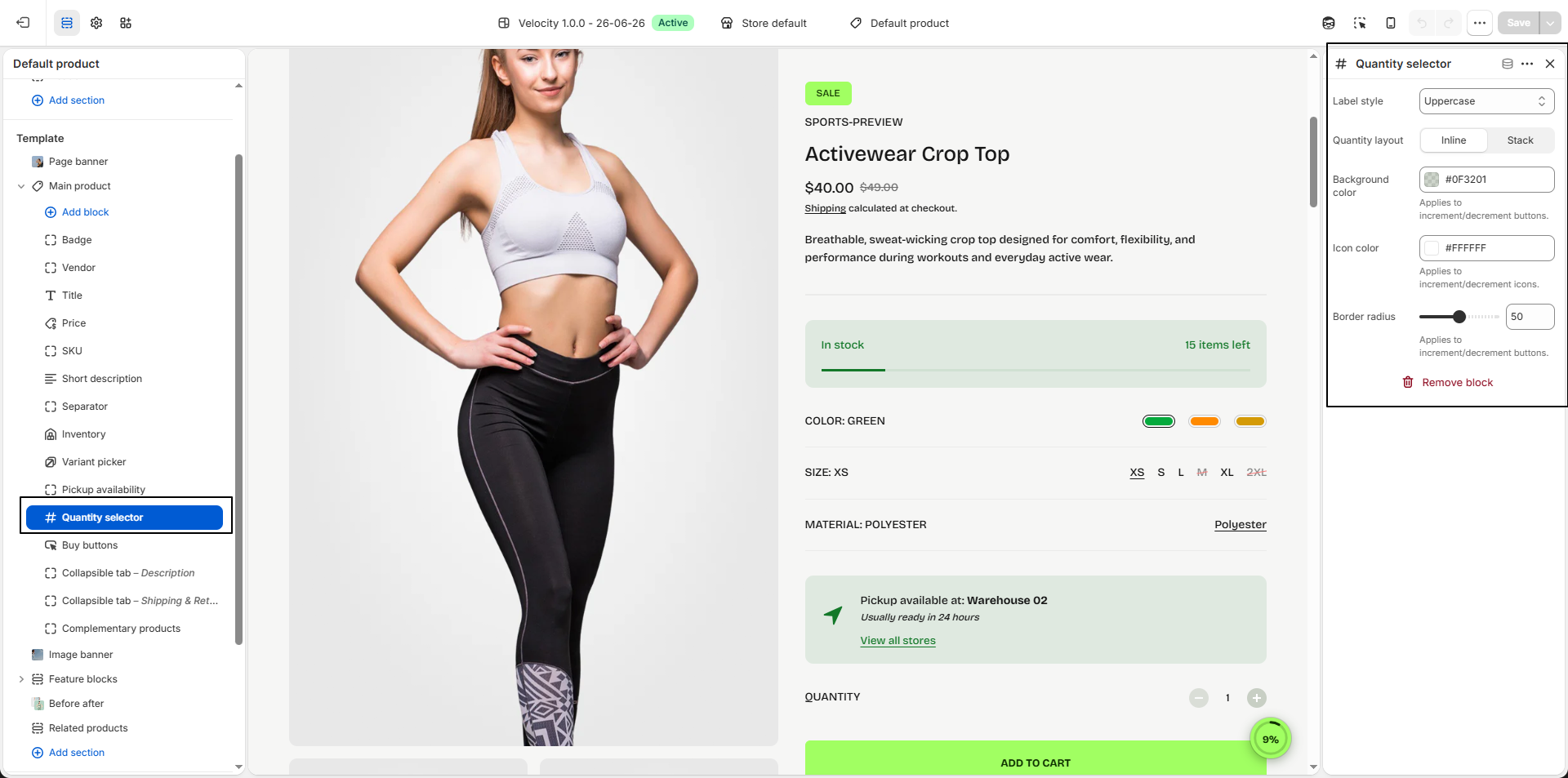
Quantity Selector:
Allow customers to adjust product quantity before adding items to the cart, creating a
smoother and more flexible purchasing experience.
-
Label Style:
Control the text appearance used for the quantity label.
- Uppercase: Displays labels in all capital letters for a bold and prominent look.
- Lowercase: Displays labels in lowercase for a softer appearance.
- Default: Uses the theme’s default typography styling.
-
Quantity Layout:
Control how the quantity selector is positioned within the product information area.
- Inline: Displays the quantity selector in a horizontal row for a compact layout.
- Stack: Places quantity controls vertically for better spacing and readability.
- Background Color: Choose the background color for the increment and decrement buttons (e.g., #0F3201) to match your store design.
- Icon Color: Set the icon color used inside the quantity buttons (e.g., #FFFFFF) for proper visibility and contrast.
- Border Radius: Adjust the roundness of the quantity selector buttons (e.g., 50px) to create either a sharp or rounded appearance.
-
Label Style:
Control the text appearance used for the quantity label.
-
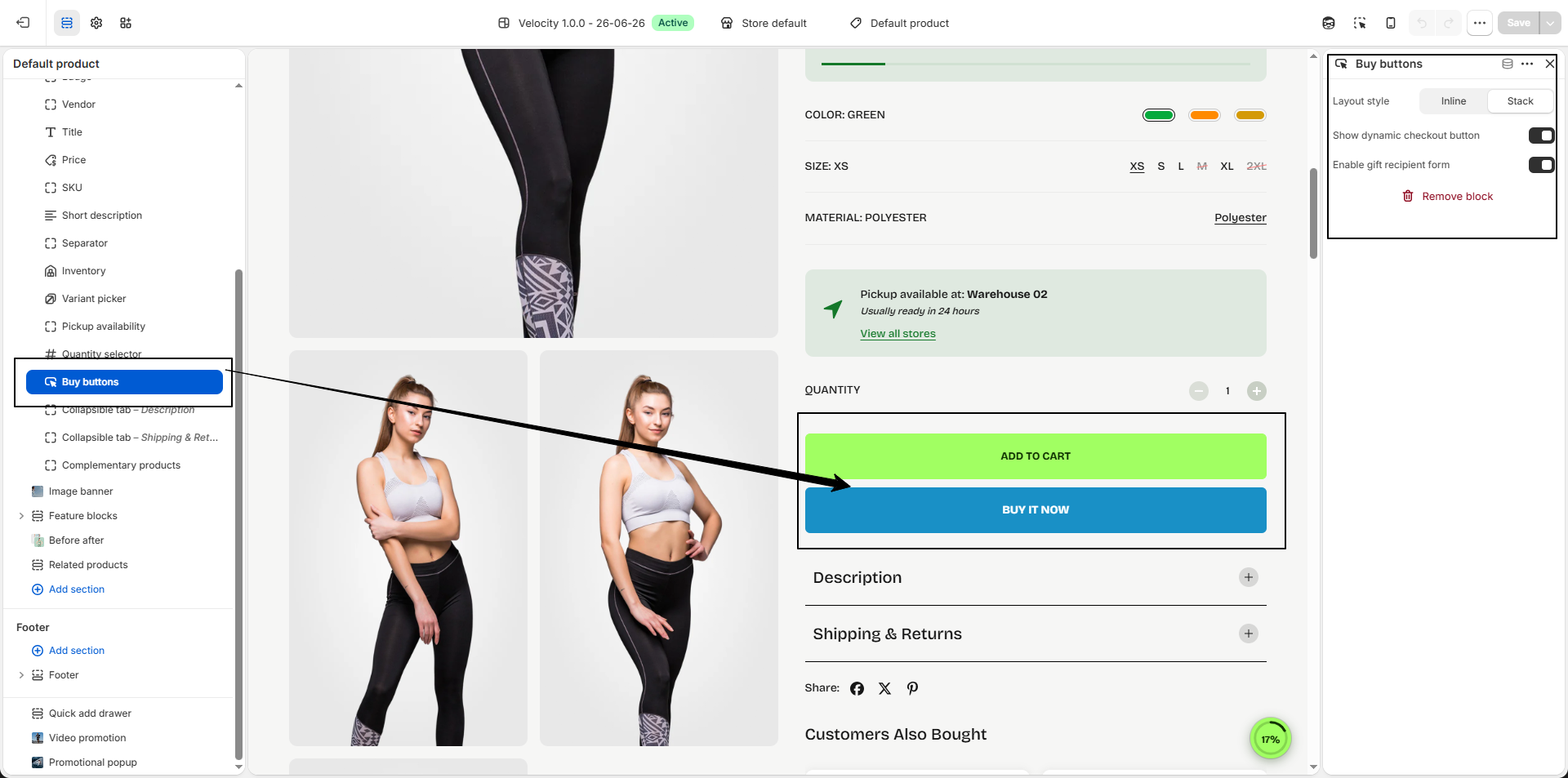
Add to Cart Button:
Configure the purchase action area to create a faster and smoother buying experience for
customers directly from the product page.
-
Layout Style:
Control how purchase actions are displayed on the product page.
- Inline: Displays the quantity selector and add to cart actions side by side for a compact and modern layout.
- Stack: Displays purchase actions vertically for improved spacing and better visibility.
- Show Dynamic Checkout Button: Enable accelerated checkout options such as Buy It Now so customers can skip the cart and proceed directly to checkout for faster conversions.
- Enable Gift Recipient Form: Display recipient details fields for gift-enabled products, allowing customers to send purchases directly to another recipient with personalized information.
-
Layout Style:
Control how purchase actions are displayed on the product page.
-
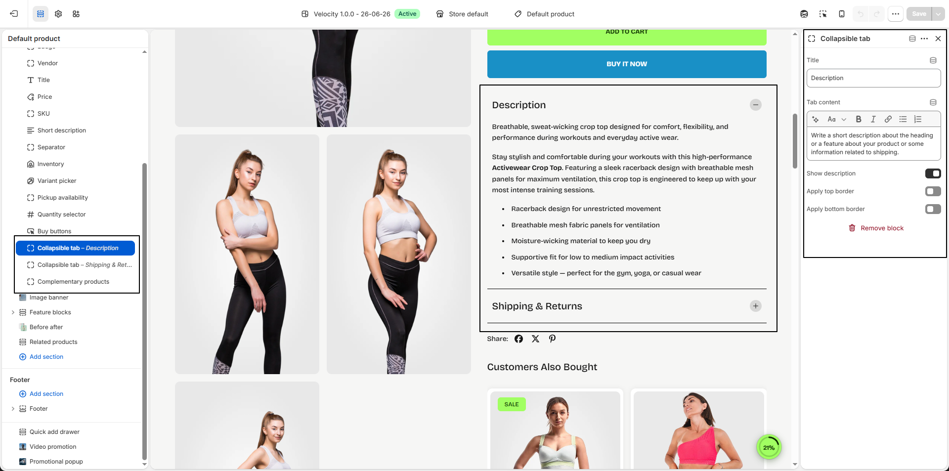
Collapsible Tab:
Display additional product information inside expandable content sections to keep the
product page clean, organized, and easy to browse.
- Title: Enter the heading for the collapsible tab (e.g., Description, Shipping Information, Product Features, Size Guide, or Warranty).
- Tab Content: Add custom text, formatted content, product highlights, shipping details, care instructions, or any additional information using the content editor.
- Show Description: Enable this option to automatically display the product description from Shopify inside the collapsible tab instead of adding content manually.
- Apply Top Border: Add a top divider line above the collapsible tab to create better visual separation between product content blocks.
- Apply Bottom Border: Add a bottom divider line below the collapsible tab for a cleaner and more structured layout.
-
Complementary Products:
Display related or recommended products on the product page to encourage additional
purchases and improve product discovery.
- Heading: Add a custom heading for the recommendations section (e.g., Customers Also Bought) to introduce suggested products.
- Number of Products to Load: Control how many recommended products are displayed in the section (e.g., 5).
- Border Radius: Adjust the corner roundness of product cards (e.g., 10px) to match your store’s visual style.
-
Product Cards:
- Show Background Color: Enable this option to apply a background color behind product cards for improved visibility and cleaner presentation.
-
Image Aspect Ratio:
Control how product images appear inside cards.
- Portrait: Displays taller product images for a modern catalog appearance.
- Square: Keeps all product images displayed in a balanced square format.
-
Text Alignment:
Choose how product information is aligned inside the card.
- Left: Align content to the left.
- Center: Center-align product details.
- Right: Align content to the right.
- Show Quick View: Enable quick view functionality to allow customers to preview product details and add items to cart without leaving the current page.
-
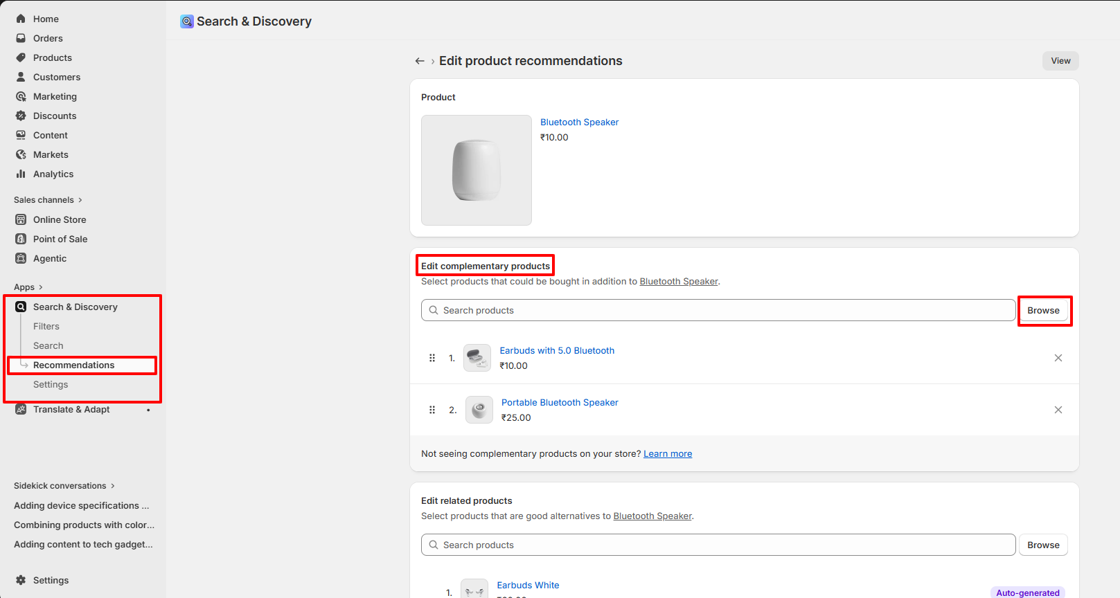
Manage Complementary Products:
- Open Shopify Admin → Apps → Search & Discover.
- Navigate to Product Recommendations.
- Select the product you want to configure.
- Open the Complementary Products section.
- Add related products you want to display.
- Save the changes.
- The selected products will automatically appear in the Complementary Products section on the product page.