Category Section
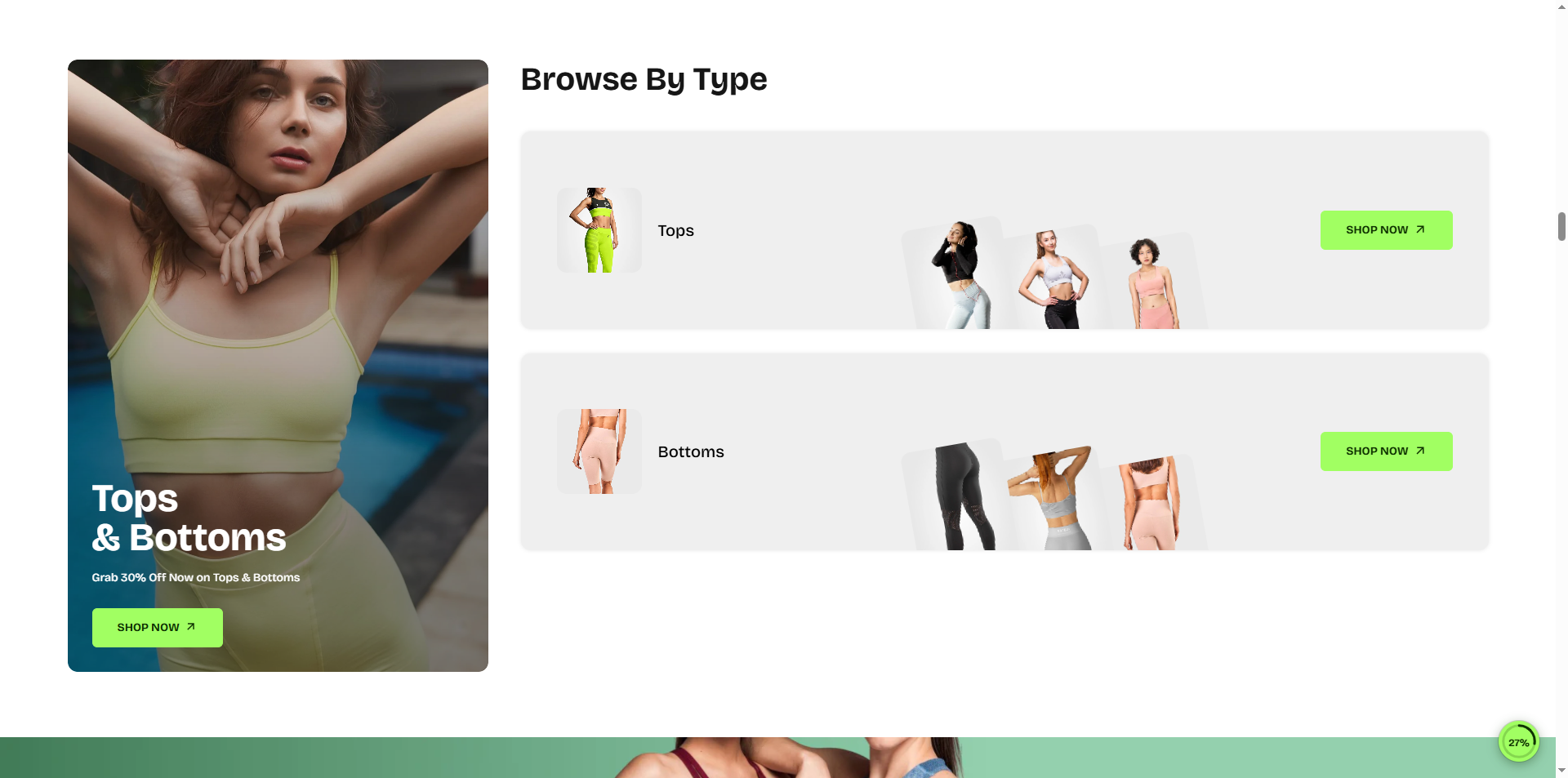
The Category Section helps you showcase your store collections in a visually engaging and easy-to-browse layout. Designed to improve product discovery, this section highlights key categories with featured imagery, collection titles, and direct call-to-action buttons that guide customers toward relevant products faster. Whether promoting best sellers, seasonal collections, or core categories, the layout keeps navigation intuitive while creating a stronger shopping experience across your storefront.
How to Add the Category Section
- From your Shopify admin, go to Online Store → Themes.
- Click Customize on the Velocity theme.
- In the Theme Editor, use the drop-down selector to choose the page where you want to add or edit the Category section.
- Click Add Section (or select an existing Category section if already added).
- Click Save to apply your changes.
How To Edit the Category Section
Here are the steps to configure the options mentioned for the Category section in your Velocity Shopify theme:
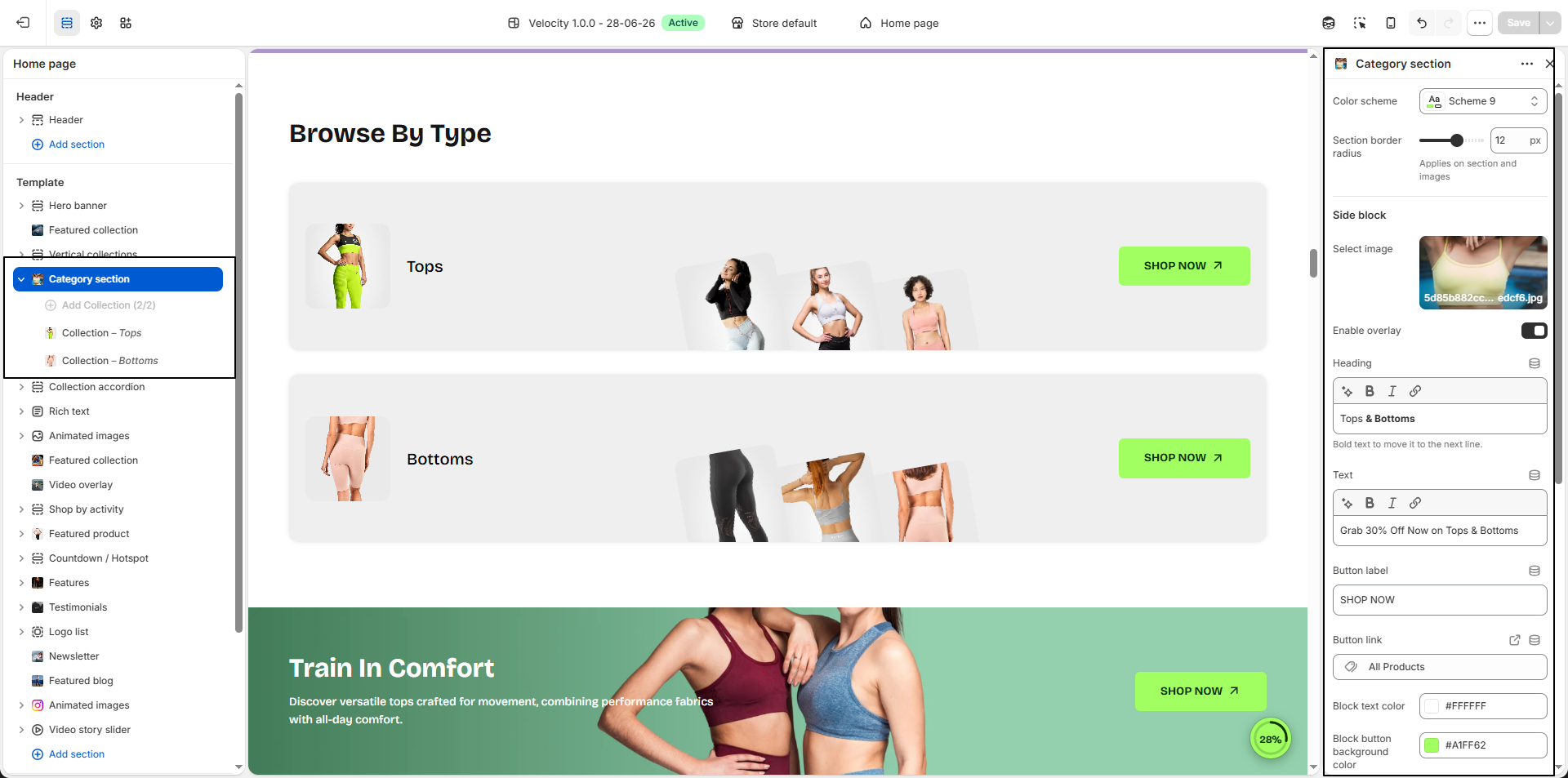
- Color Scheme: Select a predefined color scheme (e.g., Scheme 9) to control the background and overall styling of the category section.
- Section Border Radius: Adjust the corner roundness applied to the entire section and category images (e.g., 12px) for a softer and modern appearance.
-
Side Block:
Configure the featured promotional block displayed beside the category list.
- Select Image: Upload a promotional image that will appear inside the side banner block.
- Enable Overlay: Apply a dark overlay over the image to improve text readability.
-
Heading:
Add a promotional heading (e.g., Tops & Bottoms).
Tip: Use bold text to move content onto the next line. - Text: Add supporting promotional text or campaign messaging (e.g., Grab 30% Off Now on Tops & Bottoms).
- Button Label: Customize the button text (e.g., SHOP NOW).
- Button Link: Select the page or collection where customers will be redirected after clicking the button.
- Block Text Color: Choose the text color displayed over the promotional image.
- Block Button Background Color: Set the background color for the promotional button.
- Block Button Text Color: Choose the button text color.
- Block Button Hover Background Color: Define the background color shown when customers hover over the button.
- Block Button Hover Text Color: Define the text color displayed on button hover.
- Main Heading: Add the primary heading displayed above the category collection list to introduce the section.
Configure the Category Block Settings
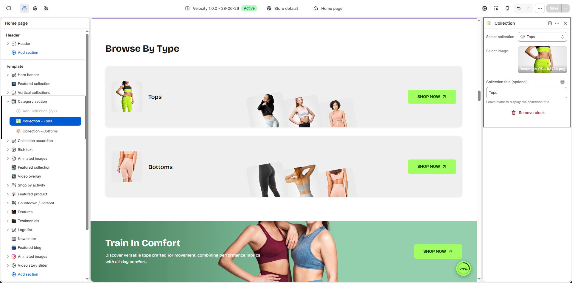
- Add Category Block: Click Add Collection Block to create a new collection card inside the Vertical Collection List section.
- Select Collection: Choose the collection you want to display. Products and collection details will automatically be linked to the selected collection.
-
Collection Title (Optional):
Enter a custom title to display instead of the original collection title.
Leave this field blank to automatically show the selected collection name.
Recommended: Maximum 3 words for best appearance. -
Select Image:
Upload a custom image to visually represent the collection block.
- Click Upload images to add the collection image.
- For best results, use transparent PNG images for a cleaner presentation.