
Velocity Theme Settings
Velocity offers extensive customization options, giving you complete creative freedom to build a store that reflects your brand’s energy and style—without requiring any coding knowledge. Using Shopify’s intuitive theme editor, you can easily customize colors, typography, layouts, spacing, and premium section designs to create a seamless and engaging shopping experience. From bold promotional content to dynamic storefront layouts, Velocity helps you craft a high-performance store that stands out and connects with your audience.
1. Favicon
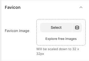
A favicon is a small icon displayed in the browser tab next to your store's title. Adding a custom favicon helps strengthen your brand identity and makes your store easily recognizable across tabs and bookmarks.
How to Add a Favicon
- From your Shopify admin, go to Online Store → Themes.
- Click Customize on the Velocity theme.
- In the Theme Editor, open Theme Settings (bottom-left corner).
- Select the Favicon option.
- Upload your favicon image using the image selector.
- Recommended size: 32 x 32 pixels.
- Tip: Use a lightweight image file to ensure faster loading.
2. Typography
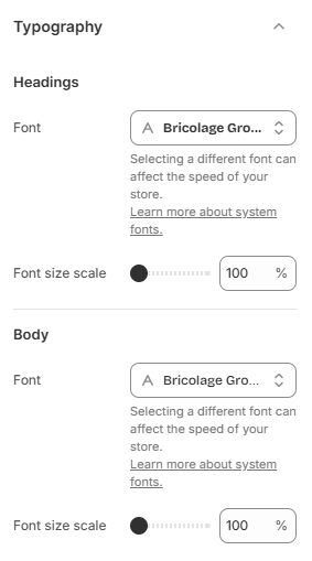
The Velocity theme allows you to fully customize your store's typography to match your brand identity. You can set separate fonts for headings and body text, ensuring a clear visual hierarchy and a consistent design across your store. Choose from Shopify's built-in Google Fonts library and apply your selections instantly for a modern and polished appearance.
- From your Shopify admin, go to Online Store → Themes.
- Click Customize on the Velocity theme.
- In the Theme Editor, open Theme Settings (bottom-left corner).
- Select the Typography option.
3. Colors
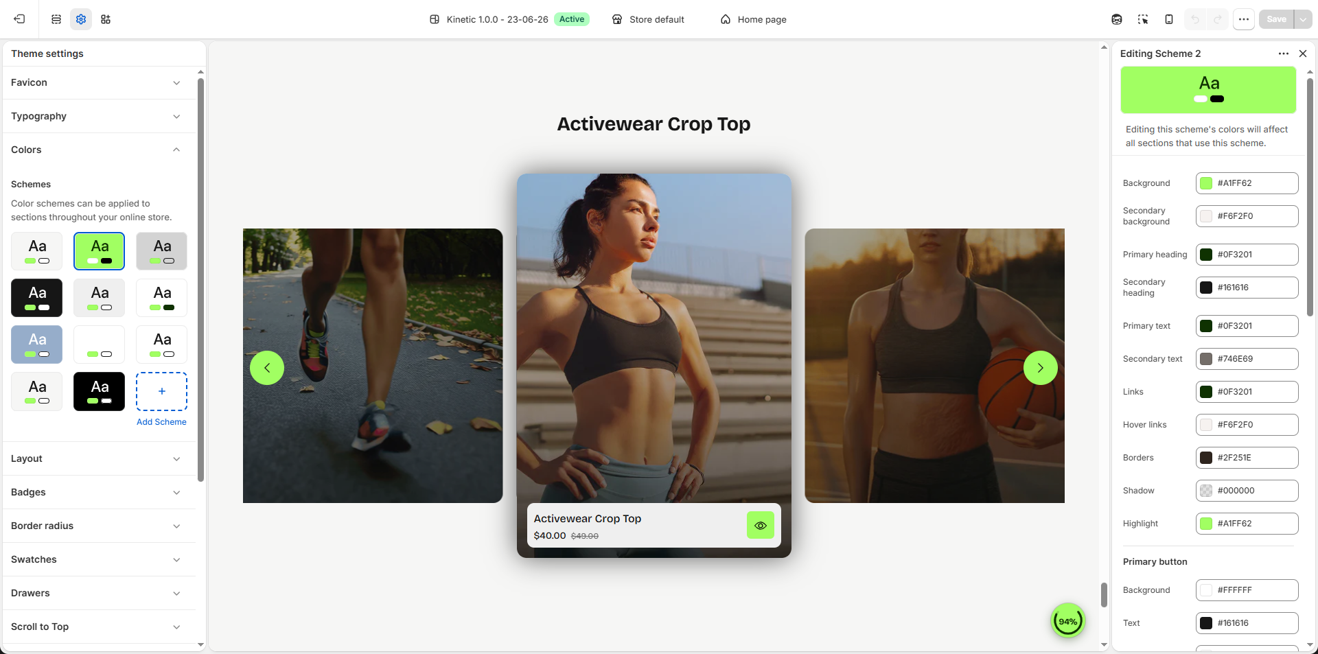
The Velocity theme includes a flexible color system based on color schemes. Each scheme groups together a set of colors that are applied consistently across your store's sections and components. You can create multiple color schemes and assign them to different sections or blocks to maintain a cohesive and visually balanced design.
What is a Color Scheme?
A color scheme is a predefined set of colors that you can reuse throughout your theme. Instead of customizing colors individually for each section, you can simply apply a scheme, which automatically controls elements such as background, text, buttons, and other design components. To learn more about Shopify color schemes, click here .
- From your Shopify admin, go to Online Store → Themes.
- Click Customize on the Velocity theme.
- In the Theme Editor, open Theme Settings (bottom-left corner).
- Select the Colors option.
4. Layout
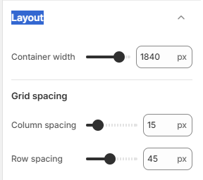
The Velocity theme includes flexible layout settings that allow you to control the overall content width and spacing between grid items across your storefront. These settings help create a balanced, premium browsing experience while maintaining clean product presentation on all screen sizes.
Layout Options
- Container Width: Controls the maximum width of the page content area (e.g., 1840px). Increasing the value creates a wider layout, while lower values provide a more compact and focused appearance.
- Column Spacing: Adjust the horizontal spacing between grid columns (e.g., 15px). This affects the gap between product cards, banners, and content blocks placed side by side.
- Row Spacing: Control the vertical spacing between rows of content (e.g., 45px). Higher values create more breathing space, while lower values create a denser layout.
How to Adjust Layout
- From your Shopify admin, go to Online Store → Themes.
- Click Customize on the Velocity theme.
- In the Theme Editor, open Theme Settings (gear icon).
- Select Layout.
- Adjust the Container Width, Column Spacing, and Row Spacing values according to your preferred storefront layout.
- Click Save to apply your changes.
5. How to Enable Badges
- From your Shopify admin, go to Online Store → Themes.
- Click Customize on the Flaunt theme.
- In the Theme Editor, open Theme Settings (bottom-left corner).
- Select Badges.
- Enable the Show badges option to display product badges across your storefront.
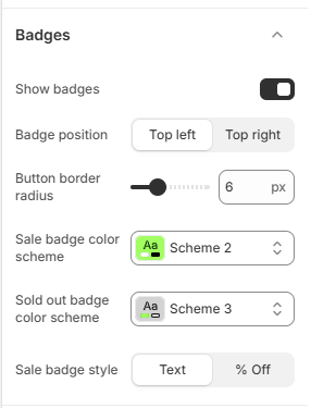
Configure Badge Settings
-
Badge Position:
Control where badges appear on product cards and product images.
- Top Left: Displays badges in the upper-left corner.
- Top Right: Displays badges in the upper-right corner.
- Button Border Radius: Adjust the roundness of badge corners (e.g., 6px) to match your store design. Higher values create softer rounded corners.
- Sale Badge Color Scheme: Select a predefined color scheme to style product sale badges consistently across the store.
- Sold Out Badge Color Scheme: Choose a separate color scheme for products marked as sold out.
-
Sale Badge Style:
Choose how discount badges are displayed:
- Text: Displays a standard sale label (e.g., “Sale”).
- % Off: Automatically displays the discount percentage based on product pricing (e.g., “25% OFF”).
6. Border Radius
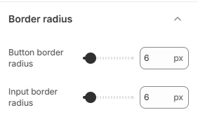
The Velocity theme allows you to control the roundness of corners for various elements through border radius settings. Adjusting these values helps create a soft, modern look that aligns with your store’s design style.
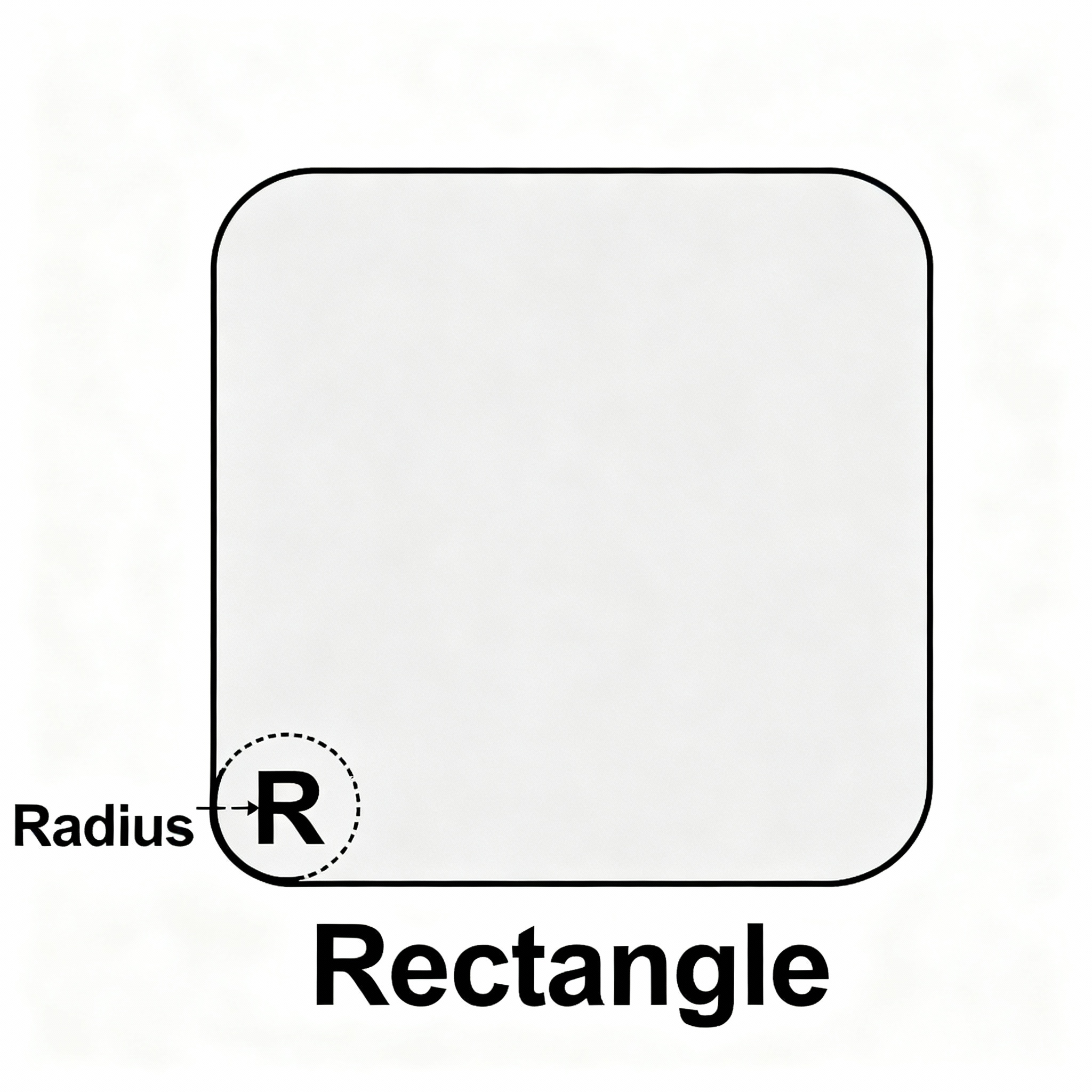
Default Border Radius Values
- From your Shopify admin, go to Online Store → Themes.
- Click Customize on the Velocity theme.
- In the Theme Editor, open Theme Settings.
- Select Border Radius or the relevant section for buttons, images, badges, or inputs.
- Adjust the pixel values as desired to achieve your preferred rounded look.
- Click Save to apply the changes store-wide.
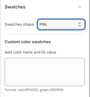
7. Products Swatches
-
Swatches Shape:
Choose how product option swatches appear across product cards, product pages, and variant
pickers.
- Default: Uses the theme’s default swatch styling with standard corners and spacing.
- Square: Displays swatches in a clean square shape for a structured and modern appearance.
- Circle: Shows swatches as circular buttons for a softer and more minimal shopping experience.
- Pills: Displays swatches in rounded pill-style containers, ideal for color names, flavor selections, or modern product layouts.
- Custom Color Swatches: Add custom color mappings for specific option values to display colors instead of plain text.
-
Add Color Name and Code:
Enter values using the following format:
red:#ff0000
green:#00ff00
Each value should be added on a new line.
8. Cart Page and Cart Drawer
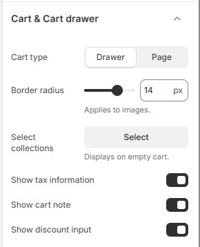
The Velocity theme provides flexible cart settings to create a smooth and optimized shopping experience. Choose whether customers interact with a dedicated cart page or a slide-out cart drawer, and enhance usability with features like discount input, cart notes, tax information, and recommended collections for empty cart states.
Cart Settings
-
Cart Type:
Select how the cart appears after customers add products.
- Drawer: Opens a slide-out cart panel without leaving the current page, allowing customers to continue shopping.
- Page: Redirects customers to a dedicated cart page for reviewing and managing their order.
- Border Radius: Adjust the corner roundness applied to cart product images (e.g., 14px) for a softer and more modern appearance.
- Select Collections: Choose collections to display when the cart is empty. This helps promote products and encourages customers to continue browsing.
- Show Tax Information: Enable this option to display tax and shipping calculation notices inside the cart before checkout.
- Show Cart Note: Enable a text field that allows customers to leave special instructions or order notes.
- Show Discount Input: Enable customers to enter and apply discount codes directly from the cart interface.
How to Configure Cart Settings
- From your Shopify admin, go to Online Store → Themes.
- Click Customize on the Velocity theme.
- In the Theme Editor, open Theme Settings (gear icon).
- Select Cart Page and Cart Drawer.
- Configure the cart layout, appearance, and additional cart options as needed.
- Click Save to apply your changes.
To learn more about cart customization, Click here.
9. Scroll to top
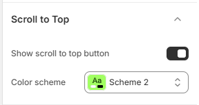
The Velocity theme includes a customizable Back to Top button that helps customers quickly return to the top of the page while browsing long collection pages, product pages, or blog content. You can control the button appearance, color scheme, alignment, and mobile size to match your store design.
Back to Top Button Settings
- Back to top button enable: Enable or disable the back to top button visibility across the storefront.
- Color Scheme: Select the background color scheme for the button.
How to Configure the Back to Top Button
- From your Shopify admin, go to Online Store → Themes.
- Click Customize on the Velocity theme.
- In the Theme Editor, open Theme Settings (gear icon).
- Select Back to top button setting.
- Enable the feature and customize the colors, position, and mobile size as needed.
- Click Save to apply your changes.
10. Quick View
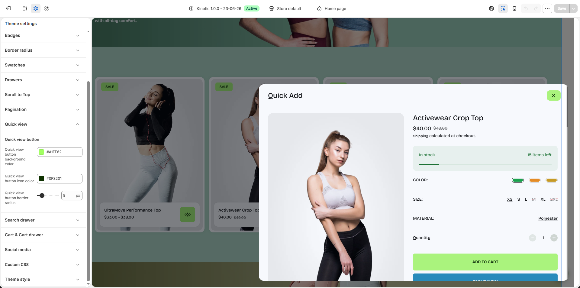
The Velocity theme includes customizable Quick View settings that allow customers to preview product details instantly without leaving the current page. You can control the appearance of the quick view button to match your store’s design and improve the browsing experience.
Quick View Settings
- Quick View Button: Enable the quick view functionality to allow customers to open a product preview popup directly from product cards.
- Quick View Button Background Color: Select the background color for the quick view button (e.g., #A1FF62) to match your brand styling and improve visibility.
- Quick View Button Icon Color: Choose the icon color displayed inside the quick view button (e.g., #0F3201) for proper contrast and readability.
- Quick View Button Border Radius: Adjust the corner roundness of the quick view button (e.g., 8px) to create either a sharp, modern appearance or a softer rounded style.
How to Configure Quick View
- From your Shopify admin, go to Online Store → Themes.
- Click Customize on the Velocity theme.
- In the Theme Editor, open Theme Settings (gear icon).
- Select Quick View.
- Customize the button colors, icon appearance, and border radius as needed.
- Click Save to apply your changes.
11. Search Drawer
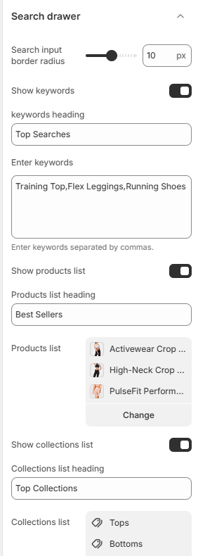
The Velocity theme includes an advanced Search Drawer that allows customers to discover products, collections, and trending searches directly from the search panel. You can customize search keywords, display featured products, and highlight collections to create a faster and more engaging shopping experience.
Search Drawer Settings
- Search Input Border Radius: Adjust the corner roundness of the search input field (e.g., 10px) to match your store’s design style.
- Show Keywords: Enable this option to display popular search terms inside the search drawer.
- Keywords Heading: Set the heading text for the keywords section (e.g., Top Searches).
-
Enter Keywords:
Add keywords separated by commas to display suggested searches.
Example: Training Top, Flex Leggings, Running Shoes - Show Products List: Enable this option to display selected products inside the search drawer.
- Products List Heading: Set the title shown above the featured product list (e.g., Best Sellers).
- Products List: Select products that will appear inside the search drawer for quick discovery and navigation.
- Show Collections List: Enable this option to display featured collections within the search drawer.
- Collections List Heading: Set the title for the collections section (e.g., Top Collections).
- Collections List: Choose collections to highlight and help customers quickly browse popular categories.
How to Configure the Search Drawer
- From your Shopify admin, go to Online Store → Themes.
- Click Customize on the Velocity theme.
- In the Theme Editor, open Theme Settings.
- Select Search Drawer.
- Configure keywords, products, collections, and appearance settings as needed.
- Click Save to apply your changes.
12. Social media
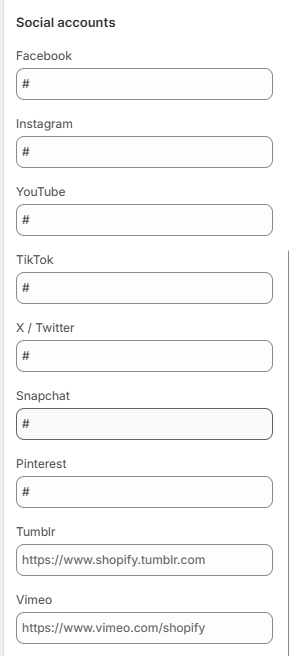
The Velocity theme allows you to connect your store with various social media platforms, making it easy for visitors to follow and engage with your brand. Social media links appear throughout the theme, including the header, footer, and dedicated social icon sections.
How to Update Social Links
- From your Shopify admin, go to Online Store → Themes.
- Click Customize on the Velocity theme.
- In the Theme Editor, open Theme Settings → Social Media.
- Paste the URLs of your social media accounts in the input fields next to each platform.
- Click Save to apply your changes.
Once added, your social icons will automatically display on your storefront, making it simple for customers to connect with your brand on platforms like Instagram, Facebook, Twitter, and more.
13. Video Promotion
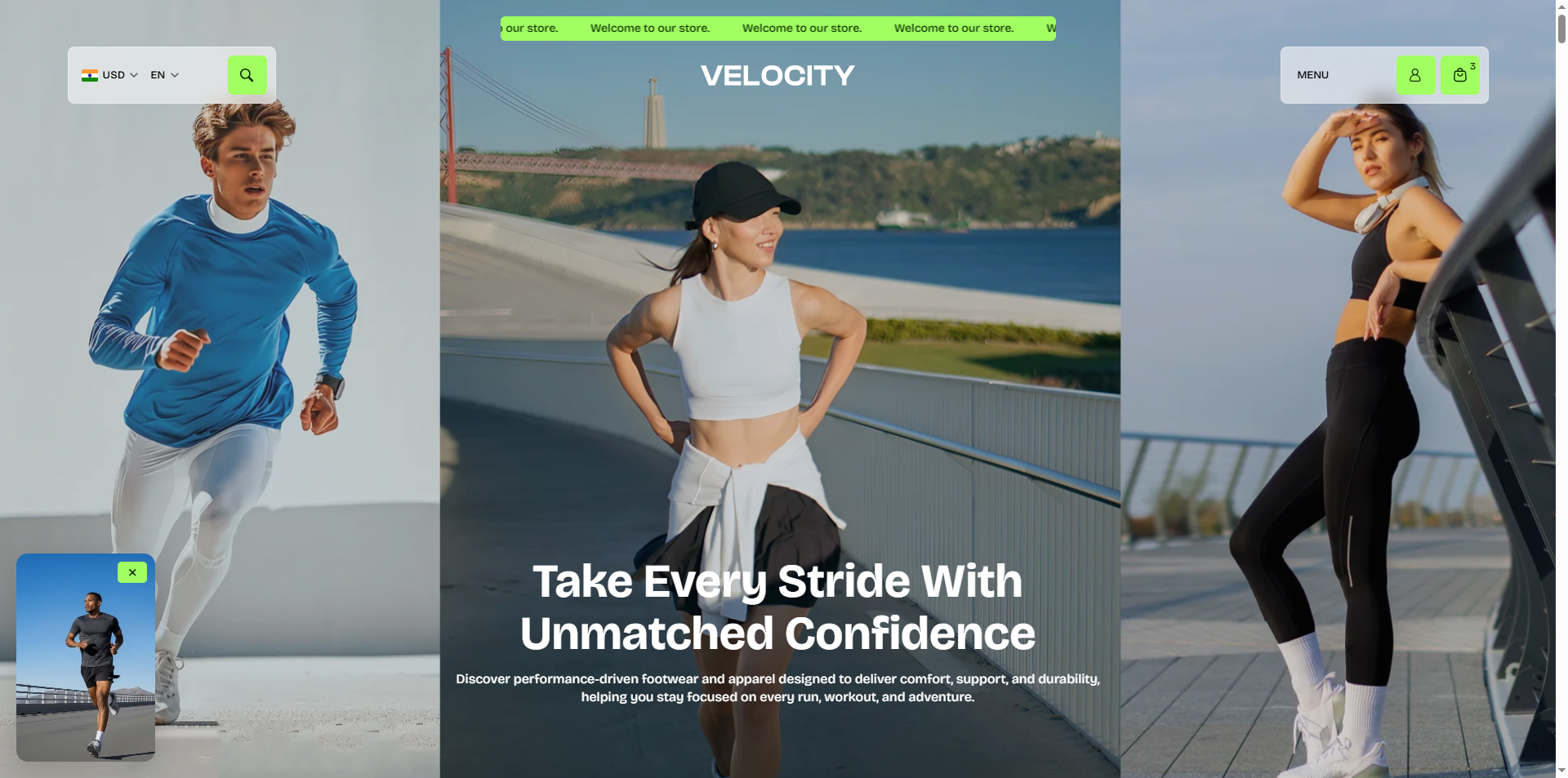
Display an interactive promotional video popup to highlight featured products, campaigns, or special offers and increase customer engagement.
- Show Video Promotion Popup: Enable this option to display the promotional video popup on your storefront.
- Video: Upload or select a promotional video file that will appear inside the popup.
- Button Text: Customize the call-to-action button label shown on hover (e.g., View Product).
- Promotion Link: Select the destination page or product customers will be redirected to after clicking the promotion button.
-
Display Trigger:
Control when the popup appears.
- After Delay: Automatically display the popup after a specified number of seconds.
- Delay (Seconds): Set how long the popup waits before appearing after page load (e.g., 1 second).
- Border Radius: Adjust the corner roundness of the video popup (e.g., 14px) for a softer and modern appearance.
-
Popup Position:
Choose where the video popup appears on the screen.
- Bottom Left: Displays the popup at the bottom-left corner of the page.
- Remember Closed State: Enable this option to remember when customers close the popup and prevent it from appearing repeatedly.
- Reopen After (Days): Set the number of days before showing the popup again to returning visitors (e.g., 30 days).
- Close Button Background Color: Select the background color for the popup close button (e.g., #A1FF62).
- Close Button Icon Color: Choose the icon color for the close button to maintain proper visibility and contrast (e.g., #0F3201).
14. Promotional Popup
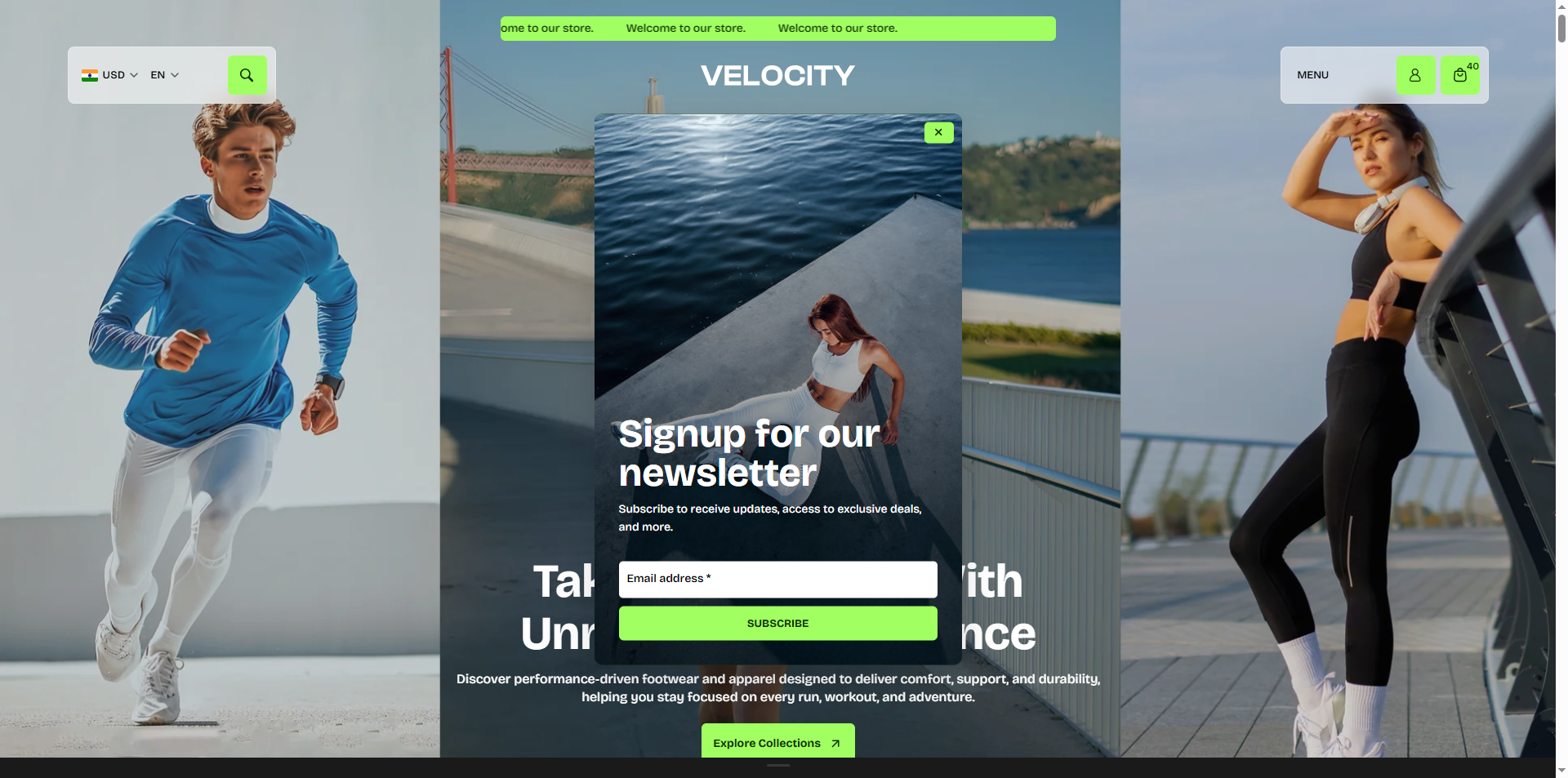
The Velocity theme includes a customizable Promotional Popup that helps you capture customer attention by displaying special offers, newsletter signups, announcements, or marketing campaigns. Control when the popup appears, who sees it, and customize its content to increase engagement and conversions.
- Show Promotional Popup: Enable this option to display the promotional popup on your storefront.
- Color Scheme: Select a predefined color scheme (e.g., Scheme 11) to control the popup's background, text, and button styling.
- Delay Until the Popup Appears: Set the number of seconds to wait before displaying the popup after the page loads (e.g., 3 seconds).
- Show Only on Home Page: Enable this option to display the popup only on your homepage.
- Hide for Account Holders: Prevent the popup from appearing to customers who are logged into their accounts.
- Show Once to Visitors: Display the popup only once per visitor to avoid showing it repeatedly during future visits.
- Border Radius: Adjust the corner roundness of the popup container (e.g., 10px) for a softer, modern appearance.
-
Select Image:
Upload an image to display inside the promotional popup.
- Click Upload images to add a promotional banner or featured image.
- Use high-quality images for the best visual presentation.
- Enable Image Overlay: Apply a dark overlay on the popup image to improve text readability.
- Heading: Enter the main promotional heading (e.g., Signup for our newsletter). A maximum of two lines will be displayed.
- Text: Add supporting promotional text or a short description. A maximum of three lines will be displayed.
- Show Newsletter Email: Enable this option to display an email subscription field, allowing visitors to subscribe directly from the popup.
15. Age Verifier
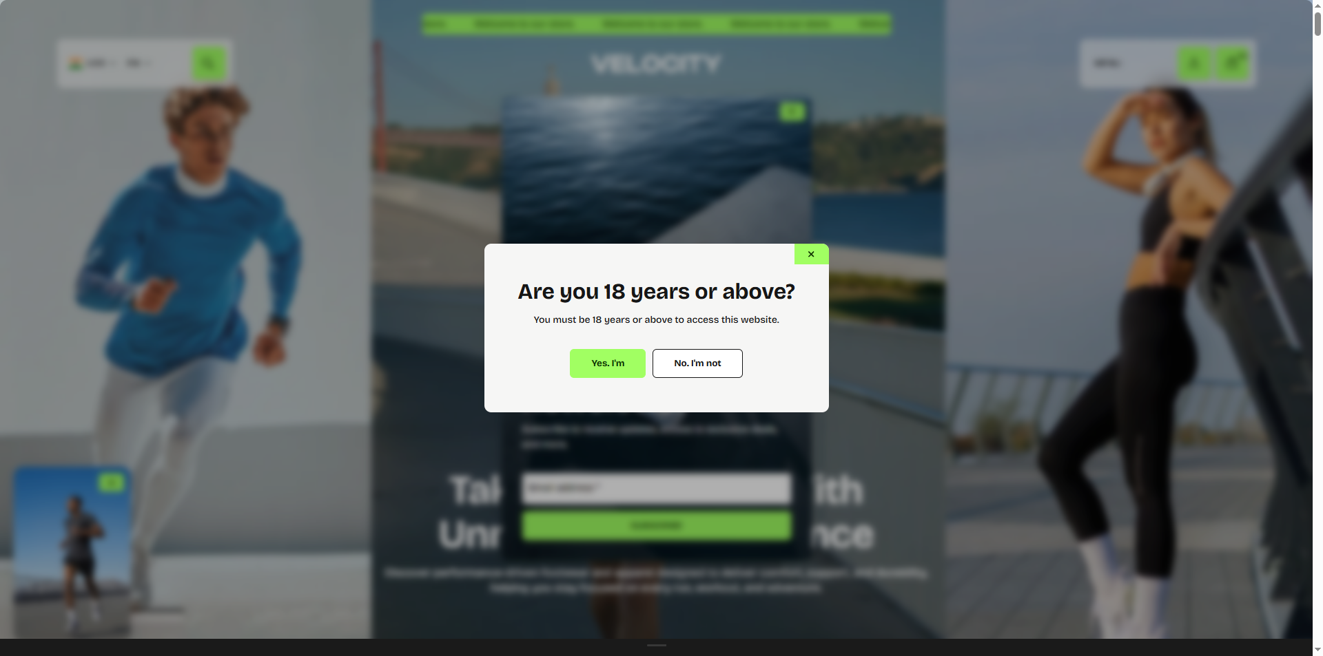
The Velocity theme includes an Age Verifier popup that helps restrict access to your store by asking visitors to confirm their age before browsing. This feature is ideal for stores selling age-restricted products and allows you to customize the popup content, appearance, and redirect behavior.
- Show Age Verifier: Enable this option to display the age verification popup when customers visit your store.
- Color Scheme: Select a predefined color scheme (e.g., Scheme 1) to control the popup's background, text, and button styling.
- Border Radius: Adjust the corner roundness of the age verification popup (e.g., 10px) for a softer and modern appearance.
- Heading: Enter the main question displayed in the popup (e.g., Are you 18 years or above?).
- Text: Add a short message explaining why age verification is required (e.g., You must be 18 years or above to access this website.).
- Yes Button Text: Customize the confirmation button label (e.g., Yes, I'm) shown to visitors who meet the age requirement.
- No Button Text: Customize the button label (e.g., No, I'm not) shown to visitors who do not meet the age requirement.
-
Redirect URL:
Specify the page visitors should be redirected to when they click the No button
or close the popup.
Note: If no URL is provided, visitors will be redirected to the Google homepage by default. - Remember Answer For (Days): Set the number of days (e.g., 30) to remember a visitor's confirmation and hide the popup on future visits.
- Custom CSS: Add custom CSS to further personalize the appearance of the age verifier popup according to your store's branding.
16. How to Enable Gift Wrapping
Gift Wrapping allows customers to add a beautifully wrapped option to their order for special occasions such as birthdays, anniversaries, and holidays. This feature offers a personalized touch and can also create an additional revenue stream for your store.
- Create a Gift Wrap Product:
- Go to Shopify Admin → Products → Add Product.
- Create a product named “Gift Wrapping” (the URL handle should be "gift-wrapping").
- Set the price you want to charge for the gift-wrapping service.
- Set the product visibility so it does not appear in your main store collections, ensuring it only appears as an option in the cart.
- Click Save to apply your changes.