Collection Accordion
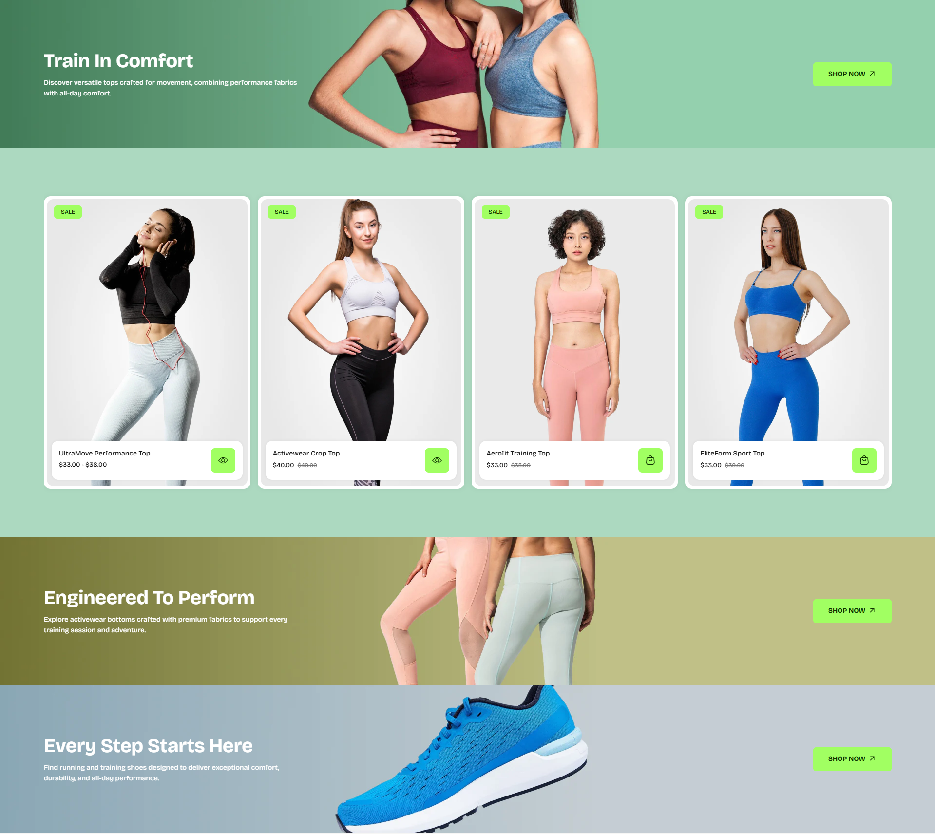
The Category Section helps you showcase your store collections in a visually engaging and easy-to-browse layout. Designed to improve product discovery, this section highlights key categories with featured imagery, collection titles, and direct call-to-action buttons that guide customers toward relevant products faster. Whether promoting best sellers, seasonal collections, or core categories, the layout keeps navigation intuitive while creating a stronger shopping experience across your storefront.
How to Add the Collection Accordion Section
- From your Shopify admin, go to Online Store → Themes.
- Click Customize on the Velocity theme.
- In the Theme Editor, use the drop-down selector to choose the page where you want to add or edit the Collection Accordion section.
- Click Add Section (or select an existing Collection Accordion section if already added).
- Click Save to apply your changes.
How To Edit the Collection Accordion Section
Here are the steps to configure the options mentioned for the Collection Accordion section in your Velocity Shopify theme:
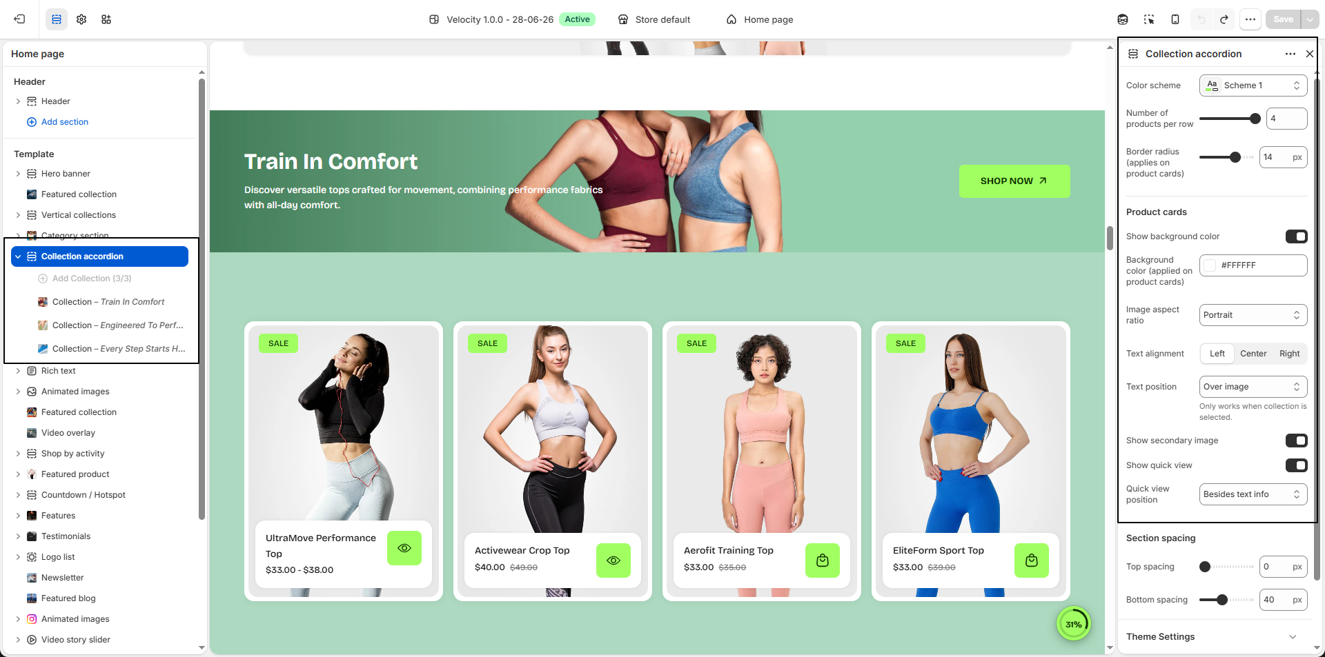
- Color Scheme: Select a predefined color scheme (e.g., Scheme 1) to control the background and overall appearance of the product section.
- Number of Products Per Row: Control how many product cards are displayed in each row (e.g., 4) to create wider or denser product layouts.
- Border Radius: Adjust the corner roundness applied to product cards (e.g., 14px) for a softer and modern design appearance.
-
Product Cards:
- Show Background Color: Enable this option to display a background color behind product cards for better visibility and cleaner presentation.
- Background Color: Select the background color applied to product cards (e.g., #FFFFFF).
-
Image Aspect Ratio:
Control how product images are displayed.
- Portrait: Displays taller images for a premium product presentation.
- Square: Displays images in a balanced square format for visual consistency.
- Adapt to Image: Preserves the original proportions of uploaded product images.
-
Text Alignment:
Control the alignment of product information.
- Left: Align product details to the left.
- Center: Center-align product content.
- Right: Align product details to the right.
-
Text Position:
Control where product information appears.
- Over Image: Display product details directly over the product image.
- Below Image: Display product information below the product image.
- Show Secondary Image: Enable this option to display an alternate product image when customers hover over the product card.
- Show Quick View: Enable quick product preview without leaving the current page.
-
Quick View Position:
- Besides Text Info: Display the quick view button near product information.
- Over Image: Display the quick view action directly over the product image.
- Section Spacing: Adjust spacing around the section to create balanced separation between content blocks and improve overall layout consistency.
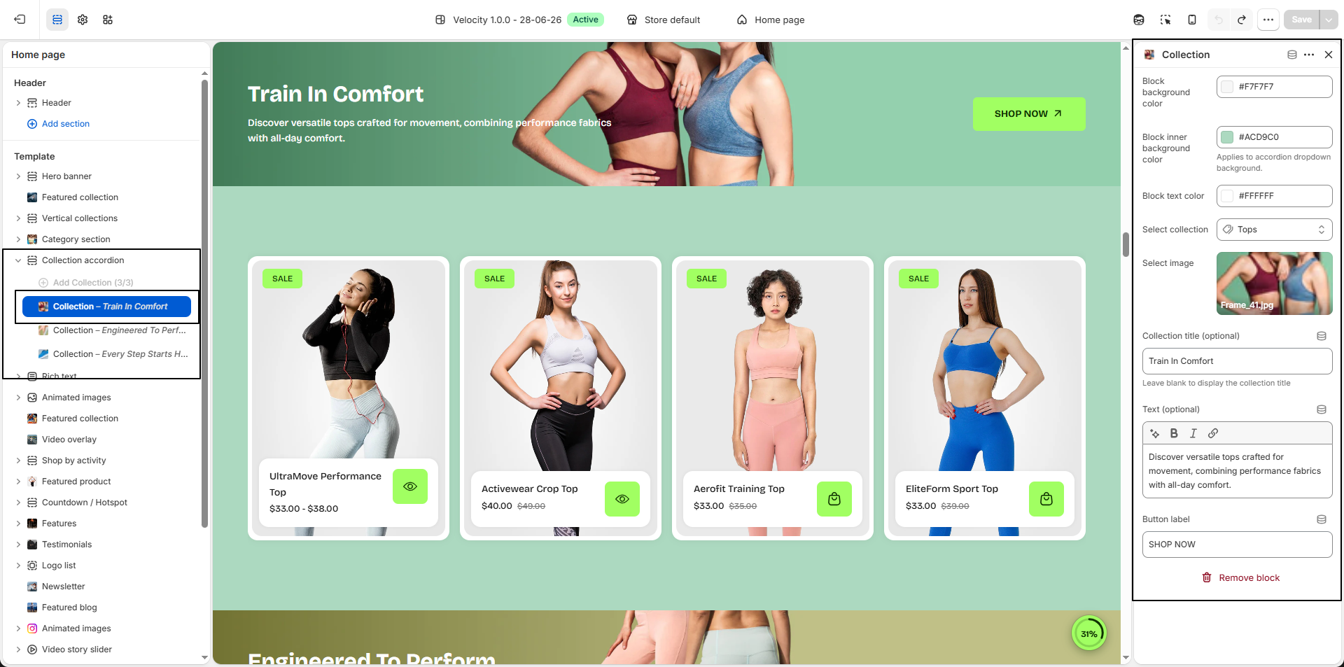
Configure the Collection Accordion Block Settings
- Add Collection Accordion Block: Click Add Collection Block to create a new accordion collection item inside the section.
- Block Background Color: Select the background color for the collection block container (e.g., #F7F7F7) to match your store design.
- Block Inner Background Color: Choose the background color applied to the accordion dropdown content area (e.g., #ACD9C0).
- Block Text Color: Define the text color used throughout the accordion block for proper readability and contrast.
- Select Collection: Choose the collection you want to display. Products and collection information will automatically connect to the selected collection.
-
Select Image:
Upload a custom image to visually represent the collection accordion block.
- Click Upload images to add the collection image.
- Use high-quality images for the best visual appearance.
-
Collection Title (Optional):
Enter a custom title to display instead of the original collection title.
Leave this field blank to automatically display the selected collection name. - Text (Optional): Add a short description or promotional message to introduce the collection and highlight featured products.
- Button Label: Customize the action button text displayed inside the collection block (e.g., SHOP NOW).
- Remove Collection Block: Select an existing accordion block and click Remove Block to delete it from the section.