
Header Section
The Header is a prominent section that appears at the top of every page, serving as the main navigation hub of your store. It includes your brand logo, menu links, and key action icons such as search, account, and cart, ensuring customers can easily explore and interact with your store.
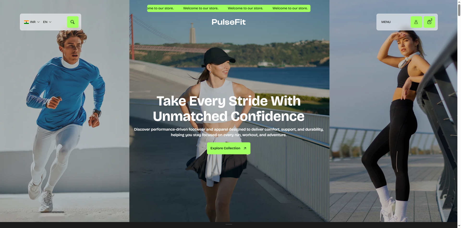
In the Velocity theme, the header is thoughtfully designed with an announcement bar at the very top to highlight offers, discounts, or time-sensitive deals. The header features a category dropdown search bar, account icon, and cart icon. This layered approach not only captures attention instantly but also enhances user engagement while maintaining a clean and organized layout for seamless navigation.
How to Configure the Header
- From your Shopify admin, go to Online Store > Themes.
- Click Customize on the Velocity theme.
- In the Theme Editor, select the Header section from the left sidebar.
- Customize the settings as per your store requirements and click Save.
Header Settings
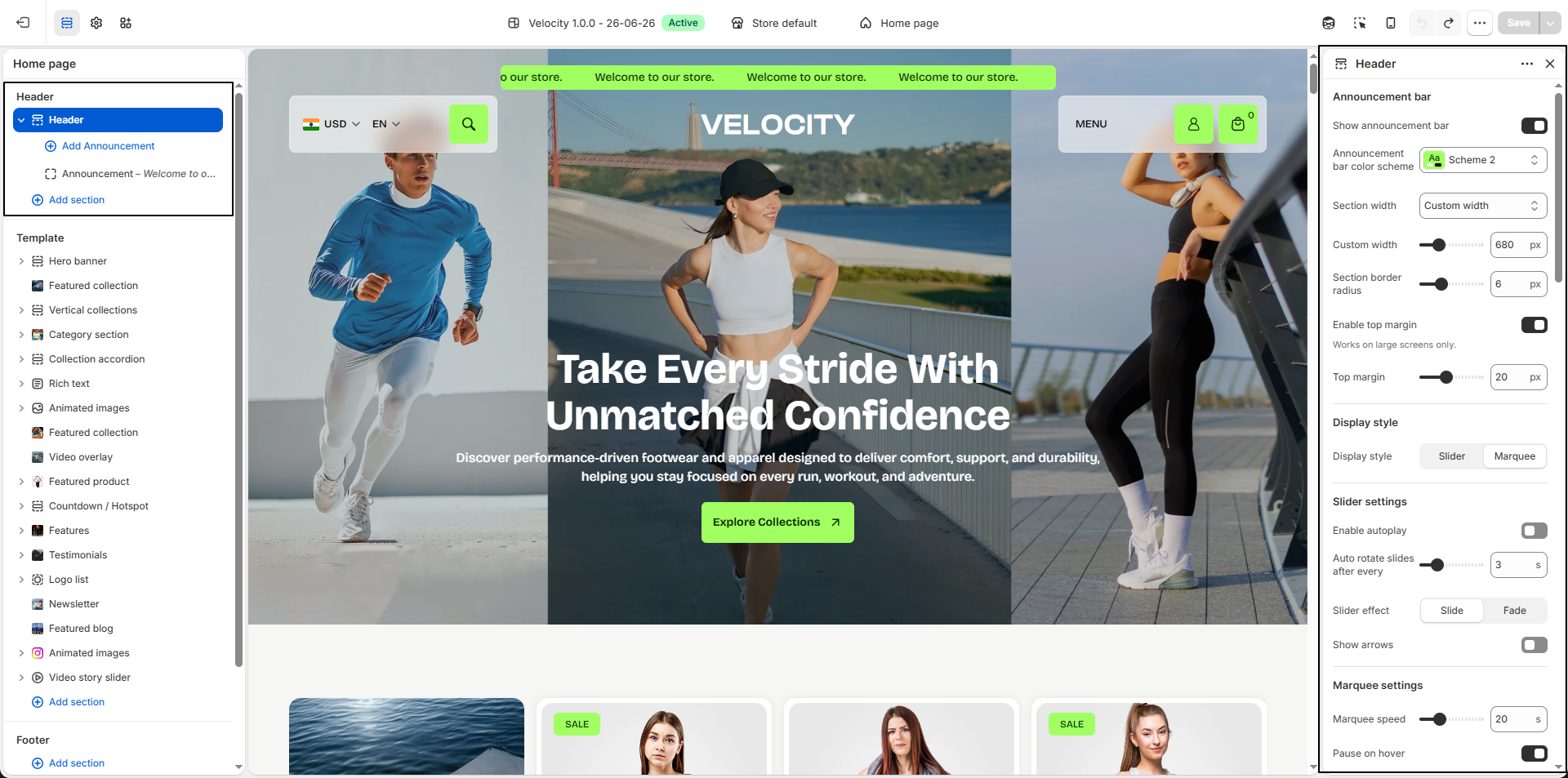
- Announcement Bar: Enable this option to display promotional messages, offers, countdowns, or important updates at the top of your store.
- Announcement Bar Color Scheme: Select a predefined color scheme (e.g., Scheme 2) to control the background and text styling of the announcement bar.
-
Section Width:
Control the width of the announcement bar container.
- Custom Width: Define a custom width value (e.g., 680px) to create a more compact and focused layout.
- Full Width: Expands the announcement bar across the entire screen width for a seamless and immersive appearance.
- Section Border Radius: Adjust the corner roundness of the announcement bar (e.g., 6px) for a softer and modern appearance.
- Enable Top Margin: Add spacing above the announcement bar to create separation from the top of the page layout.
- Top Margin: Set the amount of top spacing (e.g., 20px) applied when the top margin option is enabled.
-
Display Style:
Choose how announcements are displayed:
-
Slider: Displays announcement messages as slides.
- Enable Autoplay: Automatically rotates announcement slides.
- Auto Rotate Slides After Every: Set the slide transition interval (e.g., 3 seconds).
- Slider Effect:
- Slide: Moves announcements horizontally between slides.
- Fade: Creates a smooth fading transition effect.
- Show Arrows: Display navigation arrows for manually switching announcements.
-
Marquee: Displays announcements as continuously scrolling text.
- Marquee Speed: Control the scrolling speed of announcement text (e.g., 20).
- Pause on Hover: Pause scrolling when customers hover over the announcement bar.
-
Slider: Displays announcement messages as slides.
- Header Color Scheme: Select a predefined color scheme (e.g., Scheme 1) to control the header’s background, text, and icon appearance.
- Enable Transparent Header: Enable this option to display the header with a transparent background for a clean and immersive storefront appearance.
- Enable Only on Homepage: Apply the transparent header effect only on the homepage while keeping a standard header across other pages.
- Icon Background Color: Set the background color used behind header icons (e.g., search, account, cart).
- Icon Text Color: Define the icon color to maintain proper contrast and visibility.
- Select Logo: Upload your store logo by clicking Upload images. The selected logo will appear throughout the store header.
- Logo Width: Adjust the display size of the logo (e.g., 140px) to fit your preferred header layout.
- Show Currency Selector: Enable this option to allow customers to switch currencies directly from the header.
- Show Language Selector: Enable language switching to support multilingual storefront experiences.
- Enable Blur Effect: Apply a blur effect behind the header background to create a premium glass-style appearance while maintaining readability.
-
Menu Promos:
Showcase promotional content directly inside the navigation menu using featured images
and links.
- Select Image 01 / Select Image 02: Upload promotional images that appear inside the menu area.
- Heading: Add promotional text over the image. Use bold text to move content to the next line if needed.
- Image Link: Select the collection or destination page users will visit after clicking the promo image.
-
Aspect Ratio:
Choose how promo images are displayed:
- Adapt to Image: Maintains the original image proportions.
- Portrait: Displays taller promotional images.
- Square: Crops images into a square layout.
- Landscape: Displays wider promotional banners.
- Promo Text Color: Set the text color displayed over promotional images (e.g., #FFFFFF).
- Image Opacity: Adjust image overlay opacity to improve text readability (e.g., 20%).