
Featured Collection
The Featured Collection section in the Velocity theme allows you to showcase a selected collection of products directly on your homepage or any page. It helps highlight specific categories, seasonal products, or best-selling items in a visually engaging layout. With flexible display options such as grid or slider view, customizable headings, and optional content blocks, this section makes it easy to guide customers toward key products and improve product discovery.
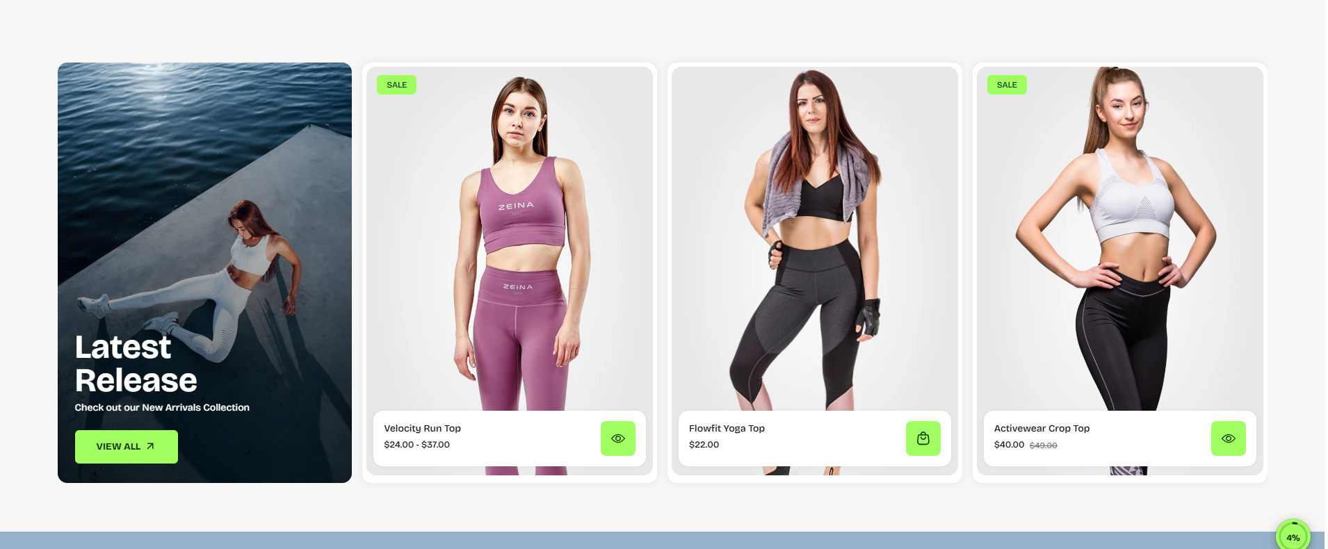
How to Add the Featured Collection Section
- From your Shopify admin, go to Online Store → Themes.
- Click Customize on the Velocity theme.
- In the left-hand editor sidebar, click Add section and select Featured Collection.
- Adjust the settings, blocks, and layout options according to your preferences.
- Click Save to apply your changes.
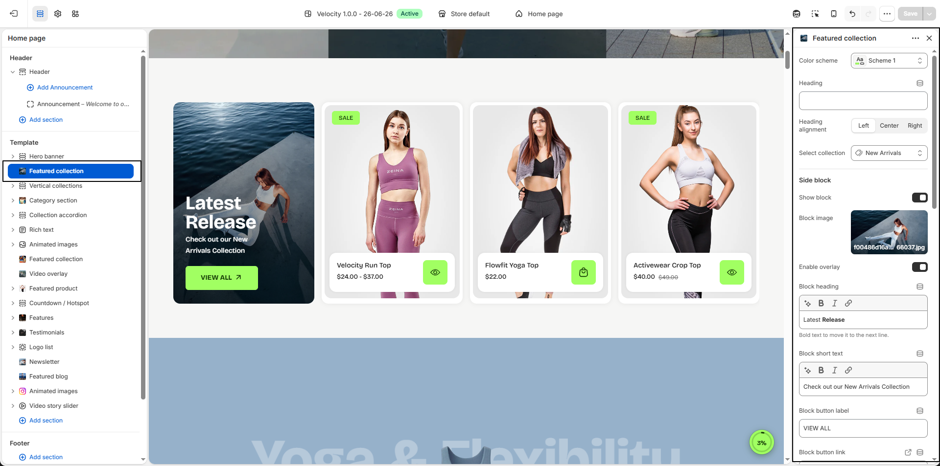
Featured Collection Section Settings
Configure settings that control the overall layout, product display, and appearance of the Featured Collection section.
- Color Scheme: Select a predefined color scheme (e.g., Scheme 1) to control the overall appearance of the section including background and text colors.
- Heading: Add a title to introduce the collection section and highlight featured products.
-
Heading Alignment:
Control the alignment of the section heading:
- Left: Align heading to the left.
- Center: Center align the heading.
- Right: Align heading to the right.
- Select Collection: Choose the collection that will be displayed in this section (e.g., New Arrivals).
-
Side Block:
Display a promotional content block beside the collection products to highlight campaigns,
categories, or featured messages.
- Show Block: Enable or disable the promotional side block.
- Block Image: Upload an image to visually promote products or collections.
- Enable Overlay: Apply an overlay effect over the image to improve text readability.
- Block Heading: Add a promotional heading displayed over the block image.
- Block Short Text: Add supporting text below the block heading.
- Block Button Label: Customize the CTA button text (e.g., View All).
- Block Button Link: Select the page or collection destination for the button.
- Block Text Color: Set the color used for heading and text content.
- Block Button Background Color: Define the button background color.
- Block Button Text Color: Choose the button text color.
- Block Button Hover Background Color: Set the button background color on hover.
- Block Button Hover Text Color: Define text color displayed during hover interaction.
-
Display Style:
Choose how collection products appear:
- Grid: Displays products in a clean grid layout.
- Slider: Displays products inside a horizontal sliding carousel.
- Number of Products to Load: Set how many products should appear initially within the collection section (e.g., 10).
- Number of Products per Row: Control how many product cards appear in each row (e.g., 4).
- Border Radius: Adjust corner roundness for product cards (e.g., 14px) to create a softer appearance.
- Show Background Color: Enable a custom background behind product cards.
- Background Color: Select the product card background color (e.g., #FFFFFF).
-
Image Aspect Ratio:
Control how product images are displayed:
- Portrait: Vertical image orientation.
- Square: Equal width and height ratio.
- Adapt to Image: Preserves the original uploaded image proportions.
-
Text Alignment:
Set alignment for product information:
- Left: Align content to the left.
- Center: Center align content.
- Right: Align content to the right.
-
Text Position:
Choose where product information appears:
- Over Image: Display product details over the image.
- Above Image: Display product details above the product image.
- Show Quick View: Enable quick product preview directly from collection cards without opening the product page.
-
Quick View Position:
Control where the quick view icon appears:
- Besides Text Info: Display quick view beside product information.
- Over Image: Display quick view directly over the product image.
Pro Tips:
Use high-quality collection images for a professional look.
Highlight best-selling or seasonal products to drive conversions.
For sliders, limit the number of items for smoother scrolling and faster load
times.
FAQs
How can I change the shape of product card images?
To customize the product card image shape:
- Go to the Customizer.
- Navigate to the Featured Collection section.
- Adjust the Image Aspect Ratio setting to achieve your desired look.
How do I enable the product slider?
To showcase products in a slider format:
- Open the Customizer.
- Locate the Featured Collection section.
- Toggle the Enable Slider option to On.