Collection Page
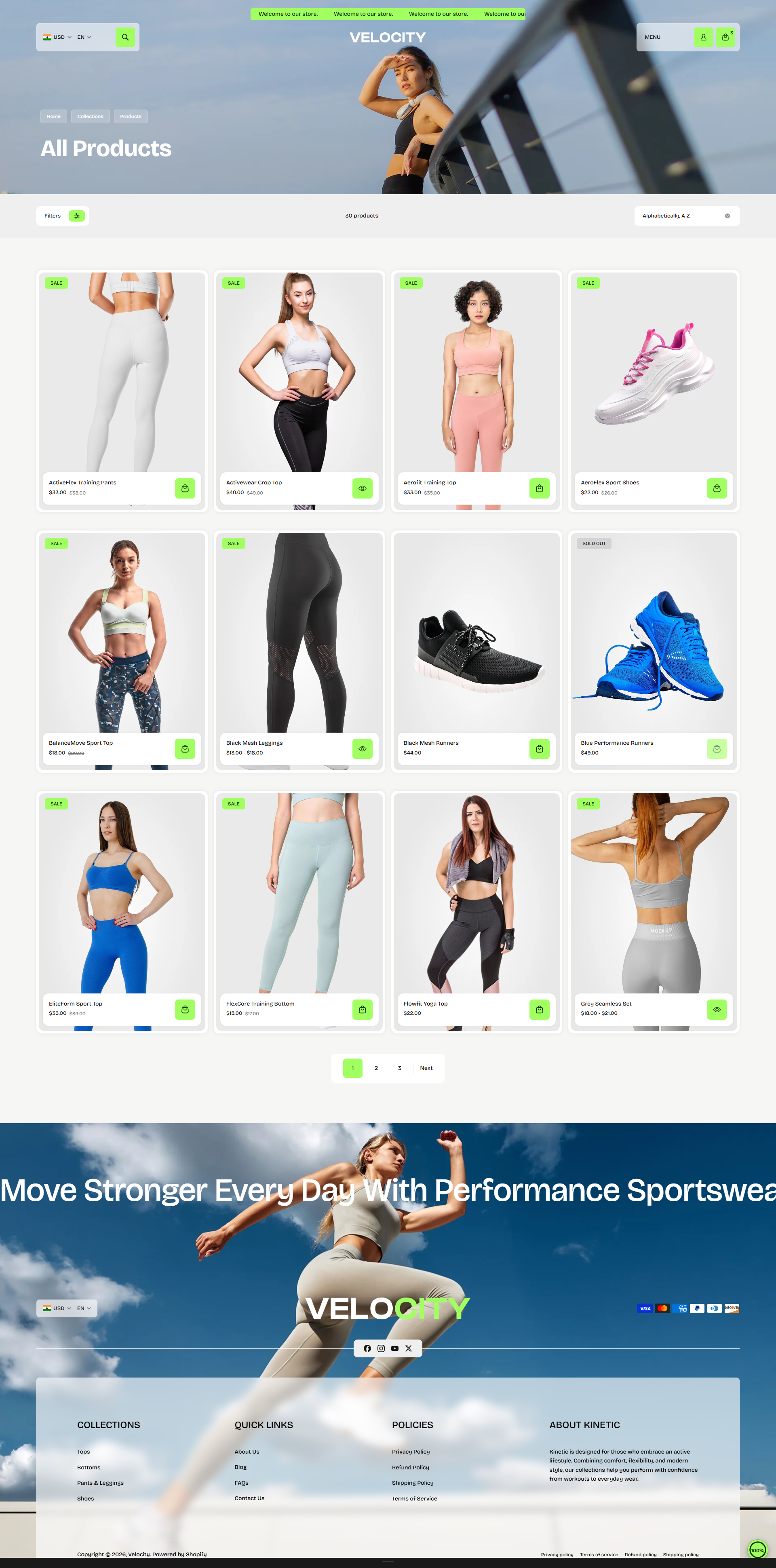
The Collection Page in the Velocity theme is designed to deliver a smooth and engaging product discovery experience. Customers can easily browse collections through a modern grid layout while accessing powerful filtering, sorting, and quick shopping features.
Built for performance and usability, Velocity enhances collection browsing with promotional banners, seamless product exploration, and interactive product cards. The layout is optimized to encourage longer browsing sessions while helping customers discover more products with minimal effort across desktop and mobile devices.
Key Features
- Collection Banner: Display collection images, titles, and descriptions to create visually engaging category pages.
- Filtering Options: Allow customers to refine products using available filter attributes for faster product discovery.
- Sorting Controls: Enable sorting by relevance, price, featured items, and Shopify’s built-in sorting options.
- Quick View: Let customers preview product details directly from collection cards without leaving the collection page.
- Continuous Scrolling Experience: Create a smoother browsing flow that encourages customers to explore more products with reduced interruptions and navigation friction.
- Modern Product Grid: Present products in a clean and structured layout for improved visibility and shopping experience.
- Responsive Design: Fully optimized for desktop, tablet, and mobile devices to ensure a consistent experience across all screen sizes.
Customize Your Collection Page
You can customize the Collection Page through the Shopify Theme Editor.
- From your Shopify admin, navigate to Online Store → Themes.
- Click Customize on the Velocity theme.
- Select Collections → Default Collection from the page selector.
- Choose the Collection section from the left sidebar.
- Configure the available settings according to your requirements.
- Click Save when finished.
Collection Section Settings
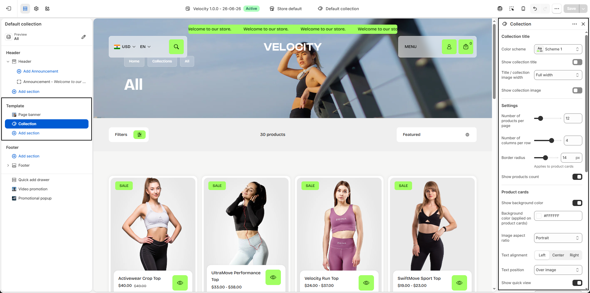
- Show Collection Title: Enable this option to display the collection title at the top of the page, helping customers easily identify the current collection.
-
Title / Collection Image Width:
Control the width of the collection banner area.
- Full Width: Expands the collection banner across the entire screen for an immersive visual experience.
- Container Width: Keeps the collection banner aligned within the store content container for a structured layout.
- Show Collection Image: Display the featured collection image assigned in Shopify to create a more engaging collection experience.
- Number of Products Per Page: Define how many products are displayed before pagination or infinite scrolling loads additional items (e.g., 12 products).
- Number of Columns Per Row: Control the number of product cards displayed in each row (e.g., 4 columns) to create wider or denser collection layouts.
-
Border Radius:
Adjust the corner roundness of product cards (e.g., 14px) to match your store’s visual
style.
Applies to product cards only. - Show Products Count: Display the total number of products available in the collection to give customers quick collection insights.
- Show Background Color: Enable this option to apply a background color behind product cards for improved visual separation.
- Background Color: Select the background color applied to collection product cards (e.g., #FFFFFF).
-
Image Aspect Ratio:
Choose how product images are displayed:
- Portrait: Displays taller product images for fashion-focused layouts.
- Adapt to Image: Preserves the original product image proportions.
- Square: Crops images into a uniform square appearance.
-
Text Alignment:
Control the alignment of product information.
- Left: Align content to the left.
- Center: Center align all text.
- Right: Align content to the right.
-
Text Position:
Control where collection text content appears.
- Over Image: Overlay collection text directly on banner images.
- Below Image: Display collection content below the banner image.
- Show Quick View: Enable quick product preview directly from collection cards without leaving the page.
-
Quick View Position:
Choose where the quick view button appears:
- Besides Text Info: Display quick view next to product details.
- Over Image: Display quick view overlay directly on the product image.
- Filters Color Scheme: Select a predefined color scheme (e.g., Scheme 5) for filter panels and controls.
- Show Filters: Enable collection filtering to help customers narrow down products faster.
- Enable Sorting: Allow customers to sort products using Shopify sorting options such as Featured, Best Selling, Price, and Newest.
- Enable Sticky Filters: Keep filters visible while scrolling for easier product refinement.
-
Pagination Type:
Choose how additional products load:
- Default: Displays standard pagination controls.
- Infinite Scroll: Automatically loads more products as customers continue scrolling.
-
Mobile Layout:
Control the product grid layout on mobile devices.
- One Column: Display one product per row.
- Two Columns: Display two products per row for a denser mobile layout.
How to Customize Filters
Filters allow customers to refine products on collection pages, making it easier to find relevant items and improving the overall shopping experience. You can manage filters using Shopify's Search & Discovery app.
- From your Shopify admin, go to Apps and open Shopify Search & Discovery.
- If the app is not installed, go to the Shopify App Store, search for Shopify Search & Discovery, and install it.
- Inside the app, navigate to Filters.
- Add, remove, or reorder filters to control which options appear on your collection pages.
- Configure filter types such as product options (e.g., size, color), price, availability, or custom metafields.
- Click Save to apply your changes.
- For more details, refer to Shopify's Search & Discovery documentation .
How to Configure the Promo Tile
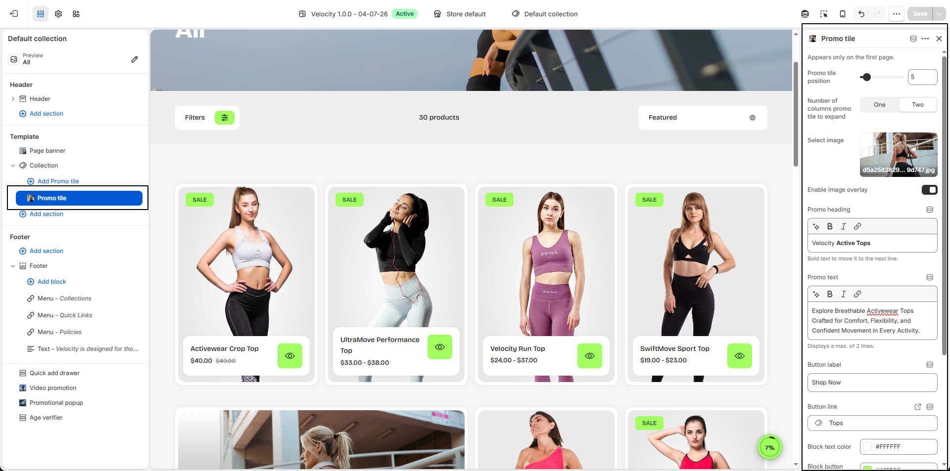
The Promo Tile lets you display a promotional banner within your collection product grid. It can be used to highlight featured collections, special offers, or seasonal campaigns while customers browse products. The promo tile appears only on the first page of the collection.
- Promo Tile Position: Choose the position where the promo tile appears within the product grid (e.g., Position 5 displays the promo tile after the fourth product).
-
Number of Columns to Expand:
Control how much horizontal space the promo tile occupies.
- One: Displays the promo tile with the width of a single product card.
- Two: Expands the promo tile across two product columns for greater visual impact.
- Select Image: Upload the promotional image displayed inside the promo tile. Use high-quality images for the best appearance.
- Enable Image Overlay: Apply an overlay on the image to improve the readability of the promotional text.
-
Promo Heading:
Enter the main promotional heading displayed over the image.
Tip: Use bold text to move content onto the next line. - Promo Text: Add a short promotional description to encourage customers to explore the featured products. A maximum of two lines will be displayed.
- Button Label: Customize the call-to-action button text (e.g., Shop Now).
- Button Link: Select the collection, product, or page that customers will be redirected to after clicking the button.
- Block Text Color: Choose the text color used for the promo heading and description.
- Block Button Background Color: Set the background color of the promo button.
- Block Button Text Color: Choose the text color displayed on the promo button.
- Block Button Hover Background Color: Select the background color displayed when customers hover over the promo button.
- Block Button Hover Text Color: Choose the text color displayed on the button during hover.