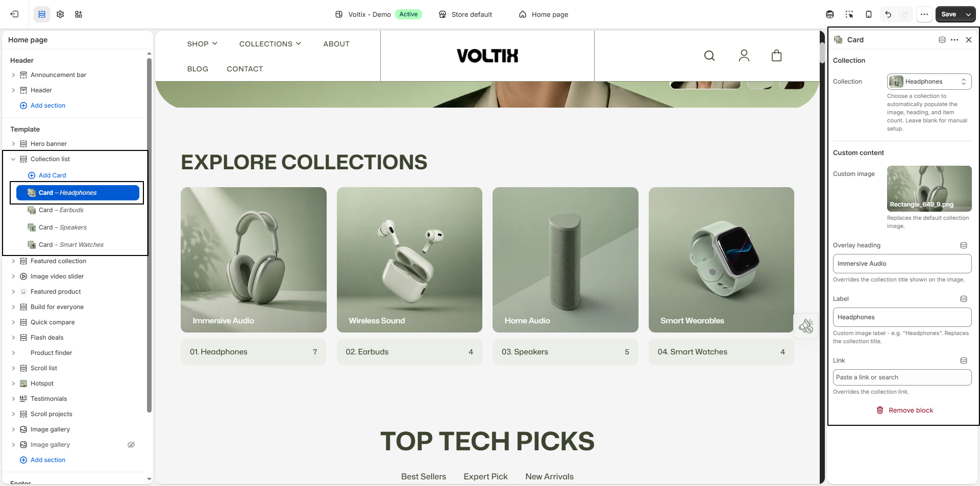
Collection List
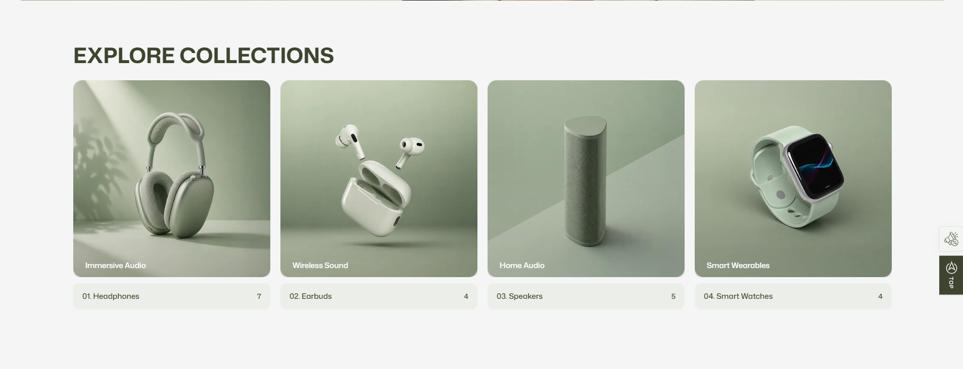
The Collection List section provides a clean and visually engaging way to showcase your store's collections. Display featured collection images, titles, and product counts to help customers quickly explore different product categories. This section is ideal for highlighting key collections, improving product discovery, and creating an intuitive browsing experience across your storefront.
How to Add the Collection List Section
- From your Shopify admin, go to Online Store → Themes.
- Click Customize on the Voltix theme.
- In the Theme Editor, use the drop-down selector to choose the page where you want to add or edit the Collection List section.
- Click Add Section (or select an existing Collection List section if already added).
- Click Save to apply your changes.
How To Edit the Collection List Section
Here are the steps to configure the options mentioned for the Collection List section in your Votelix Shopify theme:
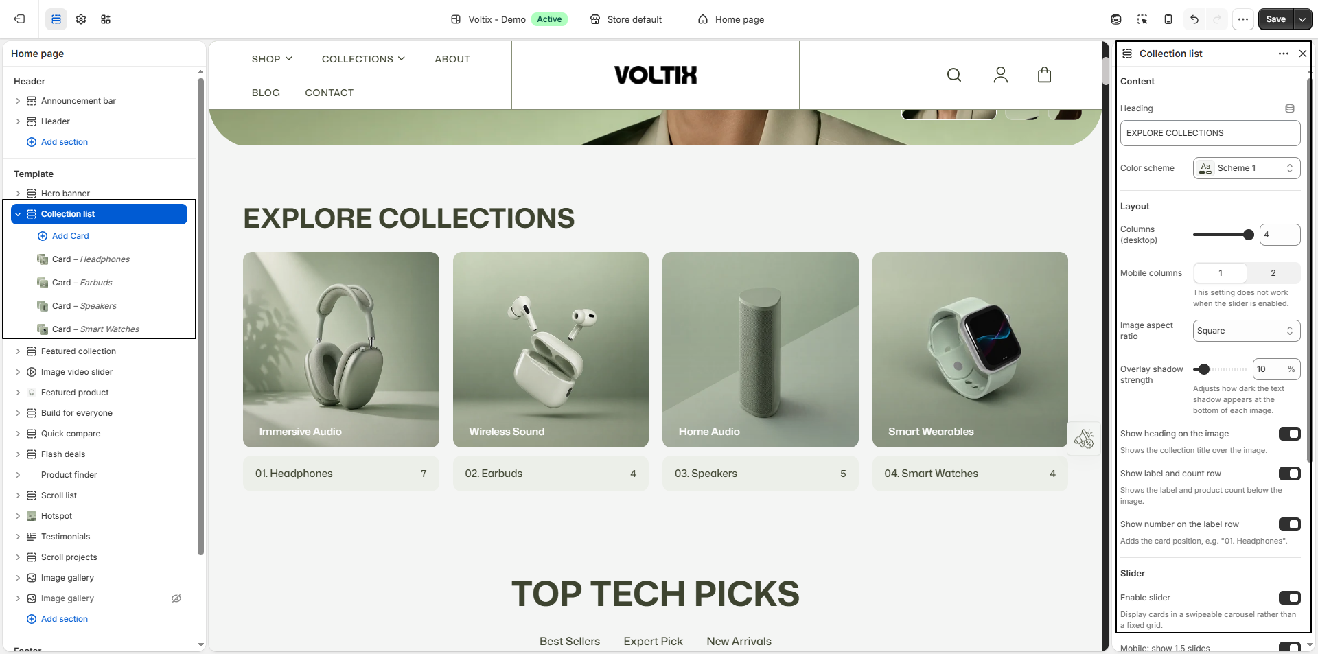
- Heading: Enter the main heading for the collection list section.
- Heading Alignment: Choose the alignment of the section heading: Left, Center, or Right.
- Color Scheme: Select a predefined color scheme to control the background and overall appearance of the collection list section.
-
Card Layout:
Choose how the collection content is displayed on the cards:
- Style 1 - Text Below Image: Displays the collection title and content below the collection image.
- Style 2 - Text Overlapping Image: Displays the collection text overlapping the collection image.
- Style 3 - Underline: Displays the collection information using an underlined style.
- Columns (Desktop): Select the number of collection cards displayed per row on desktop devices.
-
Mobile Columns:
Choose how many collection cards are displayed per row on mobile:
1 or 2.
Note: This setting does not apply when the slider is enabled. - Image Aspect Ratio: Select the aspect ratio for the collection images, such as Portrait.
- Overlay Shadow Strength: Adjust how dark the text shadow appears at the bottom of each collection image. This helps improve text visibility over the image.
- Show Heading on the Image: Enable this option to display the collection title directly over the collection image.
- Show Product Count on the Image: Enable this option to display the collection's product count below the heading on the image.
- Show Label and Count Row: Enable this option to display the collection label and product count below the collection image.
- Enable Slider: Enable this option to display the collection cards in a swipeable carousel instead of a fixed grid.
-
Extend Slider to the Right Edge:
Enable this option to align the cards to the left and extend the
slider toward the right edge of the screen, allowing part of the
next card to remain visible.
Note: This option is available on desktop and tablet only. - Mobile: Show 1.5 Slides: Enable this option to display one complete collection card along with a preview of the next card on mobile devices.
- Auto-Rotate Slides: Enable this option to automatically rotate through the collection slides.
Configure the Collection Block Settings
- Collection: Select a collection to automatically populate its image, heading, and product count. Leave this setting blank if you want to configure the collection card manually.
- Custom Image: Upload a custom image to replace the default image of the selected collection.
- Overlay Heading: Enter a custom heading to display over the collection image. This replaces the selected collection's title shown on the image.
- Label: Enter a custom label for the collection card, such as Headphones. This replaces the default collection title displayed in the label row.
- Link: Select or enter a custom link for the collection card. This overrides the default link to the selected collection.