
Product Finder
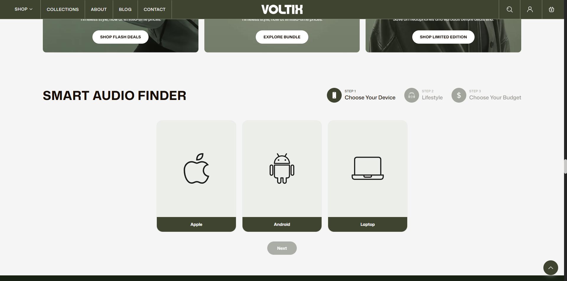
The Product Finder section is designed to help customers easily locate and browse products within your store. It provides a user-friendly interface for searching and filtering products based on various criteria such as category, price, size, and more.
In the Voltix theme, the Product Finder section can be customized to meet the specific needs of your store, ensuring that customers can quickly find the products they are looking for.
How to Add the Product Finder Section
- From your Shopify admin, go to Online Store > Themes.
- Click Customize on the Voltix theme.
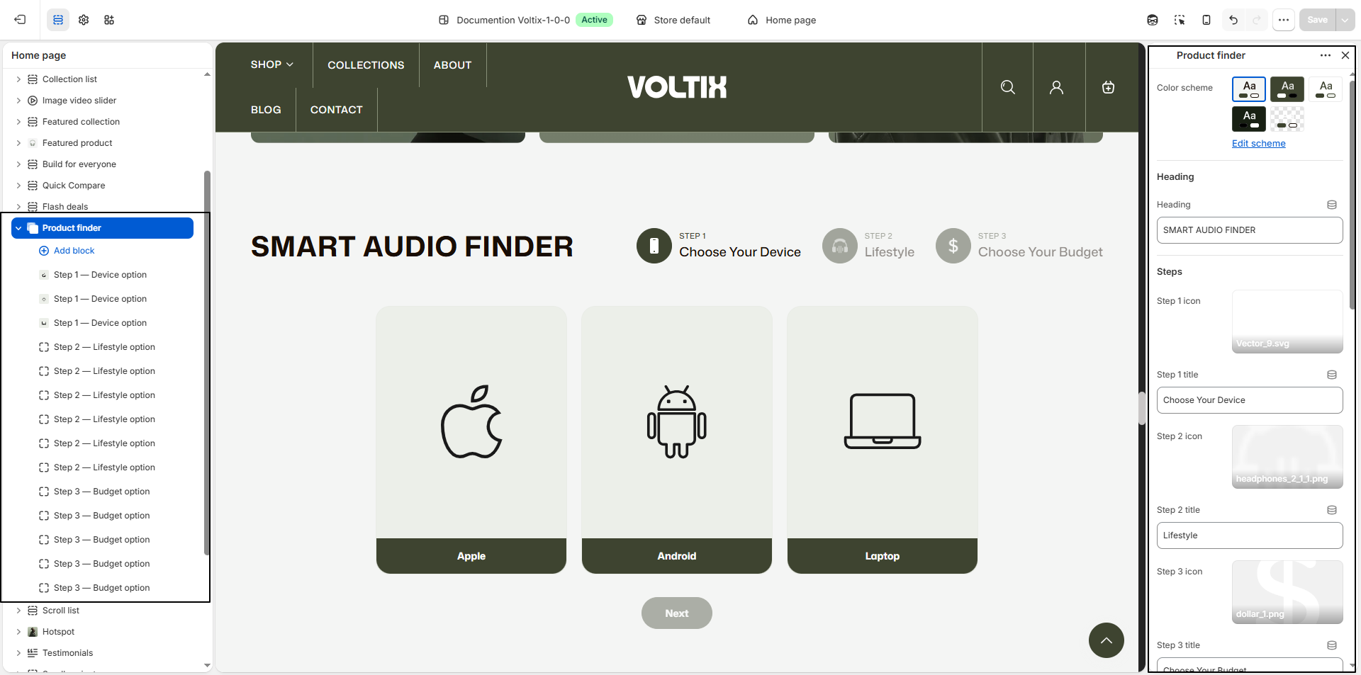
- In the Theme Editor, select the Product Finder section from the left sidebar.
- Customize the settings and add and edit block text as per your store requirements.
- Click Save.
How To Configure The Product Finder Settings
The section settings allow you to configure the appearance, steps, navigation, result handling, and colors of the Product Finder section. This helps customers answer a series of questions and find products that match their selected preferences.
- Color Scheme: Select a color scheme for the Product Finder section. Use Edit scheme to customize the colors used throughout the section.
- Heading: Enter the main heading for the Product Finder, such as SMART AUDIO FINDER.
- Step 1 icon: Upload an icon to represent the first step, such as Vector_9.svg.
- Step 1 title: Enter the title for the first step, such as Choose Your Device.
- Step 2 icon: Upload an icon to represent the second step, such as headphones_2_1_1.png.
- Step 2 title: Enter the title for the second step, such as Lifestyle.
- Step 3 icon: Upload an icon to represent the third step, such as dollar_1.png.
- Step 3 title: Enter the title for the third step, such as Choose Your Budget.
- "Next" button label: Customize the text displayed on the button used to move customers to the next step. The default label is Next.
- Final step's button label: Enter the button text displayed when the customer reaches the final step, such as Show My Results.
- Redirecting label: Enter the text displayed on the button while the customer is being redirected to the filtered collection page, such as Finding your matches….
- Collection to filter: Select the collection where shoppers will land after completing the Product Finder. The selected answers are applied to the collection URL. Leave this setting blank to use /collections/all.
- Sort results by: Choose how the filtered products are sorted. Available options include Collection's default, Featured, Best selling, Alphabetically, A–Z, Alphabetically, Z–A, Price, low to high, Price, high to low, Date, new to old, and Date, old to new.
- Selected option background: Set the background color for an option selected by the customer, such as #3E4430.
- Selected option text: Set the text color displayed inside selected options, such as #FFFFFF.
- Option/card background: Set the background color for available options and cards, such as #F1EFEA.
- Option border: Set the border color for the available options and cards, such as #DAD6CC.
- Card border radius: Adjust the roundness of the Product Finder option and card corners.
Product Finder Block Settings
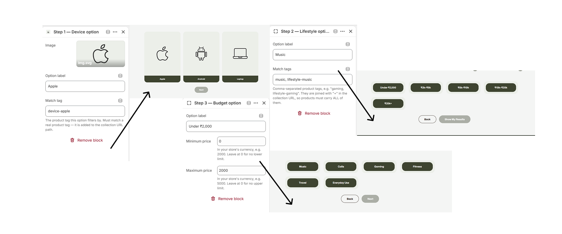
The Product Finder section uses three different types of blocks to help customers find products based on their preferences. Each step has its own block settings and should be configured separately.
Step 1 — Device Option Block
The Device Option block allows you to create device-based choices that filter products using product tags.
- Image: Upload an image or icon to represent the device option, such as img.svg.
- Option label: Enter the name displayed to customers for the device option, such as Apple.
- Match tag: Enter the product tag used to filter products for this option, such as device-apple. The tag must exactly match a real product tag in Shopify. The tag is added to the collection URL when the customer selects this option.
- Remove block: Select this option to remove the Device Option block from Step 1.
Step 2 — Lifestyle Option Block
The Lifestyle Option block allows you to create lifestyle-based choices that filter products using one or more product tags.
- Option label: Enter the name displayed to customers for the lifestyle option, such as Calls.
- Match tags: Enter the product tags used to filter products for this option, such as calls. Multiple tags can be entered as a comma-separated list, for example gaming, lifestyle-gaming.
- Match tags behavior: When multiple tags are entered, they are joined with + in the collection URL. Products must contain all of the specified tags to match the selected lifestyle option.
- Remove block: Select this option to remove the Lifestyle Option block from Step 2.
Step 3 — Budget Option Block
The Budget Option block allows you to create price-based choices so customers can filter products according to their preferred budget.
- Option label: Enter the budget range displayed to customers, such as Under ₹2,000.
- Minimum price: Enter the minimum product price for the selected budget range using your store's currency. For example, enter 2000 for a minimum price of ₹2,000. Enter 0 if there is no minimum price limit.
- Maximum price: Enter the maximum product price for the selected budget range using your store's currency. For example, enter 5000 for a maximum price of ₹5,000. Enter 0 if there is no maximum price limit.
- Remove block: Select this option to remove the Budget Option block from Step 3.