Voltix Theme Settings
Voltix offers a wide range of customization options, giving you full creative control over your store without the need for coding. With Shopify's intuitive theme editor, you can easily adjust colors, typography, layouts, and other design elements to match your brand's identity and create a seamless shopping experience.
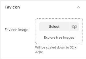
1. Favicon
A favicon is a small icon displayed in the browser tab next to your store's title. Adding a custom favicon helps strengthen your brand identity and makes your store easily recognizable across tabs and bookmarks.
How to Add a Favicon
- From your Shopify admin, go to Online Store → Themes.
- Click Customize on the Voltix theme.
- In the Theme Editor, open Theme Settings (bottom-left corner).
- Select the Favicon option.
- Upload your favicon image using the image selector.
- Recommended size: 32 x 32 pixels.
- Tip: Use a lightweight image file to ensure faster loading.
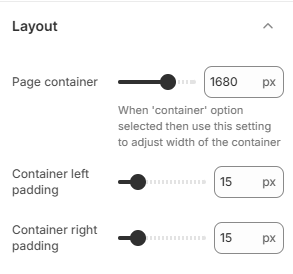
2. Layout
The Voltix theme includes layout settings that allow you to control the page width container and padding on different screen sizes.
Layout Options
- Page container: Adjusts the width of the page container in pixels (e.g., 1680px) when the 'container' layout option is selected.
- Container left padding: Adjusts the padding space on the left side of the container (e.g., 15px).
- Container right padding: Adjusts the padding space on the right side of the container (e.g., 15px).
How to Adjust Layout
- From your Shopify admin, go to Online Store → Themes.
- Click Customize on the Voltix theme.
- In the Theme Editor, open Theme Settings (gear icon).
- Select Layout.
- Adjust the sliders as per your design requirements and click Save.
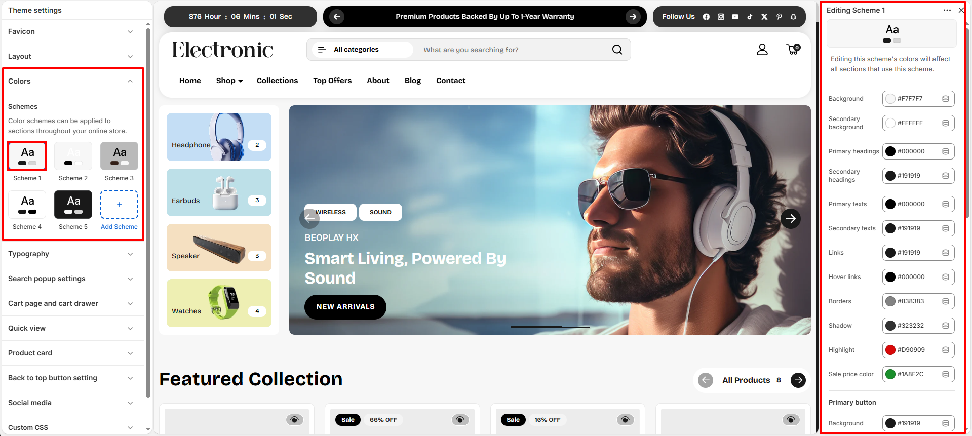
3. Colors
The Voltix theme includes a flexible color system based on color schemes. Each scheme groups together a set of colors that are applied consistently across your store's sections and components. You can create multiple color schemes and assign them to different sections or blocks to maintain a cohesive and visually balanced design.
What is a Color Scheme?
A color scheme is a predefined set of colors that you can reuse throughout your theme. Instead of customizing colors individually for each section, you can simply apply a scheme, which automatically controls elements such as background, text, buttons, and other design components. To learn more about Shopify color schemes, click here .
- From your Shopify admin, go to Online Store → Themes.
- Click Customize on the Voltix theme.
- In the Theme Editor, open Theme Settings (bottom-left corner).
- Select the Colors option.
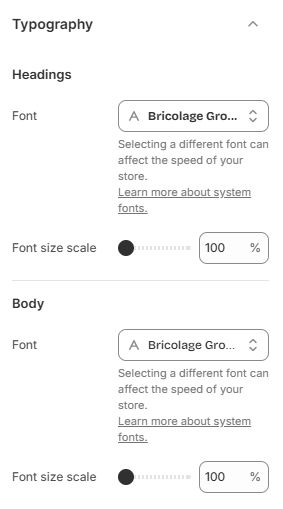
4. Typography
The Voltix theme allows you to fully customize your store's typography to match your brand identity. You can set separate fonts for headings and body text, ensuring a clear visual hierarchy and a consistent design across your store. Choose from Shopify's built-in Google Fonts library and apply your selections instantly for a modern and polished appearance.
- From your Shopify admin, go to Online Store → Themes.
- Click Customize on the Voltix theme.
- In the Theme Editor, open Theme Settings (bottom-left corner).
- Select the Typography option.
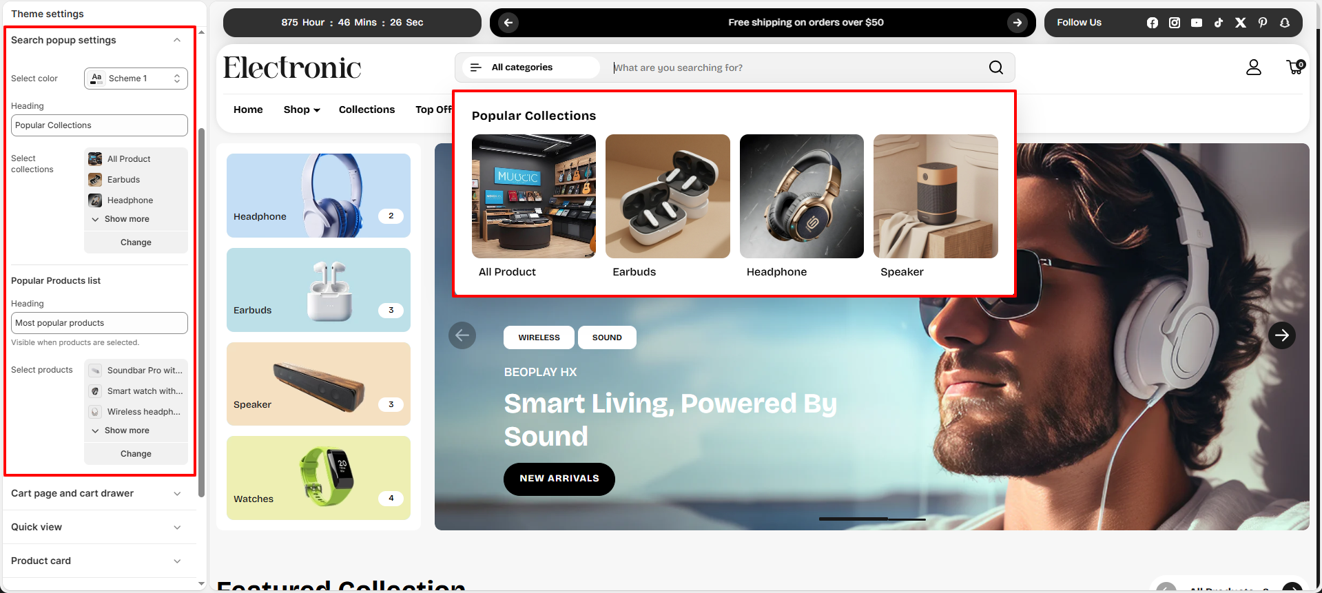
5. Search Popup Settings
The Voltix theme includes a Search Popup that appears when customers click the search icon. It helps users quickly discover products and collections by displaying a list of popular collections and highlighted products directly within the popup modal.
Search Popup Settings
- Select color: Select a color scheme (e.g., Scheme 1) to apply to the background and text of the search popup.
- Heading: Set the main heading for the popular collections section (e.g., Popular Collections).
- Select collections: Choose the collections you want to highlight as featured or popular categories (e.g., All Product, Earbuds, Headphone, Speaker).
Popular Products List Settings
- Heading: Set the title for the featured products section (e.g., Most popular products).
- Select products: Choose the specific products you want to display in the popup (e.g., Soundbar Pro, Smart watch, Wireless headphones). This list will be visible only when products are selected.
How to Configure the Search Popup
- From your Shopify admin, go to Online Store → Themes.
- Click Customize on the Voltix theme.
- In the Theme Editor, open Theme Settings (gear icon).
- Select Search popup settings.
- Configure the color scheme, collections, popular products heading, and select products.
- Click Save to apply your changes.
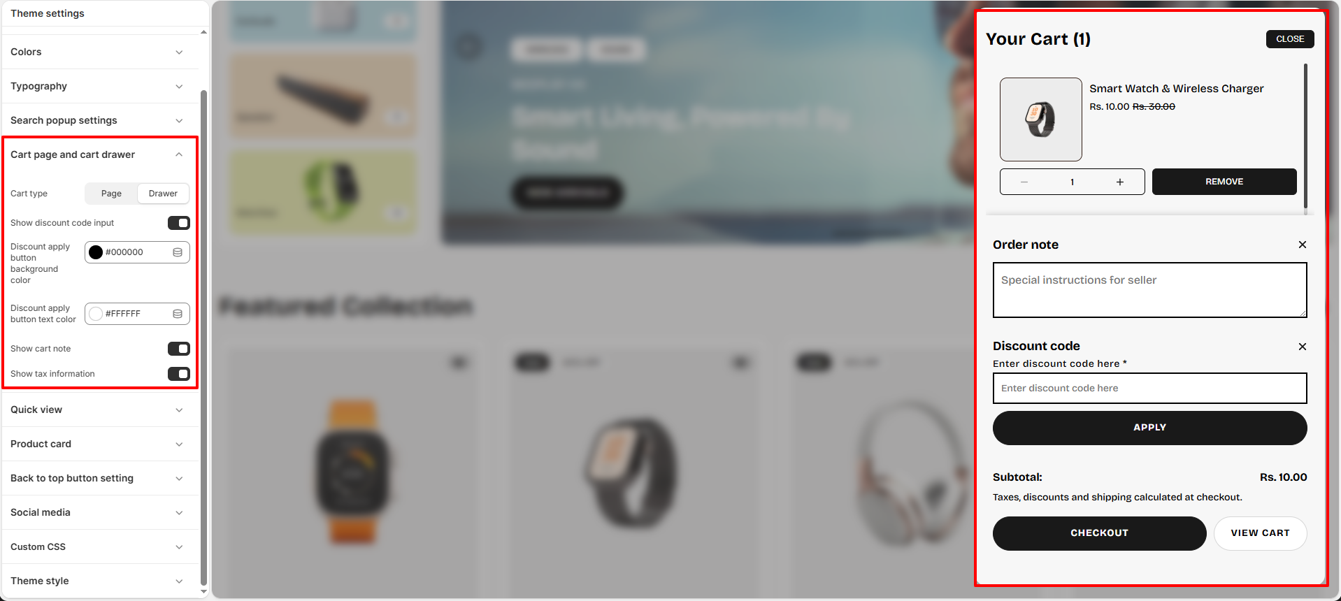
6. Cart Page and Cart Drawer
The Voltix theme offers flexible options for displaying and configuring your store's cart. You can choose between a dedicated cart page or a slide-out cart drawer, and enable features like order notes, discount codes, and tax information directly on the cart interface.
Cart Settings
- Cart type: Choose how the cart is displayed to customers when they add a product. Select between Page (redirects to a dedicated cart page) or Drawer (opens a slide-out drawer on the right side of the screen).
- Show discount code input: Toggle this option on to allow customers to apply discount codes directly within the cart before checkout.
- Discount apply button background color: Select the background color for the discount apply button (e.g., #000000).
- Discount apply button text color: Select the text color for the discount apply button text (e.g., #FFFFFF).
- Show cart note: Toggle this on to show a text area where customers can enter special instructions or order notes for the seller.
- Show tax information: Toggle this on to display tax and shipping calculations notice (e.g., "Taxes, discounts and shipping calculated at checkout") inside the cart.
How to Configure the Cart Settings
- From your Shopify admin, go to Online Store → Themes.
- Click Customize on the Voltix theme.
- In the Theme Editor, open Theme Settings (gear icon).
- Select Cart page and cart drawer.
- Configure the cart type, discount codes, button colors, cart notes, and tax settings as needed.
- Click Save.
To know more about cart settings, Click here.
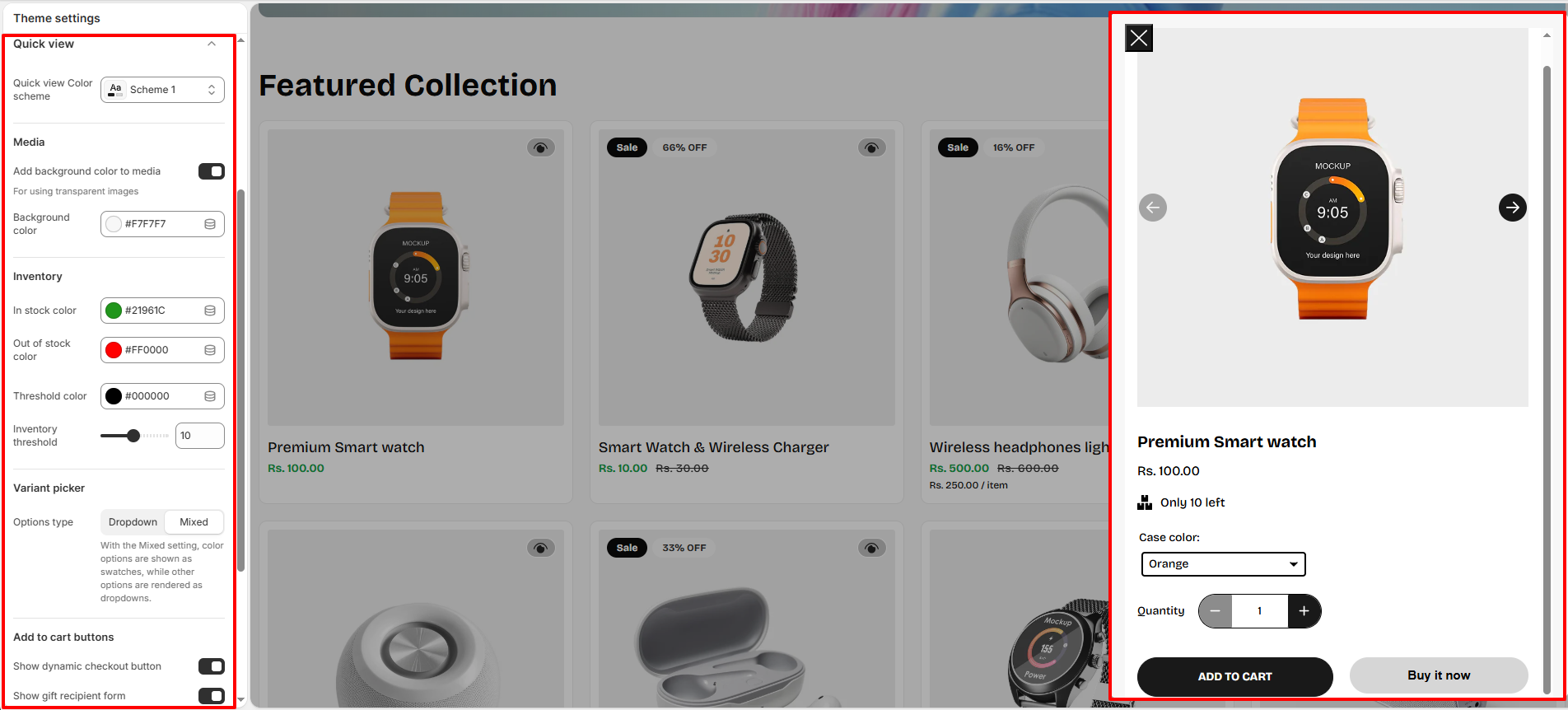
7. Quick view
The Voltix theme provides a Quick view settings panel to configure the product preview modal that appears when customers click the quick view icon on product cards.
- Quick view Color scheme: Choose a color scheme (e.g., Scheme 1) for the quick view pop-up modal.
-
Media Settings:
Control the background of the product media inside the quick view popup.
- Add background color to media: Enable this option to apply a background color behind product images. This is especially useful for transparent images.
- Background color: Choose a background color (e.g., #F7F7F7) to improve image visibility and consistency.
-
Inventory Settings:
Customize how stock availability status is highlighted.
- In stock color: Select the color used to indicate available products (e.g., #21961C).
- Out of stock color: Select the color used for unavailable products (e.g., #FF0000).
- Threshold color: Choose the color displayed when inventory is below the threshold limit (e.g., #000000).
- Inventory threshold: Set the quantity limit (e.g., 10) below which stock is considered low and the threshold color/message is triggered.
-
Variant picker Settings:
Configure the layout options for product variants like sizes and colors.
- Options type: Choose between:
- Dropdown: Render all option selections as dropdown menus.
- Mixed: Render color options as swatches and other options as dropdowns for a cleaner selection experience.
- Options type: Choose between:
-
Add to cart buttons Settings:
Control the availability of checkout buttons in the quick view modal.
- Show dynamic checkout button: Enable this option to display accelerated checkout options (like *Buy it now*), allowing customers to purchase directly from the quick view popup.
- Show gift recipient form: Enable this option to allow customers to send the product as a gift by adding fields for recipient details.
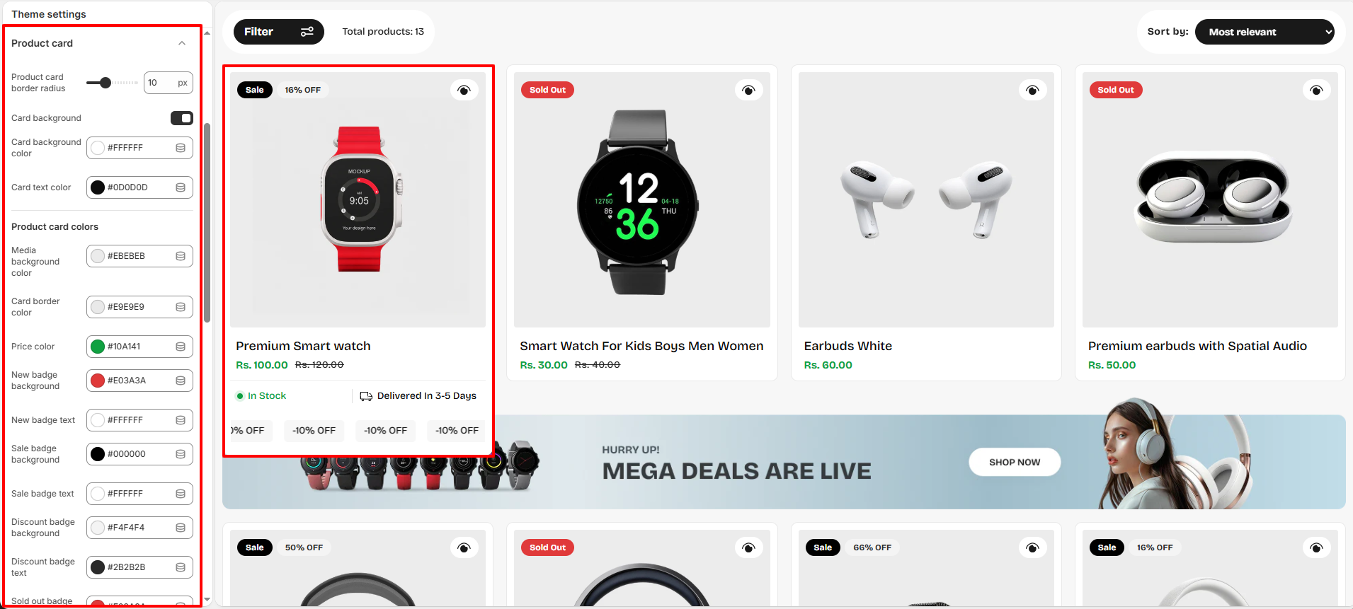
8. Product Card
The Voltix theme includes advanced Product Card settings that allow you to fully customize the appearance of product cards across collection pages, featured collections, and product sliders. You can control colors, badges, quick view options, button styles, and delivery text to match your brand design.
Product Card Settings
- Product card border radius: Adjust the roundness of the product card corners (e.g., 10px) for a modern or sharp card style.
- Card background: Enable this option to apply a custom background color to the product card container.
- Card background color: Choose the background color of the product card (e.g., #FFFFFF).
- Card text color: Select the primary text color used inside the product card (e.g., #0D0D0D).
Product Card Colors
- Media background color: Set the background color behind product images (e.g., #EBEBEB).
- Card border color: Choose the border color for the product card (e.g., #E9E9E9).
- Price color: Select the text color used for product prices (e.g., #10A141).
- New badge background: Choose the background color for the "New" badge (e.g., #E03A3A).
- New badge text: Select the text color for the "New" badge (e.g., #FFFFFF).
- Sale badge background: Set the background color for the "Sale" badge (e.g., #000000).
- Sale badge text: Choose the text color for the "Sale" badge (e.g., #FFFFFF).
- Discount badge background: Select the background color for discount badges (e.g., #F4F4F4).
- Discount badge text: Select the text color for discount badges (e.g., #2B2B2B).
- Sold out badge background: Choose the background color for the "Sold Out" badge (e.g., #E03A3A).
- Sold out badge text: Choose the text color for the "Sold Out" badge (e.g., #FFFFFF).
- Meta text color: Set the color for secondary/meta product information (e.g., #0D0D0D).
- Delivery text: Customize the delivery message displayed on the product card (e.g., Delivered In 3-5 Days).
Product Card Badges and Quick View Settings
- Badges disabled: Enable this option to hide all product badges from the product card.
- Enable quick view and quick add to cart button: Toggle this option to display quick view and quick add-to-cart actions on product cards.
- Button background color: Choose the background color for quick action buttons (e.g., #FFFFFF).
- Button text/icon color: Select the text and icon color for product card buttons (e.g., #191919).
Link Setting
- Disabled with collection page link: Enable this option to disable navigation to the collection page from the product card.
Discount Marquee Settings
- Use metafield: Enable this option to dynamically display discount or promotional text using Shopify metafields.
- Text: Set the default marquee promotional text (e.g., -10% OFF).
- Marquee background color: Choose the background color for the discount marquee section (e.g., #F7F7F7).
- Marquee text color: Select the text color for the marquee text (e.g., #191919).
How to Configure Product Card Settings
- From your Shopify admin, go to Online Store → Themes.
- Click Customize on the Voltix theme.
- In the Theme Editor, open Theme Settings (gear icon).
- Select Product card.
- Customize colors, badges, quick view settings, buttons, and marquee options as needed.
- Click Save to apply your changes.
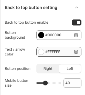
9. Back to Top Button Setting
The Voltix theme includes a customizable Back to Top button that helps customers quickly return to the top of the page while browsing long collection pages, product pages, or blog content. You can control the button appearance, color scheme, alignment, and mobile size to match your store design.
Back to Top Button Settings
- Back to top button enable: Enable or disable the back to top button visibility across the storefront.
- Button background: Select the background color for the button (e.g., #000000).
- Text / arrow color: Choose the color used for the arrow icon or text inside the button (e.g., #FFFFFF).
-
Button position:
Choose the alignment position of the button on the screen:
- Right: Displays the button on the bottom-right side.
- Left: Displays the button on the bottom-left side.
- Mobile button size: Adjust the size of the back to top button for mobile devices (e.g., 40px).
How to Configure the Back to Top Button
- From your Shopify admin, go to Online Store → Themes.
- Click Customize on the Voltix theme.
- In the Theme Editor, open Theme Settings (gear icon).
- Select Back to top button setting.
- Enable the feature and customize the colors, position, and mobile size as needed.
- Click Save to apply your changes.
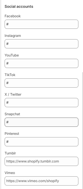
10. Social media
The Voltix theme allows you to connect your store with various social media platforms, making it easy for visitors to follow and engage with your brand. Social media links appear throughout the theme, including the header, footer, and dedicated social icon sections.
How to Update Social Links
- From your Shopify admin, go to Online Store → Themes.
- Click Customize on the Voltix theme.
- In the Theme Editor, open Theme Settings → Social Media.
- Paste the URLs of your social media accounts in the input fields next to each platform.
- Click Save to apply your changes.
Once added, your social icons will automatically display on your storefront, making it simple for customers to connect with your brand on platforms like Instagram, Facebook, Twitter, and more.