
Crisp Animated Hero Section
The Crisp Animated Hero Section is designed to create visually engaging promotional banners with animated transitions, interactive slide navigation, and customizable content layouts. This section helps merchants showcase featured products, promotional campaigns, seasonal launches, and brand storytelling in a premium full-width hero experience.
With advanced customization controls for slide animations, autoplay functionality, responsive heights, thumbnail navigation, overlay styling, typography, spacing, and custom colors, you can create dynamic storefront experiences that improve customer engagement and visual impact across all devices.
How to Add the Crisp Animated Hero Section
- From your Shopify admin, go to Online Store → Themes.
- Click Customize on the Voltix theme.
- In the Theme Editor, click Add section.
- Select Crisp animated hero from the available sections.
- Configure the section settings such as layout, animation speed, slide autoplay, content width, thumbnail styling, and spacing options.
- Add multiple Slide blocks to showcase different promotional banners.
- Click Save to publish your changes.
How To Configure The Crisp Animated Hero Settings
The section settings control the overall appearance, animation behavior, responsive layout, spacing, autoplay functionality, and interactive navigation for the Crisp Animated Hero section.
- Accessible Label: Add accessibility text for screen readers.
- Color Scheme: Select a predefined color scheme for the section.
- Section Width: Choose between page width or full width layout.
- Desktop Height: Control the hero banner height on desktop devices.
- Mobile Height: Adjust the banner height for mobile screens.
- Corner Radius: Control the rounded corners of the hero container.
- Overlay Opacity: Add a dark overlay effect over slide images.
- Content Width: Adjust the maximum width of the text content area.
- Title Size: Control the heading font size inside slides.
- Thumbnail Size: Set the size of slide thumbnail previews.
- Thumbnail Gap: Adjust spacing between slide thumbnails.
- Transition Duration: Control the animation transition speed between slides.
- Enable Smooth Scroll Effect: Enable animated smooth scrolling effects for slides.
- Auto-Rotate Slides: Automatically rotate hero slides.
- Change Slide Every: Set the autoplay interval duration for slide rotation.
- Pause Autoplay on Hover: Pause slide transitions when users hover over the section.
- Enable Keyboard Navigation: Allow users to navigate slides using keyboard controls.
- Disable Animations: Turn off transition animations if needed.
- Top Padding: Add spacing above the section.
- Bottom Padding: Add spacing below the section.
- Top Margin: Control the external top margin of the section.
- Bottom Margin: Control the external bottom margin of the section.
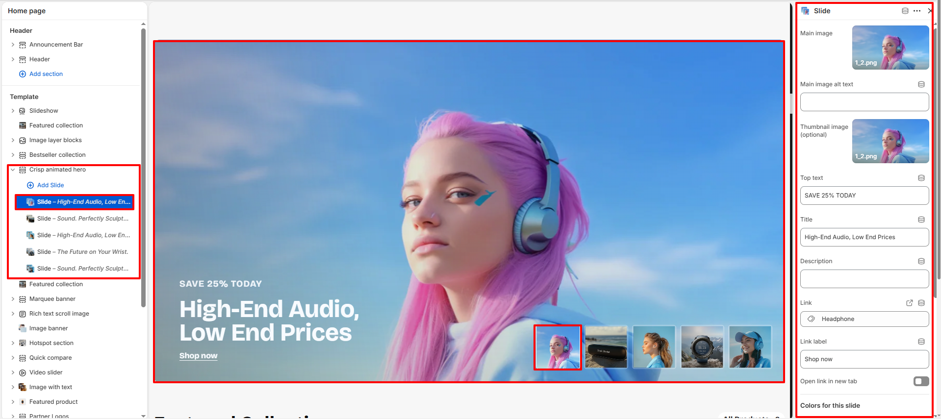
Slide Block Settings
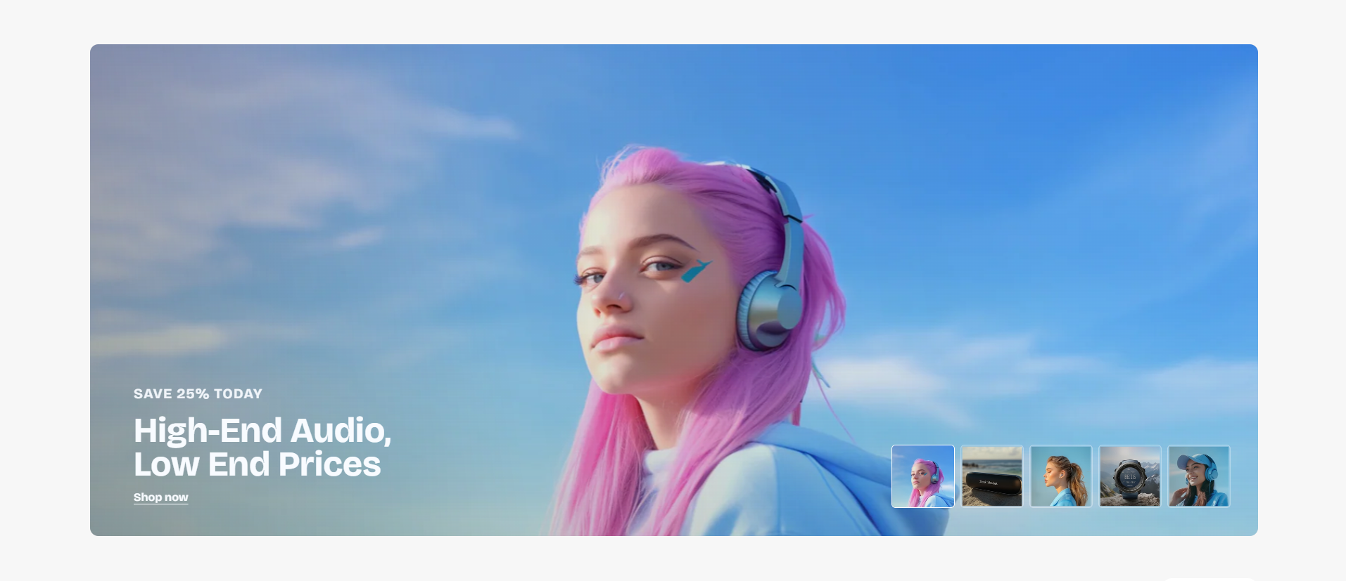
Each Slide block allows you to create an individual animated hero banner with customizable images, promotional content, buttons, and color styling.
- Main Image: Upload the primary hero banner image.
- Main Image Alt Text: Add descriptive alt text for accessibility and SEO.
- Thumbnail Image: Upload an optional thumbnail image for slide navigation.
- Top Text: Add promotional text displayed above the main title.
- Title: Set the main heading text for the slide.
- Description: Add supporting content or promotional messaging.
- Link: Choose the destination URL for the slide button.
- Link Label: Customize the button text.
- Open Link in New Tab: Enable opening links in a separate browser tab.
- Top Text Color: Select the color for the promotional text.
- Title Color: Set the heading text color.
- Description Text Color: Choose the color for the description content.
- Link Color (Hover): Control the hover color for slide links.
- Link Text Color: Set the button or link text color.
- Active Thumbnail Border Color: Customize the border color for the active slide thumbnail.