Slideshow
The Slideshow section in the Voltix theme is a highly dynamic homepage feature designed to present multiple promotional campaigns, product highlights, and categories side-by-side. It consists of two main visual modules: a large right-side image slider (**Slide** block) and an optional left-side categories panel (**Block item** block). This combination creates a premium, navigation-rich presentation on your storefront.
How to Add the Slideshow Section
- From your Shopify admin, go to Online Store → Themes.
- Click Customize on the Voltix theme.
- In the left-hand editor sidebar, click Add section and select Slideshow.
- Add slide blocks and block items to construct the content you want to display.
- Click Save to lock in your changes.
Slideshow Section Settings
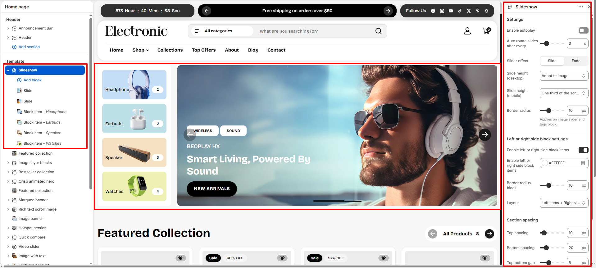
Configure settings that affect the overall slideshow layout, rotation behavior, border radius, and spacing.
- Enable autoplay: Toggle this on to make the slides rotate automatically without customer interaction.
- Auto rotate slides after every: Adjust the slider timing (e.g., 3 seconds) for slide transitions.
- Slider effect: Select between transition animations: Slide or Fade.
- Slide height (desktop): Control slide height constraints on desktop viewports (e.g., Adapt to image).
- Slide height (mobile): Control slide height constraints on mobile devices (e.g., One third of the screen).
- Border radius: Set the rounding of the image slider and slide tags (e.g., 10px).
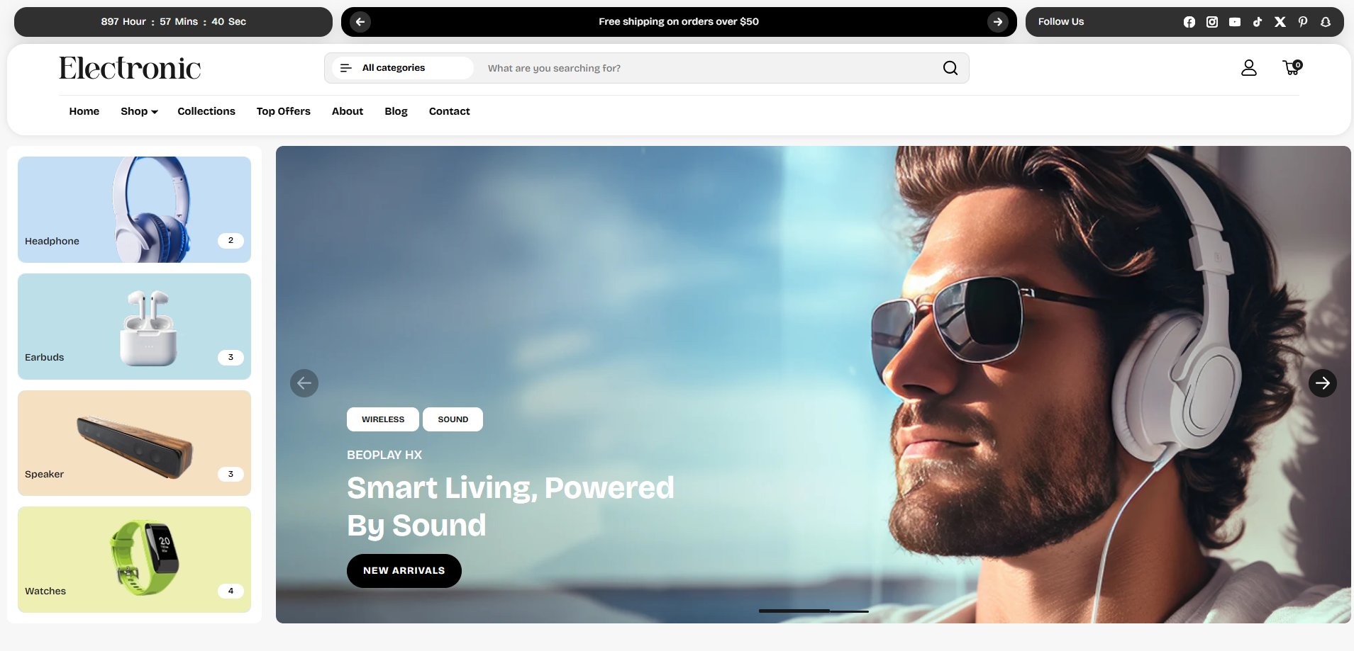
- Enable left or right side block items: Toggle this on to show category cards (e.g., Headphone, Earbuds, Speaker, Watches) next to the main slideshow banner.
- Left or right side block items background: Choose a background color (e.g., #FFFFFF) for the category panel.
- Border radius block: Set the border radius rounding of the left/right side block items (e.g., 10px).
- Layout: Determine the position of block items relative to the slides (e.g., Left items + Right slide).
-
Section Spacing:
Configure top/bottom margins:
- Top spacing: Gap above the section (e.g., 10px).
- Bottom spacing: Gap below the section (e.g., 20px).
- Top bottom gap: Gap between internal slideshow sections (e.g., 5px).
- Left right gap: Gap between left and right side of the section (e.g., 10px).
Available Blocks
The Slideshow section supports adding two types of content blocks:
- Slide: Banners with a large background image, tags, headings, text description, and a call-to-action button.
- Block item: Category cards that highlight collection images, title, background color, and product counts next to the slides.
Slide Block Settings
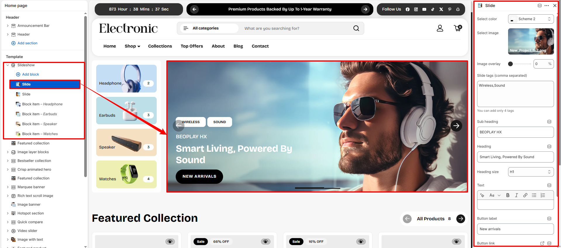
- Select color: Choose a color scheme (e.g., Scheme 2) to skin the slide's text and background block.
- Select image: Upload a high-quality desktop/lifestyle background image for the slide.
- Image overlay: Add a darker overlay transparency (e.g., 0%) to improve text readability on bright images.
- Slide tags (comma separated): Input up to 4 tags to display as badges on the slide banner (e.g., Wireless, Sound).
- Sub heading: Specify a small introductory label displayed above the main heading (e.g., BEOPLAY HX).
- Heading: Write the primary promotional text for the slide (e.g., Smart Living, Powered By Sound).
- Heading size: Choose heading text sizing tier (e.g., H1).
- Text: Add supporting body description text to detail the promotion.
- Button label: Enter the CTA button text (e.g., New arrivals).
- Button link: Select a collection, page, or external URL redirect for the button click.
- Open link in a new tab: Toggle this option on to open the button destination link in a new browser tab.
- Content position: Choose where the slide content box is positioned over the image (e.g., Bottom left).
- Text alignment: Set the text alignment style for the slide content block (options: Left, Center, or Right).
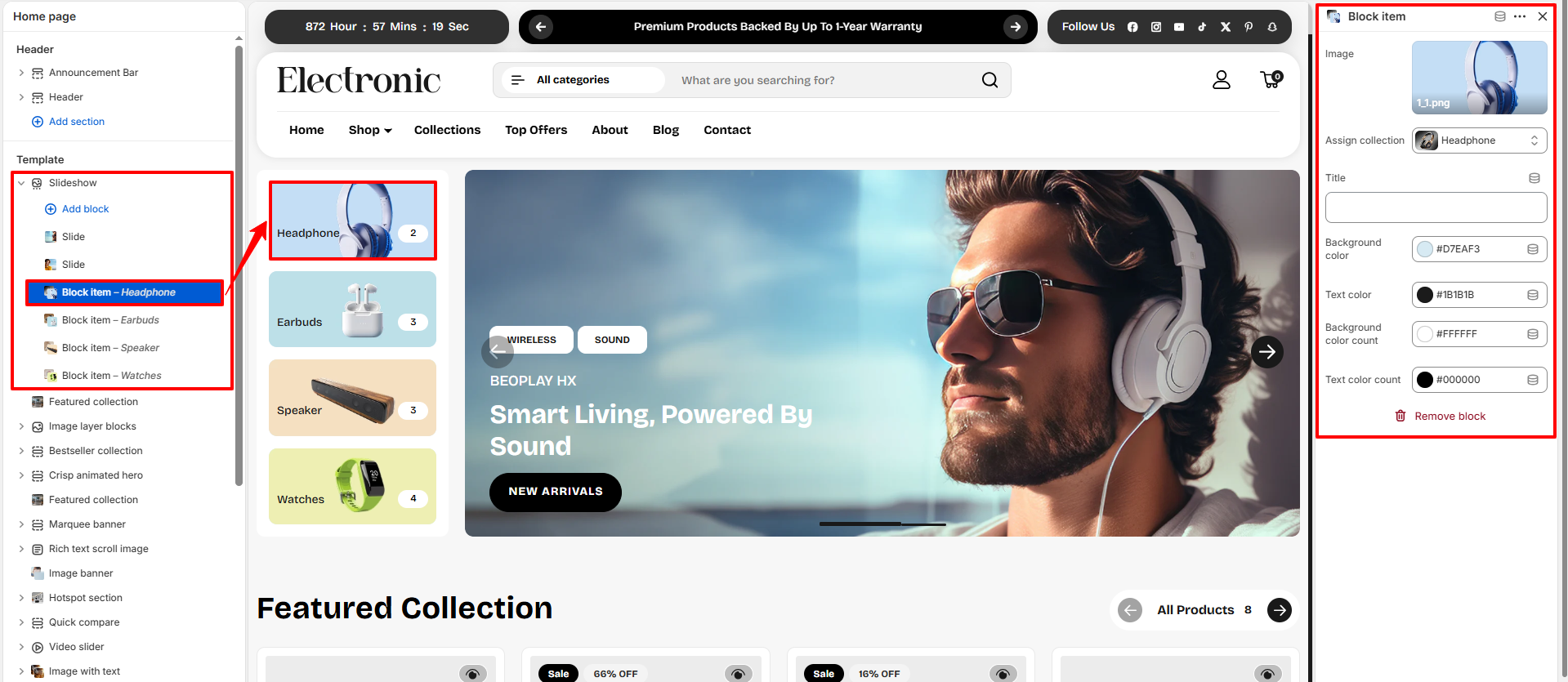
Block Item (Category) Settings
- Image: Upload an icon or feature image representing the collection (e.g., headphones, earbuds).
- Assign collection: Select the collection associated with this block item (e.g., Headphone). Clicking the block redirects shoppers to this collection page.
- Title: Override the collection name with a custom label. If left blank, it defaults to the assigned collection's name.
- Background color: Select a background highlight color (e.g., #D7EAF3) for this category card.
- Text color: Select the text color for the category card title (e.g., #1B1B1B).
- Background color count: Choose the background color for the circular count badge indicating the quantity of items in that collection (e.g., #FFFFFF).
- Text color count: Choose the text color for the quantity badge (e.g., #000000).