
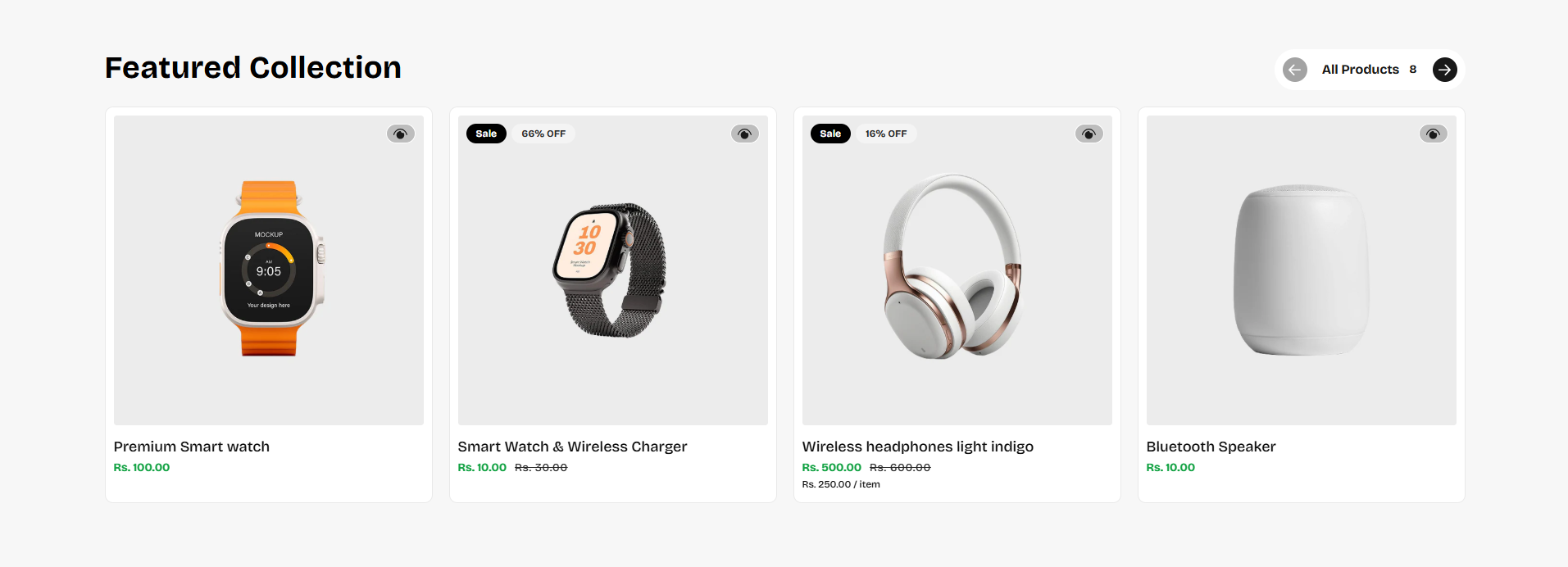
Featured Collection
The Featured Collection section in the Voltix theme allows you to showcase a selected collection of products directly on your homepage or any page. It helps highlight specific categories, seasonal products, or best-selling items in a visually engaging layout. With flexible display options such as grid or slider view, customizable headings, and optional content blocks, this section makes it easy to guide customers toward key products and improve product discovery.
How to Add the Featured Collection Section
- From your Shopify admin, go to Online Store → Themes.
- Click Customize on the Voltix theme.
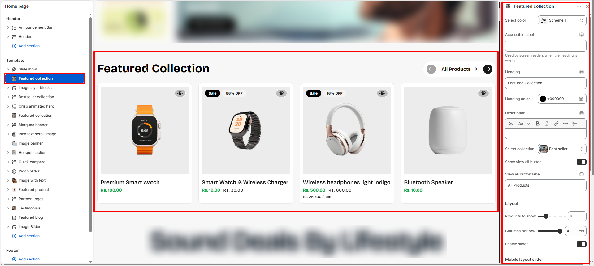
- In the left-hand editor sidebar, click Add section and select Featured Collection.
- Adjust the settings, blocks, and layout options according to your preferences.
- Click Save to apply your changes.
Featured Collection Section Settings
Configure settings that control the overall layout, product display, and appearance of the Featured Collection section.
- Color Scheme: Select a predefined color scheme (e.g., Scheme 1) to control background and text colors for the section.
- Accessible Label: Enter an alternative label used by screen readers when the section heading is empty, to ensure accessibility compliance.
- Heading: Add a title for the section (e.g., Featured Collection) to introduce the featured products.
- Heading Color: Choose a custom color for the section heading (e.g., #000000).
- Description: Add an optional short description below the heading to provide context about the featured collection.
- Select Collection: Choose the collection you want to showcase (e.g., Best Seller).
- Show View All Button: Toggle this on to display a "View All" button that links customers to the full collection page.
- View All Button Label: Customize the text shown on the "View All" button (e.g., All Products).
- Products to Show: Set how many products from the collection will display in the section (e.g., 6).
- Columns per Row: Select how many products appear per row on desktop (e.g., 4).
- Enable Slider: Toggle this option to display products in a sliding carousel format instead of a static grid.
- Columns on Mobile: Choose how many product cards appear per row on mobile devices (e.g., Single column).
-
Section Spacing:
Configure padding around the section:
- Padding top: Gap above the section (e.g., 40px).
- Padding bottom: Gap below the section (e.g., 40px).
- Mobile padding top: Top gap on mobile devices (e.g., 20px).
- Mobile padding bottom: Bottom gap on mobile devices (e.g., 20px).
Pro Tips:
Use high-quality collection images for a professional look.
Highlight best-selling or seasonal products to drive conversions.
For sliders, limit the number of items for smoother scrolling and faster load
times.
FAQs
How can I change the shape of product card images?
To customize the product card image shape:
- Go to the Customizer.
- Navigate to the Featured Collection section.
- Adjust the Image Aspect Ratio setting to achieve your desired look.
How do I enable the product slider?
To showcase products in a slider format:
- Open the Customizer.
- Locate the Featured Collection section.
- Toggle the Enable Slider option to On.
How do I add color swatches on featured collection section pages?
Absolutely! Voltix supports color swatches on product cards. If your product variants use the color swatch metafield, swatches will automatically appear on collection pages.
Learn more about setting up swatches here.