
UGC Gallery
The UGC Gallery section allows you to showcase user-generated beauty content alongside featured products. It is ideal for highlighting real looks, customer inspiration, and product styling in an engaging visual gallery.
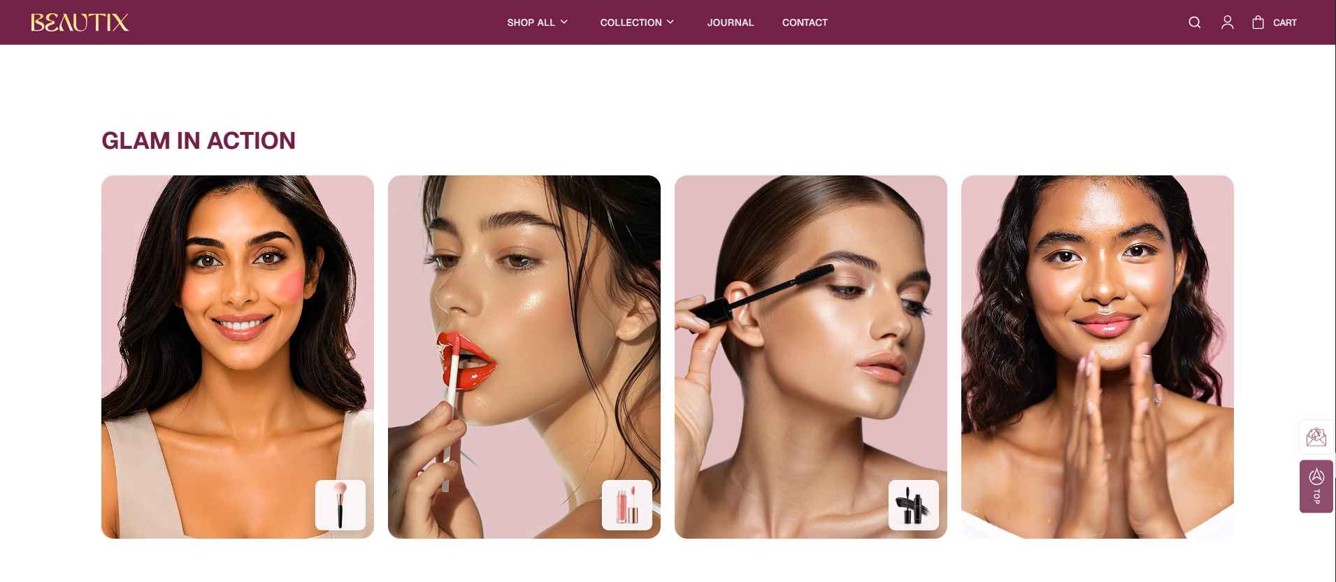
How to Add the UCG Gallery Section
- From your Shopify admin, go to Online Store → Themes.
- Click Customize on the Voltix theme.
- In the Theme Editor, use the drop-down selector to choose the page where you want to add or edit the UCG Gallery section.
- Click Add Section (or select an existing UCG Gallery Section if already added).
- Click Save to apply your changes.
How To Edit the UGC Gallery Section
The UGC Gallery section allows you to showcase user-generated beauty content in a visual gallery with featured products. You can customize the heading, layout, card appearance, video playback, and product card settings.
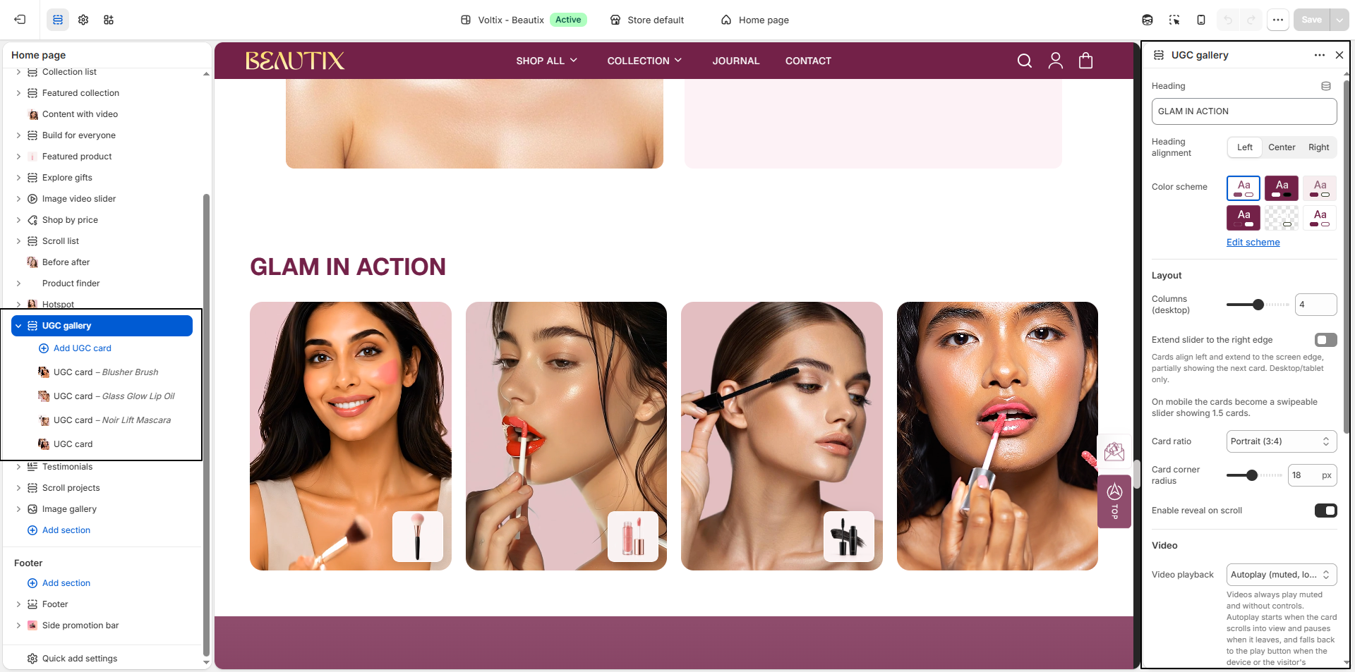
- Heading: Enter the main heading for the UGC gallery.
- Heading Alignment: Choose the heading alignment: Left, Center, or Right.
- Color Scheme: Select a color scheme for the section. Click Edit scheme to customize the selected color scheme.
- Columns (Desktop): Set the number of cards displayed per row on desktop.
-
Extend Slider to the Right Edge:
Enable this option to extend the cards toward the right edge of the
screen, with the next card partially visible. This option applies to
desktop and tablet.
On mobile, the cards become a swipeable slider displaying approximately 1.5 cards. - Card Ratio: Select the aspect ratio for the UGC cards: Tall (4:5), Portrait (3:4), or Square (1:1).
- Card Corner Radius: Adjust the roundness of the UGC cards.
- Enable Reveal on Scroll: Enable this option to add a reveal animation when the UGC cards enter the viewport while scrolling.
-
Video Playback:
Choose how videos behave when displayed in the gallery.
- Autoplay (muted, loops): Videos automatically play without sound or controls when they scroll into view and pause when they leave the viewport. If autoplay is blocked by the device or reduced-motion settings, a play button is displayed instead.
- Play Button: Displays a play button that allows customers to manually start the video.
-
Product Card Position:
Choose where the featured product information appears on the UGC card.
- Overlay on Image: Displays the product card over the UGC image.
- Below Image: Displays the product card below the UGC image.
- Show Product Price: Enable this option to display the product price on the featured product card.
- Product Card Corner Radius: Adjust the corner radius of the featured product card.
How To Edit the UGC Block
The UGC Block allows you to add an image or video, provide an accessible label, and feature products within the UGC card.
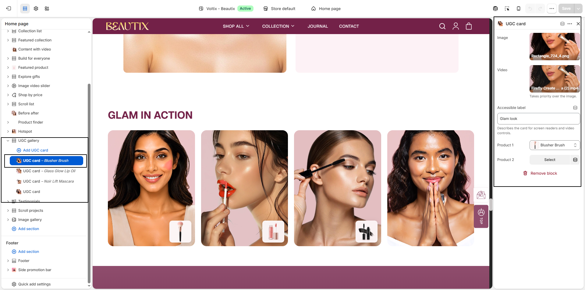
- Image: Upload an image to display in the UGC card.
- Video: Select a video to display in the UGC card. The selected video takes priority over the uploaded image.
- Accessible Label: Add a descriptive label for the UGC card. This helps screen readers and improves accessibility.
- Product 1: Select the first product to feature in the UGC card.
- Product 2: Select an additional product to feature in the UGC card.
- Remove Block: Use Remove block to delete the selected UGC card from the section.