
Hero Banner
The Hero Banner is a prominent homepage section in the Voltix theme, designed to capture customers' attention as soon as they enter your store. It provides a large, visually engaging area for showcasing your featured products, promotional campaigns, new arrivals, or important brand messages.
With flexible image, content, and navigation options, the Hero Banner allows you to combine impactful visuals with compelling headings, descriptions, and call-to-action buttons. You can use the slider functionality to highlight multiple promotions or products, while supporting content such as featured categories and navigation links helps customers discover more of your store.
The responsive layout ensures that your hero content looks polished across desktop, tablet, and mobile devices, creating a strong first impression while guiding customers toward key products and collections.
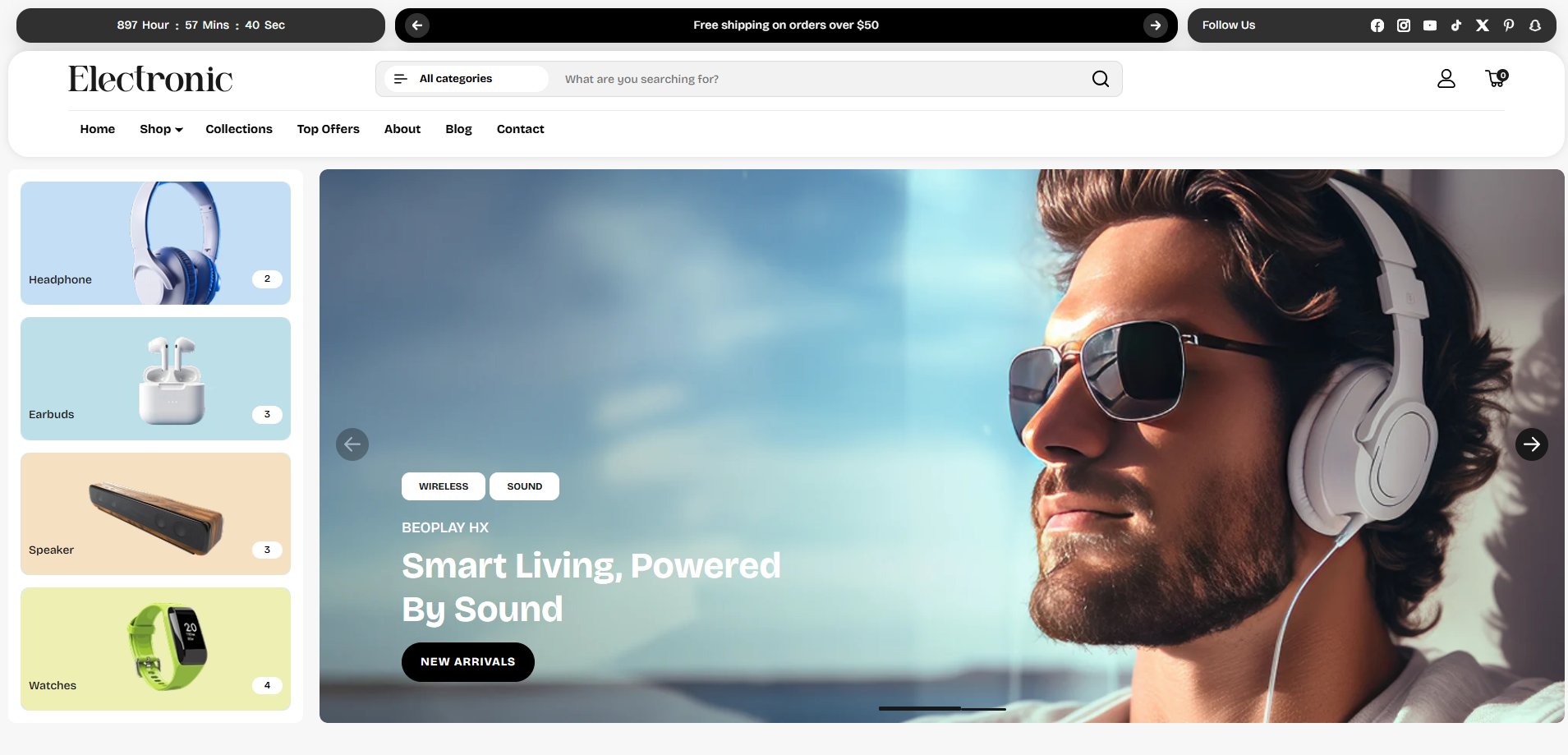
How to Add the Hero Banner Section
- From your Shopify admin, go to Online Store → Themes.
- Click Customize on the Voltix theme.
- In the left-hand editor sidebar, click Add section and select Hero Banner.
- Add slide blocks and block items to construct the content you want to display.
- Click Save to lock in your changes.
Hero Banner Section Settings
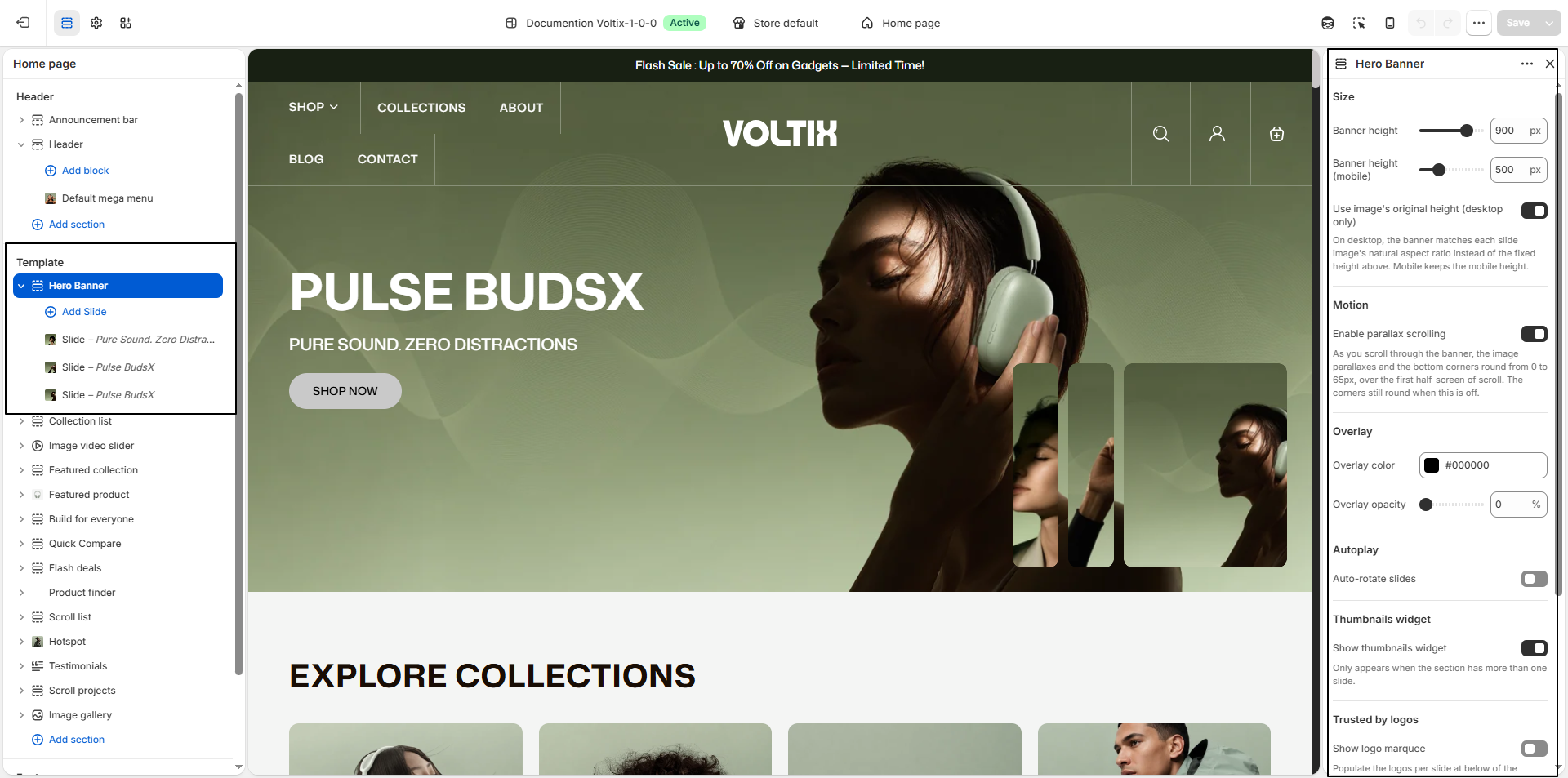
Configure settings that affect the overall Hero Banner layout, rotation behavior, border radius, and spacing.
- Banner Height: Set the height of the banner on desktop devices according to your preferred layout.
- Banner Height (Mobile): Set the banner height specifically for mobile devices to ensure the banner displays correctly on smaller screens.
- Use Image's Original Height (Desktop Only): Enable this option to automatically adjust the desktop banner height according to each slide image's natural aspect ratio. This allows each slide to maintain its original image proportions.
- Enable Parallax Scrolling: Enable this option to add a parallax scrolling effect to the banner image as customers scroll down the page. The bottom corners of the banner also become rounded up to 65px during the first half-screen of scrolling.
- Overlay Color: Choose the color of the overlay displayed over the banner image. The default overlay color is #000000.
- Overlay Opacity: Adjust the transparency of the overlay to control how strongly it appears over the banner image.
- Auto-Rotate Slides: Enable this option to automatically switch between multiple banner slides without requiring customers to manually change them.
- Show Thumbnails Widget: Enable this option to display thumbnail previews for the banner slides. The thumbnails widget is shown only when the banner contains multiple slides.
-
Thumbnails Position:
Choose where the thumbnail navigation appears on the banner:
- Bottom Left - Horizontal: Displays thumbnails horizontally at the bottom left.
- Bottom Center - Horizontal: Displays thumbnails horizontally at the bottom center.
- Bottom Right - Horizontal: Displays thumbnails horizontally at the bottom right.
- Left Middle - Vertical: Displays thumbnails vertically along the middle of the left side.
- Right Middle - Vertical: Displays thumbnails vertically along the middle of the right side.
-
Switch Slide On:
Choose how customers switch between slides using the thumbnails:
- Hover: The slide changes when the customer hovers over a thumbnail.
- Click: The slide changes when the customer clicks a thumbnail.
- Thumbnails Border Radius: Adjust the corner radius of the thumbnail images to control how rounded the thumbnail edges appear.
Slider Block Settings
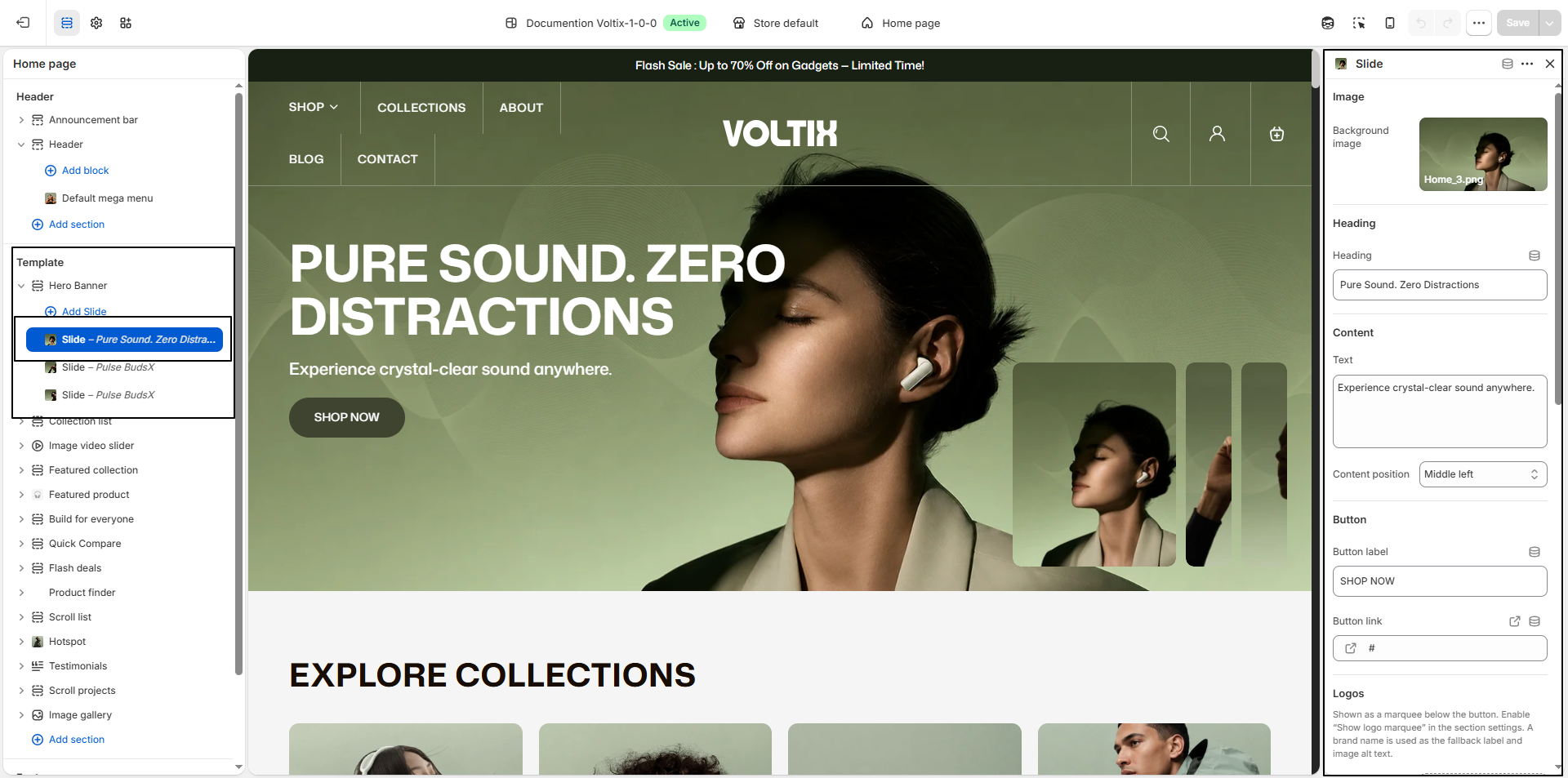
- Background Image: Upload the image that will be displayed as the background of the banner slide.
- Heading: Enter the main heading for the banner, such as PURE SOUND..
- Break the Heading Text into Two Lines: Enable this option to split the heading into two separate lines for a more structured and visually appealing layout.
- Second-Line Heading: Enter the text that should appear on the second line of the heading, such as ZERO DISTRACTIONS. This option is used when the Break Heading setting is enabled.
- Text: Add supporting content or a short description below the heading. The maximum length is 225 characters. Any content exceeding this limit may be truncated.
- Content Position: Choose where the heading, text, and button are positioned within the banner. Available options include: Top Left, Middle Left, Bottom Left, Top Center, Middle Center, Bottom Center, Top Right, Middle Right, and Bottom Right.
- Button Label: Enter the text displayed on the call-to-action button, such as SHOP NOW.
- Button Link: Add the destination link for the button. Customers will be redirected to the selected page or collection when they click the button.