
Footer Settings
The Footer section helps you display branding, navigation links, newsletter signup, feature highlights, localization options, social media icons, and payment methods in a professional layout. These settings improve store usability, customer trust, and overall shopping experience.
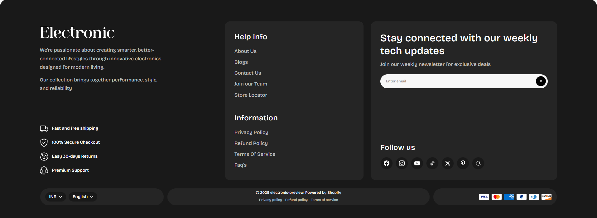
- Show Logo: Enable this option to display your store logo inside the footer section.
- Show Store Name: Enable to display your store name along with or instead of the logo.
- Logo Image: Upload your footer logo image for branding purposes.
- Brand Title Fallback: Enter a fallback store title that will appear if no logo image is uploaded.
- Brand Description: Add a short description about your store or brand to help customers understand your business and products.
- Logo Width: Adjust the width of the footer logo to control its display size.
- Show Newsletter Form: Enable this option to display the newsletter subscription form in the footer.
- Newsletter Title: Add a heading for the newsletter section such as Stay connected with our weekly tech updates.
- Newsletter Subtext: Add a short message encouraging visitors to subscribe to your newsletter.
- Email Placeholder: Customize the placeholder text shown inside the email input field.
- Newsletter Button Label: Customize the subscribe button text.
- Newsletter Success Message: Enter the message customers will see after successfully subscribing.
- Newsletter Colors: Customize newsletter input, text, background, and button colors to match your branding.
- Enable Social Media: Enable this option to display social media icons in the footer.
- Social Heading: Customize the social media section heading such as Follow us.
- Show Localization Popup: Enable this option to allow customers to select their country and language preferences.
- Localization Position: Choose the placement of the localization selector in the footer.
- Show Currency Selector: Enable to display available currency options for international customers.
- Show Language Selector: Enable to display language options in the footer.
- Show Payment Icons: Display supported payment method icons to build customer trust.
- Always Include Shop Pay: Enable this option to always display the Shop Pay payment method.
- Show Shopify Policy Links: Enable to display policy links such as Privacy Policy, Refund Policy, and Terms of Service.
- Custom Payment Icons Image: Upload your own custom payment methods image if needed.
- Outer Corner Radius: Adjust the roundness of the footer container corners.
- Card Corner Radius: Control the border radius for footer cards and blocks.
- Heading Text Size: Adjust the size of footer headings and titles.
- Text Size: Control the size of footer paragraph and menu text.
- Feature Icon Size: Adjust the size of feature item icons displayed in the footer.
- Footer Background: Customize the overall footer background color.
- Card Background: Change the background color of footer cards and content blocks.
- Main Text Color: Select the primary text color used throughout the footer.
- Secondary Text Color: Adjust the secondary text color for descriptions and supporting content.
- Border Color: Customize the border color used for footer cards and separators.
- Padding Top: Adjust the spacing above the footer content.
- Padding Bottom: Adjust the spacing below the footer content.
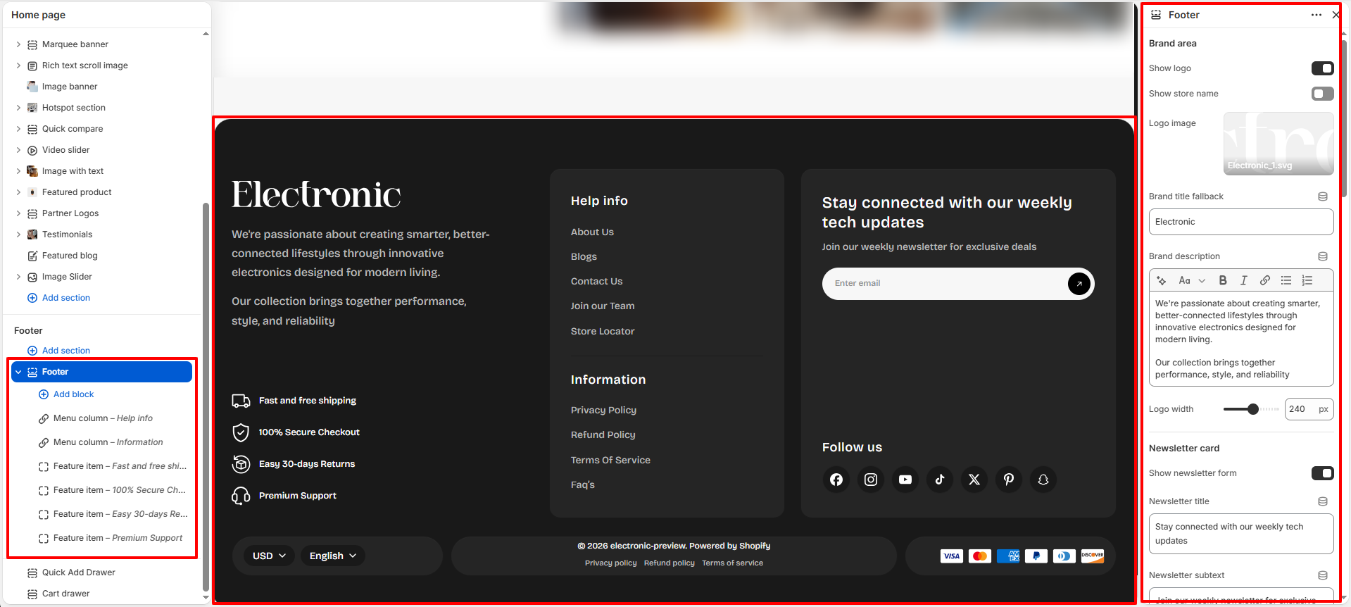
Feature Item Block
The Feature Item block allows you to highlight important store benefits such as free shipping, secure checkout, easy returns, or premium support.
- Icon: Select an icon that represents the feature item.
- Text: Enter the feature text such as Fast and free shipping.
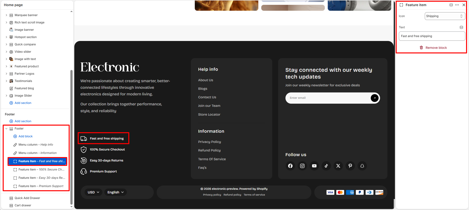
Menu Column Block
The Menu Column block helps you organize important navigation links inside the footer area for better accessibility and customer navigation.
- Heading: Enter the title for the menu column such as Help info or Information.
- Menu: Select the Shopify navigation menu you want to display in the footer.