
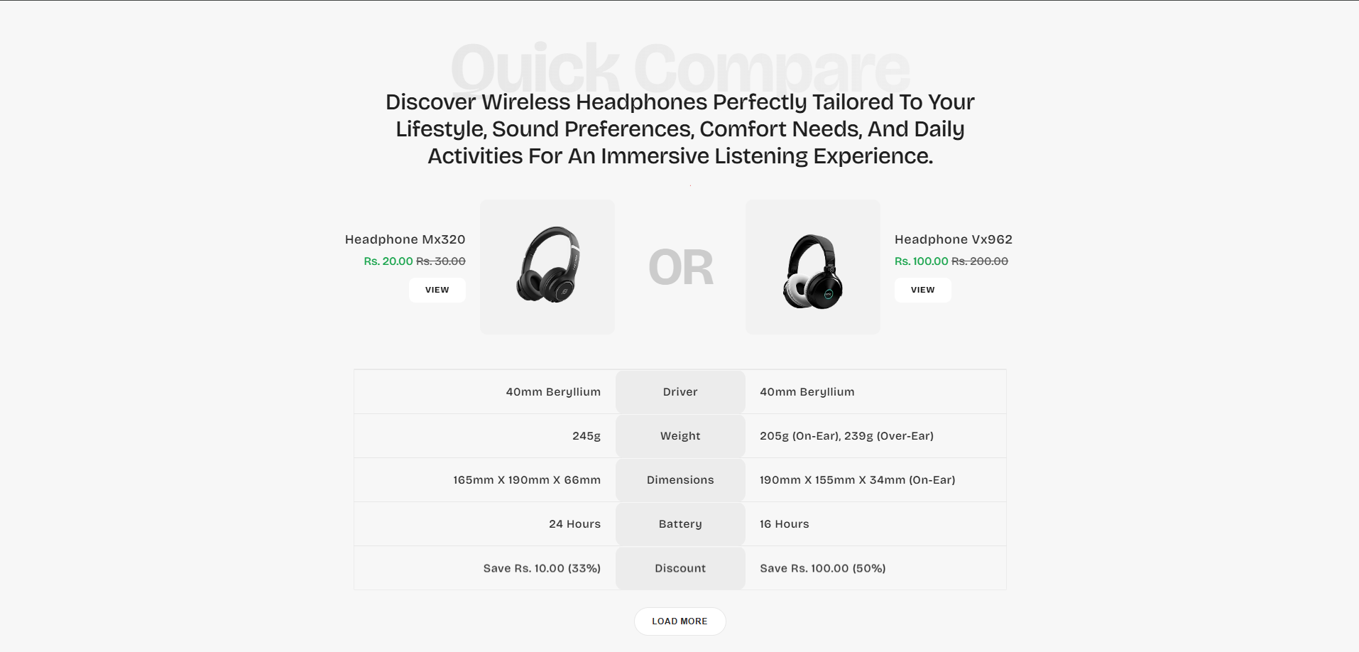
Quick Compare
The Quick Compare section allows merchants to showcase two products side-by-side in a structured comparison layout. This section helps customers quickly understand the differences between products by displaying important information such as pricing, specifications, features, options, and other product details in an easy-to-read format.
The section is useful for highlighting product variations, comparing similar products, showcasing upgrades, or helping customers choose the product that best fits their needs. With customizable layouts, specification rows, product cards, styling controls, responsive settings, and metafield support, the Quick Compare section helps create a modern shopping experience that improves product discovery and supports faster purchasing decisions.
How to Add the Quick Compare Section
- From your Shopify admin, go to Online Store → Themes.
- Click Customize on the Voltix theme.
- In the Theme Editor, click Add section.
- Select Quick compare from the available sections.
- Configure the section settings such as layout width, heading content, colors, typography, spacing, animations, navigation labels, and comparison behavior.
- Add multiple Product card and Specification row blocks to build your comparison table.
- Click Save to publish your changes.
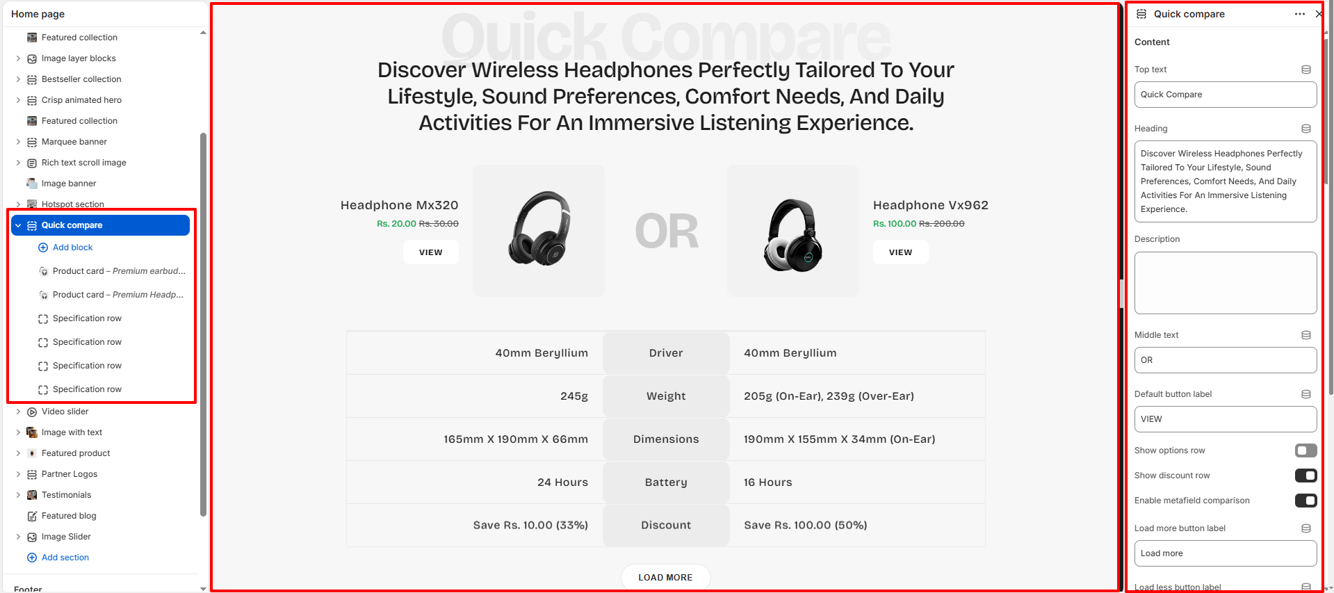
How To Configure The Quick Compare Settings
The section settings allow you to control the overall appearance, comparison layout, typography styling, product card behavior, animations, spacing, responsive design, accessibility labels, and color customization for the Quick Compare section.
- Top Text: Add a small heading displayed above the main title.
- Heading: Configure the main section heading content.
- Description: Add supporting descriptive text below the heading.
- Middle Text: Define the comparison separator text displayed between products.
- Default Button Label: Customize the default product action button text.
- Show Options Row: Enable or disable the product options row.
- Show Discount Row: Display discount comparison information.
- Enable Metafield Comparison: When enabled, the section automatically uses Shopify product metafields to display dynamic product specifications and feature comparisons. This allows merchants to compare detailed product information such as battery life, dimensions, weight, connectivity, material, waterproof rating, sound quality, charging time, compatibility, and other custom metafield data added to products. The comparison table updates automatically based on the metafield values available for each selected product, making it easier to create scalable and advanced comparison layouts without manually entering every specification row.
- Load More Button Label: Customize the text used for the load more button.
- Load Less Button Label: Configure the load less button label.
- Accessible Section Label: Add accessibility labels for screen readers.
- Accessible Table Region Label: Improve accessibility for comparison tables.
- Table Caption: Define a caption for the specification comparison table.
- Heading Alignment: Choose left, center, or right heading alignment.
- Container Max Width: Set the maximum width of the comparison section.
- Product Image Area Height: Control image display height on desktop devices.
- Product Image Area Height (Mobile): Adjust image height for mobile screens.
- Specification Table Max Width: Configure the comparison table width.
- Specification Row Height: Set the height for specification rows.
- Card Corner Radius: Adjust rounded corners for product cards.
- Image Area Corner Radius: Configure image container corner styling.
- Heading Size: Set heading typography size for desktop and mobile devices.
- Top Text Size: Control the size of the top label text.
- Background Color: Customize the section background color.
- Heading Color: Set the heading text color.
- Body Text Color: Configure the default body text color.
- Price Color: Customize the product price text color.
- Button Background: Set the background color for action buttons.
- Button Text Color: Configure button label colors.
- Enable Reveal Animations: Enable entrance animations for content blocks.
- Reveal Movement Distance: Control animation movement distance.
- Reveal Speed: Adjust the animation transition speed.
- Padding Top: Add spacing above the section.
- Padding Bottom: Add spacing below the section.
- Margin Top: Configure external top spacing.
- Margin Bottom: Configure external bottom spacing.
- Custom CSS: Add advanced custom styling for the section.
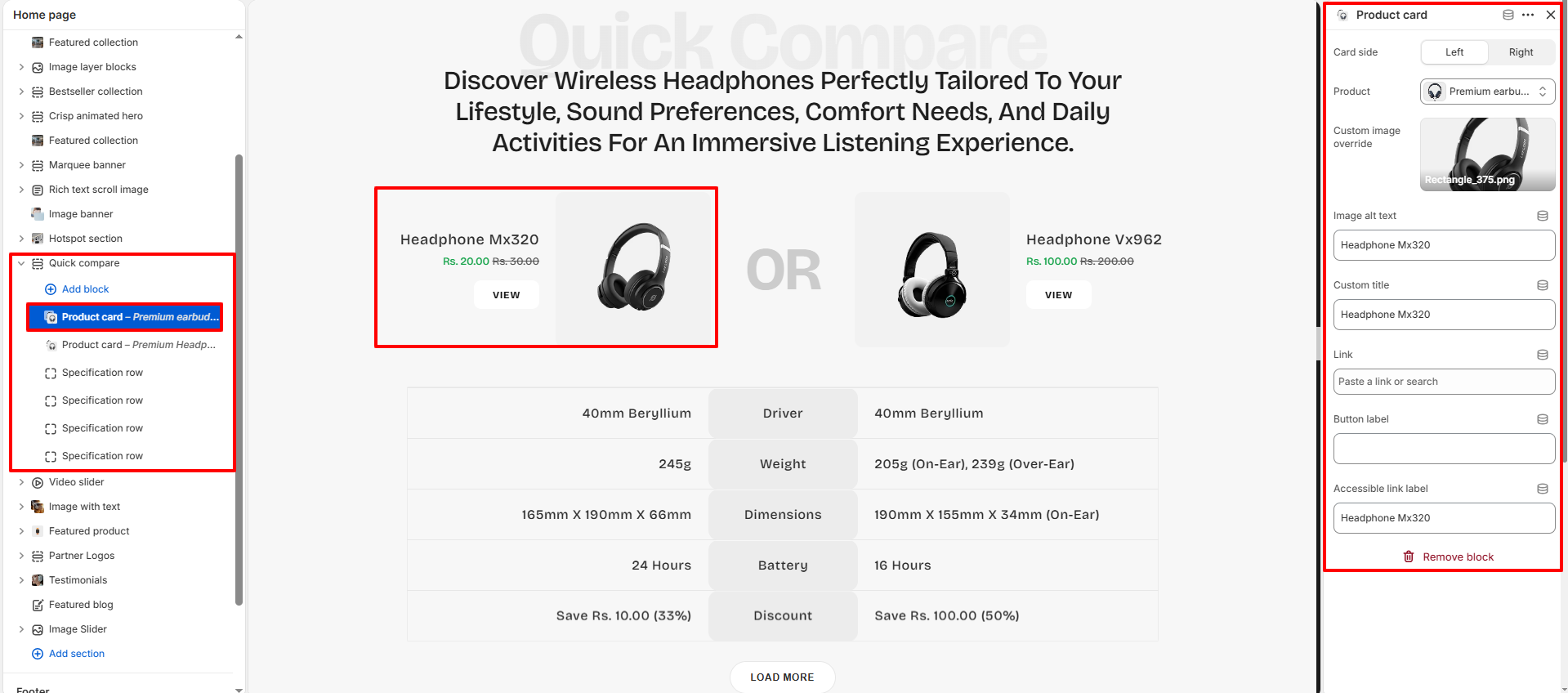
Product Card Block Settings
Each Product Card block allows you to configure individual products used in the comparison layout with custom product information, imagery, links, and button labels.
- Card Side: Choose whether the product appears on the left or right side.
- Product: Select the Shopify product to display.
- Custom Image Override: Upload a custom image instead of the default product image.
- Image Alt Text: Add descriptive alt text for accessibility and SEO.
- Custom Title: Replace the default product title with custom text.
- Link: Assign a destination URL for the product card.
- Button Label: Customize the product action button text.
- Accessible Link Label: Add accessibility labels for screen readers.
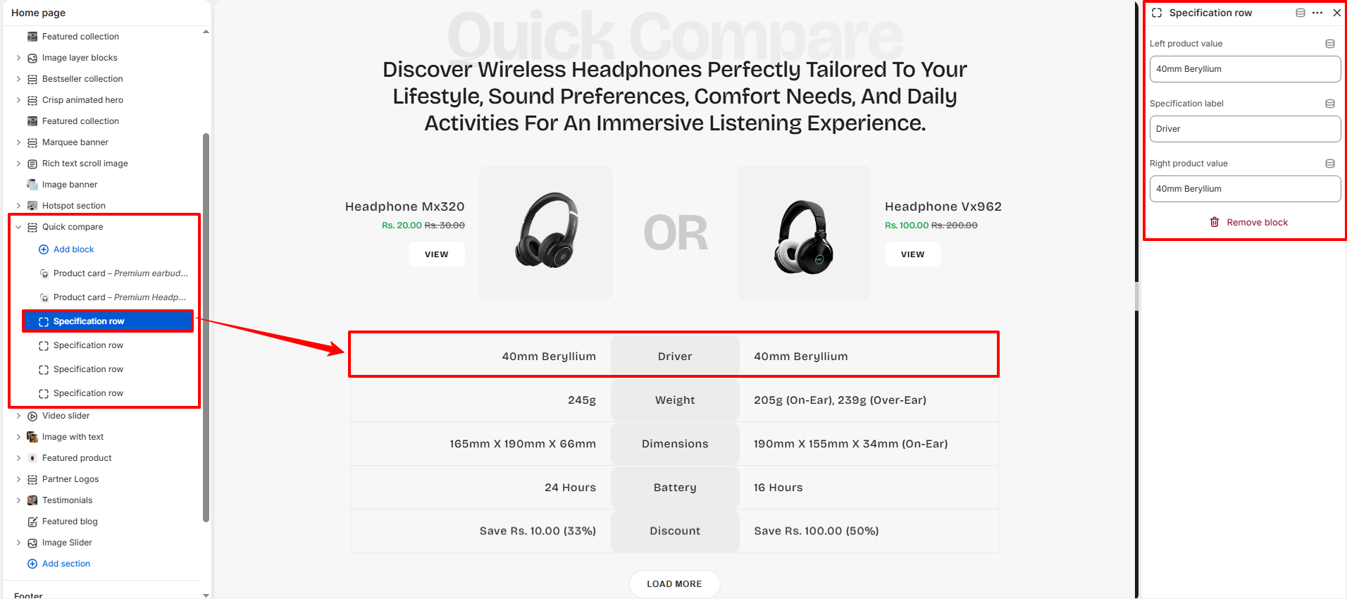
Specification Row Block Settings
The Specification Row block allows you to display detailed side-by-side product specifications and feature comparisons.
- Left Product Value: Add the specification value for the left-side product.
- Specification Label: Define the specification category or feature label.
- Right Product Value: Add the specification value for the right-side product.