
Image Layer Blocks Section
The Image Layer Blocks Section is designed to create visually engaging promotional layouts by combining layered images, text overlays, and interactive content cards. This section helps merchants highlight featured products, lifestyle collections, seasonal campaigns, or category-based promotions in a modern and immersive style.
With customizable card dimensions, overlay effects, typography controls, spacing options, and motion settings, you can create dynamic layouts that enhance storytelling and improve customer engagement.
How to Add the Image Layer Blocks Section
- From your Shopify admin, go to Online Store → Themes.
- Click Customize on the Voltix theme.
- In the Theme Editor, click Add section.
- Select Image layer blocks from the available sections.
- Configure the layout, images, typography, and motion settings according to your design needs.
- Click Save to publish your changes.
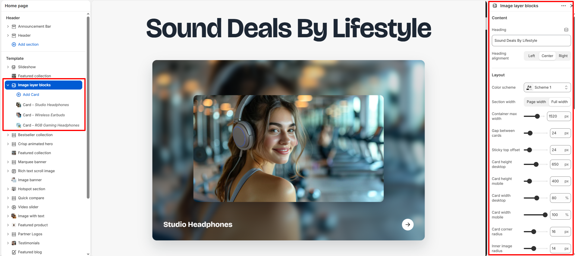
How To Configure The Image Layer Blocks Settings
The section settings control the overall appearance, spacing, animations, typography, and card layout of the Image Layer Blocks section.
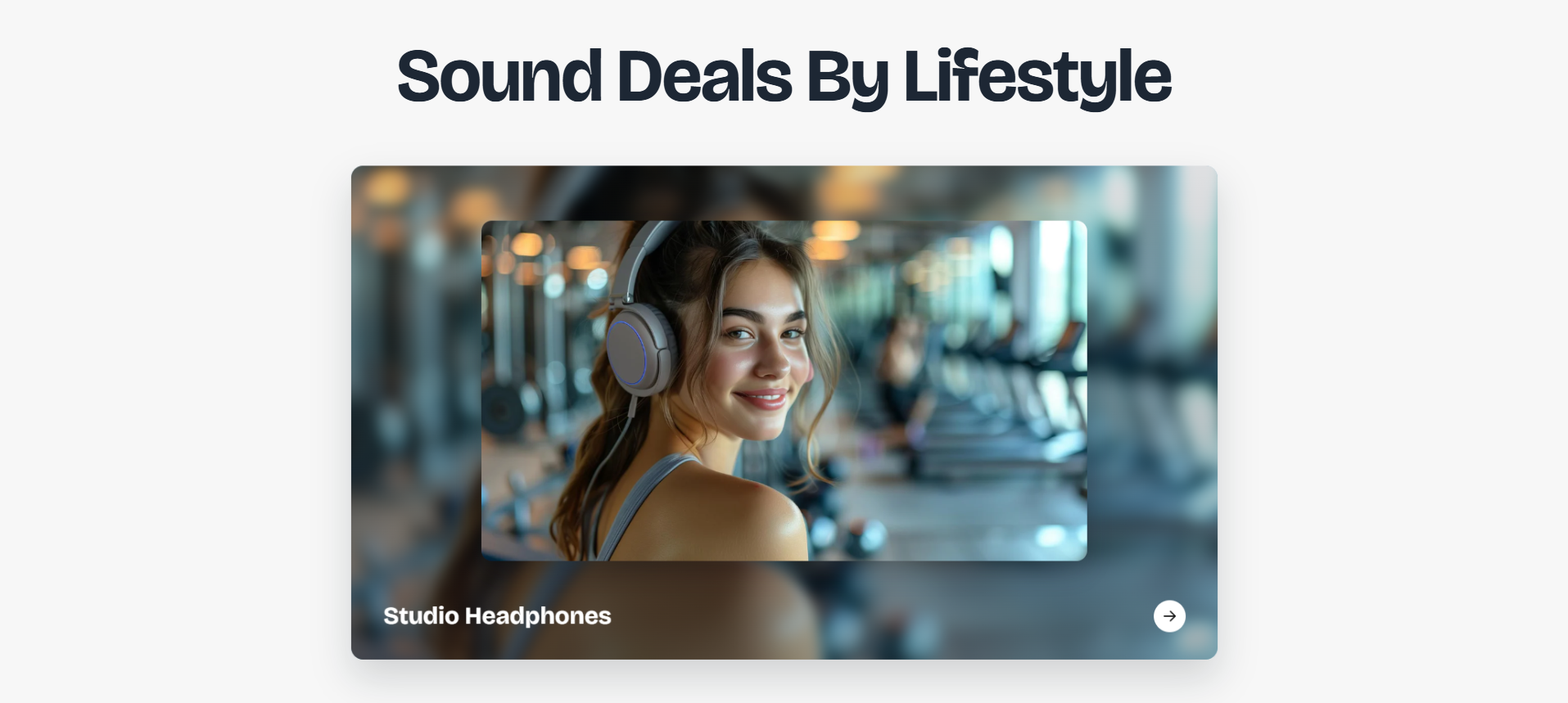
- Heading: Add the main title for the section (example: Sound Deals By Lifestyle).
-
Heading Alignment:
Choose the alignment of the section heading.
- Left: Aligns the heading to the left.
- Center: Centers the heading.
- Right: Aligns the heading to the right.
- Color Scheme: Select a predefined color scheme for the section.
- Section Width: Choose between page width or full width layout.
- Container Max Width: Control the maximum width of the section container.
- Gap Between Cards: Adjust the spacing between individual cards.
- Sticky Top Offset: Control the sticky positioning offset for cards.
- Card Height Desktop: Set the card height for desktop devices.
- Card Height Mobile: Set the card height for mobile devices.
- Card Width Desktop: Adjust the width of cards on desktop screens.
- Card Width Mobile: Adjust the width of cards on mobile screens.
- Card Corner Radius: Control the rounded corners of cards.
- Inner Image Radius: Set the border radius for the inner floating image.
- Inner Image Width: Adjust the width of the floating image layer.
- Disable Stacking Effect On Mobile: Disable layered stacking animations for mobile devices.
- Card Scale Step: Adjust the scaling difference between stacked cards.
- Lift Distance: Control the upward lift animation distance.
- Background Blur: Apply blur effect to background images.
- Overlay Opacity: Adjust the transparency level of the image overlay.
- Heading Size Desktop: Set the heading font size for desktop devices.
- Heading Size Mobile: Set the heading font size for mobile devices.
- Card Title Size: Adjust the font size for card titles.
- Heading Color: Select the color of the section heading text.
- Card Title Color: Set the text color for card titles.
- Muted Text Color: Choose the muted text color for secondary content.
- Arrow Background: Set the background color of navigation arrows.
- Arrow Icon Color: Choose the icon color of navigation arrows.
- Card Backdrop Color: Configure the overlay backdrop color behind cards.
- Card Shadow Opacity: Adjust the intensity of card shadows.
- Top Padding: Add spacing above the section.
- Bottom Padding: Add spacing below the section.
- Top Margin: Control the external top margin of the section.
- Bottom Margin: Control the external bottom margin of the section.
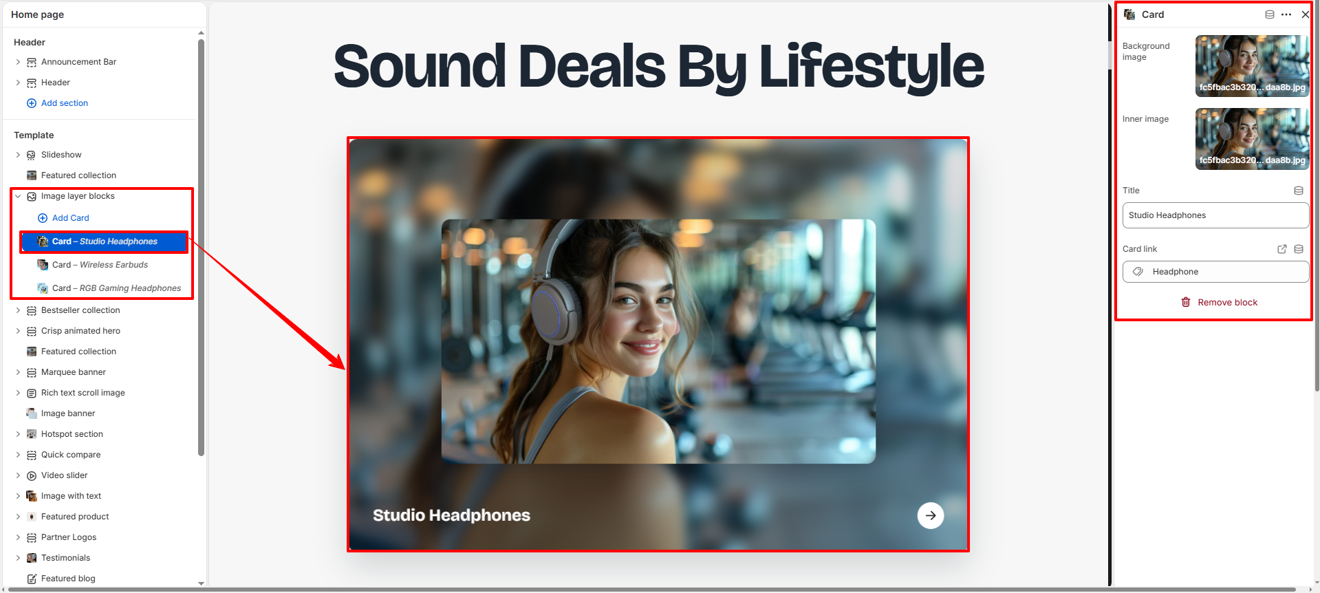
Block Settings
Each Image Layer Block contains individual settings for managing images, text content, overlays, and navigation links.
- Background Image: Upload a background image for the card.
- Inner Image: Add a foreground image layered above the background image.
- Title: Enter the title displayed on the card.
- Card Link: Choose the destination URL for the card.