
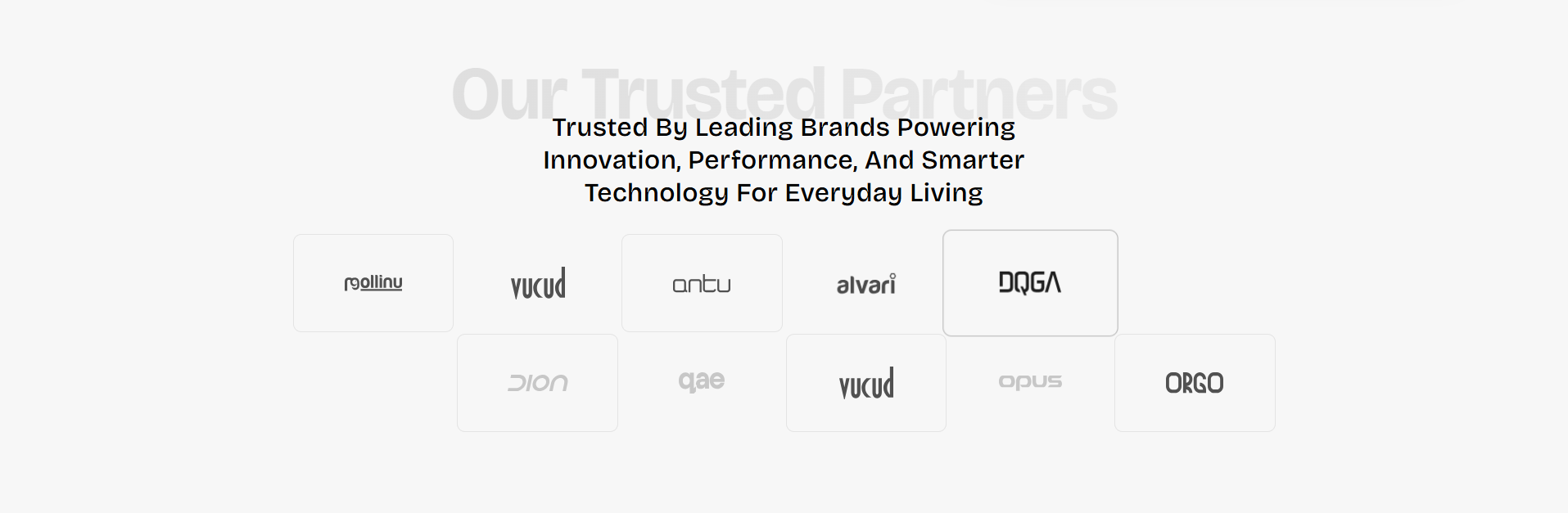
Partner Logos
The Partner Logos section allows merchants to showcase trusted brand partners, suppliers, featured collaborations, certifications, or company logos in a clean responsive grid layout. This section helps build customer trust and improve brand credibility by visually highlighting associated companies and partnerships.
With flexible layout controls, customizable logo grids, spacing adjustments, mobile slider functionality, grayscale hover effects, fade animations, and responsive design settings, the Partner Logos section creates an engaging and professional brand showcase experience across all devices.
How to Add the Partner Logos Section
- From your Shopify admin, go to Online Store → Themes.
- Click Customize on the Voltix theme.
- In the Theme Editor, click Add section.
- Select Partner Logos from the available sections.
- Configure the section settings including heading text, logo grid layout, spacing, animations, mobile slider behavior, and logo appearance options.
- Add multiple Partner logo blocks to display brand logos.
- Click Save to publish your changes.
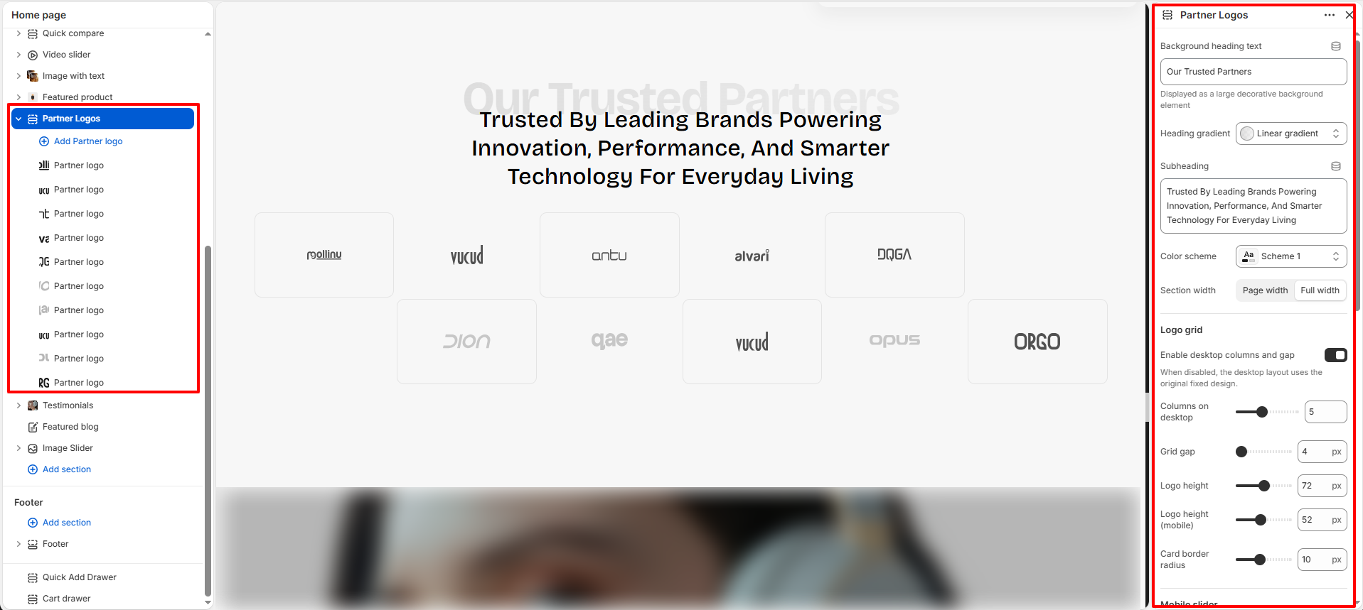
How To Configure The Partner Logos Settings
The section settings allow you to control the overall appearance, layout structure, spacing, animations, responsiveness, accessibility, and logo presentation for the Partner Logos section.
- Background Heading Text: Add large decorative background text displayed behind the main heading.
- Heading Gradient: Apply gradient styling to the decorative background heading.
- Subheading: Add the main descriptive heading content displayed in the section.
- Color Scheme: Select the color scheme used for the section background and content.
- Section Width: Choose between Page Width or Full Width layout styles.
- Enable Desktop Columns and Gap: Enable custom desktop grid layout controls for logo columns and spacing.
- Columns on Desktop: Adjust the number of logo columns displayed on desktop devices.
- Grid Gap: Control spacing between logo cards.
- Logo Height: Set the logo image height for desktop devices.
- Logo Height (Mobile): Configure the logo image height for mobile devices.
- Card Border Radius: Adjust the rounded corner styling for logo cards.
- Enable Auto Slider On Mobile: Automatically convert the logo grid into a slider on mobile devices.
- Auto Slide Speed: Control the speed of automatic logo sliding on mobile.
- Default Logo Opacity: Set the default transparency level for logo images.
- Show Logos In Grayscale: Display logos in grayscale until hovered for interactive visual effects.
- Fade-In Duration: Control the animation duration for logo fade-in effects.
- Stagger Delay Between Logos: Add delayed animation timing between logo appearances.
- Padding Top: Add spacing above the section.
- Padding Bottom: Add spacing below the section.
- Section Accessible Label: Add accessibility labels for improved screen-reader support.
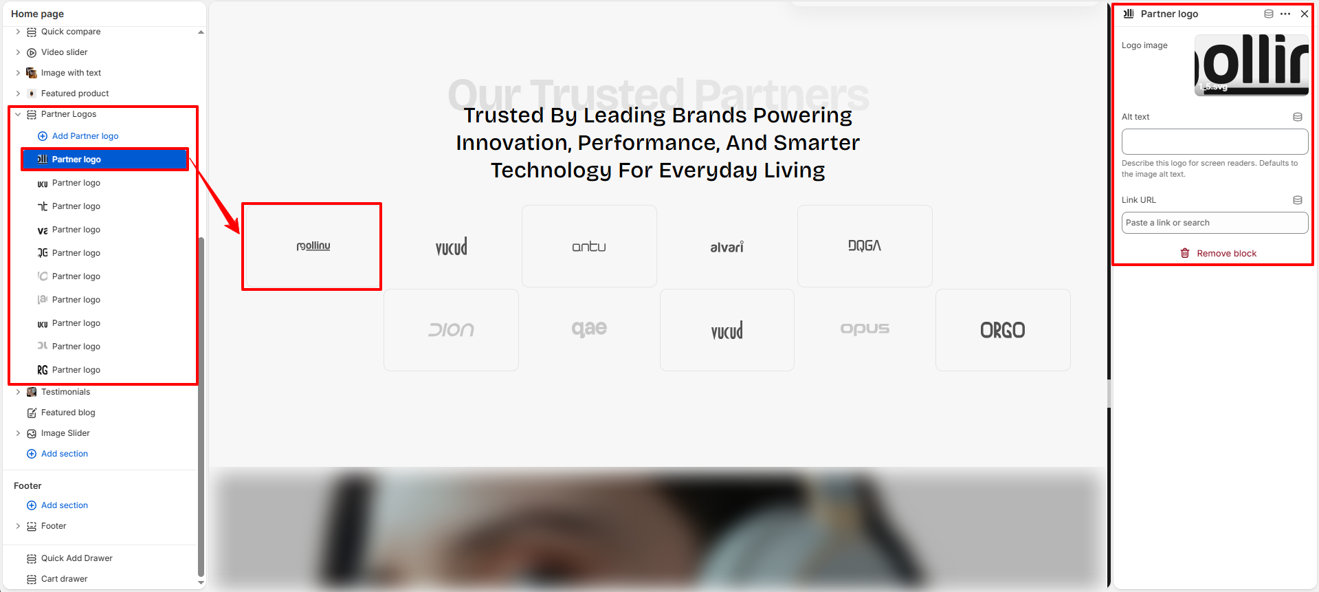
Partner Logo Block Settings
The Partner Logo block allows you to manage individual brand logos displayed inside the Partner Logos section.
- Logo Image: Upload the brand or partner logo image.
- Alt Text: Add descriptive alternative text for accessibility and SEO purposes.
- Link URL: Assign a destination URL to make the logo clickable.