
Hotspot Section
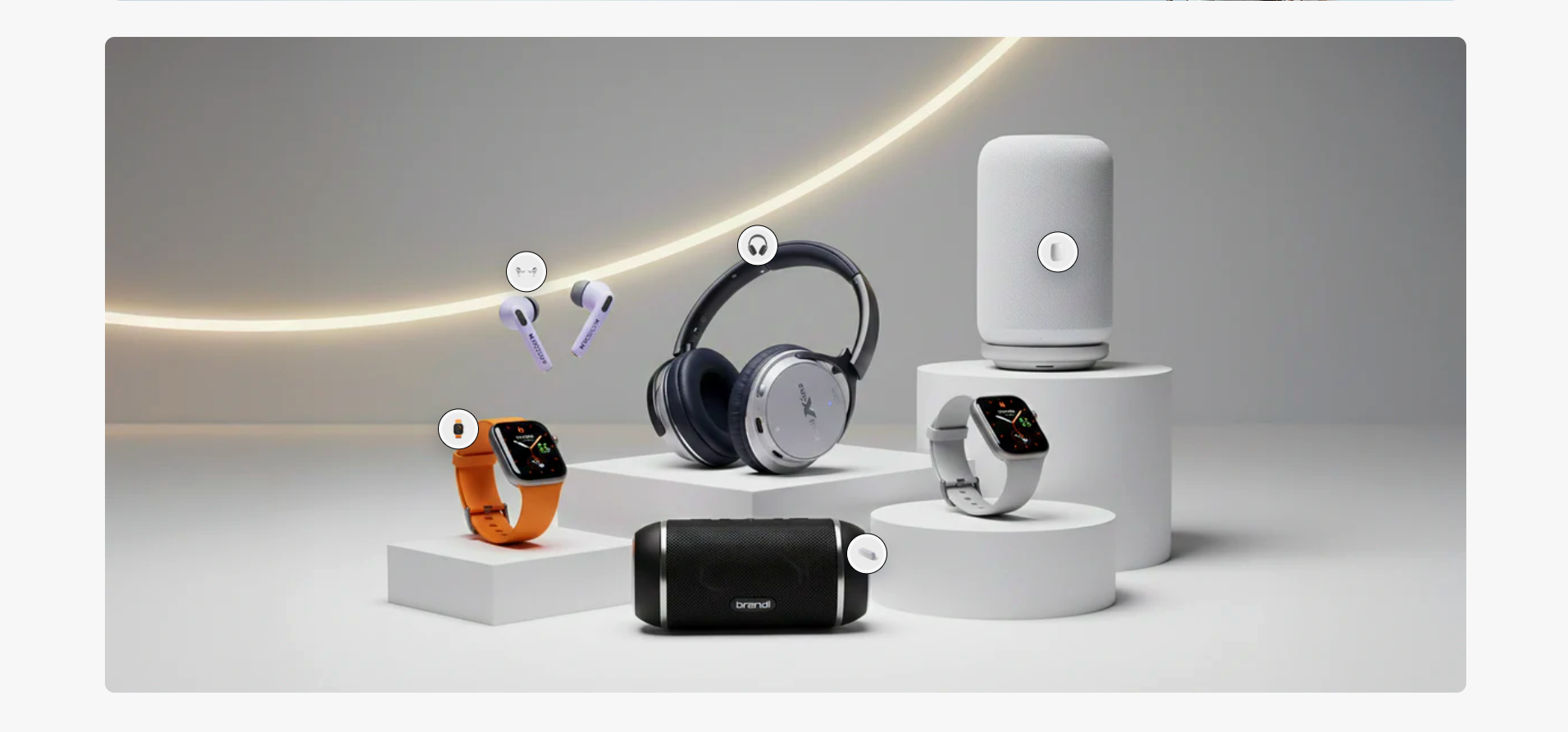
The Hotspot Section is designed to create interactive product showcase experiences by placing clickable hotspot markers directly on top of banner images. This section helps merchants highlight featured products in a visually engaging and modern layout, allowing customers to quickly explore products from a single scene.
With flexible customization options for hotspot positioning, popup cards, typography styling, responsive layouts, section spacing, colors, and product assignments, the Hotspot Section provides an effective way to create immersive shopping experiences optimized for both desktop and mobile devices.
How to Add the Hotspot Section
- From your Shopify admin, go to Online Store → Themes.
- Click Customize on the Voltix theme.
- In the Theme Editor, click Add section.
- Select Hotspot section from the available sections.
- Upload a background image and configure the section layout, hotspot styling, popup appearance, and typography settings.
- Add multiple hotspot blocks and assign products to each hotspot marker.
- Adjust the hotspot positions to match the product locations displayed in the image.
- Click Save to publish your changes.
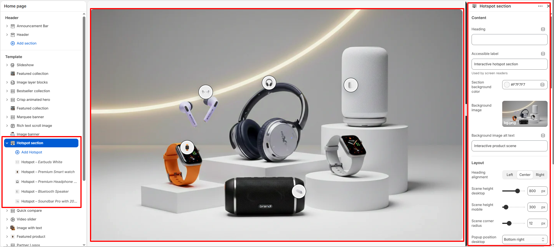
How To Configure The Hotspot Section Settings
The section settings allow you to control the overall hotspot layout, interactive behavior, popup styling, typography appearance, responsive visibility, and spacing options for the Hotspot Section.
- Heading: Add a custom title for the hotspot section.
- Accessible Label: Add screen-reader friendly accessibility text.
- Section Background Color: Select the background color for the section.
- Background Image: Upload the main image used for the hotspot showcase.
- Background Image Alt Text: Add descriptive alt text for accessibility and SEO.
- Heading Alignment: Align the section heading to the left, center, or right.
- Scene Height (Desktop): Adjust the image display height for desktop screens.
- Scene Height (Mobile): Control the image height for mobile devices.
- Scene Corner Radius: Adjust the rounded corners of the hotspot container.
- Popup Position (Desktop): Choose where the popup card appears on desktop screens.
- Hotspot Size: Control the size of the clickable hotspot markers.
- Hotspot Border Width: Adjust the border thickness around hotspot icons.
- Hotspot Background Color: Customize the hotspot marker background color.
- Hotspot Border Color: Select the border color for hotspot markers.
- Hotspot Icon Color: Customize the icon color displayed inside hotspots.
- Card Background Color: Control the popup product card background color.
- Image Background Color: Select the background color behind product images.
- Badge Background Color: Customize the sale or label badge background color.
- Badge Text Color: Adjust the badge text color.
- Price Color: Customize the product price color.
- Title Color: Control the popup product title color.
- Popup Width: Adjust the width of the popup product card.
- Popup Horizontal Offset: Control the horizontal popup spacing on desktop.
- Popup Vertical Offset: Adjust the vertical popup spacing on desktop.
- Popup Corner Radius: Customize the rounded corners of popup cards.
- Popup Shadow Opacity: Control the popup shadow visibility.
- Popup Animation Duration: Adjust the popup opening animation speed.
- Background Blur on Open: Add blur effect to the background when popup opens.
- Backdrop Overlay Opacity: Control the overlay opacity behind active popups.
- Pause Lenis When Popup Opens: Pause smooth scrolling while popup is active.
- Heading Size (Desktop): Adjust the heading font size for desktop devices.
- Heading Size (Mobile): Control the heading font size for mobile devices.
- Heading Color: Customize the section heading color.
- Top Padding: Add spacing above the section.
- Bottom Padding: Add spacing below the section.
- Top Margin: Control the outer top spacing of the section.
- Bottom Margin: Control the outer bottom spacing of the section.
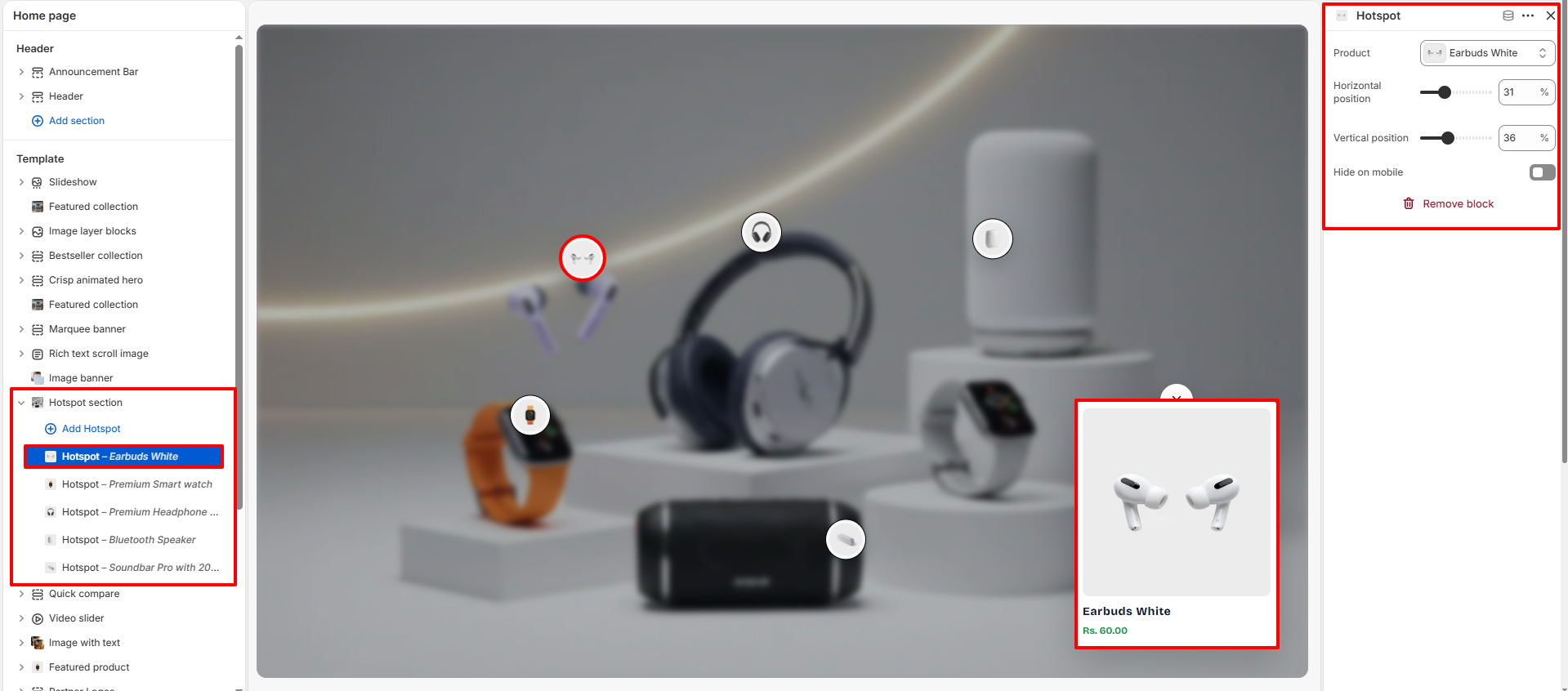
How To Configure Hotspot Blocks
Each hotspot block allows you to assign a specific product and position the hotspot marker precisely inside the interactive image scene.
- Product: Select the product displayed inside the hotspot popup card.
- Horizontal Position: Adjust the hotspot position from left to right.
- Vertical Position: Adjust the hotspot position from top to bottom.
- Hide on Mobile: Hide specific hotspot markers on mobile devices.