
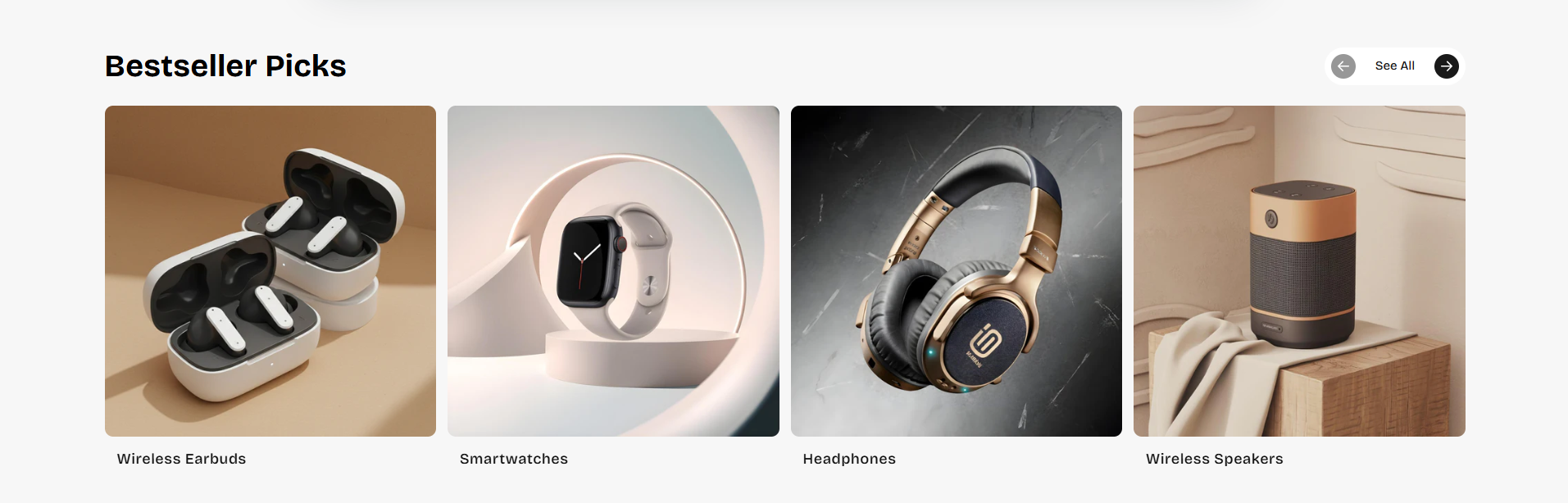
Bestseller Collection Section
The Bestseller Collection Section is designed to showcase featured product collections in a clean and interactive slider layout. This section helps merchants highlight trending categories, bestselling products, seasonal collections, or curated shopping experiences in a visually engaging format.
With customizable layout controls, autoplay functionality, spacing options, navigation settings, card styling, and responsive design controls, you can create attractive collection showcases that improve customer engagement and product discovery.
How to Add the Bestseller Collection Section
- From your Shopify admin, go to Online Store → Themes.
- Click Customize on the Voltix theme.
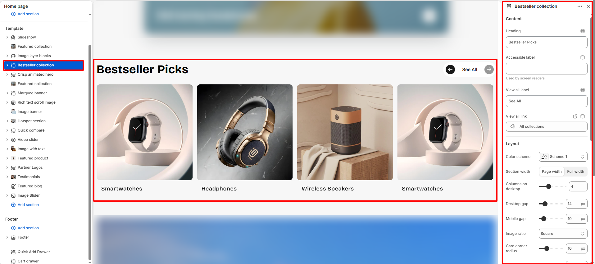
- In the Theme Editor, click Add section.
- Select Bestseller collection from the available sections.
- Configure the section settings such as heading, layout, spacing, autoplay, navigation arrows, and colors.
- Click Save to publish your changes.
How To Configure The Bestseller Collection Settings
The section settings control the overall appearance, layout behavior, spacing, autoplay functionality, navigation controls, and card styling for the Bestseller Collection section.
- Heading: Add the main title for the section (example: Bestseller Picks).
- Accessible Label: Add accessibility text for screen readers.
- View All Label: Set the label text for the collection link button.
- View All Link: Choose the destination URL for the “See All” button.
- Color Scheme: Select a predefined color scheme for the section.
- Section Width: Choose between page width or full width layout.
- Columns on Desktop: Control the number of collection cards displayed in a single row on desktop devices.
- Desktop Gap: Adjust spacing between cards on desktop screens.
- Mobile Gap: Adjust spacing between cards on mobile devices.
- Image Ratio: Select the image aspect ratio for collection cards.
- Card Corner Radius: Control the rounded corners of collection cards.
- Transition Speed: Set the animation speed for slider transitions.
- Autoplay: Enable automatic sliding of collection items.
- Change Slide Every: Set the autoplay interval duration.
- Show Arrows: Enable or disable navigation arrows.
- Use Custom Card Colors: Enable custom colors for collection cards.
- Card Background: Select the background color for cards.
- Card Title Color: Set the text color for collection titles.
- Link and Arrow Color: Choose the color for navigation links and arrows.
- Top Padding: Add spacing above the section.
- Bottom Padding: Add spacing below the section.
- Top Margin: Control the external top margin of the section.
- Bottom Margin: Control the external bottom margin of the section.
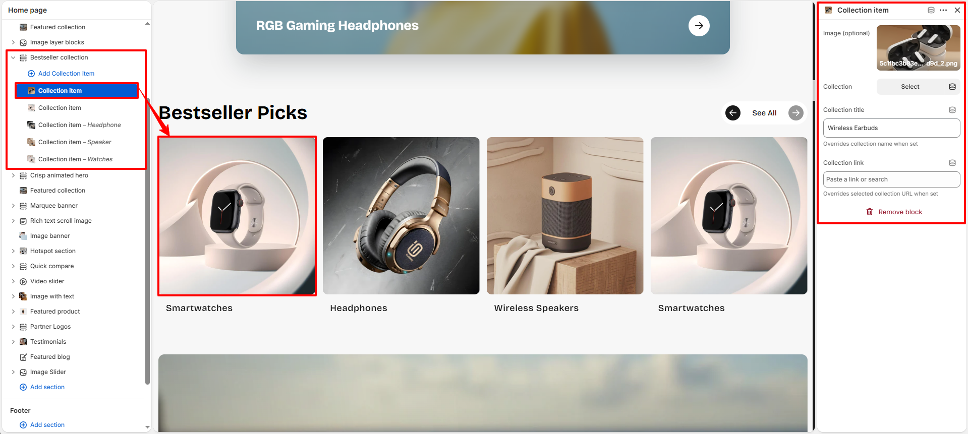
Collection Item Block Settings
Each Collection Item block allows you to display an individual featured collection card inside the Bestseller Collection section.
- Image: Upload a custom image for the collection card.
- Collection: Select a Shopify collection to display.
- Collection Title: Override the selected collection name with a custom title.
- Collection Link: Add a custom destination URL for the collection card.
- Remove Block: Delete the selected Collection Item block if no longer needed.