
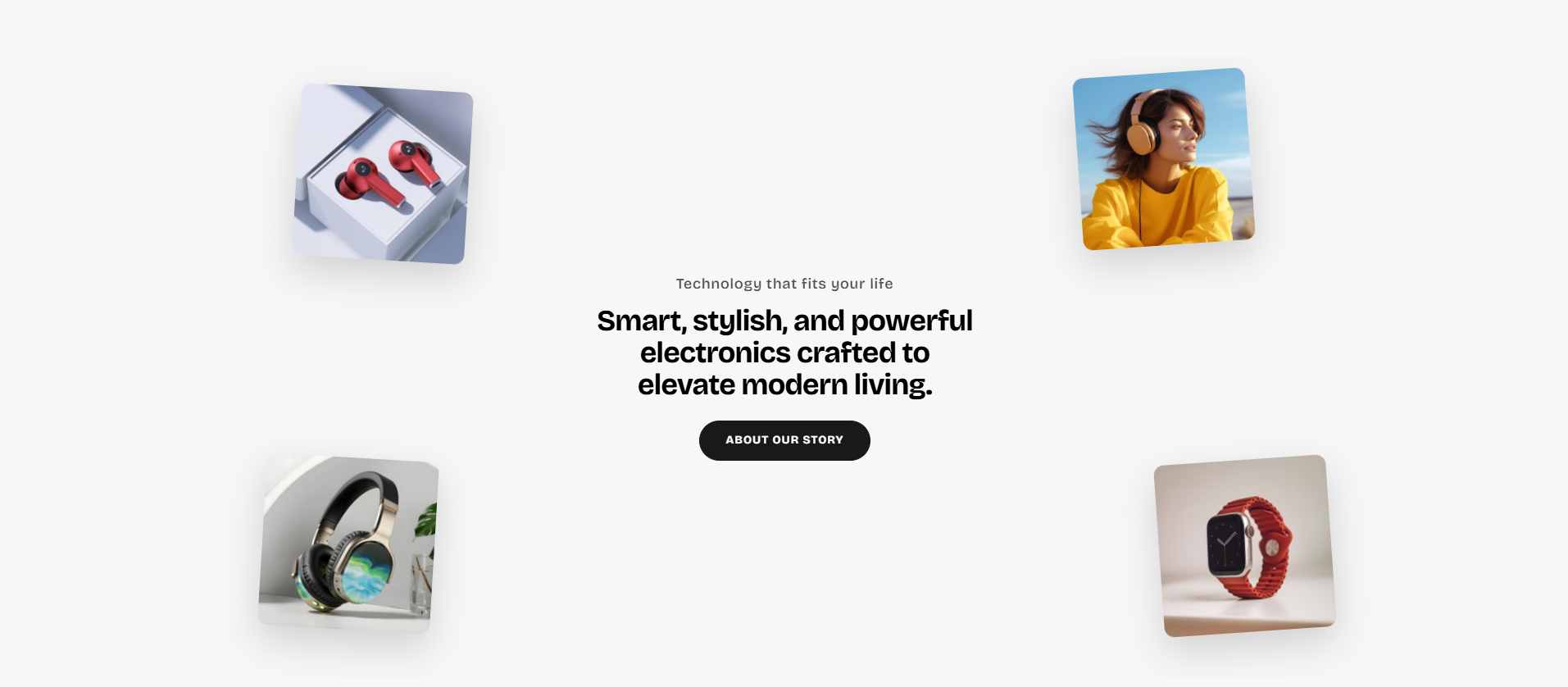
Rich Text Scroll Image
The Rich Text Scroll Image section is designed to create an interactive storytelling experience using animated floating images, rich typography, call-to-action buttons, and smooth scroll-based motion effects. This section helps merchants showcase featured products, promotional campaigns, brand identity, and lifestyle visuals in a modern and engaging layout.
With flexible customization options for floating image positioning, animation intensity, content alignment, responsive spacing, typography styling, button appearance, and scene layout, the Rich Text Scroll Image section allows you to create immersive storefront experiences that capture customer attention across all devices.
How to Add the Rich Text Scroll Image Section
- From your Shopify admin, go to Online Store → Themes.
- Click Customize on the Voltix theme.
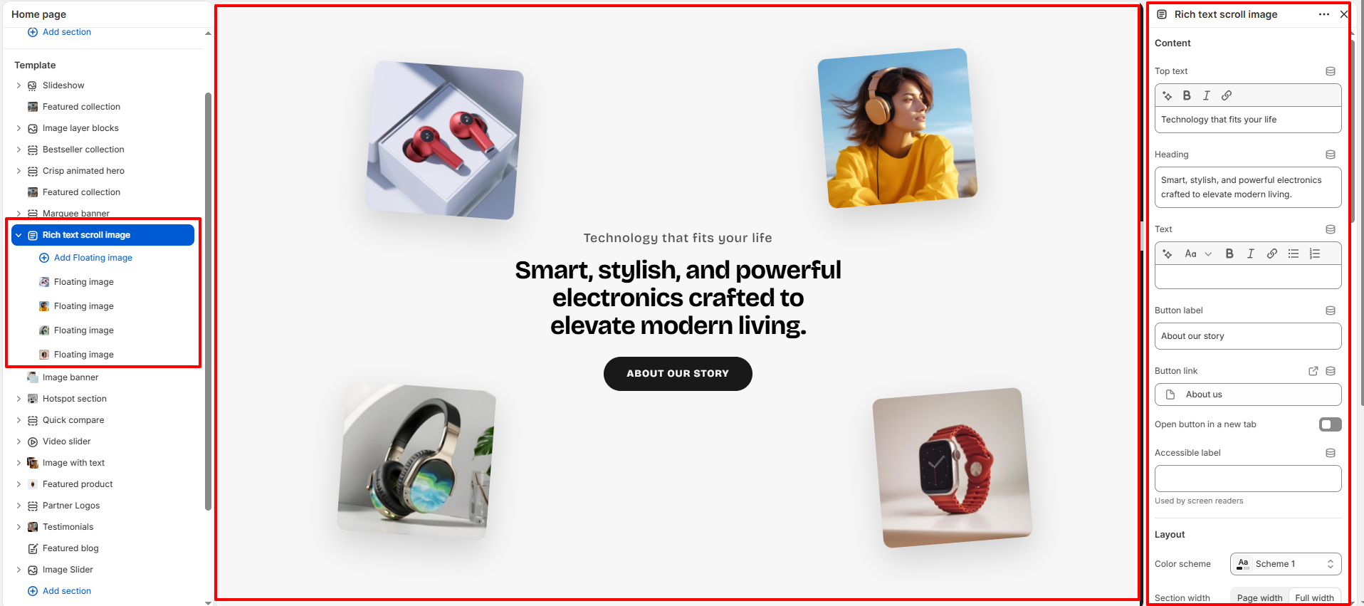
- In the Theme Editor, click Add section.
- Select Rich text scroll image from the available sections.
- Configure the section settings such as content layout, floating image positioning, motion effects, typography styling, spacing, and button appearance.
- Add multiple Floating image blocks to create layered animated visuals around the content area.
- Click Save to publish your changes.
How To Configure The Rich Text Scroll Image Settings
The section settings allow you to control the overall scene layout, content alignment, floating image animation behavior, typography styling, responsive spacing, and visual appearance of the Rich Text Scroll Image section.
- Top Text: Add a small introductory label displayed above the heading.
- Heading: Add the main promotional heading content.
- Text: Add supporting descriptive text below the heading.
- Button Label: Customize the call-to-action button text.
- Button Link: Assign a destination link for the button.
- Open Button in a New Tab: Open the button link in a separate browser tab.
- Accessible Label: Add accessibility text for screen readers.
- Color Scheme: Select a predefined color scheme for the section.
- Section Width: Choose between page width or full width layout.
- Content Position: Align the content area to the left, center, or right.
- Text Alignment: Control the alignment of text content.
- Content Max Width: Set the maximum width of the content container.
- Desktop Scene Height: Control the section height on desktop devices.
- Mobile Scene Height: Adjust the section height for mobile screens.
- Visible Floating Images on Mobile: Control how many floating images appear on mobile devices.
- Enable Scroll Motion: Enable animated floating motion while scrolling.
- Easing: Choose the animation easing style.
- Start Animation at Viewport: Define when the animation starts during scrolling.
- End Animation at Viewport: Control when the animation ends while scrolling.
- Motion Intensity: Adjust the strength of floating motion effects.
- Scene Background: Select the background color for the section.
- Scene Corner Radius: Adjust the rounded corners of the section container.
- Content Spacing: Add spacing between content elements.
- Top Text Size: Control the font size of the top text.
- Heading Size (Desktop): Set the desktop heading font size.
- Heading Size (Mobile): Adjust the mobile heading font size.
- Body Text Size: Control the size of descriptive text.
- Image Corner Radius: Adjust the rounded corners of floating images.
- Image Shadow Opacity: Control the shadow visibility behind floating images.
- Button Style: Choose between primary and secondary button styles.
- Button Corner Radius: Adjust the roundness of the button corners.
- Top Padding: Add internal spacing above the section.
- Bottom Padding: Add internal spacing below the section.
- Top Margin: Add external spacing above the section.
- Bottom Margin: Add external spacing below the section.
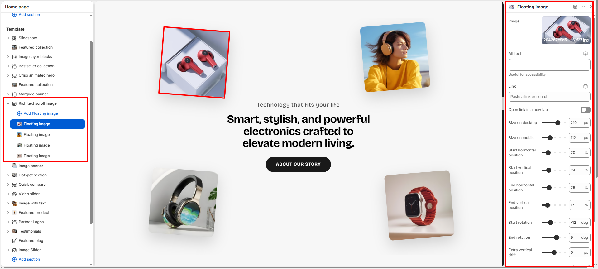
Floating Image Block Settings
Each Floating Image block allows you to create animated floating visuals with customizable image positioning, sizing, motion effects, and responsive behavior.
- Image: Upload the floating image displayed inside the scene.
- Alt Text: Add descriptive accessibility text for the image.
- Link: Assign a destination link to the floating image.
- Open Link in a New Tab: Open the image link in a separate browser tab.
- Size on Desktop: Control the image size for desktop devices.
- Size on Mobile: Adjust the image size for mobile screens.
- Start Horizontal Position: Define the starting horizontal position of the image.
- Start Vertical Position: Define the starting vertical position of the image.
- End Horizontal Position: Set the ending horizontal animation position.
- End Vertical Position: Set the ending vertical animation position.
- Start Rotation: Control the initial image rotation angle.
- End Rotation: Define the final image rotation angle during animation.
- Extra Vertical Drift: Add additional floating movement to the image.
- Layer Order: Control the stacking order of floating images.
- Corner Radius: Adjust the roundness of the image corners.
- Hide on Mobile: Hide specific floating images on mobile devices.