
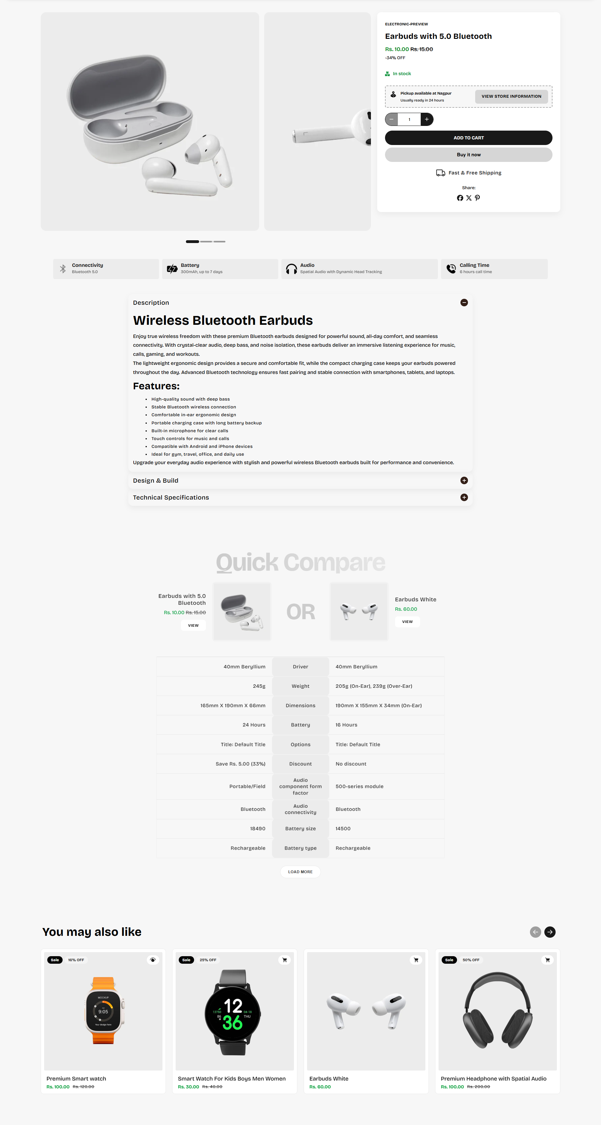
Product Section
The Product Section in the Voltix theme gives you complete control over your product layout, media appearance, spacing, and product information blocks. You can easily customize the shopping experience while keeping the product page modern, clean, and conversion-focused.
Product Section Settings
The Product Section settings allow you to customize the layout, product media, styling, and spacing of your product page.
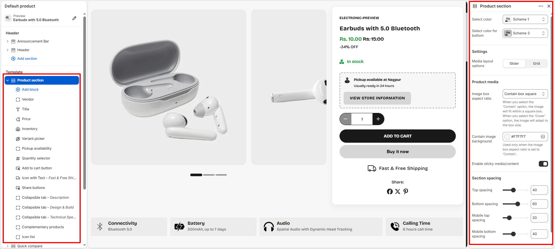
- Select Color: Choose a color scheme for the overall product section background and text styling.
- Select Color For Bottom: Apply a separate color scheme for bottom description and complemetary product block.
-
Media Layout Options:
Control how product media is displayed.
- Slider: Display product images in a swipeable slider layout.
- Grid: Display product images in a grid-style layout.
-
Product Media:
-
Image Box Aspect Ratio:
Define how product images fit inside their containers.
- Contain Box Square: Keeps the full image visible inside a square image box.
- Cover: Crops the image to completely fill the image container.
- Adapt: Automatically adjusts image height based on uploaded media.
- Contain Image Background: Add a custom background color behind contained product images.
- Enable Sticky Media/Content: Keeps the product media or content sticky while customers scroll through the page.
-
Image Box Aspect Ratio:
Define how product images fit inside their containers.
-
Section Spacing:
- Top Spacing: Adjust spacing above the product section.
- Bottom Spacing: Adjust spacing below the product section.
- Mobile Top Spacing: Control top spacing specifically for mobile devices.
- Mobile Bottom Spacing: Control bottom spacing specifically for mobile devices.
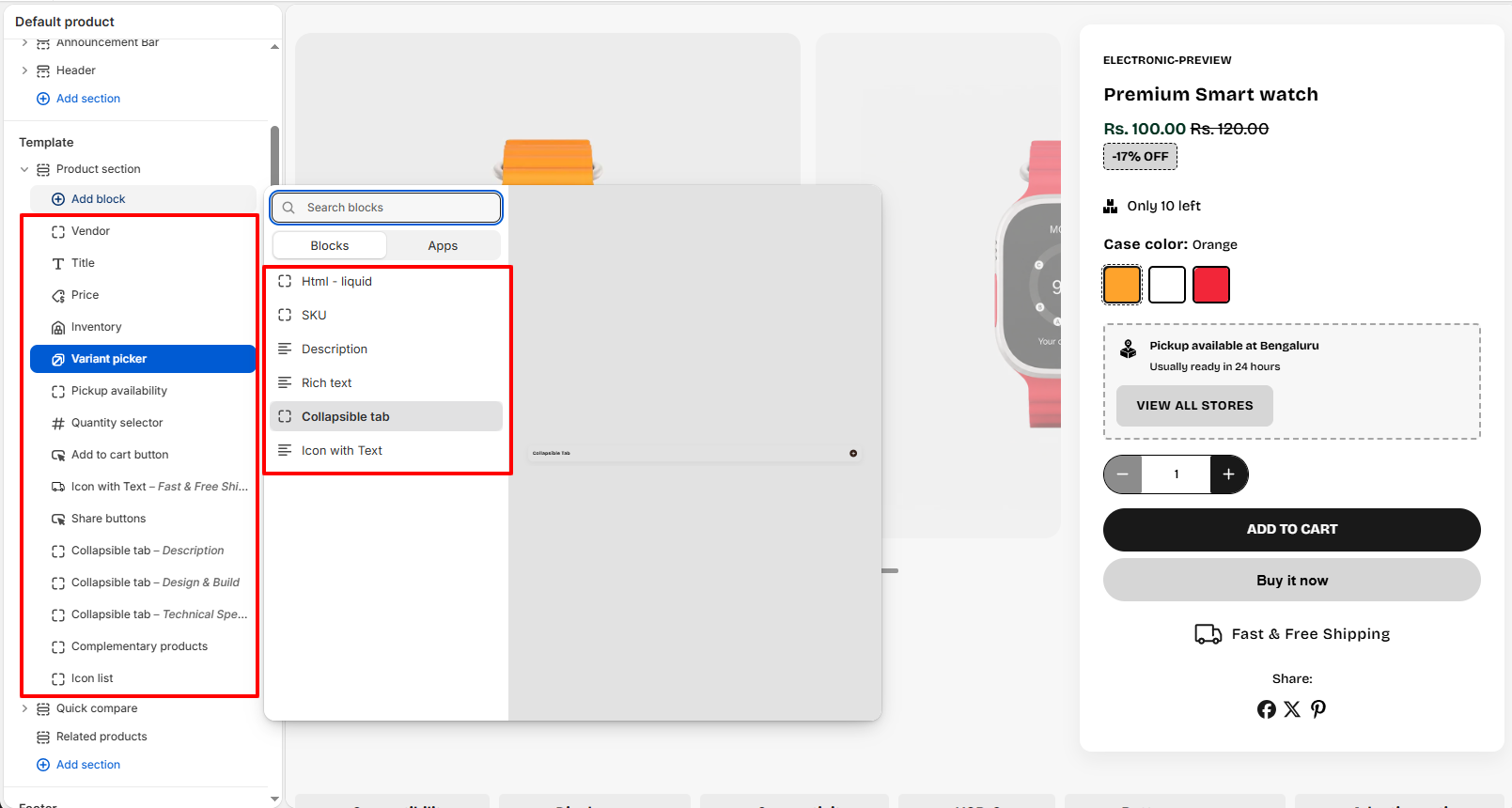
Available Product Blocks
Voltix includes multiple product information blocks that can be added, removed, and rearranged according to your store requirements.
- Vendor: Display the product vendor or brand name.
- Title: Show the product title prominently.
- Price: Display product pricing and compare-at pricing.
-
Inventory:
Display real-time product stock availability to help customers understand whether an item
is available, running low, or out of stock.
- Inventory Low Stock Threshold: Set the quantity limit at which the low stock warning should appear.
- In Stock Color: Choose the color used for the “In Stock” status label.
- Custom In Stock Text: Add a custom availability message for products that are currently in stock.
- Out Of Stock Color: Select the color used for products that are unavailable.
- Low Stock Color: Choose the color displayed when product inventory reaches the low stock threshold.
-
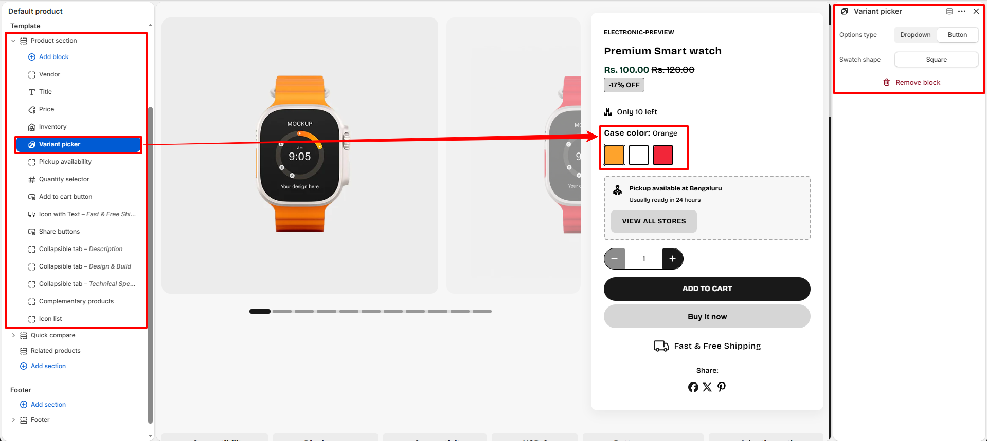
Variant Picker:
Allow customers to select product variants such as size, color, material, or style.
-
Options Type:
Control how variant options are displayed on the product page.
- Dropdown: Displays variant options inside a dropdown selector for a compact layout.
- Button: Displays variant options as clickable buttons or swatches for a more visual shopping experience.
-
Swatch Shape:
Choose the appearance style for color or image swatches.
- Square: Displays swatches with square corners for a modern structured look.
-
Options Type:
Control how variant options are displayed on the product page.
- Pickup Availability: Show local pickup availability information.
-
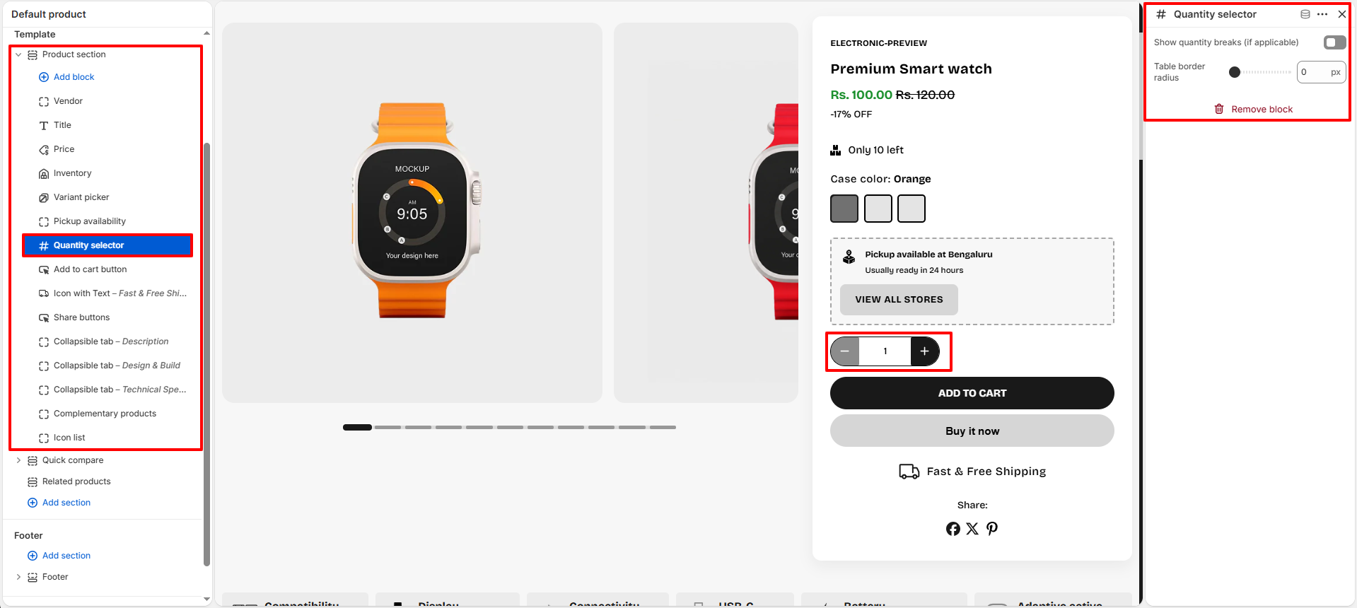
Quantity Selector:
Allow customers to increase or decrease product quantity before adding items to the cart.
- Show Quantity Breaks (If Applicable): Enable this option to display quantity-based pricing or bulk purchase discounts when available.
- Table Border Radius: Adjust the corner roundness of the quantity selector buttons and container to match your store design style.
-
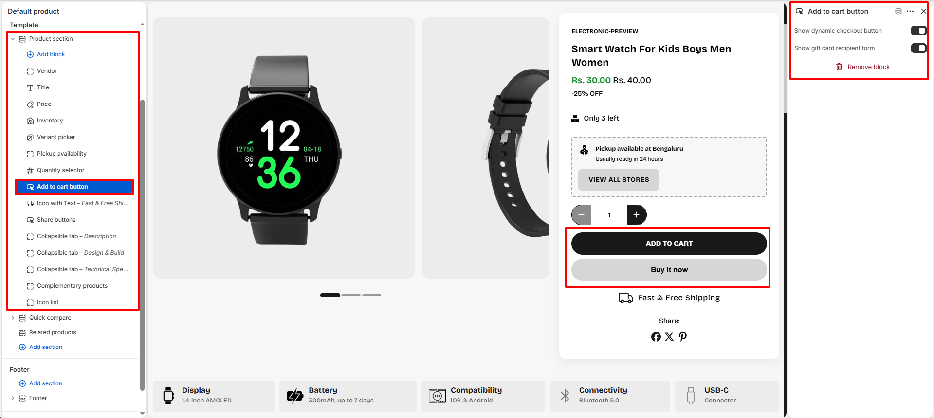
Add To Cart Button:
Display the primary purchase button that allows customers to quickly add products to their
cart and proceed to checkout.
- Show Dynamic Checkout Button: Enable an accelerated checkout option such as “Buy It Now” to allow customers to skip the cart and complete purchases faster.
- Show Gift Card Recipient Form: Display a recipient form for gift card products, allowing customers to send gift cards directly to another person with recipient details and a custom message.
-
Icon With Text:
Highlight product benefits like shipping, warranty, returns, or secure payment.
- Icon: Select an icon to display alongside the text. Icons help visually highlight important product information and make the message more noticeable to customers. Choose an icon that best represents the content being displayed, such as shipping, returns, warranty, or support.
- Text Content: Enter the text that will appear next to the selected icon. This can be used to communicate key product benefits, promotional messages, or store policies. Keep the text short and clear for better visibility and readability.
- Text Color: Choose the color of the text displayed beside the icon. Use a color that aligns with your store branding while maintaining sufficient contrast for easy reading.
- Share Buttons: Allow customers to share products on social media platforms.
-
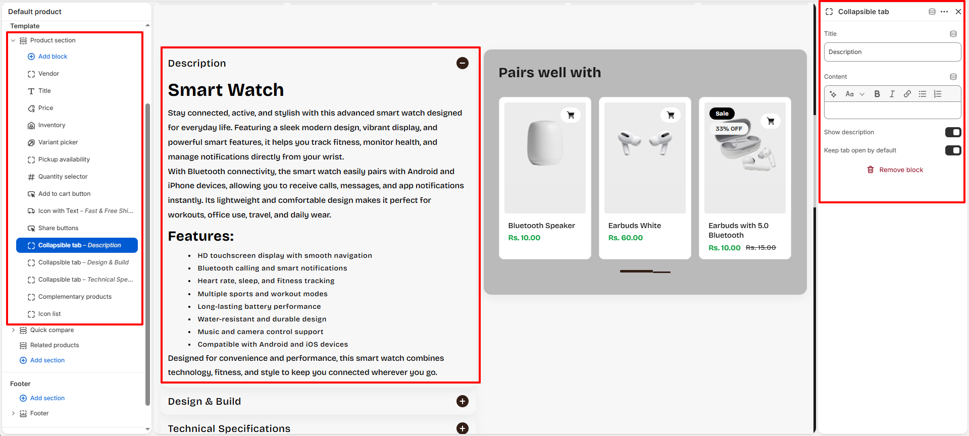
Collapsible Tab:
Organize product information into expandable sections such as descriptions,
specifications, shipping details, FAQs, warranty information, and more.
- Title: Add a heading for the collapsible tab such as Description, Design & Build, Technical Specifications, or Shipping & Returns.
- Content: Add custom text, product details, formatting, links, or additional information inside the tab content area using the rich text editor.
- Show Description: Enable this option to automatically display the product description content inside the collapsible tab.
- Keep Tab Open By Default: Enable this setting if you want the tab content to remain expanded when the product page first loads.
-
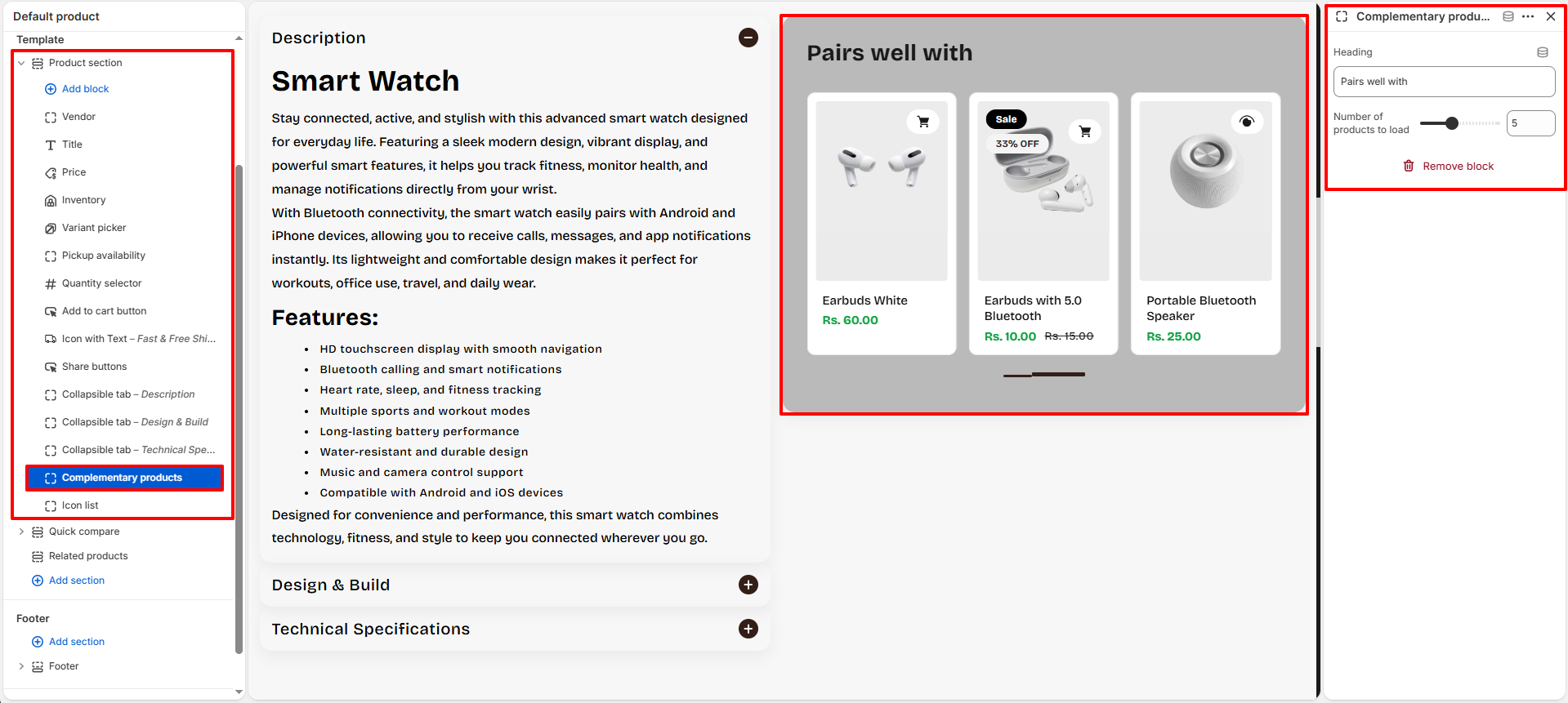
Complementary Products:
Showcase related or recommended products to encourage additional purchases
and improve the customer shopping experience.
- Heading: Add a custom heading for the complementary products section such as “Pairs well with” or “You may also like”.
-
Number Of Products To Load:
Control how many complementary products are displayed
inside the product recommendation slider.
-
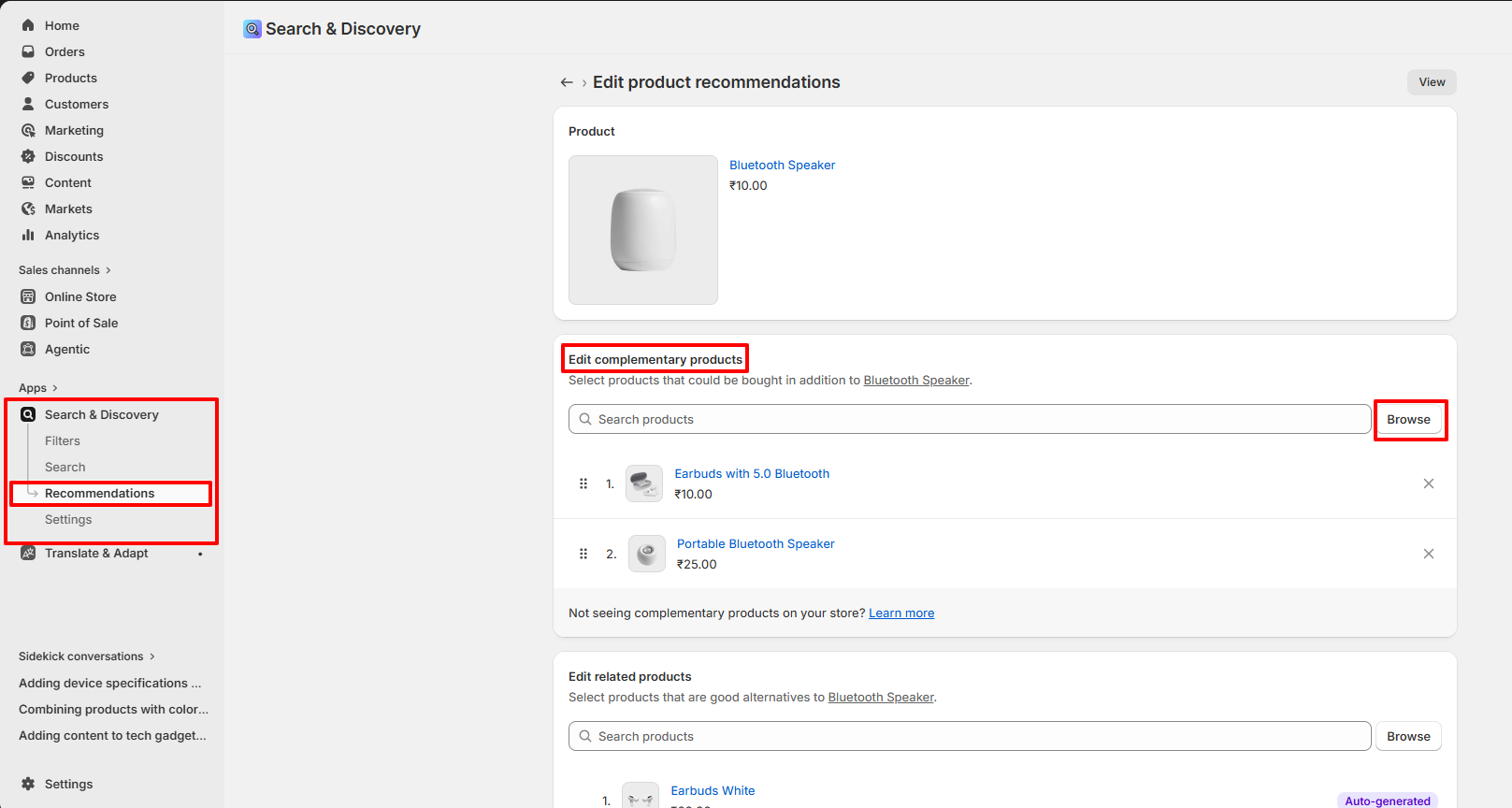
Set Complementary Products Using Shopify Search & Discover App:
- Install and open the Shopify Search & Discover app from your Shopify admin.
- Navigate to: Search & Discover → Product Recommendations.
- Open the product where you want to assign complementary products.
- In the Complementary Products section, click Add Complementary Products.
- Select the related or recommended products you want to display.
- Save the changes.
- The selected products will automatically appear inside the Complementary Products block on the product page.
-
Icon List:
Display product highlights with icons, title, and supporting text.
This block is powered by Shopify Metaobjects and Metafields,
allowing you to dynamically manage reusable product specifications.
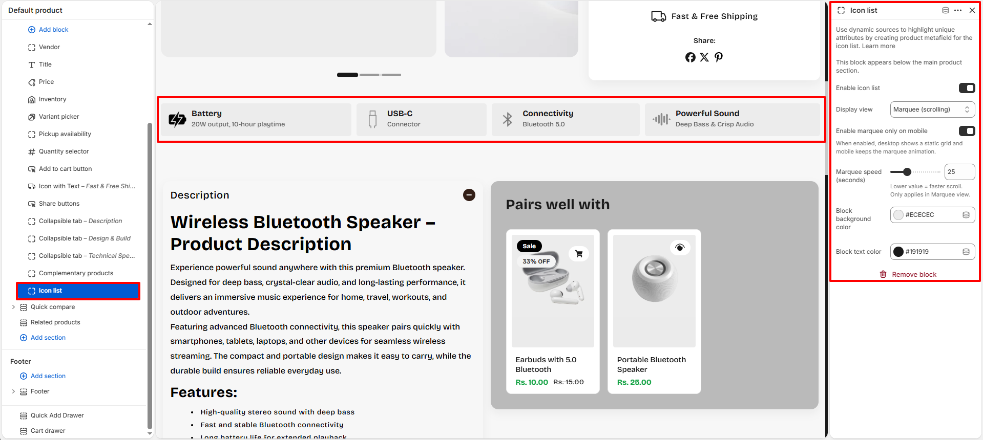
- Enable Icon List: Enable or disable the icon list block from the product page section.
-
Display View:
Choose how the icon list appears on the storefront.
- Grid: Display all specification items in a static grid layout.
- Marquee (Scrolling): Display icon items inside a continuously scrolling marquee layout.
- Enable Marquee Only On Mobile: Keep the desktop layout static while enabling scrolling animation only on mobile devices.
- Marquee Speed: Control the scrolling speed of marquee items. Lower values create faster movement.
- Block Background Color: Choose the background color for each icon item block.
- Block Text Color: Select the text and icon color used inside icon blocks.
How Icon List Works
The Icon List block uses Shopify Metaobjects and Product Metafields to dynamically display reusable product specification items.
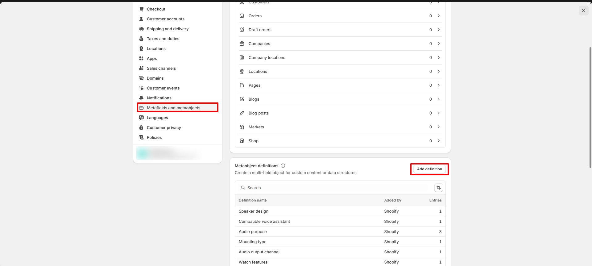
Step 1 — Create Metaobject Definition
First, create a Metaobject definition for storing icon list items.
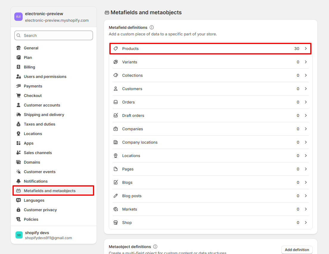
- Go to: Shopify Admin → Settings → Metafields and metaobjects
- Scroll to the Metaobjects section.
- Click Add definition.
Step 2 — Create Metaobject Fields
Create a metaobject named: Device Specifications
Add the following fields:
- Icon: File
- Title: Single line text
- Text: Single line text
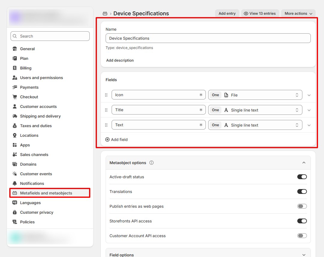
Note: Make sure the Metaobject name, Product Metafield name, and all field names are exactly the same as shown in this documentation.
Example:
- Metaobject Name: Device Specifications
- Metafield Name: Device Specifications
- Field Names: Icon, Title, Text
Using different names may prevent the Icon List block from connecting properly with the dynamic source.
Step 3 — Create Product Metafield
After creating the metaobject definition, create a Product Metafield to connect products with the specification entries.
- Go back to: Settings → Metafields and metaobjects
- Open the Products metafield section.
- Click Add definition.
Step 4 — Configure Product Metafield
- Name: Device Specifications
- Type: Metaobject
- Select: Device Specifications
- Enable: List of entries
Important: The Product Metafield name and Metaobject definition name must match exactly.
If the names are different,It will not work correctly inside the Icon List block.
Step 5 — Add Specification Entries
Create specification entries such as:
- Battery — 20W output, 10-hour playtime
- USB-C — Connector
- Connectivity — Bluetooth 5.0
- Powerful Sound — Deep Bass & Crisp Audio
How The Dynamic Icon List Works
The product metafield connects products with reusable metaobject entries. Each entry automatically outputs:
- Icon image
- Title
- Supporting text
Any updates made to the metaobject entries automatically reflect across all connected products.
- HTML - Liquid: Add custom HTML or Liquid code inside the product page.
- SKU: Display the product SKU dynamically.
- Description: Show the full product description.
- Rich Text: Add custom formatted content with headings, text, and links.
Quick Compare Setup
The Quick Compare section allows you to display a comparison product alongside the current product. Instead of manually selecting products inside the section settings, Voltix allows you to assign comparison products directly from the Shopify product editor using Product Metafields.
Note: To configure the design, layout, colors, and other section settings for the Quick Compare section, please refer to the Quick Compare Section documentation.
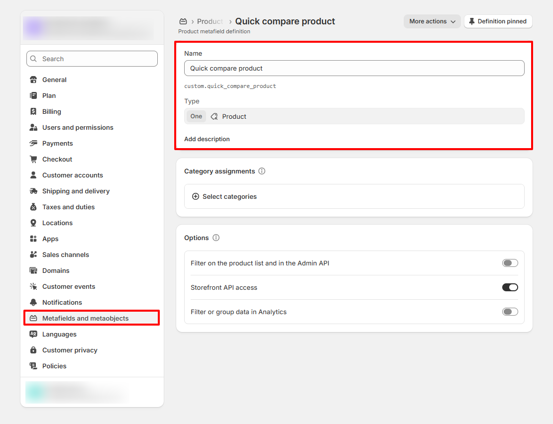
Step 1 — Create Product Metafield Definition
First, create a Product Metafield that will be used to assign comparison products.
- Go to: Shopify Admin → Settings → Metafields and metaobjects
- Open the Products metafield section.
- Click Add definition.
- Configure the metafield using the following settings:
- Name: Quick compare product
- Type: Product
- Value: One
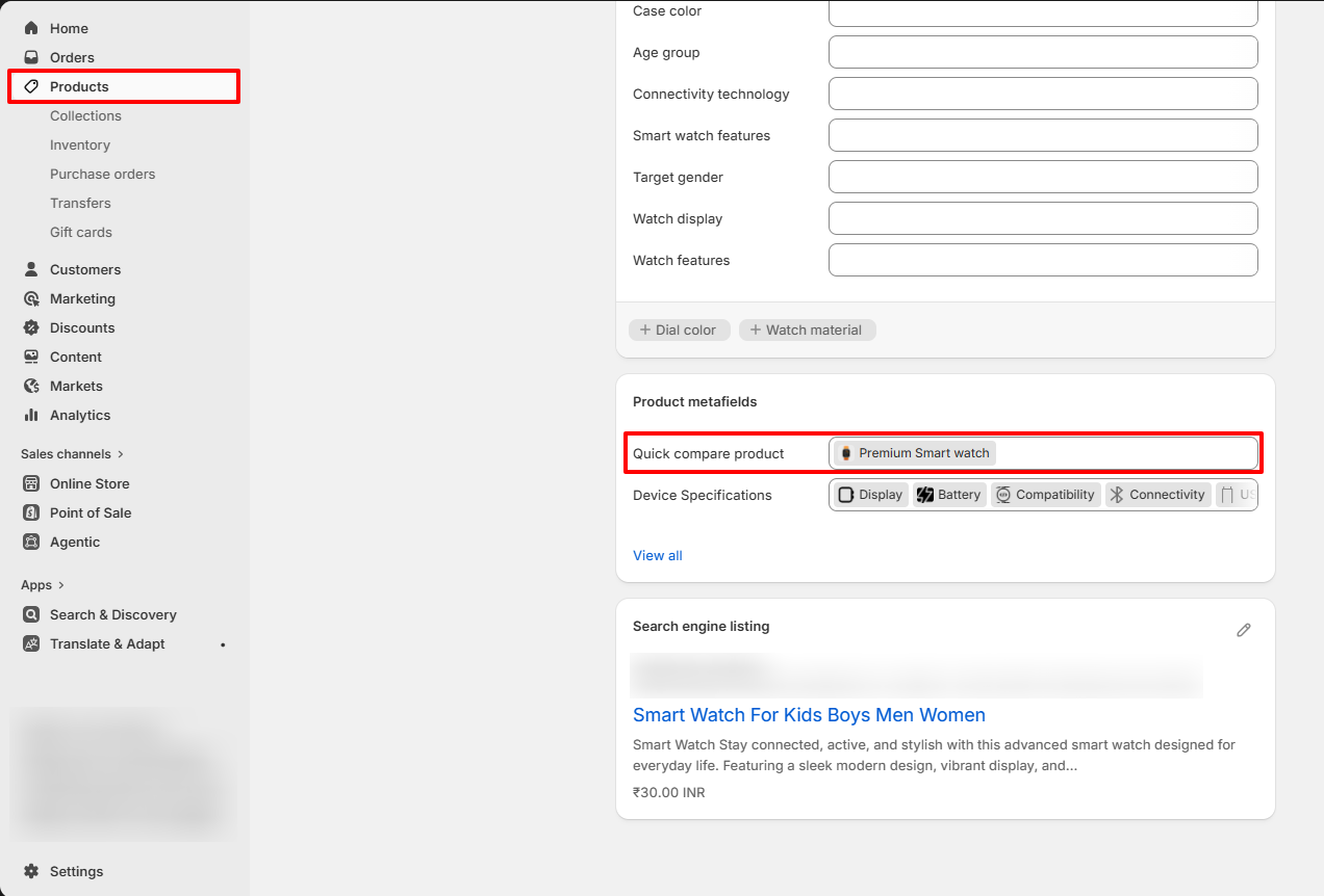
Step 2 — Assign a Comparison Product
After creating the metafield definition, you can assign a comparison product to any product.
- Go to: Shopify Admin → Products
- Open the product where you want to display a comparison product.
- Scroll down to the Metafields section.
- Locate the Quick compare product metafield.
- Click the product selector.
- Select the product that should appear in the Quick Compare section.
- Save the product.
Step 3 — Connect the Metafield to the Quick Compare Block
After assigning comparison products through the product metafield, you must connect the metafield to the Quick Compare block within the Product Page section.
- Go to: Shopify Admin → Online Store → Themes → Customize
- Open any product template that contains the Quick Comparesection.
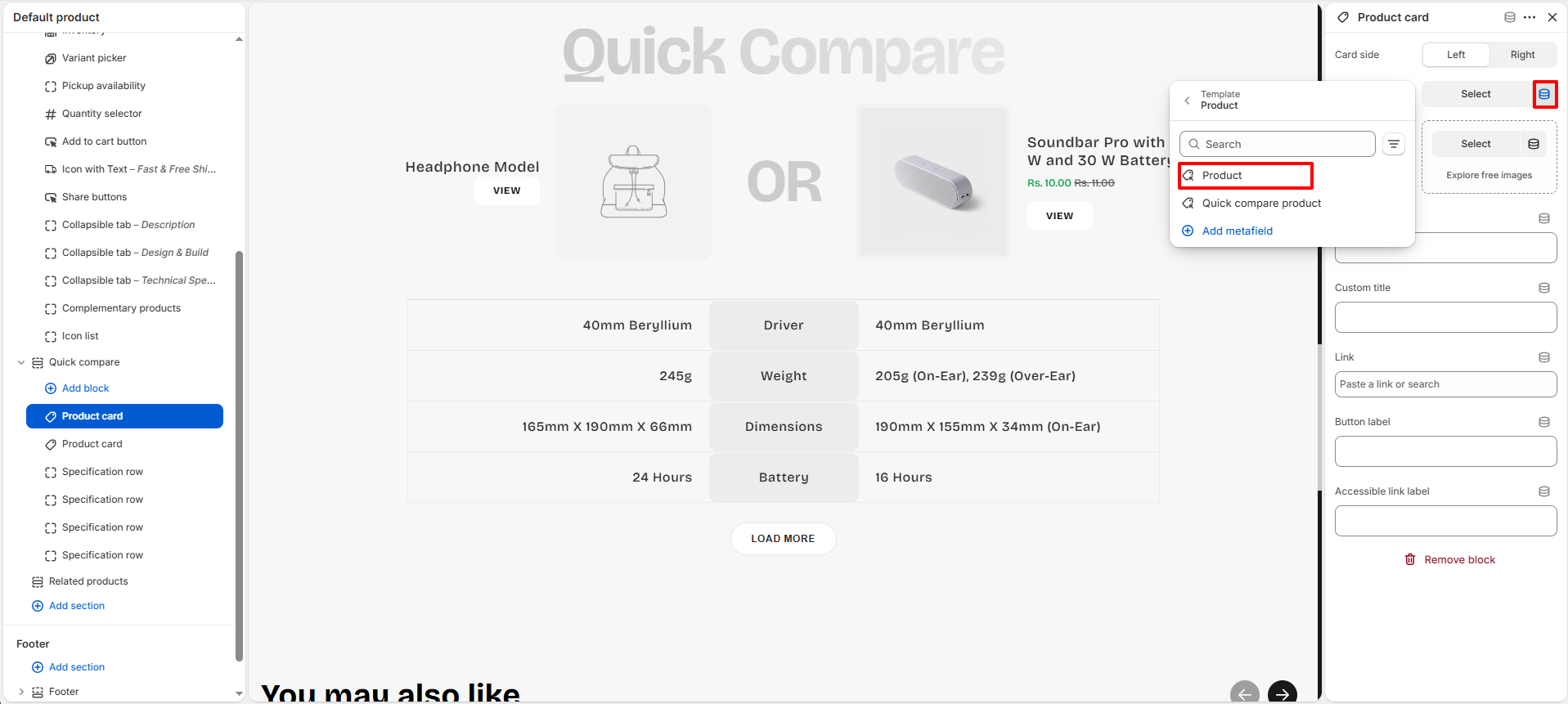
- Select the Product Card block from the Quick Compare section.
- Locate the Product Card setting.
- Click the Dynamic Source icon.
-
First Product card block assign Product metafield
-
Second Product card block assign Product metafield which we have created
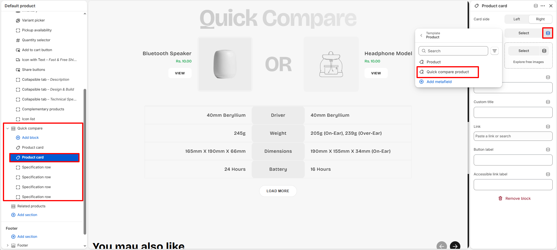
- Save the changes.
Important: The Quick Compare block must be connected to the Quick compare product metafield using a Dynamic Source. Otherwise, the comparison product selected on the product page will not be displayed on the storefront.
How It Works
Once the metafield is connected, the Quick Compare block automatically reads the product selected in the Quick compare product metafield and displays it as the comparison product on the storefront.
- No manual product selection is required inside the theme editor.
- Each product can have its own unique comparison product.
- Comparison products are managed directly from the Shopify product editor.
- Updating the metafield value automatically updates the Quick Compare section.
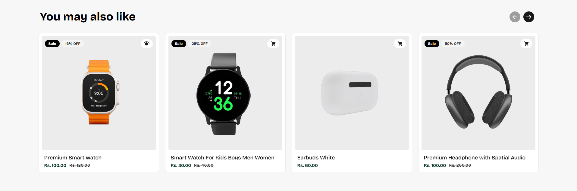
Related Products
The Related Products section helps customers discover additional products that may be relevant to their interests. By displaying recommended products directly on the product page, this section encourages further product exploration, improves product discovery, and can help increase average order value.
Related Products Section Settings
The Related Products section includes several customization options that allow you to control the appearance, layout, spacing, and product card display settings.
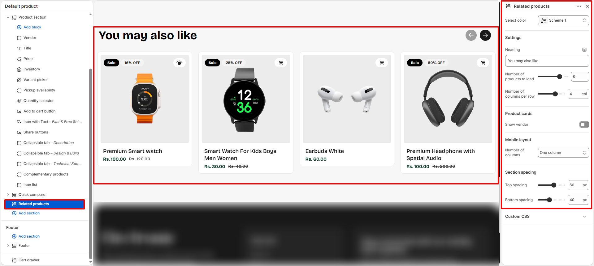
- Select Color: Choose the color scheme used for the Related Products section.
- Heading: Customize the heading displayed above the product recommendations.
- Number Of Products To Load: Control how many recommended products are displayed.
- Number Of Columns Per Row: Adjust the number of product cards displayed per row on desktop devices.
- Show Vendor: Enable or disable the product vendor name on the product cards.
-
Mobile Layout:
- One Column: Displays one product card per row on mobile devices.
- Two Columns: Displays two product cards per row on mobile devices.
-
Section Spacing:
- Top Spacing: Adjust the spacing above the section.
- Bottom Spacing: Adjust the spacing below the section.
Customize Related Product Recommendations
Follow the steps below if you would like to manually choose the products displayed in the Related Products section.
Step 1 — Open Shopify Search & Discover
- Go to: Shopify Admin → Apps
- Open the Shopify Search & Discover app.
- If the app is not installed, install it from the Shopify App Store.
Step 2 — Open Recommendations
- Inside the Search & Discover app, navigate to: Product Recommendations
- Select the product for which you want to customize recommendations.
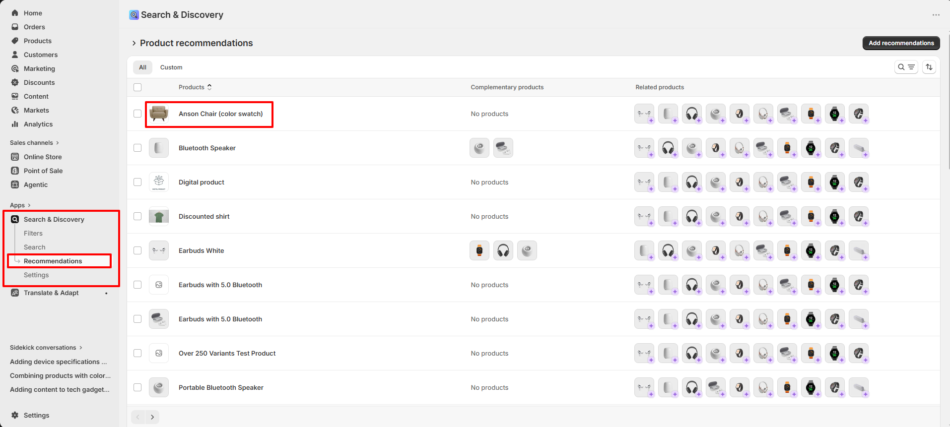
Step 3 — Customize Related Products
- In the Related Products area, click Browse.
- Select the products you want to recommend.
- Add or remove products as needed.
- Save your changes.
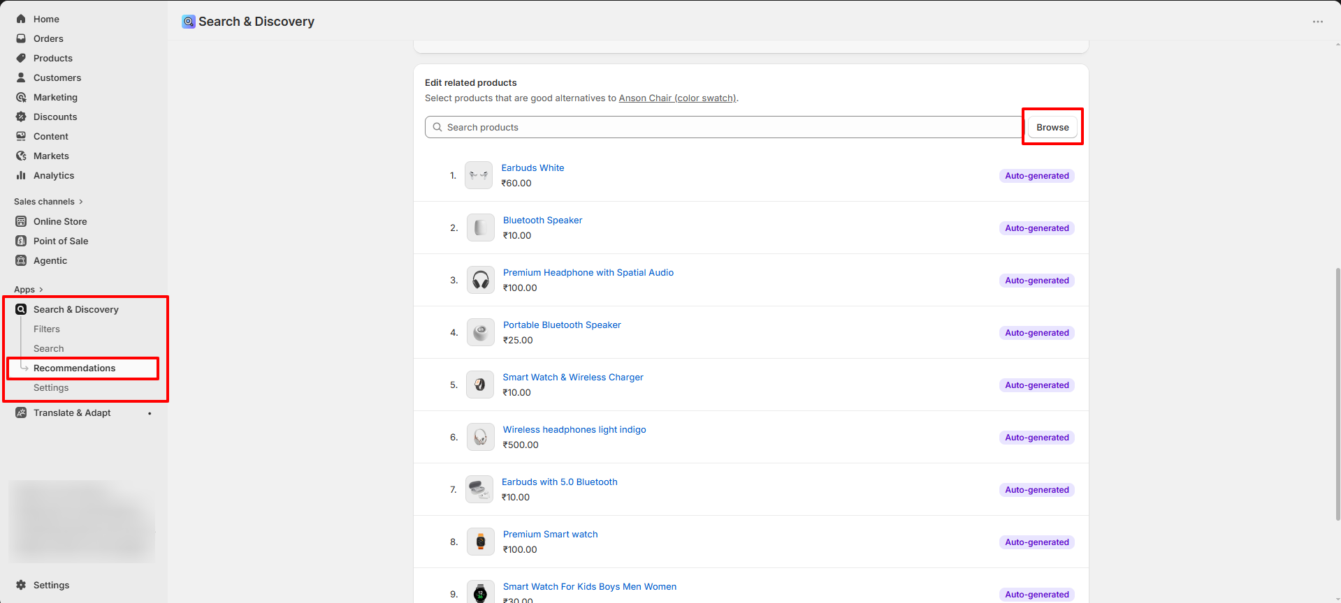
How It Works
The Related Products section automatically displays recommendations provided by Shopify Search & Discover.
- No manual setup is required for recommendations to appear.
- Shopify automatically generates product recommendations using store and product data.
- You can optionally replace the automatically generated recommendations by manually selecting products within the Search & Discover app.
- Any updates made in the Search & Discover app are automatically reflected on the storefront.
- Each product can have its own unique set of customized recommendations.