
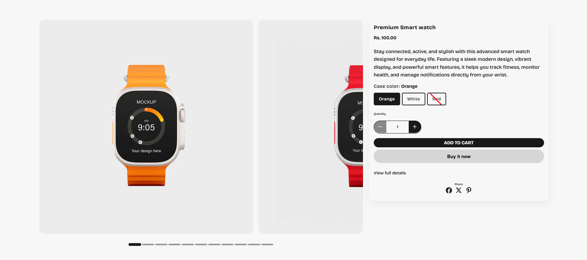
Featured Product
The Featured Product section allows you to highlight a single product in a clean and engaging layout. Customers can view product images, pricing, variants, quantity selector, and purchase buttons directly from the section, making it perfect for showcasing trending, featured, or best-selling products.
How to Edit the Featured Product
Follow these steps to customize and manage the Featured Product section in your Shopify theme.
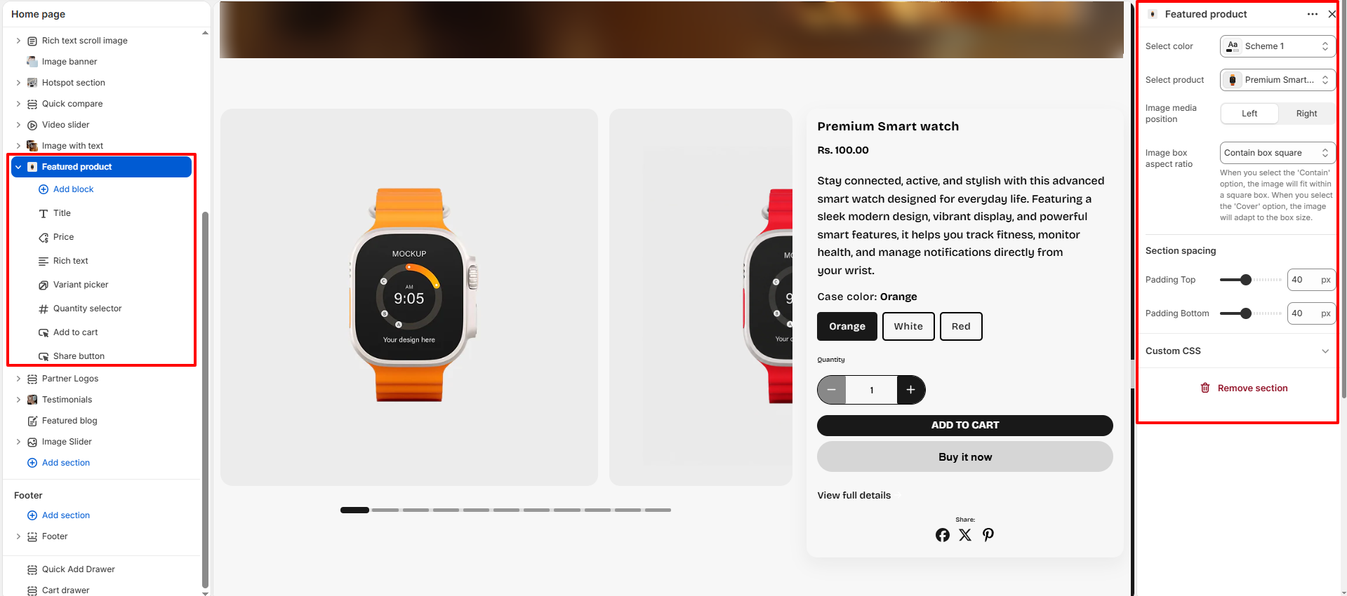
- Select Color: Choose a color scheme for the Featured Product section to match your store branding and overall design style.
- Select Product: Select the product you want to showcase in this section. The selected product will automatically display its images, details, variants, and purchase options.
-
Image Media Position: Control the placement of the product media within
the layout.
- Left: Displays product images on the left side and content on the right.
- Right: Displays product images on the right side and content on the left.
-
Image Box Aspect Ratio: Adjust the shape and display style of the product
image
container.
- Contain Box Square: Keeps the full image visible inside a square container.
- Cover: Fills the image area completely for a bold visual appearance.
- Adapt: Automatically adjusts according to the original image ratio.
-
Section Spacing: Customize the spacing around the section for better
layout balance.
- Padding Top: Controls the top spacing of the section.
- Padding Bottom: Controls the bottom spacing of the section.
- Custom CSS: Add custom CSS styles to personalize the design and appearance of the Featured Product section.
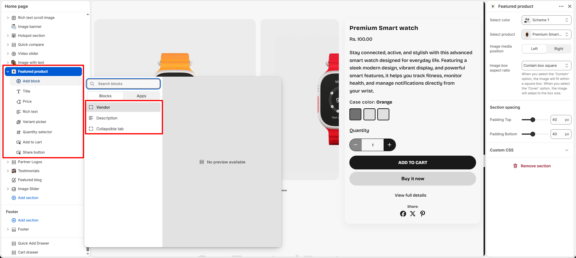
Available Product Blocks
The Featured Product section includes multiple customizable blocks that help you display product information in a structured and visually appealing way. You can add, remove, and rearrange blocks according to your store requirements.
- Title: Displays the product title prominently inside the section.
- Price: Shows the product price and automatically updates when variants are selected.
-
Richtext: Add and manage custom text content for the product section
using the rich
text editor.
- Richtext: Enter product descriptions, feature highlights, promotional content, or additional information to display inside the section.
-
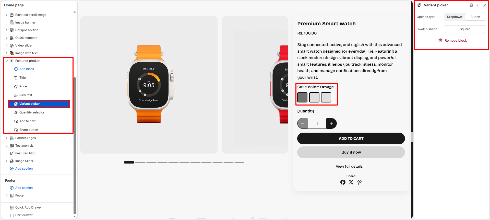
Variant Picker: Use this block to allow customers to select different
product
variants such as color, size, or style.
-
Options Type: Choose how the variant options are displayed to
customers.
- Dropdown: Displays variant options inside a compact dropdown menu.
- Button: Displays variant options as clickable buttons for a more interactive experience.
-
Swatch Shape: Select the shape of the variant swatches displayed
in the
section.
- Square: Displays square-shaped swatches.
For more details about swatches, click here.
Refer to Shopify's Color option with swatches documenattion for more.
Also, refer to the Adding color swatches using category metafields
-
Options Type: Choose how the variant options are displayed to
customers.
- Quantity Selector: Lets customers increase or decrease the quantity before adding the product to the cart.
-
Add to Cart: Use this block to display the Add to Cart button and
purchase options
for the featured product.
- Show Dynamic Checkout Button: Enable this option to display a dynamic checkout button such as "Buy it now" for faster purchasing and direct checkout functionality.
-
Share Button: Use this block to allow customers to share the featured
product on
social media platforms.
- Show Social Icons: Enable this option to display social sharing icons such as Facebook, Twitter, Pinterest, and more for better product visibility and engagement.
- Vendor: Displays the brand or vendor name associated with the product.
- Description: Displays detailed product information and specifications.
-
Collapsible Tab: Use this block to organize additional product
information inside
expandable tabs for a cleaner and more structured layout.
- Title: Enter the heading name for the collapsible tab section.
- Content: Add descriptions, product details, shipping information, FAQs, return policies, or any additional content using the rich text editor.
- Show Description: Enable this option to display the product description content inside the collapsible tab automatically.
- Keep Tab Open by Default: Enable this option to keep the collapsible tab expanded when the page loads.
-
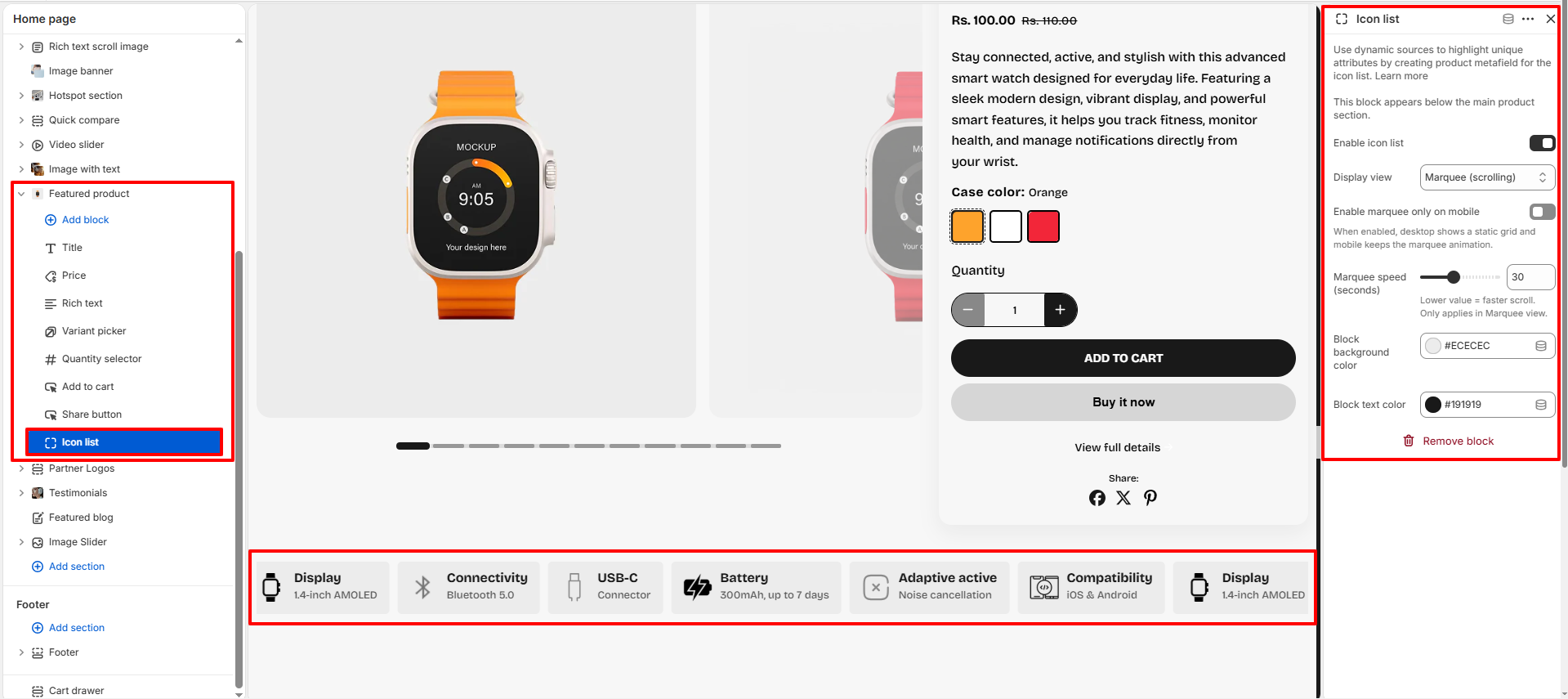
Icon List: Use this block to highlight important product features,
specifications, or benefits using icons and text. The Icon List block helps customers
quickly understand key product attributes in a visually engaging format.
- Enable Icon List: Enable or disable the icon list display for the featured product.
-
Display View: Choose how the icon list items are displayed.
- Grid: Displays icon list items in a static grid layout.
- Marquee (Scrolling): Continuously scrolls icon list items horizontally for a dynamic presentation.
- Enable Marquee Only on Mobile: When enabled, the scrolling marquee effect will only be shown on mobile devices, while desktop users will see a static grid layout.
- Marquee Speed: Adjust the scrolling speed of the marquee animation. Lower values result in faster scrolling.
- Block Background Color: Select the background color used for each icon list item.
- Block Text Color: Select the text color displayed inside the icon list items.
To learn how to create and manage Icon List content using product metafields, click here .
Pro Tips:
Use high-quality product images to create a strong visual impact.
Keep important product details above the Add to Cart button for better
conversions.
Use collapsible tabs to organize additional product information neatly.