
Video Slider
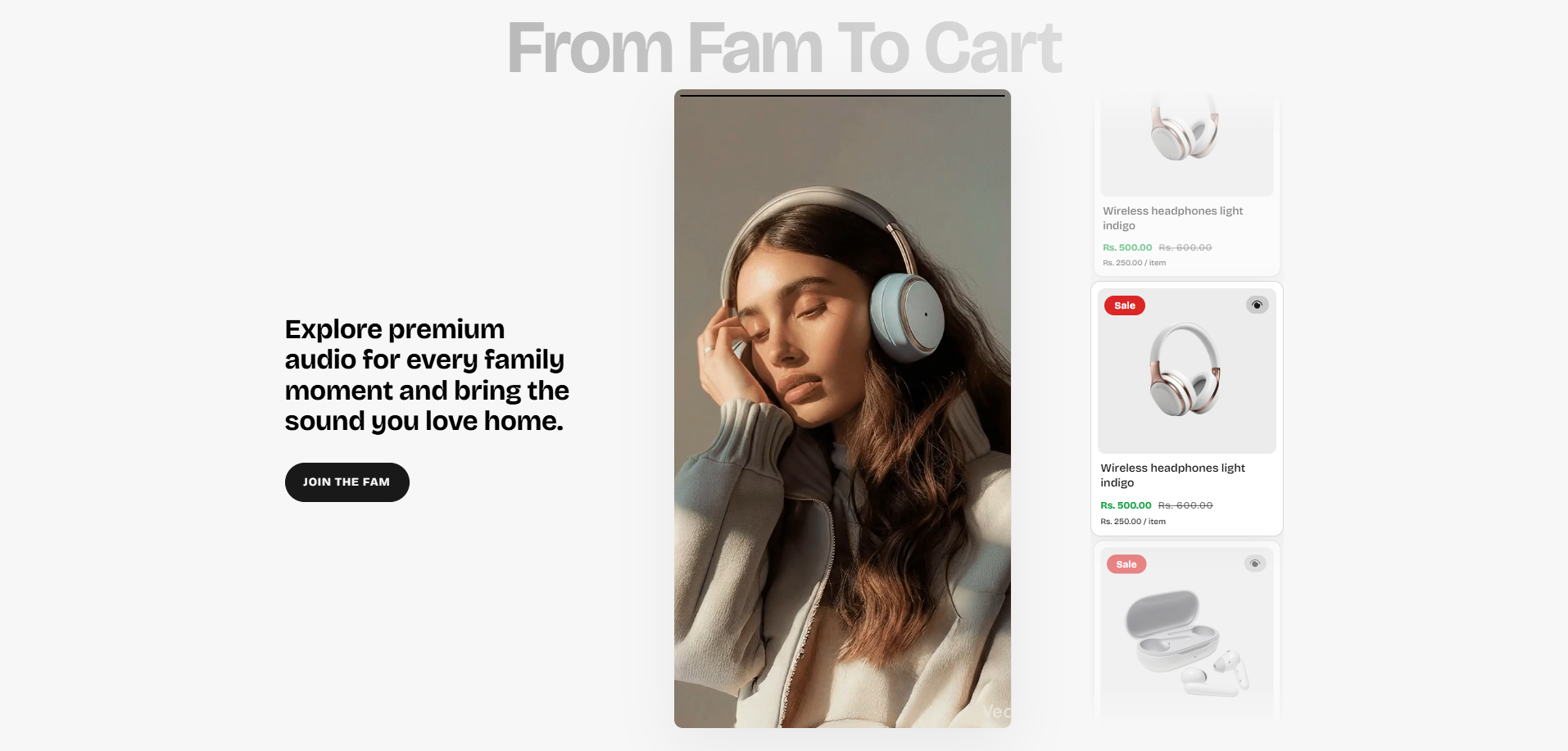
The Video Slider section allows merchants to showcase engaging video-based promotional content alongside featured product cards in a modern interactive layout. This section helps create immersive shopping experiences by combining autoplay videos, GIFs, promotional messaging, and product highlights in a visually dynamic slider interface.
The section is useful for promoting featured collections, storytelling campaigns, product launches, seasonal offers, and brand-focused media experiences. With customizable content settings, autoplay controls, responsive media layouts, product linking options, animation support, color customization, and accessibility settings, the Video Slider section helps improve customer engagement and supports stronger visual product discovery.
How to Add the Video Slider Section
- From your Shopify admin, go to Online Store → Themes.
- Click Customize on the Voltix theme.
- In the Theme Editor, click Add section.
- Select Video slider from the available sections.
- Configure the section settings such as heading content, media behavior, autoplay controls, slide duration, product card styling, colors, spacing, and responsive layout options.
- Add multiple Media slide blocks to showcase videos, GIFs, or image-based promotional slides.
- Click Save to publish your changes.
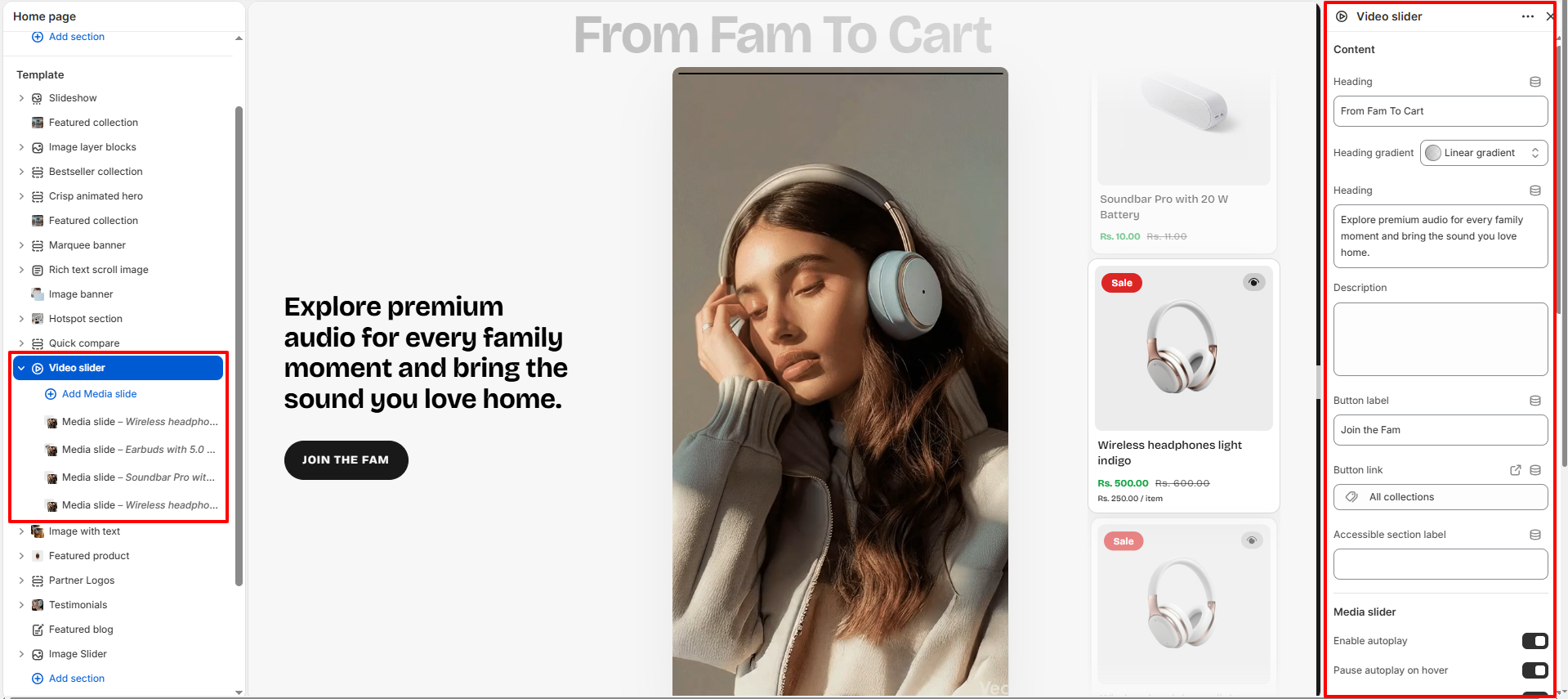
How To Configure The Video Slider Settings
The section settings allow you to control the overall appearance, slider behavior, typography styling, autoplay functionality, product card design, responsive media display, spacing, accessibility labels, and color customization for the Video Slider section.
- Heading: Configure the main section heading content.
- Heading Gradient: Apply gradient styling to the heading text.
- Heading: Add supporting promotional heading text.
- Description: Add descriptive content below the heading.
- Button Label: Customize the primary action button text.
- Button Link: Assign a destination URL for the button.
- Accessible Section Label: Add accessibility labels for screen readers.
- Enable Autoplay: Automatically rotate media slides.
- Pause Autoplay on Hover: Stop autoplay when users hover over the slider.
- Show Navigation Arrows: Display previous and next slider controls.
- Slide Transition Speed: Control the animation transition duration between slides.
- Default Slide Duration: Set the default timing used for image or GIF slides.
- Maximum Video Playback: Limit the maximum playback duration for videos.
- Media Corner Radius: Adjust rounded corners for media containers.
- Media Height Desktop: Configure media display height for desktop devices.
- Media Height Mobile: Adjust media height for mobile screens.
- Card Background: Customize the product card background color.
- Card Border: Set the border color for product cards.
- Card Media Background: Configure the media area background color.
- Card Text: Set the product title text color.
- Card Price: Customize the product price color.
- Card Badge Background: Configure the sale badge background color.
- Card Badge Text: Set the sale badge text color.
- Color Scheme: Select the overall section color scheme.
- Padding Top: Add spacing above the section.
- Padding Bottom: Add spacing below the section.
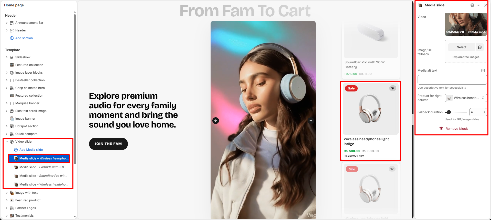
Media Slide Block Settings
Each Media Slide block allows you to configure individual video, image, or GIF slides used inside the slider layout. These blocks help merchants create engaging multimedia experiences with linked product recommendations and fallback media support.
- Video: Upload or select a Shopify-hosted video for the slide.
- Image/GIF Fallback: Add a fallback image or animated GIF used when video playback is unavailable.
- Media Alt Text: Add descriptive alt text for accessibility and SEO.
- Product for Right Column: Select the product displayed beside the media slide.
- Fallback Duration: Configure the display duration used for image or GIF slides.