
Image Slider
The Image Slider section allows merchants to create visually engaging promotional sliders using multiple images, text content, call-to-action buttons, and customizable layouts. This section is designed to showcase trending products, promotional campaigns, social media highlights, and featured collections in a modern and interactive format.
With flexible slide management, autoplay functionality, transition controls, spacing adjustments, responsive layouts, and customizable styling options, the Image Slider section helps improve customer engagement and enhances the overall storefront experience.

How to Add the Image Slider Section
- From your Shopify admin, go to Online Store → Themes.
- Click Customize on the Voltix theme.
- In the Theme Editor, click Add section.
- Select Image Slider from the available sections.
- Configure the section settings including text panel content, autoplay controls, transition speed, spacing, color scheme, and slider styling.
- Add multiple Slide blocks to display slider images.
- Click Save to publish your changes.
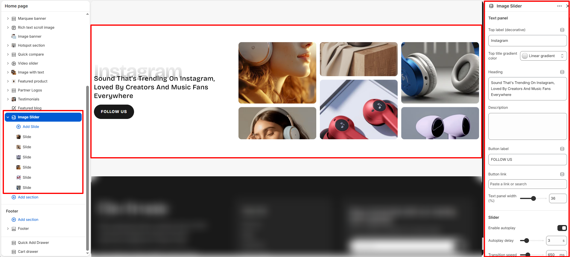
How To Configure The Image Slider Settings
The section settings allow you to control the overall layout structure, slider functionality, text content, autoplay behavior, spacing, responsiveness, and design appearance for the Image Slider section.
- Top Label (Decorative): Add a small decorative label displayed above the main heading.
- Top Title Gradient Color: Apply gradient styling to the top label text.
- Heading: Add the main heading text displayed beside the image slider.
- Description: Add optional supporting content below the heading.
- Button Label: Add custom text for the call-to-action button.
- Button Link: Assign a destination URL to the button.
- Text Panel Width: Control the width of the content area beside the slider.
- Enable Autoplay: Automatically rotate slider images.
- Autoplay Delay: Set the delay timing between slide transitions.
- Transition Speed: Adjust the animation speed during slide transitions.
- Pause On Hover: Pause autoplay functionality when the user hovers over the slider.
- Gap Between Slides: Control spacing between slider images.
- Slide Border Radius: Adjust the rounded corner styling for slider images.
- Color Scheme: Select the color scheme used for the section content and slider area.
- External Top Spacing: Add spacing above the section.
- External Bottom Spacing: Add spacing below the section.
- Padding Top: Control the internal top spacing of the section.
- Padding Bottom: Control the internal bottom spacing of the section.
- Accessible Section Label: Add accessibility labels for improved screen-reader support.
- Custom CSS: Add custom styling for advanced design customization.
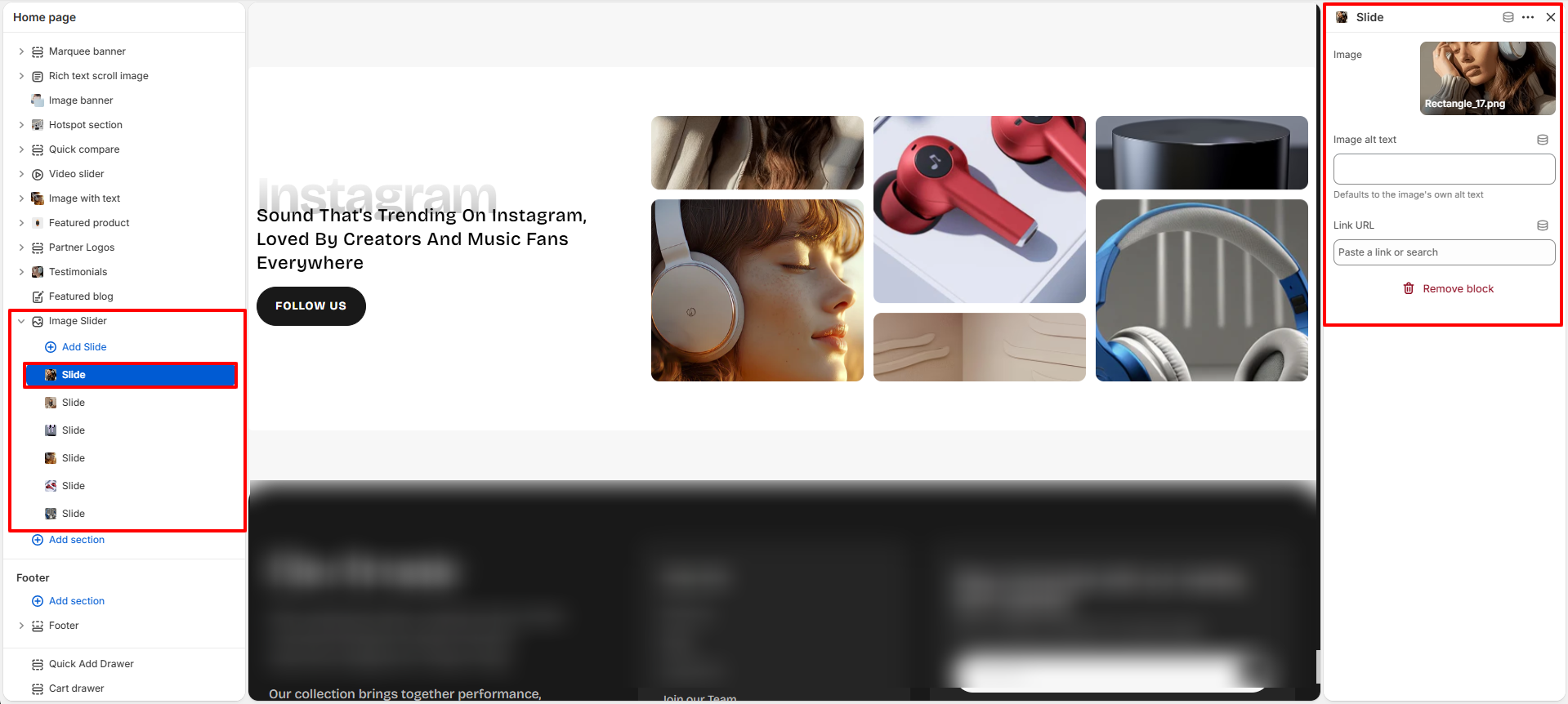
Slide Block Settings
The Slide block allows you to manage individual slider images displayed inside the Image Slider section.
- Image: Upload the image displayed inside the slider.
- Image Alt Text: Add descriptive alternative text for accessibility and SEO purposes.
- Link URL: Assign a clickable destination link for the slide image.