
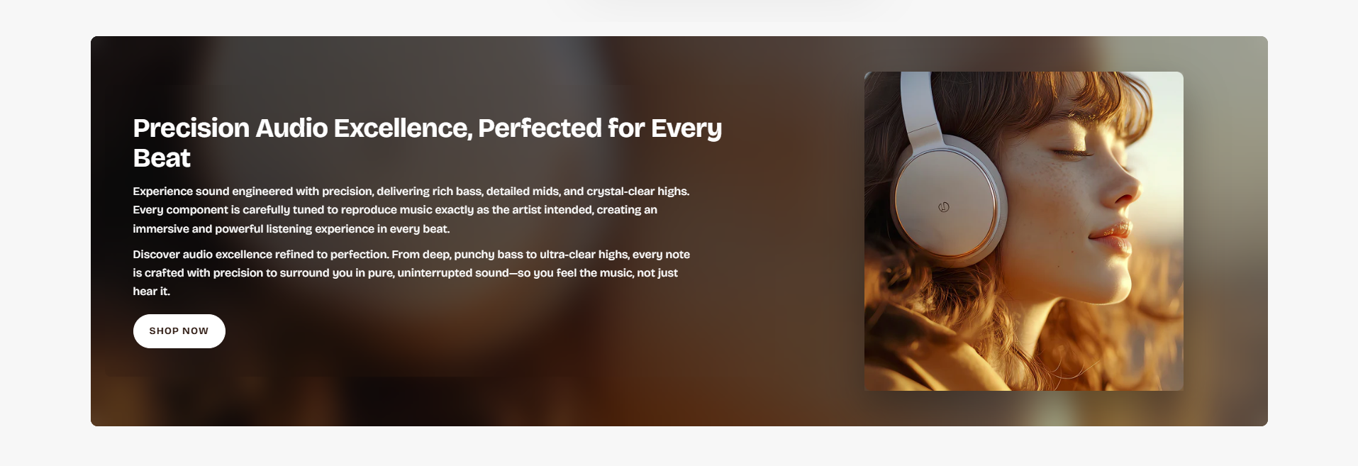
Image With Text
The Image With Text section allows merchants to combine engaging visuals with promotional content in a clean side-by-side layout. This section is ideal for showcasing featured collections, promotional campaigns, brand storytelling, lifestyle imagery, or product highlights with supporting text and call-to-action buttons.
With flexible layout controls, glass effects, responsive image settings, spacing customization, text styling options, and button configurations, the Image With Text section helps create visually appealing content areas that improve user engagement and guide customers toward important pages or products.
How to Add the Image With Text Section
- From your Shopify admin, go to Online Store → Themes.
- Click Customize on the Voltix theme.
- In the Theme Editor, click Add section.
- Select Image with text from the available sections.
- Configure the section settings including layout width, images, glass effects, spacing, typography, colors, and button settings.
- Add and customize the Text block content.
- Click Save to publish your changes.
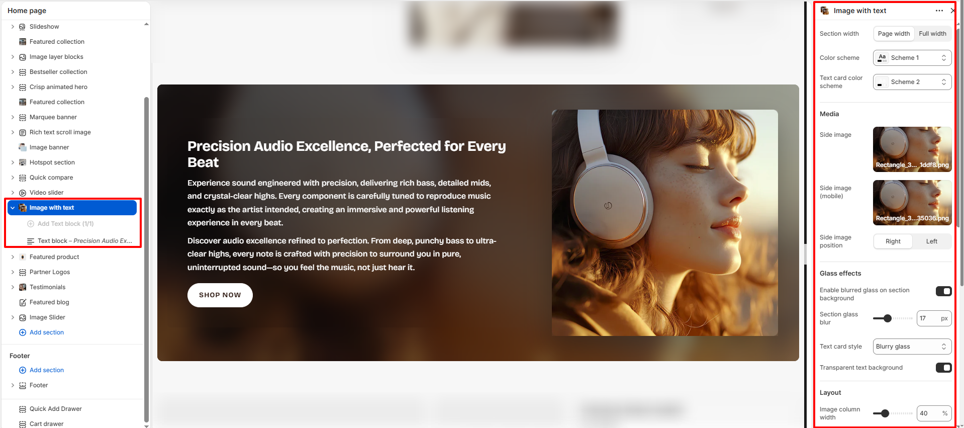
How To Configure The Image With Text Settings
The section settings allow you to control the overall layout, media positioning, glassmorphism effects, spacing, responsiveness, accessibility labels, colors, and content styling for the Image With Text section.
- Section Width: Choose whether the section displays in Page Width or Full Width layout.
- Color Scheme: Select the overall color scheme used for the section background and content.
- Text Card Color Scheme: Apply a separate color scheme specifically for the text content card.
- Side Image: Upload the desktop image displayed beside the content.
- Side Image (Mobile): Upload a mobile-optimized version of the image.
- Side Image Position: Choose whether the image appears on the left or right side.
- Enable Blurred Glass On Section Background: Adds a modern glass blur effect behind the section content.
- Section Glass Blur: Control the intensity of the blur effect.
- Text Card Style: Choose the visual appearance of the text container, such as Blurry Glass.
- Transparent Text Background: Enable transparent styling behind the text card.
- Image Column Width: Adjust the width ratio of the image column.
- Text Card Padding: Control the internal spacing inside the text content area.
- Internal Padding Top: Adjust the top spacing inside the section.
- Internal Padding Bottom: Adjust the bottom spacing inside the section.
- Section Corner Radius: Configure rounded corners for the section container.
- Side Image Corner Radius: Set rounded corners for the side image.
- Minimum Height (Desktop): Define the minimum section height for desktop devices.
- Minimum Height (Tablet): Configure the minimum section height for tablet devices.
- Minimum Height (Mobile): Adjust the minimum section height for mobile devices.
- Accessibility Label: Add optional labels to improve screen-reader accessibility.
- Padding Top: Add spacing above the section.
- Padding Bottom: Add spacing below the section.
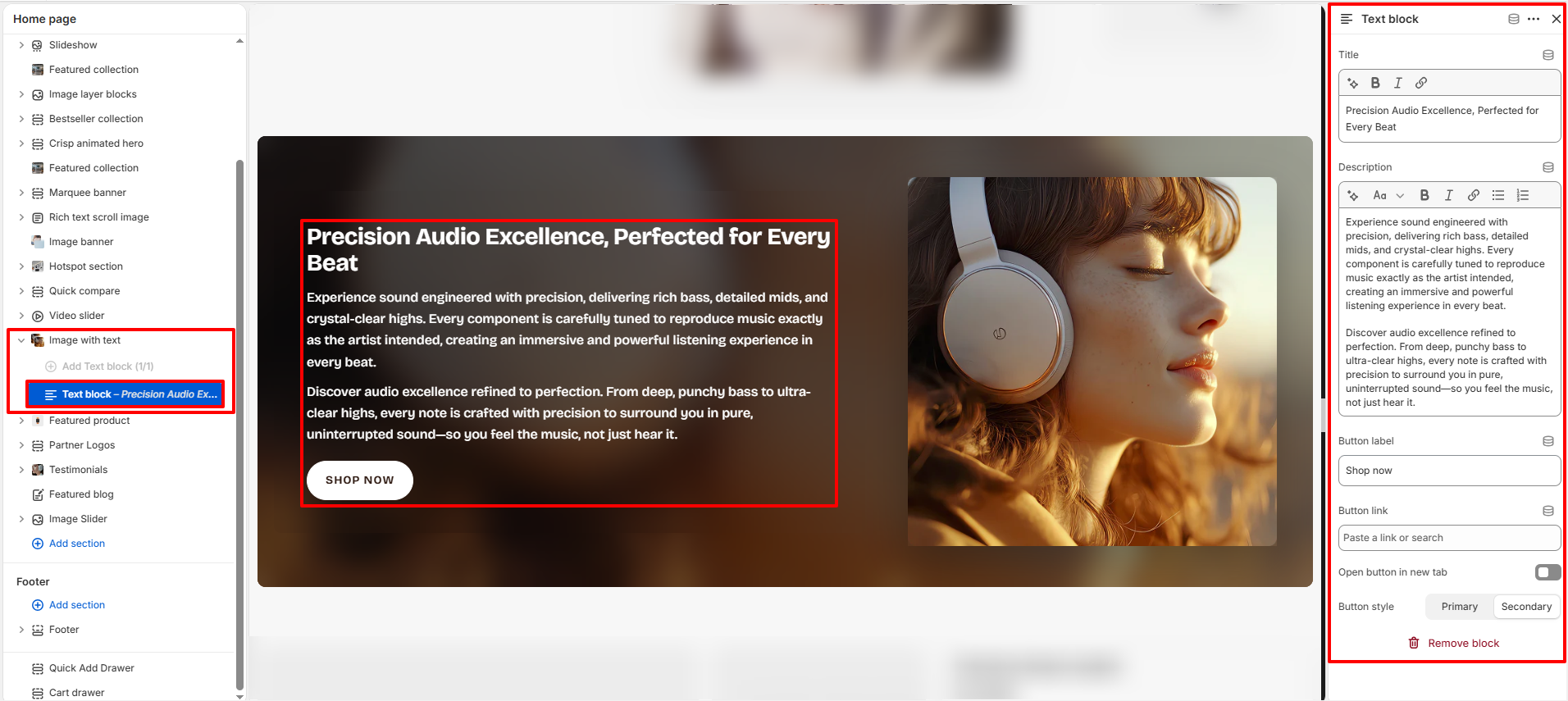
Text Block Settings
The Text Block allows you to manage the content displayed inside the Image With Text section, including headings, descriptions, and action buttons.
- Title: Add the main heading displayed inside the section.
- Description: Add supporting descriptive content below the title.
- Button Label: Customize the call-to-action button text.
- Button Link: Assign the destination URL for the button.
- Open Button In New Tab: Enable this option to open the button link in a separate browser tab.
- Button Style: Choose between Primary and Secondary button styles.