
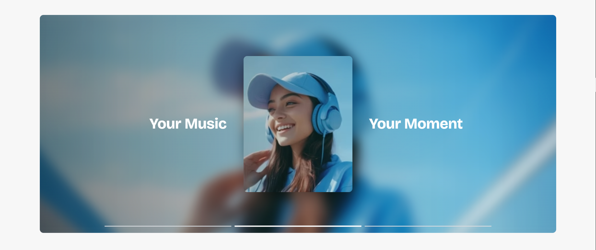
Marquee Banner
The Marquee Banner section is designed to create an immersive and modern promotional slider experience with animated transitions, layered imagery, and bold typography. This section helps merchants highlight featured products, promotional campaigns, lifestyle imagery, and branded storytelling in a visually engaging format.
With flexible customization options for autoplay, slide animation timing, responsive layouts, typography, overlay styling, spacing, navigation controls, and image presentation, the Marquee Banner section allows you to create premium storefront experiences that capture customer attention across all devices.
How to Add the Marquee Banner Section
- From your Shopify admin, go to Online Store → Themes.
- Click Customize on the Voltix theme.
- In the Theme Editor, click Add section.
- Select Marquee banner from the available sections.
- Configure the section settings such as autoplay behavior, transition speed, image layout, typography styling, spacing, and overlay appearance.
- Add multiple Slide blocks to display different promotional banners and product highlights.
- Click Save to publish your changes.
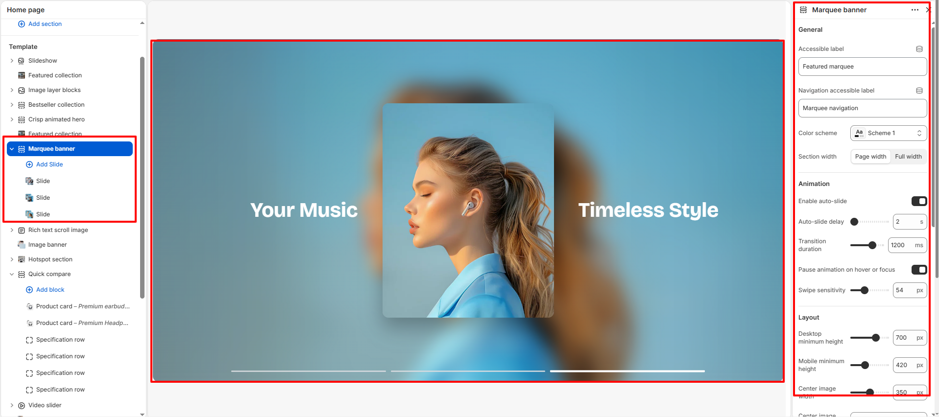
How To Configure The Marquee Banner Settings
The section settings allow you to control the overall layout, animation behavior, image presentation, typography styling, spacing, accessibility, and navigation experience for the Marquee Banner section.
- Accessible Label: Add accessibility text for screen readers.
- Navigation Accessible Label: Define accessibility text for the navigation controls.
- Color Scheme: Select a predefined color scheme for the section.
- Section Width: Choose between page width or full width layout.
- Enable Auto-slide: Automatically rotate slides within the banner.
- Auto-slide Delay: Set the duration between automatic slide transitions.
- Transition Duration: Control the speed of slide transition animations.
- Pause Animation on Hover or Focus: Pause autoplay when users hover over or focus on the section.
- Swipe Sensitivity: Adjust swipe responsiveness for touch devices.
- Desktop Minimum Height: Control the minimum section height on desktop devices.
- Mobile Minimum Height: Adjust the banner height for mobile screens.
- Center Image Width: Set the width of the featured center image.
- Center Image Ratio: Choose the image aspect ratio style.
- Image Corner Radius: Control the roundness of the center image corners.
- Section Corner Radius: Adjust the rounded corners of the entire banner section.
- Desktop Text Size: Set the text size for desktop screens.
- Mobile Text Size: Control text sizing on mobile devices.
- Text Color: Choose the text color used inside the banner.
- Navigation Bar Color: Customize the color of the slide navigation bars.
- Active Navigation Color: Set the active state color for navigation indicators.
- Overlay Opacity: Add a dark overlay effect over background images.
- Top Padding: Add internal spacing above the section.
- Bottom Padding: Add internal spacing below the section.
- Custom CSS: Add custom styling for advanced design customization.
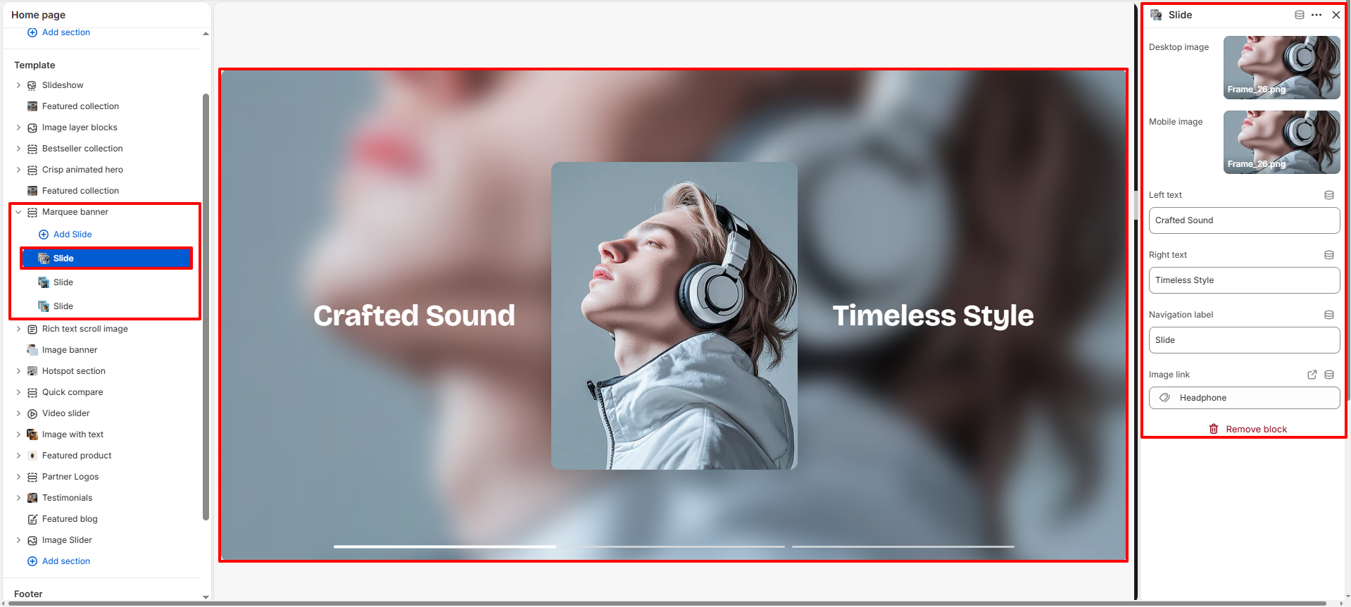
Slide Block Settings
Each Slide block allows you to create individual promotional banners with customizable images, text content, navigation labels, and destination links.
- Desktop Image: Upload the main banner image for desktop devices.
- Mobile Image: Upload a responsive image optimized for mobile screens.
- Left Text: Add promotional text displayed on the left side of the banner.
- Right Text: Add promotional text displayed on the right side of the banner.
- Navigation Label: Customize the label used for slide navigation indicators.
- Image Link: Assign a destination link for the slide image or banner.