
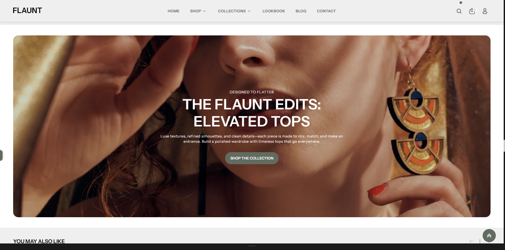
Image Banner
The Image Banner section allows you to add customizable text content anywhere in your store. It’s perfect for highlighting messages, sharing brand stories, adding announcements, or providing important information in a clean and readable format. With flexible formatting options, you can easily adjust headings, paragraphs, and links to match your design and communicate clearly with customers.
How to Add the Image Banner
- From your Shopify admin, go to Online Store → Themes.
- Click Customize on the Flaunt theme.
- In the Theme Editor, use the drop-down selector to choose the page where you want to add or edit the Image Banner section.
- Click Add Section (or select an existing Image Banner if already added).
- Click Save to apply your changes.
How to Edit the Image Banner
Here are the steps to configure the available settings for the Image Banner in your Flaunt Shopify theme:
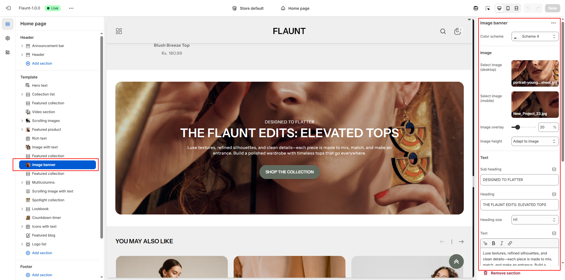
- Color Scheme: Choose a color scheme (e.g., Scheme 4) to define the banner’s background, text color, and overall visual tone.
-
Select Image (Desktop):
- Click Upload images to add the main banner image for desktop screens.
- This image will be displayed for larger devices to maintain high-quality visuals.
-
Select Image (Mobile):
- Upload a mobile-optimized image that appears on smaller screens.
- Ensures the banner looks clean and well-cropped on mobile devices.
- Image Overlay: Adjust the overlay level (0–100) to darken or tint the image, improving text readability.
-
Image Height: Choose how tall the banner should appear.
- Adapt to image: Uses the natural height of the uploaded image.
- One-third / Half / Two-thirds of screen: Sets the banner height relative to the user's screen.
- Full screen: Fills the entire height of the browser viewport like a hero section.
- Subheading: Add a short introductory line that appears above the main heading.
- Heading: Enter the primary title to create a strong visual impact.
-
Heading Size: Select the heading style.
- H1: Large and bold, ideal for hero banners.
- H2/H3: (If available) Smaller options for subtle layouts.
- Text: Add descriptive content to explain the promotion, collection, or message showcased in the banner.
- Button Label: Enter the text for the call-to-action button (e.g., “Shop the Collection”).
- Button Link: Choose the destination page or collection. Optionally enable the setting to open the link in a new tab.
- Content Max Width: Set the maximum width of the text block to keep the banner clean and readable.
-
Content Position: Select where the text block should appear
within the banner.
- Top / Middle / Bottom: Adjusts vertical placement.
- Left / Center / Right: Controls horizontal placement.
- Middle Center: Centers the content both vertically and horizontally.
-
Text Alignment: Choose how the text inside the content block
should align.
- Left: Traditional, clean layout.
- Center: Balanced and eye-catching.
- Right: Modern, stylized alignment.
Pro Tips:
Keep your text short and impactful for maximum engagement.
Use high-quality, optimized images to ensure fast load times.
Pair your banner with a strong call-to-action button to drive clicks.