
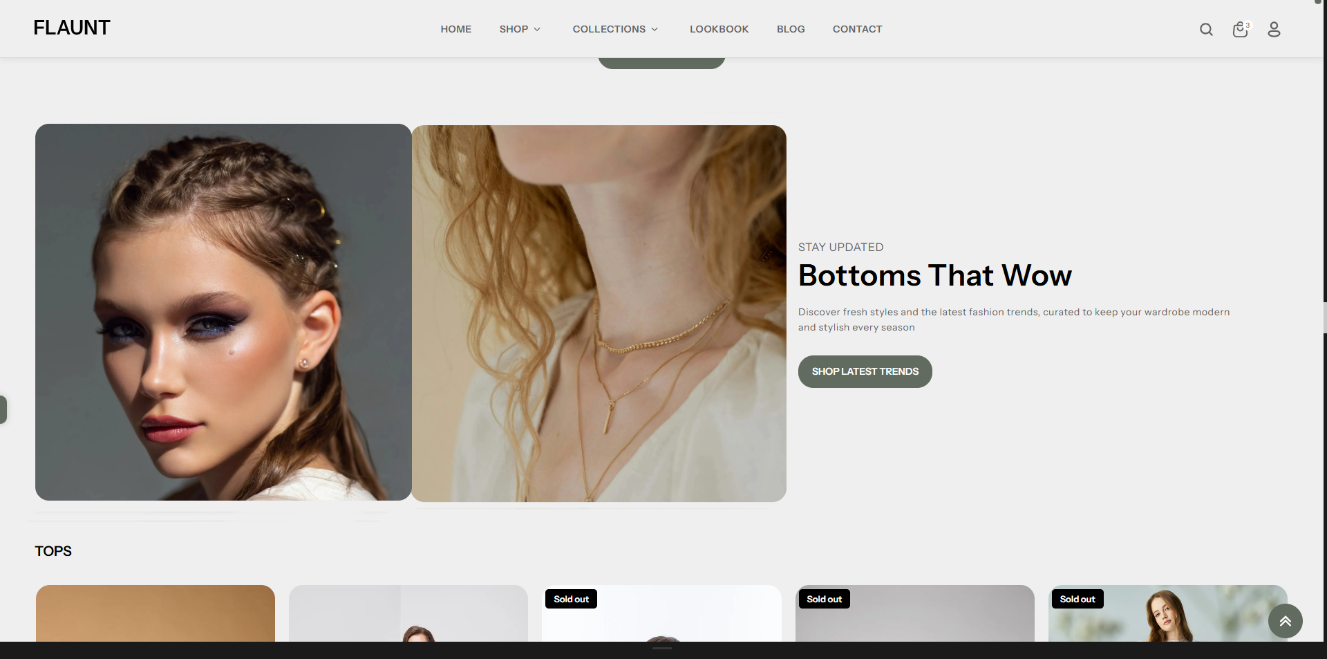
Image With Text
The Image with Text section allows you to showcase two images alongside customizable text and a call-to-action button. It’s perfect for highlighting products, collections, or brand moments in a visually engaging layout. With flexible text placement and dual-image support, this section helps you create impactful promotions that stand out on any page.
How to Add the Image With Text
- From your Shopify admin, go to Online Store → Themes.
- Click Customize on the Flaunt theme.
- In the Theme Editor, use the drop-down selector to choose the page where you want to add or edit the Image With Text section.
- Click Add Section (or select an existing Image With Text if already added).
- Click Save to apply your changes.
How to Edit the Image With Text
Here are the steps to configure the available settings for the Image With Text in your Flaunt Shopify theme:
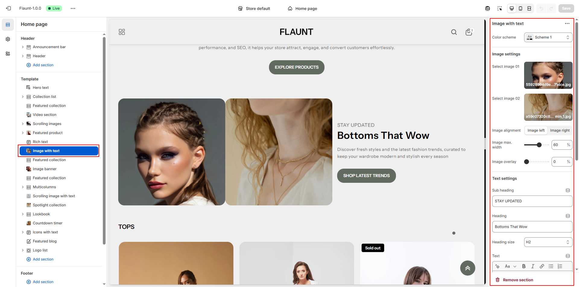
- Color Scheme: Choose a color scheme (e.g., Scheme 1) to define the background, text, and accent colors used in the section.
-
Select Image 01:
- Click Upload images to upload the first image.
- This image appears on the selected side based on your alignment setting.
-
Select Image 02:
- Upload a second image to enhance the visual layout.
- Both images work together to highlight products, collections, or brand visuals.
-
Image Alignment: Choose whether the images appear on the left or right
side of the text.
- Image Left: Images appear on the left side, text on the right.
- Image Right: Images appear on the right side, text on the left.
- Image Max Width: Set the maximum width of the images. Increasing the value makes images appear more prominent.
- Image Overlay: Adjust the overlay level to apply a color tint over the images. A higher value increases the overlay intensity.
- Subheading: Add a short descriptive line above the main heading to introduce the content theme.
- Heading: Enter the primary title for the section to capture customer attention.
-
Heading Size: Choose the size of the heading text.
- H1: Largest, most prominent title style.
- H2: Medium size, suitable for most layouts.
- H3: (If available) Smaller, subtle heading style.
- Text: Add descriptive content such as product details, brand information, or promotional messaging.
- Button Label: Enter the text for the button (e.g., “Shop Latest Trends”).
- Button Link: Choose the destination page or collection. Optionally enable “Open link in a new tab.”
-
Text Horizontal Position: Control how the text appears horizontally.
- Left: Aligns text toward the left edge.
- Center: Centers the text block.
- Right: Aligns text toward the right side.
-
Text Vertical Position: Choose where the text is placed vertically
within the section.
- Top: Places text at the top.
- Center: Centers text for a balanced layout.
- Bottom: Positions text at the bottom.
-
Text Alignment: Choose how the paragraph and heading text should align
within the text block.
- Left: Standard left-aligned content.
- Center: Creates a visually centered layout.
- Right: Right-aligns text for a modern design style.