
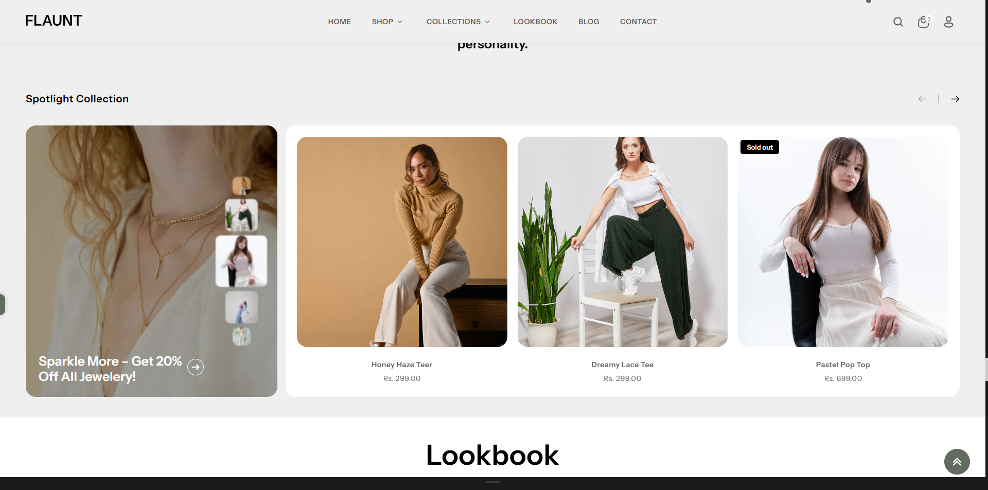
Spotlight Collection
The Spotlight Collection section highlights products from a specific collection in a clean and engaging layout. It’s perfect for showcasing best-sellers, new arrivals, or themed collections, helping customers quickly explore featured items and boosting product visibility across your store.
How to Add the Spotlight Collection Section
The Spotlight Collection section allows you to feature specific collections on your homepage or other pages, helping customers explore categories quickly and easily. Follow the steps below to edit and customize it:
- From your Shopify admin, go to Online Store → Themes.
- Click Customize on the Flaunt theme.
- In the Theme Editor, use the drop-down selector to choose the page where you want to add or edit the Spotlight Collection section.
- Click Add Section (or select an existing Spotlight Collection section if already added).
- Click Save to apply your changes.
How To Edit the Spotlight Collection section
Here are the steps to configure the options mentioned for the Spotlight Collection section in your Flaunt Shopify theme:
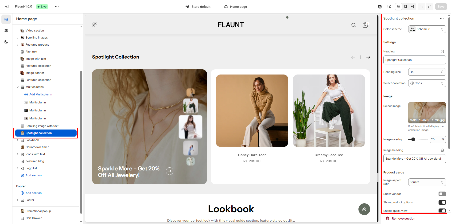
- Color Scheme: Choose a color scheme (e.g., Scheme 4) to define the banner’s background, text color, and overall visual tone.
- Heading: Enter a bold title for the section (e.g., “Spotlight Collection”) to introduce the featured products.
- Heading Size: Choose the size of your heading (e.g., H5) depending on how prominent you want the title to appear.
- Select Collection: Choose the specific collection whose products you want to highlight (e.g., Tops).
-
Select Image:
- Upload a custom image for the spotlight banner.
- If left blank, the default image from the selected collection will be displayed.
- Image Overlay: Adjust the overlay intensity to enhance text visibility over the image.
- Image Heading: Add a promotional or descriptive line that appears over the image (e.g., “Sparkle More – Get 20% Off All Jewellery!”).
-
Product Cards – Image Aspect Ratio: Select how product images
should appear.
- Square: Ensures all product images appear in a uniform 1:1 ratio.
- Portrait: Displays taller images suitable for vertical visuals.
- Landscape: Shows wider images for a panoramic or horizontal look.
- Adapt to Image: Keeps the original proportions of each uploaded image.
- Show Vendor: Enable this option if you want to display the vendor or brand name on each product card.
- Show Product Options: Toggle to display variant options like size, color, etc., directly in the product cards.
- Enable Quick View: Allow customers to preview product details in a popup without leaving the page.
-
Mobile Layout – Number of Columns: Choose how products should
display on mobile.
- One Column: Displays products in a single column for easy scrolling.
- Two Columns: Shows products side-by-side for a compact grid layout.