
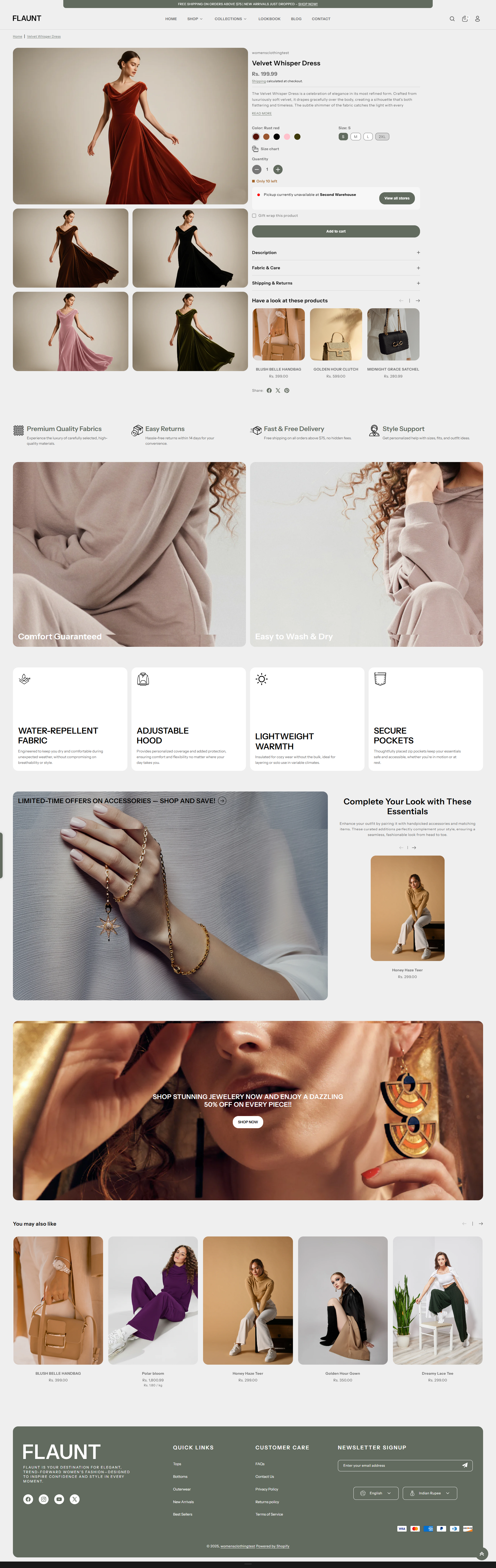
Product Page
The Product Page in the Flaunt theme showcases detailed product information with a clean, customizable layout. It highlights images, descriptions, pricing, variants, and other key details, providing a seamless shopping experience for customers.
What Makes Flaunt’s Product Page Stand Out?
-
Flexible Media Layouts: Choose from multiple media layouts like
thumbnails on the
left, right, or bottom.
- Option to use a stacked or slider layout.
- Rich Product Media Support: Showcase your items with images, videos, and even 3D models.
-
Built-In Conversion Boosters:
- Sticky Add to Cart bar (optional)
- Dynamic Checkout Button (Buy it Now) for faster purchases
- Stock Indicators to create urgency
- Trust badges and estimated delivery messages for reassurance
- Interactive Features: Image lightbox, variant swatches (color, size), and quantity pickers for an intuitive experience.
- Pickup Availability: Display pickup options on the product page to inform customers of local availability.
Customize Your Product Page
On the Product Page, you can configure how your product details are displayed, helping customers engage with your items and make purchases easily. Make sure the products are published on your online store before adjusting these settings.
- From your Shopify admin, go to Online Store → Themes.
- Click Customize on the Flaunt theme.
- In the Theme Editor, use the drop-down page selector and choose Products → Default product.
- Adjust media layouts, product details, conversion boosters, badges, pickup options, and interactive features as desired.
- Click Save to apply your changes.
Settings Provided To Edit the Product Page
Review the provided information about media types to understand your options. Learn more about media types.
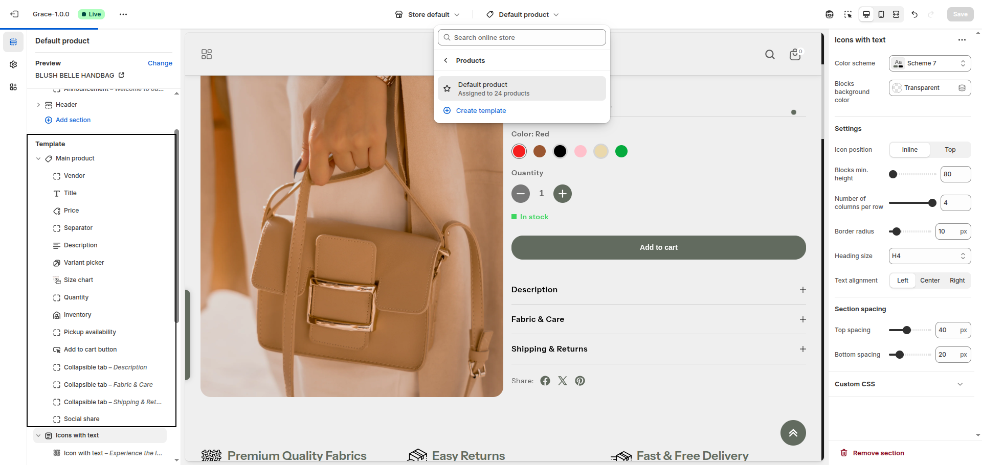
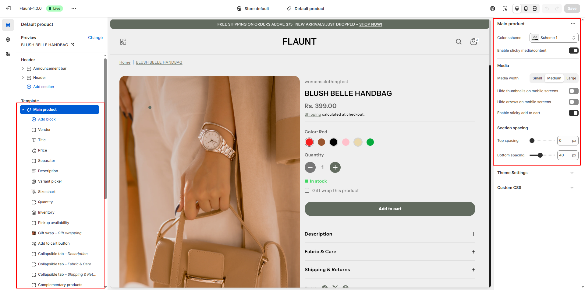
- Color Scheme: Select a scheme to control the background, text, and accent colors of the product page. Example: Scheme 1. This helps maintain a consistent look and feel across your store.
- Enable Sticky Media/Content: Toggle this option to keep product images or content visible while scrolling down the page. Useful for keeping key information in view while customers explore details.
-
Media Width: Adjust the width of your product images to best fit your
page layout.
- Small – Compact display, good for minimalist layouts.
- Medium – Balanced size for most themes.
- Large – Prominent images, ideal for visual-heavy products.
-
Media Layout: Choose how your product media is displayed to enhance
customer browsing
experience.
- Slider – Scroll through multiple images in a carousel.
- Stack – Display images vertically or in a single column.
- Hide Thumbnails on Mobile Screens: Toggle to remove image thumbnails on smaller devices, creating a cleaner mobile layout.
- Hide Arrows on Mobile Screens: Toggle to hide slider navigation arrows on mobile devices, reducing clutter.
- Enable Sticky Add to Cart: Keep the Add to Cart button visible as users scroll, making it easier for them to purchase without having to scroll back up.
Product Information Blocks:
In the Flaunt theme, Blog Content Blocks help you showcase articles, updates, or stories in a visually engaging way. You can add text, images, videos, and links to highlight key information, making your blog easy to navigate and appealing to readers. These blocks allow you to structure content flexibly, keeping your posts organized and enhancing the overall reading experience.
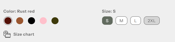
- Vendor: Use this block to display the vendor or brand name of the product.
- Title: Use this block to show the product title prominently.
- Price: Use this block to display the product price. This updates dynamically with variant selection.
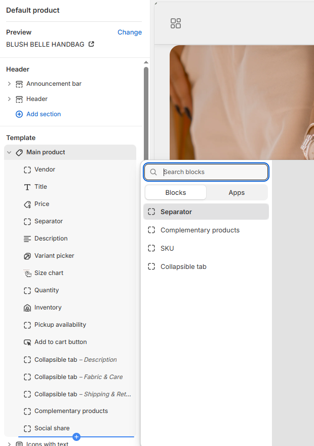
- Separator: Add spacing between different product information blocks for better readability.
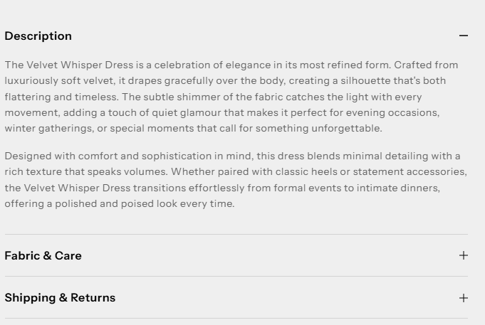
- Description: Show the product description. You can set the number of lines to display to keep the section concise.
- Variant Picker: Use this block to let customers select different product
options
like size, color, or material.
- Options Layout: Choose how variant options appear.
- Inline: Display options in a horizontal row.
- Stack: Display options vertically for better visibility on mobile or long lists.
- Variant Picker Type: Choose the input style for variants.
- Button: Display variants as clickable buttons. Supports showing variant images instead of colors.
- Dropdown: Display variants in a dropdown menu for compact layouts.
- Show Variant Image Instead of Color: Toggle this option when using the Button type to display the actual product image for each variant, giving customers a visual reference.
- Options Layout: Choose how variant options appear.
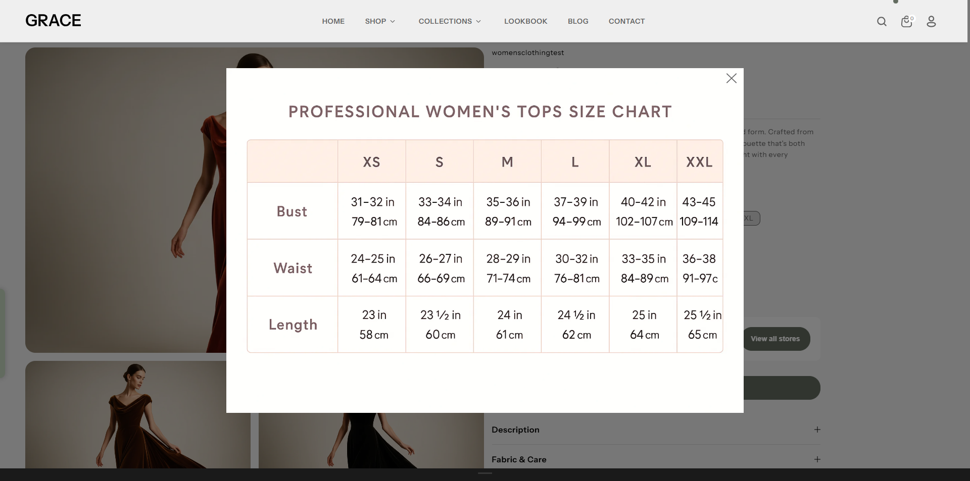
- Size Chart: Use this block to display a size chart for your product,
helping
customers choose the correct size.
- Title: Enter a title for the size chart (default: "Size Chart").
- Select Icon: Upload an icon to visually represent the size chart toggle.
- Select Desktop Image: Upload the desktop version of the size chart image.
- Select Mobile Image: Upload the mobile version of the size chart image.
- OR Select Page: Link to a dedicated page for the size chart if you prefer not to upload images.
- Link to a Product Option: Select the product option (e.g., "Size") that this chart corresponds to. The chart will only appear if this option exists. If left blank, it will always be visible. (Case-sensitive)
- Quantity: Use this block to show the quantity selector on the product page, allowing customers to choose the number of items to purchase.
- Inventory: Use this block to display stock levels and create urgency.
- In Stock Color: Color indicator for items available in stock (default: #3ED660).
- Threshold Color: Color indicator for low-stock items (default: #EE9441).
- Out of Stock Color: Color indicator for items out of stock (default: #FF8888).
- Inventory Threshold: Set the quantity at which the threshold color appears to alert customers of limited stock.
- Pickup Availability: Display local pickup options on the product page to let customers know if the product is available for in-store pickup.
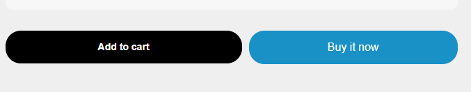
- Add to Cart Button: Use this block to display the Add to Cart button.
- Show Dynamic Payment Button: Enable to show quick purchase options like Apple Pay or Google Pay.
- Show Recipient Information Form for Gift Cards: Allow buyers to schedule gift card delivery with a personalized message.
- Collapsible Tab: Use this block to organize product information into
expandable
sections, making the product page cleaner and easier to navigate.
The Collapsible Content block in product page lets you organize additional information into
an
accordion-style layout.
This keeps your product pages clean and user-friendly while allowing customers to expand and
view more
details as needed.
- Title: Enter the heading for the tab (e.g., “Shipping Information”, “Care Instructions”).
- Description: Add a short description or summary for the tab content.
- Content: Enter the full details that will appear inside the collapsible tab when expanded. This may include text, lists, or other product details.
- Complementary:The Complementary Products block in Flaunt lets you showcase
related
or recommended items directly on the product page.
- Title: Enter the heading for the tab (e.g., “Shipping Information”, “Care Instructions”).
- Description: Add a short description or summary for the tab content.
- Content: Enter the full details that will appear inside the collapsible tab when expanded. This may include text, lists, or other product details.
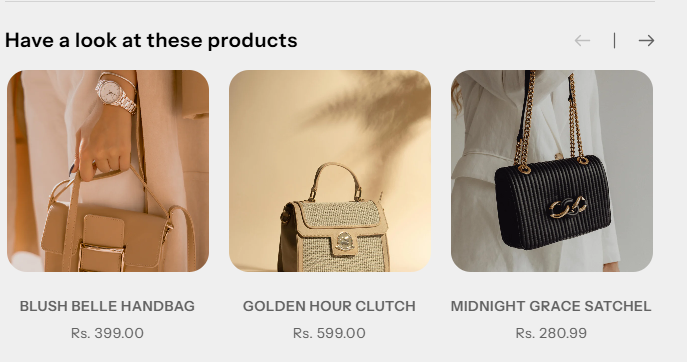
This is an excellent way to increase your average order value by suggesting add-ons,
frequently
bought together items, or matching accessories.
Shopify’s Search & Discovery app to let you assign these complementary products
easily.
Product Siblings Feature
In the Flaunt theme, the Product Siblings feature lets you connect related products such as different colors, styles, or variations and display them directly on the product page. These linked products appear as swatches, allowing customers to quickly switch between options without leaving the page. Swatches can be shown as colors or product images, and their shape can be customized from the theme settings for a clean and modern shopping experience.
How to Set Up Product Siblings
- From your Shopify admin, go to Content → Metaobjects.
- Click Add definition and create a new metaobject named Product siblings.
-
Add the following fields:
- Product: Type – Product (Single value)
- Color name: Type – Single line text
- Color value: Type – Color
- Next, go to Settings → Custom data → Products and create a new Metafield named Product siblings.
- Connect this metafield to the Product siblings metaobject and set it as List of values.
- Go back to Content → Metaobjects → Product siblings and click Add entry to create sibling product groups.
- Open each product and assign the relevant sibling entries in the Product siblings metafield section.
How to Enable in the Flaunt Theme
- From your Shopify admin, go to Online Store → Themes.
- Click Customize on the Flaunt theme.
- Use the page selector and choose Products → Default product.
- Click Add block and select Product Siblings.
- Adjust swatch style and display settings as needed.
- Click Save to apply your changes.
Customization Options
-
Options Layout:
Choose how variant options are displayed.
- Inline: Displays variant options in a single horizontal row.
- Stack: Displays variant options stacked vertically.
-
Variant Picker Type:
Select how customers interact with variant options.
- Button: Shows variants as clickable buttons.
- Dropdown: Displays variants inside a dropdown menu.
-
Show Variant Image Instead of Color:
Replaces color swatches with variant images for a more visual selection experience.
Note: This option works only when the Variant Picker Type is set to Button.
FAQs
How can I hide the "Buy it Now" or dynamic checkout button?
The dynamic checkout button, also known as "Buy it Now," appears below the main Add to Cart button on product pages. It allows customers to instantly proceed to checkout with a single item.To disable this feature:
- Go to the Buy Block Settings in the product page.
- Toggle the dynamic checkout button off.
For more detailed instructions, refer to Shopify's guide on Adding and Removing Dynamic Checkout Buttons.
How can I display unique content for each product in the collapsible tab block?
You can personalize the collapsible tabs for each product by linking them to product text metafields. This allows you to showcase product-specific details such as care instructions, sizing information, materials, ingredients, or other unique attributes tailored to each item.
How do I add color swatches on product pages?
Absolutely! Adorn supports color swatches on product. If your product variants use the color swatch metafield, swatches will automatically appear on collection pages.
Learn more about setting up swatches here.