
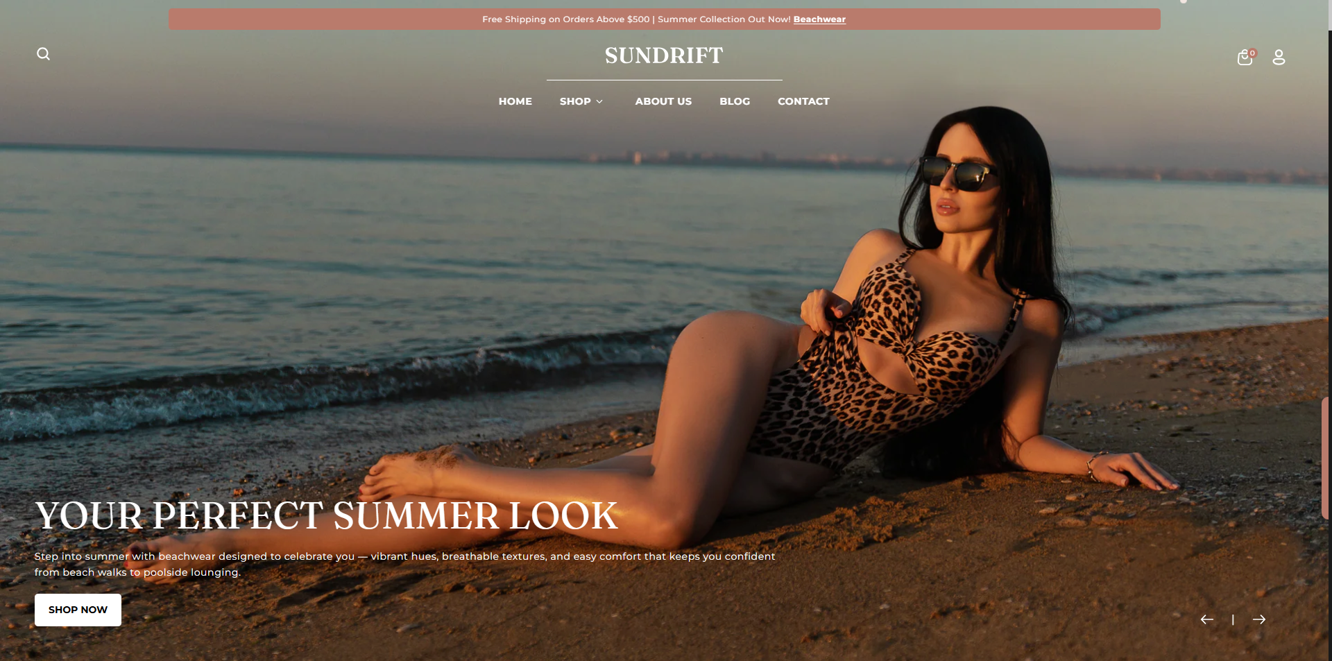
Slideshow
The Slideshow section allows you to showcase up to eight images in a rotating slideshow. It’s perfect for highlighting key products, promotions, or brand messages by combining images, text, and buttons. You can choose to enable auto-rotation for a dynamic display or keep a single static slide until the customer manually navigates through the slideshow.
Adding the Slideshow section
- Open the Customizer and go to the page where you want to add the Slideshow section.
- On the left-hand side, you'll find a list of available sections. Click the "Add section" button.
- From the available options, choose "Slideshow" to add it to your page.
Steps to Configure the Slideshow in Your Shopify Theme, Flaunt
Here are the steps to configure the options mentioned for the Slideshow section in your Flaunt Shopify theme:
-
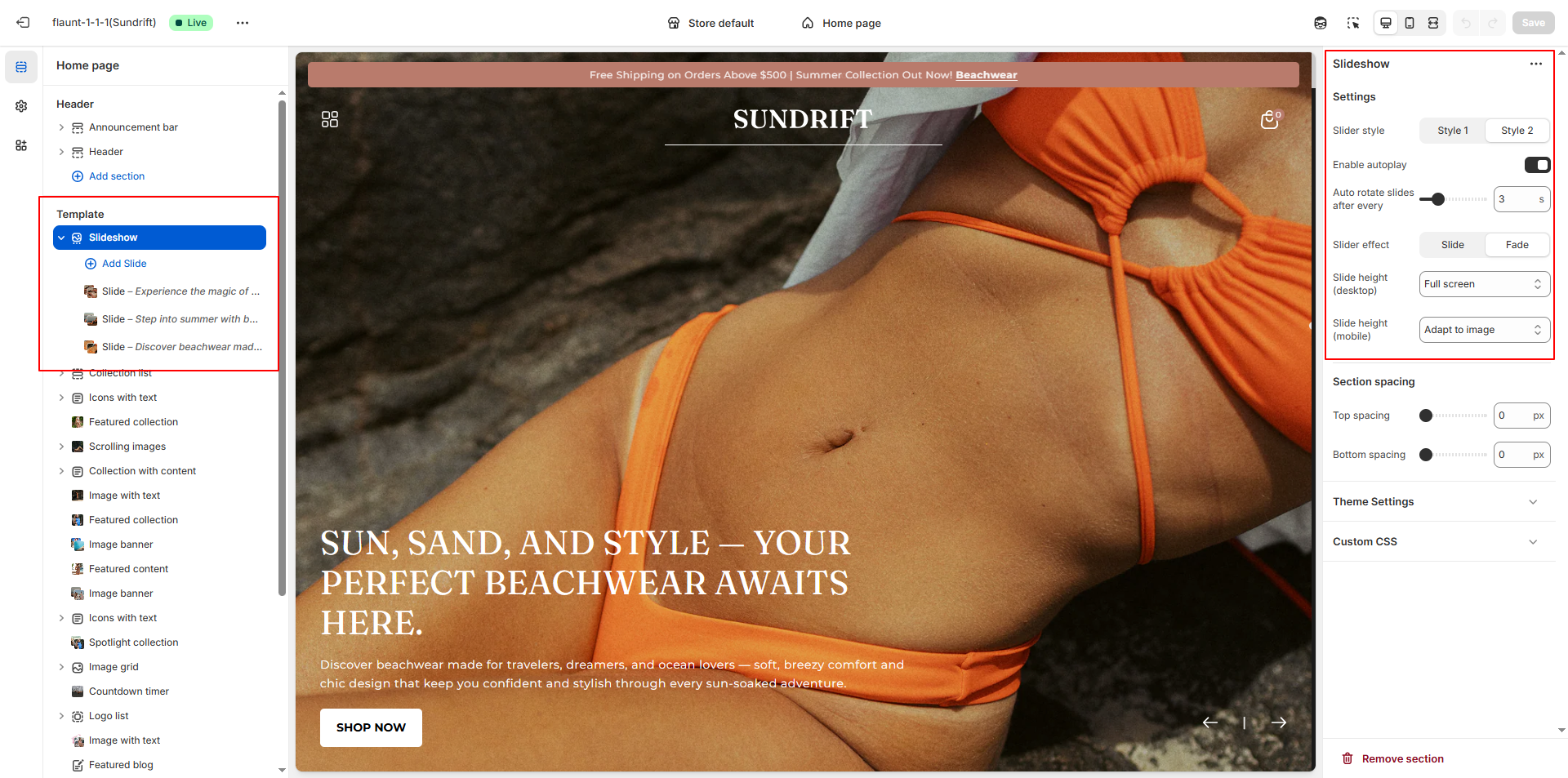
Slider Style: Choose the visual layout for your slider.
- Style 1: A clean, classic slider layout.
- Style 2: A more modern, visually enhanced slider design.
- Enable Autoplay: Turn this on to allow slides to rotate automatically.
- Autoplay Speed: Set the number of seconds between each slide transition.
-
Slider Effect: Choose how slides transition.
- Slide: Moves slides horizontally or vertically.
- Fade: Smooth fade-in and fade-out transitions.
-
Slide Height: Adjust the slider height for larger
screens.
- Half of the screen: Displays the slider at 50% of the screen height.
- One third of the screen: Displays the slider at approximately 33% of the screen height.
- Two third of the screen: Displays the slider at roughly 66% of the screen height.
- Full screen: Expands the slideshow to take up the full screen height
- Adapt to first image height: Automatically adjusts the height based on the height of the first uploaded image. Ideal for image-driven layouts.
Configure the Slider Block Settings
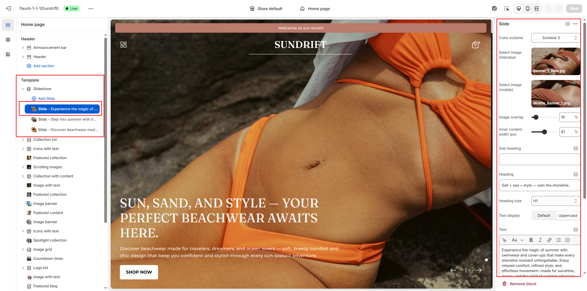
- Color Scheme: Choose the predefined color scheme (Scheme 3) for the banner’s background, text, and buttons.
- Select Image (Desktop): Upload or choose your desktop banner image using the image picker.
- Select Image (Mobile): Upload or select a mobile-optimized banner image to ensure proper display on smaller screens.
- Image Overlay: Adjust the overlay opacity (0–100) to darken or lighten the banner image for better text visibility.
- Inner Content Width (px): Set the maximum width of the text container inside the banner (e.g., 61px).
- Subheading: Enter an optional short text above the main heading.
- Heading: Add the main title for your banner.
- Heading Size: Choose the heading style (e.g., H1) to control text size.
- Text Display: Choose between Default or Uppercase for heading styling.
- Text: Enter descriptive banner content or promotional messaging.
- Button Label: Add the call-to-action button text (e.g., SHOP NOW).
- Button Link: Select or paste the URL for the button (e.g., link to a collection like Beachwear). Enable “Open link in a new tab” if needed.
- Content Position: Choose where the banner content should appear (e.g., Bottom Left).
- Text Alignment: Set the text alignment (Left, Center, Right).