
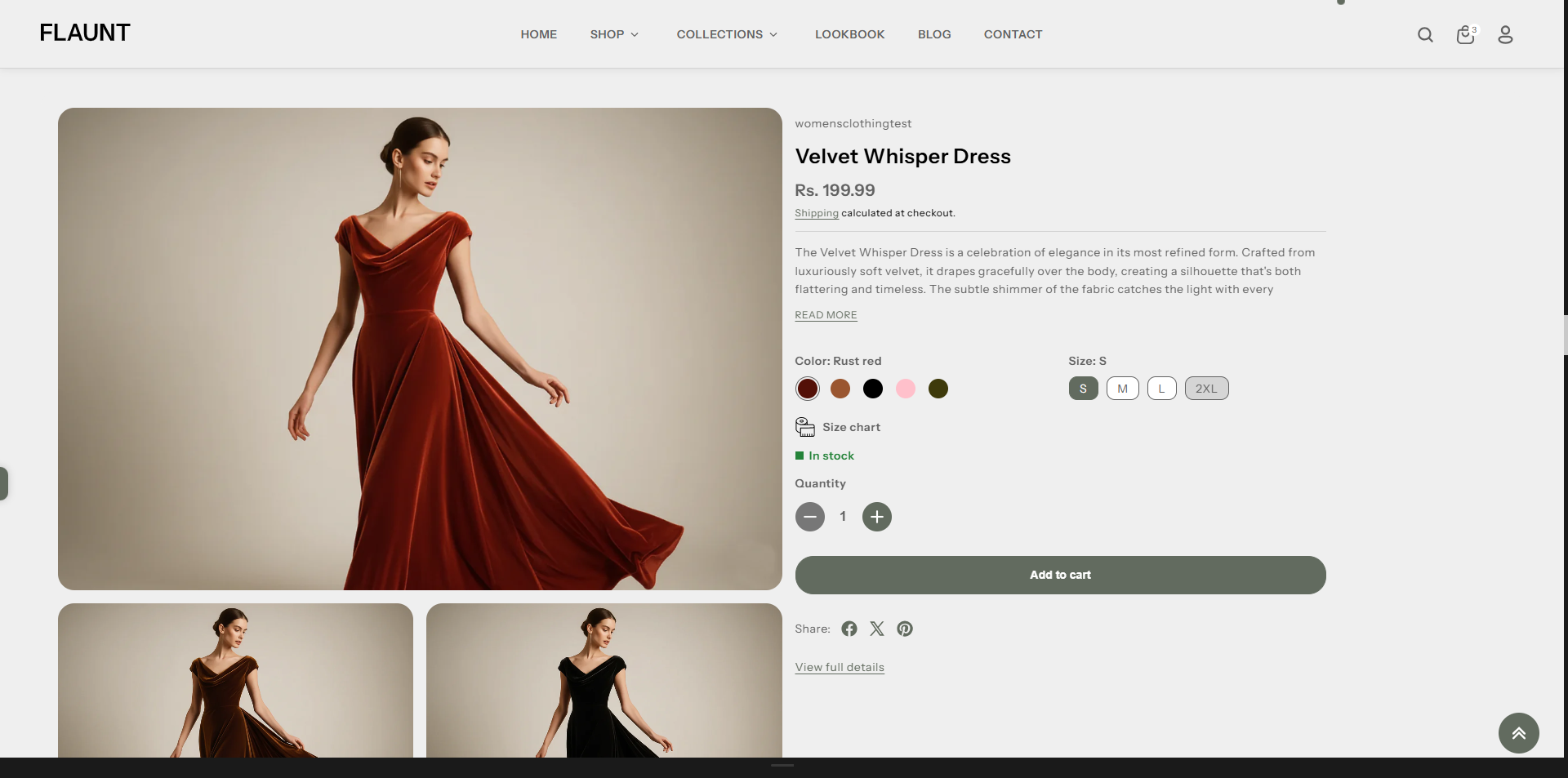
Featured Product
The Featured Product section highlights a single key product with a clean, focused layout. Customers can view details, select variants, adjust quantity, and add the item to their cart directly from the section—making it ideal for showcasing best-sellers, new launches, or limited-time offers.
How to Edit the Featured Product
Here are the steps to configure the available settings for the Featured Product in your Flaunt Shopify theme:
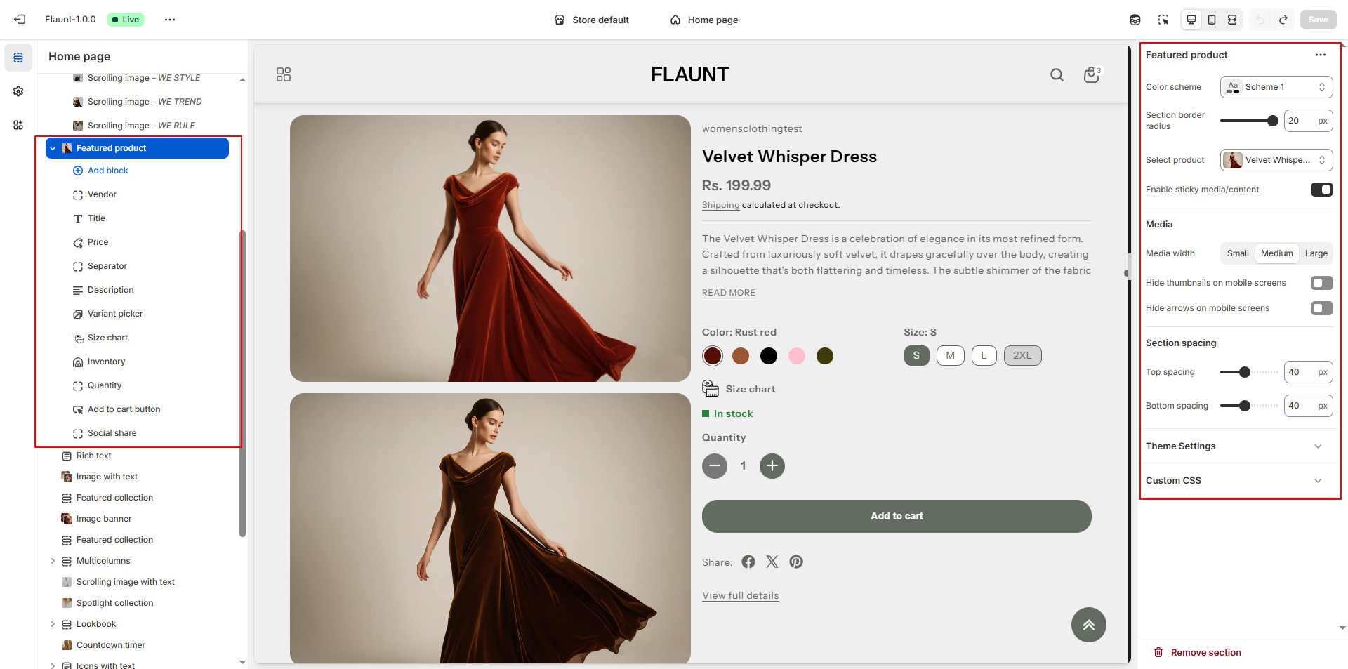
- Color Scheme: Select a color scheme (e.g., Scheme 1) to set the section’s background, text, and accent colors, ensuring a consistent visual appearance across your store.
- Section Border Radius: Enter a border radius value (e.g., 20) to control how rounded the corners of the section appear, giving the layout a softer or sharper look.
- Select Product: Choose the product you want to feature in this section. The selected product will display its images, variants, and purchase options directly in the layout.
- Enable Sticky Media/Content: Toggle this option to keep product images or content fixed on the screen while scrolling, allowing customers to view important details easily.
-
Media Width: Adjust how wide the product media appears within the layout.
- Small: Compact image size ideal for minimal designs.
- Medium: Balanced width suitable for most layouts.
- Large: Large, bold media display for visually rich products.
- Hide Thumbnails on Mobile Screens: Enable this to remove small thumbnails on mobile devices for a cleaner, more focused product display.
- Hide Arrows on Mobile Screens: Toggle this to hide navigation arrows on mobile sliders, reducing clutter and improving the mobile viewing experience.
- Enable Sticky Add to Cart: Keep the Add to Cart button visible as customers scroll, making purchasing easier and improving conversion.
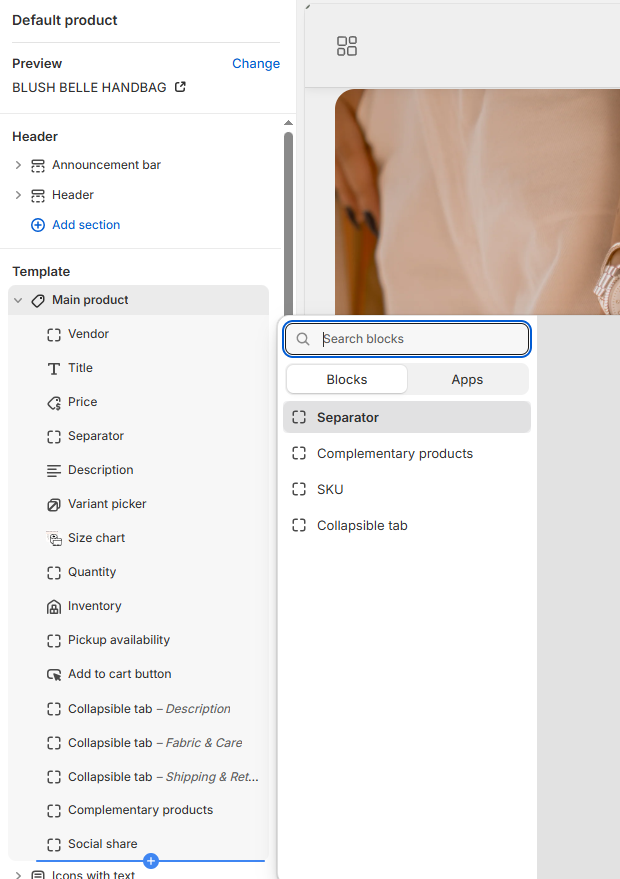
Product Information Blocks:
In the Flaunt theme, Blog Content Blocks help you showcase articles, updates, or stories in a visually engaging way. You can add text, images, videos, and links to highlight key information, making your blog easy to navigate and appealing to readers. These blocks allow you to structure content flexibly, keeping your posts organized and enhancing the overall reading experience.
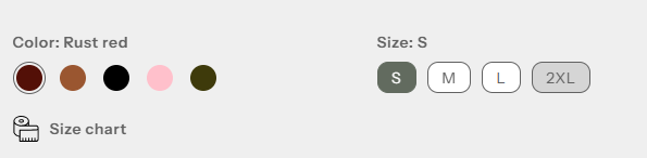
- Vendor: Use this block to display the vendor or brand name of the product.
- Title: Use this block to show the product title prominently.
- Price: Use this block to display the product price. This updates dynamically with variant selection.
- Separator: Add spacing between different product information blocks for better readability.
- Description: Show the product description. You can set the number of lines to display to keep the section concise.
- Variant Picker: Use this block to let customers select different
product options
like size, color, or material.
- Options Layout: Choose how variant options appear.
- Inline: Display options in a horizontal row.
- Stack: Display options vertically for better visibility on mobile or long lists.
- Variant Picker Type: Choose the input style for variants.
- Button: Display variants as clickable buttons. Supports showing variant images instead of colors.
- Dropdown: Display variants in a dropdown menu for compact layouts.
- Show Variant Image Instead of Color: Toggle this option when using the Button type to display the actual product image for each variant, giving customers a visual reference.
- Options Layout: Choose how variant options appear.
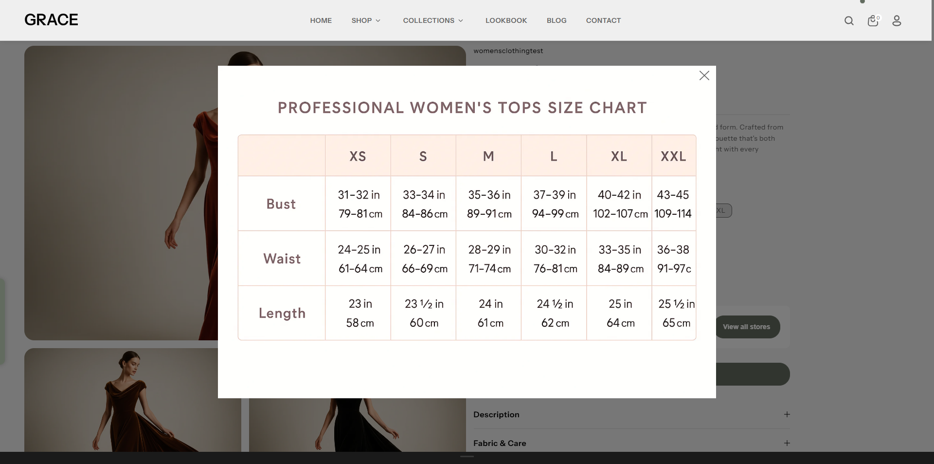
- Size Chart: Use this block to display a size chart for your product,
helping
customers choose the correct size.
- Title: Enter a title for the size chart (default: "Size Chart").
- Select Icon: Upload an icon to visually represent the size chart toggle.
- Select Desktop Image: Upload the desktop version of the size chart image.
- Select Mobile Image: Upload the mobile version of the size chart image.
- OR Select Page: Link to a dedicated page for the size chart if you prefer not to upload images.
- Link to a Product Option: Select the product option (e.g., "Size") that this chart corresponds to. The chart will only appear if this option exists. If left blank, it will always be visible. (Case-sensitive)
- Quantity: Use this block to show the quantity selector on the product page, allowing customers to choose the number of items to purchase.
- Inventory: Use this block to display stock levels and create urgency.
- In Stock Color: Color indicator for items available in stock (default: #3ED660).
- Threshold Color: Color indicator for low-stock items (default: #EE9441).
- Out of Stock Color: Color indicator for items out of stock (default: #FF8888).
- Inventory Threshold: Set the quantity at which the threshold color appears to alert customers of limited stock.
Pro Tips:
Feature a high-converting product (best seller or limited
edition) to drive sales.
Use lifestyle product images to create an emotional
connection.
Keep the description concise for better visual balance.