
Product Page
In Adorn theme, the Product page is vital to your Shopify store, as it’s where customers decide to make a purchase. Configuring this page thoughtfully ensures all essential product details are presented clearly and attractively.
Setup Product-page Template
The Adorn theme includes one product templates: By default, the Default Product template is assigned when you add a new product to your store. This is where customers can learn about your product, its features, price, and other important details.
How to create Product to Your Online Store
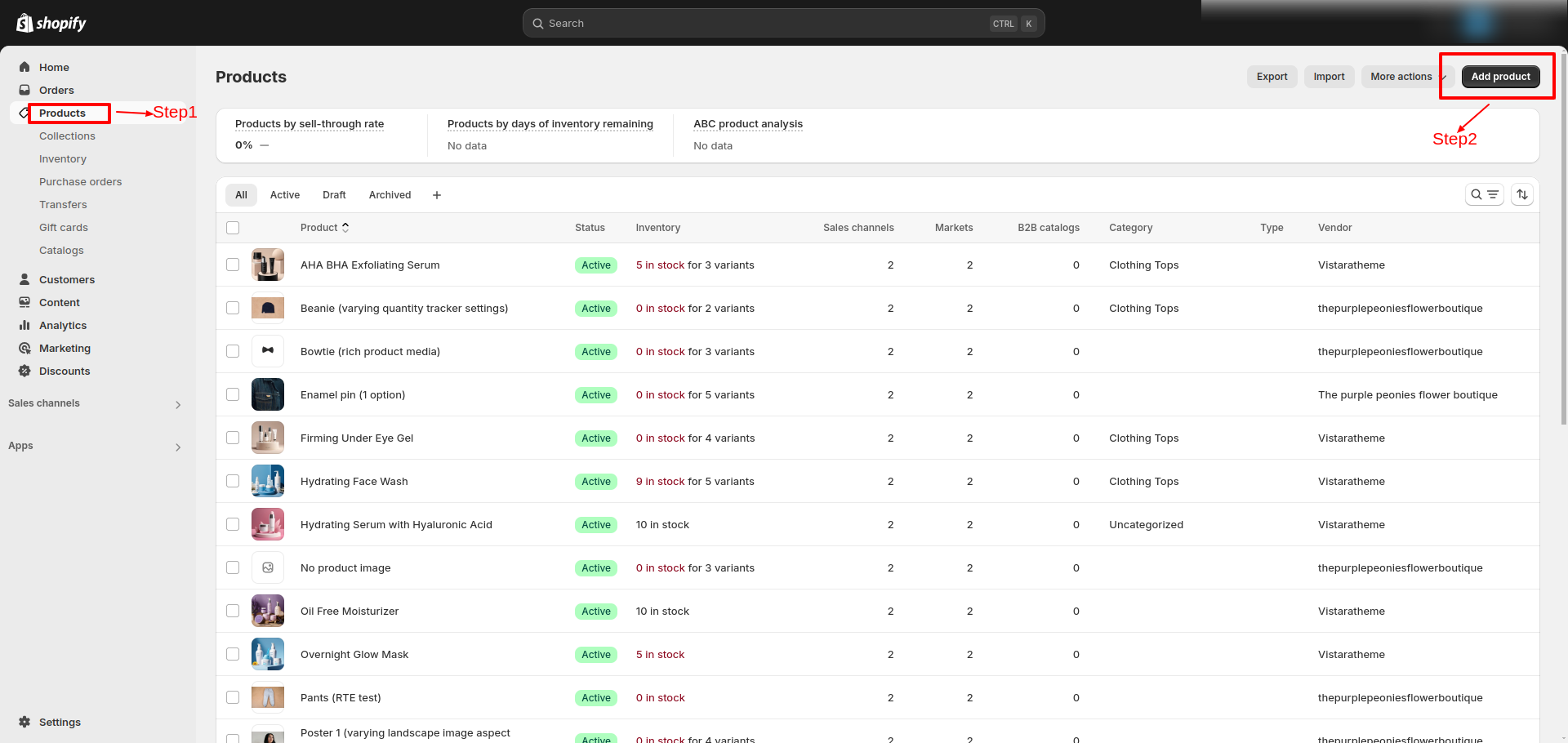
Go to Online Store >> Products >> All Products .
Set up a Product pages section
- From the Shopify admin area, go to Online store > Themes > Customize..
- Select Products from the dropdown at the top and choose the desired product template.
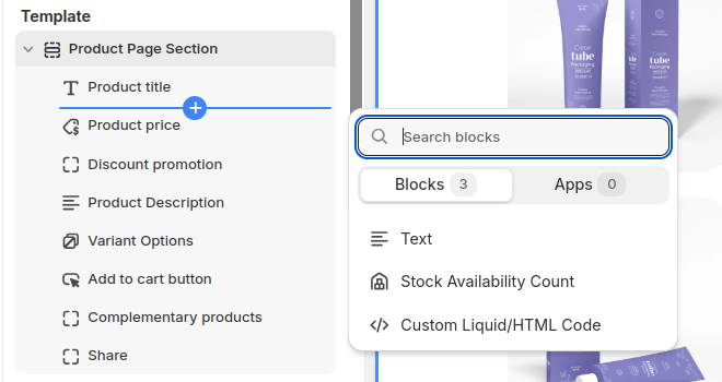
- Click on Product page section to edit the product page and product Media settings.
- Select one of the pre-loaded blocks to begin customizing its settings, or click Add block to choose a block from the list.
Settings Provided To Edit the Product Page
Review the provided information about media types to understand your options. Learn more about media types.
1. Desktop Media Layout
Choose one of the layout options:
- Grid (1 per row): Displays media in a single column layout.
- Grid (2 columns): Displays media in a two-column layout for better organization.
- Thumbnails: Displays small thumbnail previews below the main media.
- Full Width Gallery: Displays the products in a full-width gallery layout.
2. Mobile Layout
- Show Image Thumbnails: When you enable this option, small image thumbnails will be displayed below or beside the main media. This is useful for showcasing additional images or variants.
- Hide Image Thumbnails: When you disable this option, the thumbnails will not appear on mobile devices.
3. Constrain Media to Screen Height, Media Fit and Desktop Media Position
- Toggle Constrain Media To Screen Height to On if you want the media height limited to the screen.
- Select Media Fit as either Contain or Cover based on how you want images to display.
- Media Layout Position (Desktop): Choose the Desktop media position as either Left or Right. (Note: These settings do not apply to media in the Full Width Gallery layout)
- Media Border Radius: Set a border radius (e.g., 40px) to create rounded edges for your media elements.
- Show Only Selected Variant Media: Turn on this setting to display media specific to the selected product variant, providing a dynamic and personalized experience.
- Video Repeat Mode: Enable this option to loop videos continuously, ensuring an uninterrupted viewing experience.
- Content Sticky On Desktop: Activate this option to keep the media section fixed on the screen while the user scrolls through the page content.
4. Enable Image Zoom
You have three options for how to interact with product images in your Shopify theme, Adorn: Image Zoom, Lightbox, and Click on Hover. Here's how each option works and how to set them up:
- Lightbox: This will allow images to open in a lightbox on mobile when clicked or hovered over.
- Click on Hover: Changes or zooms the image on hover.
- None: No interactive behavior; the image stays static.
5. Enable Sticky Add to Cart
- Toggle Enable Sticky Add to Cart to On to keep the Add to Cart button visible as users scroll.
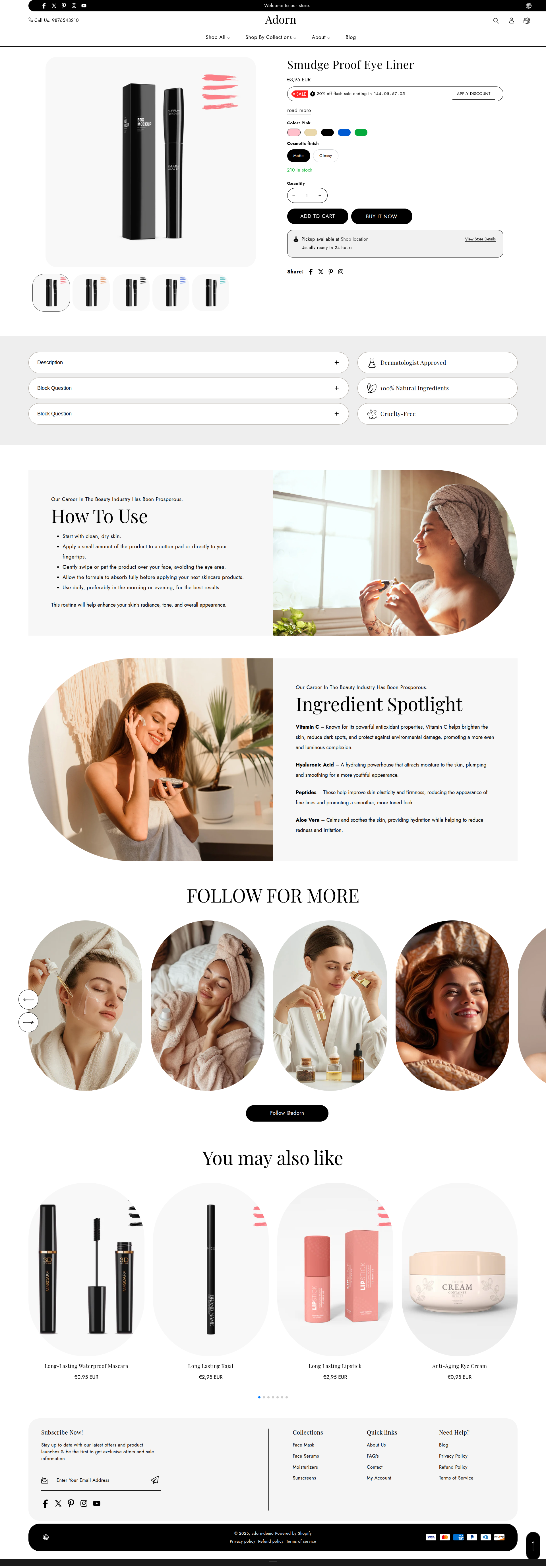
Product Information
Configure a Product information block within a Product pages section
In Adorn theme, product information is key to the product page, offering customers essential details like features, specifications, dimensions, and materials. This helps shoppers understand the product's purpose, benefits, and how well it fits their needs.
Product information may also include images, title, reviews, and other media, providing a complete view of the item and helping customers make confident, informed decisions. This guide will walk you through setting up the product information section to personalize your product page effectively.
1. Text
- In the Text box, enter text to display inside the block. Format the text and add links using the Text editor pane.
2. Product Title
- Use this block to show the product title.
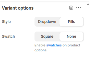
3. Variant picker
Select your preferred style for displaying variants
- Dropdown: Shows options in a dropdown menu.
- Pills: Displays options as pill-shaped buttons.
- Swatch: Shows color or pattern swatches for options.
- Square: Displays variants as square buttons.
- None: Disables the variant picker style, displaying options without special formatting.
Refer to Shopify’s Color option with swatches documenattion for more.
Also, refer to the Adding color swatches using category metafields
4. Inventory status
- Stock Availability Count: Displays the available stock quantity.
- Inventory Trigger Point: Set a threshold (default: 10) to define when low stock messaging appears. Choose 0 to always show "In Stock" if available.
- Show Inventory Count: Enable to display the remaining stock when the inventory falls below the trigger point.
Adjust the Low inventory threshold slider to set a value between 0 and 100. When the in-stock quantity of a product is greater than the slider value, the text Ready to ship is displayed inside the block. Otherwise, the block displays the text "Only n in stock". n is the in-stock quantity of the product.
Select the Show inventory count checkbox to show/hide a count of remaining stock inside the block after the Low inventory threshold is exceeded. With is option enabled, the block displays the text "Only n in stock". n is the in-stock quantity of the product.
5. Description
- Displays a text area to contain a product's description text inside the section.
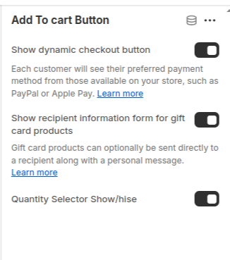
6. Add to Cart Button Settings
- Show Dynamic Checkout Button: Select the checkbox Show dynamic checkout button to show/hide a button with the customer's preferred payment method, beside the Add to cart button, inside the block. Refer to Shopify help: Dynamic checkout buttons .
- Show Recipient Information Form for Gift Card Products:
- Quantity Selector: Displays a quantity selector, allowing customers to adjust the number of products they want to purchase.
Enable this option to allow customers to provide recipient details for gift card purchases.
Customers can include a recipient's email address and a personal message when sending the gift card directly Learn more Shopify Gift Card Settings.
7. Custom Liquid
- In the Custom Liquid box, enter Liquid template language code. Refer to Learning Liquid: A guide to Shopify theme development.
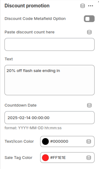
8. Discount promotion
Steps to Configure Discount Promotion in the Shopify Adorn Theme
1. Using Metafields for Dynamic Discounts
This method allows different discounts for each product.
- Enable Metafield Option in the Theme:
-
- Online store > Themes > Customize
- Locate the Discount Promotion section in product page.
- Enable the Discount Code Metafield Option.
- Create a Metafield for Discounts:
-
- Go to Settings > Custom Data > Product in Shopify admin.
- Create a new metafield named discount_code set Namespace and Key: discount_code or use type Text
- Assign Values to the Metafield:
-
- Go to Products in your Shopify Admin.
- Open a product and scroll down to the Metafields section.
- Add the discount text or code (e.g., "20% off sale", "10OFFONE").
2. Using Default Settings for Global Discounts
This method applies the same discount across all products.
- Configure Global Discount Settings:
- Add the following details:
-
- Discount Code: Enter a universal code.
- Text: Enter the promotional text.
- Countdown Date: Set the end date for the promotion (e.g., 2025-02-14 00:00:00).
- Text/Icon Color: Choose the desired color for text and icons.
- Sale Tag Color: Customize the color for the sale tag.
10. Steps for Configuring Complementary Products
- Install Search & Discovery App
- Set Heading: Enter a heading in the Heading field.
- Set Product Count: Locate the Products Count option and set the proudtc to show.
- Enable Quick Add Button: In the same section, enable the Quick Add Button option to allow customers to quickly add products to the cart.
- Adjust Image Ratio: Select the desired Image Ratio for product images: Portrait, Adapt to Image and Square.
- Configure Banner Border Radius: Adjust the Banner Border Radius to define the roundness of products.
Install the Search & Discovery app to enable the selection of complementary products.
To select complementary products, add the Search & Discovery app. Learn more
11. Steps to Configure Product Info Collapsible in Adorn Theme
Follow these steps to set up collapsible product information sections in the Adorn theme:
- Click Add Collapsible Section.
- Toggle Enable Collapsible to activate it.
- Enter a Collapsible Title (e.g., Ingredients, How to Use, Delivery & Return Policy).
- Add Collapsible Content, which appears when expanded.
FAQs
How can I hide the "Buy it Now" or dynamic checkout button?
The dynamic checkout button, also known as "Buy it Now," appears below the main Add to Cart button on product pages. It allows customers to instantly proceed to checkout with a single item.To disable this feature:
- Go to the Buy Block Settings in the product page.
- Toggle the dynamic checkout button off.
For more detailed instructions, refer to Shopify's guide on Adding and Removing Dynamic Checkout Buttons.
How can I display unique content for each product in the collapsible tab block?
You can personalize the collapsible tabs for each product by linking them to product text metafields. This allows you to showcase product-specific details such as care instructions, sizing information, materials, ingredients, or other unique attributes tailored to each item.
How do I add color swatches on product pages?
Absolutely! Adorn supports color swatches on product. If your product variants use the color swatch metafield, swatches will automatically appear on collection pages.
Learn more about setting up swatches here.