
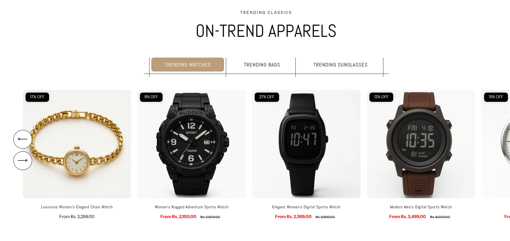
Collection Tabs
The Collection Tabs section offers a dynamic way to showcase products from multiple collections in a single, organized space. With a built-in tab feature, customers can easily switch between collections—such as categories like watches, bags, or sunglasses—without leaving the page.
Unlike a standard collection layout, this section highlights selected collections and displays their products directly, making it easier for shoppers to browse and discover what they’re looking for quickly and intuitively.
How To Add the Collection Tabs section
- Login to your Customizer and navigate to the page you would like to display this section.
- You'll see a list of available sections on the left-hand side. Locate the Add section button and click on it.
- From the list of available sections, find and select Collection Tabs.
How To Edit the Collection Tabs section
Here are the steps to configure the options mentioned for the Collection Tabs section in your Adorn Shopify theme:
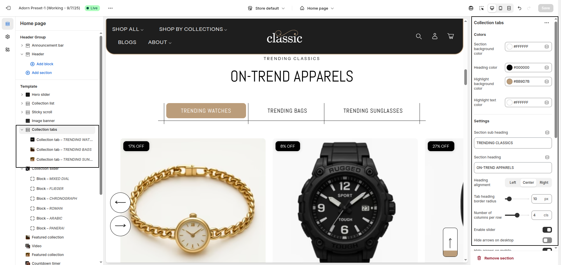
1. Set Section Color Scheme
- Set Section Background Color: Use this option to set the background color of the entire Collection Tabs ection.
- Set Main Heading Color: Choose the main heading color to define the color of the section title.
- Set Highlight Background Color: Use this setting to set the active title block backgound.
- Set Highlight Text Color: Use this setting to set the active title color.
2. Configure the Section Heading Settings
- Section Sub Heading: Enter the subheading text that appears above the main heading.
- Use the Section Heading field to enter a custom title for the section.
- Set Heading Alignment: Choose your preferred alignment: Left, Center, or Right.
- Tab Heading Border Radius: Adjust the roundness of the tab headings. Increasing the value makes the corners more rounded, while lower values keep them sharp or slightly curved.
3. Configure Collection Cards
- Number of Products per Row: Define how many collection cards are shown per row.
- Desktop Border Radius: Set rounded corners for collection cards on desktop.
- Mobile Border Radius: Set the border radius for mobile devices.
- Show Secondary Image: Enable this option to display a second image when the user hovers over the product card. This provides a quick product preview without navigating away.
- Show Vendor: Toggle this to display the vendor (brand or seller) name on each product card. Useful when showcasing products from multiple brands.
- Quick Add & Style:
Enhance user experience by enabling Quick Add, which allows customers to add
products directly to the cart from the product card—no need to visit the product detail
page.
Additionally, choose a Style for the product card layout:
- Standard – Shows product image, title, price, and optional elements like vendor or secondary image.
- None – Displays a simplified product card with minimal design and features.
4. Configure Image Ratio
Under Image Ratio, select one of the following options:
- Adapt to image: Keeps the original image ratio.
- Portrait: Displays images in a portrait ratio.
- Square: Crops images into a square format.
5. Enable Slider Options
- Enable Slider: Toggle this to display collection cards in a horizontal slider format.
- Hide Arrows on Desktop: Enable this to hide navigation arrows on larger screens.
- Hide Arrows on Mobile: Enable this to hide slider arrows on mobile devices for a cleaner UI.
6. Configure the Collection Tab Block Settings
- Adding a New slide: To add a new slide, simply click on the Add collection tab block button to add a new slide.
- Select Collection: Choose the desired collection from the Select Collection dropdown.
- Add Heading: Enter your heading text in the Heading field.