
Collection List
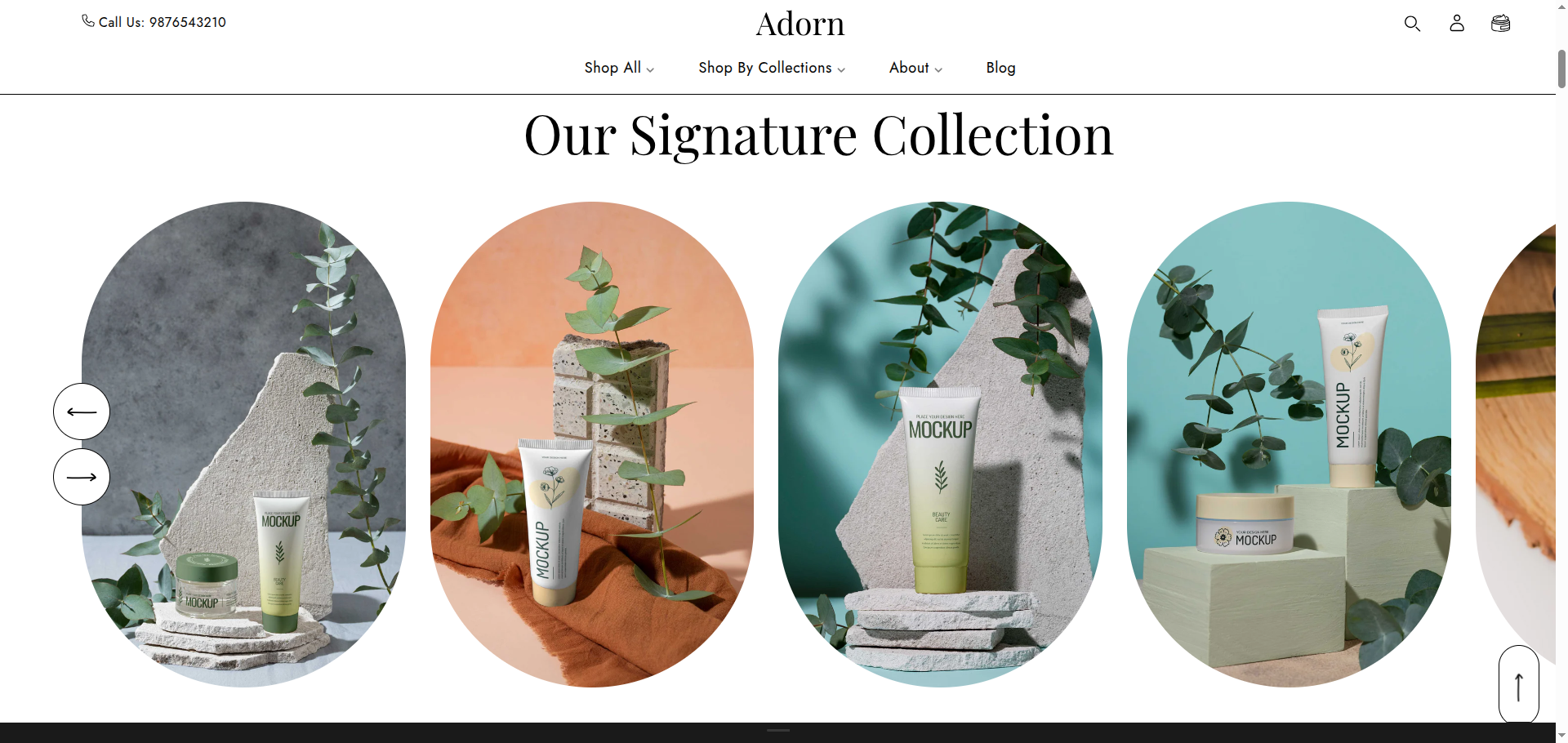
The Collection List section in Adorn provides a streamlined way to showcase your collections directly on the homepage or other pages. This feature lets merchants display products by category without requiring customers to navigate through the main menu, making browsing as simple as scrolling.
Unlike a standard Collection List page, this section allows you to select specific collections to feature, making it perfect for promoting new or popular categories. This setup also helps customers quickly find what they’re looking for.
How To Add the Collection List section
- Login to your Customizer and navigate to the page you would like to display this section.
- You'll see a list of available sections on the left-hand side. Locate the Add section button and click on it.
- From the list of available sections, find and select Collection List.
How To Edit the Collection List section
Here are the steps to configure the options mentioned for the Collection List section in your Adorn Shopify theme:
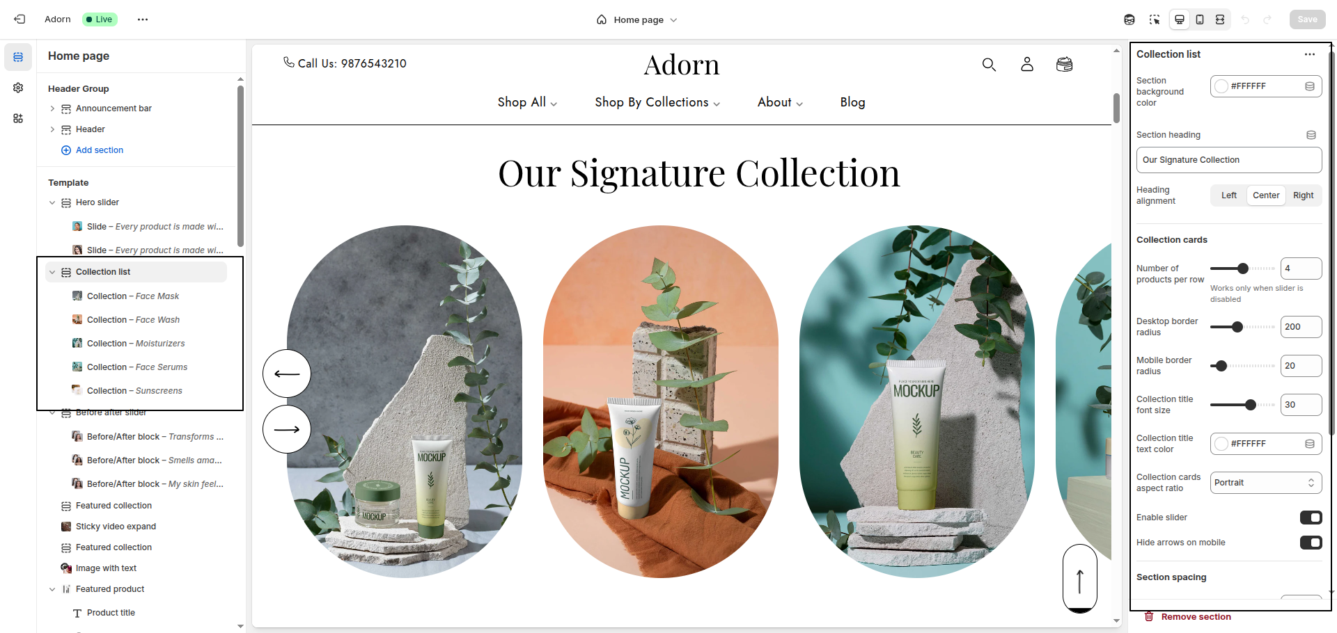
1. Set Section Color Scheme
- Set Section Background Color: Use this option to set the background color of the entire Collection List section.
- Set Main Heading Color: Choose the main heading color to define the color of the section title.
- Set Slider Title Background & Text Color: Use this setting to define the background behind each slider title.
- Set Collection Title Color: Use this setting to set the color of text displayed
over each collection image. Example:
#FFFFFF.
2. Configure Button Colors
- Button Background Color: Set the default button background color. Example:
#000000. - Button Text Color: Set the default button text color. Example:
#FFFFFF. - Button Hover Background Color: Choose the background color for the button on
hover. Example:
#FFFFFF. - Button Hover Text Color: Define the text color for the button when hovered.
Example:
#000000.
3. Section Heading Setting
- Use the Section Heading field to enter a custom title for the section.
- Set Heading Alignment: Choose your preferred alignment: Left, Center, or Right.
4. Slider Title Setting
- Show Slider Title Block: Enable the option to display the title and description above the collection slider.
- Add Slider Title and Text: Use the slider Title field to add a bold title.
- Configure Button Settings: Set a a button label like view all to display a call-to-action button and use button link field to define where the button redirects
5. Configure Collection Cards
- Number of Products per Row: Define how many collection cards are shown per row.
- Desktop Border Radius: Set rounded corners for collection cards on desktop.
- Mobile Border Radius: Set the border radius for mobile devices.
- Collection Title Font Size: Adjust the font size of the collection title (e.g., 30px) to make it stand out or align with your theme's typography
6. Configure Image Ratio
Under Image Ratio, select one of the following options:
- Adapt to image: Keeps the original image ratio.
- Portrait: Displays images in a portrait ratio.
- Square: Crops images into a square format.
7. Enable Slider Options
- Enable Slider: Toggle this to display collection cards in a horizontal slider format.
- Hide Arrows on Desktop: Enable this to hide navigation arrows on larger screens.
- Hide Arrows on Mobile: Enable this to hide slider arrows on mobile devices for a cleaner UI.
8. Configure the Collection Block Settings
- Adding a New slide: To add a new slide, simply click on the Add collection block button to add a new slide.
- Select Collection: Choose the desired collection from the Select Collection dropdown.
- Select Image: Click Upload images to add from your computer, or select Explore free images to browse Shopify’s library.
- Add Heading: Enter your heading text in the Heading field.
- Removing a slide: Select an existing slide and click the Remove Block button to delete it.