
Slideshow
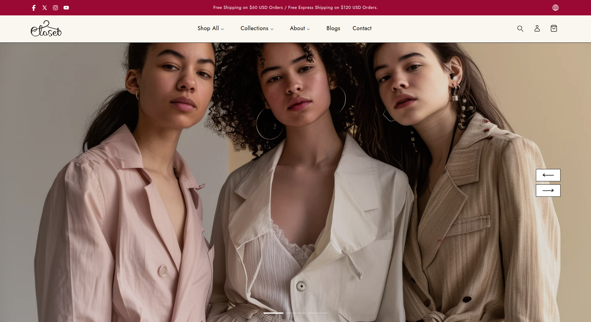
The Slideshow section allows you to showcase up to eight images in a rotating slideshow. It’s perfect for highlighting key products, promotions, or brand messages by combining images, text, and buttons. You can choose to enable auto-rotation for a dynamic display or keep a single static slide until the customer manually navigates through the slideshow.
Adding the Slideshow section
- Open the Customizer and go to the page where you want to add the Slideshow section.
- On the left-hand side, you'll find a list of available sections. Click the "Add section" button.
- From the available options, choose "Slideshow" to add it to your page.
Steps to Configure the Slideshow in Your Shopify Theme, Adorn
Here are the steps to configure the options mentioned for the Slideshow section in your Adorn Shopify theme:
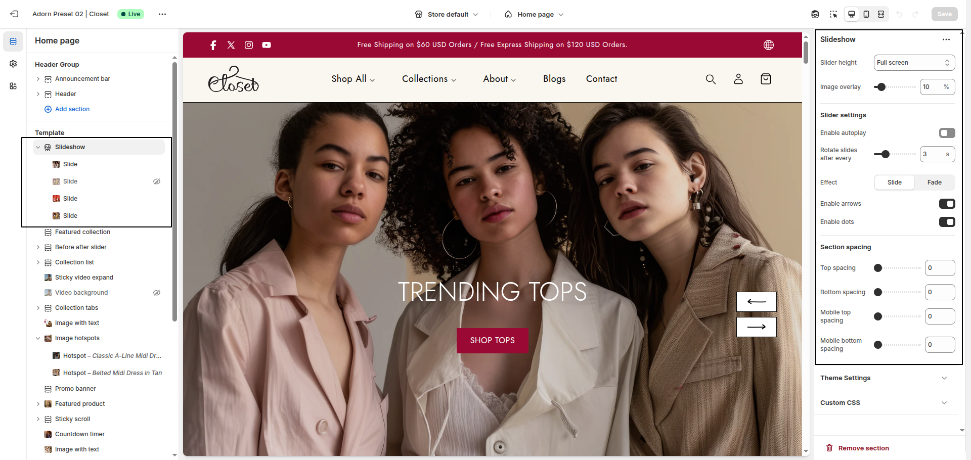
1. Configure Slider Height
- Use the Slider Height setting to control how much vertical space the hero slider occupies on the screen.
- Available options:
- Half of the screen: Displays the slider at 50% of the screen height.
- One third of the screen: Displays the slider at approximately 33% of the screen height.
- Two third of the screen: Displays the slider at roughly 66% of the screen height.
- Full screen: Expands the slideshow to take up the full screen height
- Adapt to first image height: Automatically adjusts the height based on the height of the first uploaded image. Ideal for image-driven layouts.
2. Image Overlay
- Adjust the overlay opacity to darken or lighten the background image, ensuring better text visibility.
3. Configure Slider Behavior and Controls
- Enable autoplay: Toggle this option to automatically cycle through slides.
- Rotate Slides After Every: Set the time interval (in seconds) between
each slide transition. Example:
3seconds. - Enable Arrows: Display navigation arrows to allow users to manually switch between slides.
- Enable Dots: Show dot indicators below the slider that reflect the number of slides and current position.
- Slide Transition Type: Choose how slides transition: Slide (horizontal movement) or Fade (smooth crossfade)
Set your preferred option based on the style you want for your Hero Slider.
Configure the Slider Block Settings
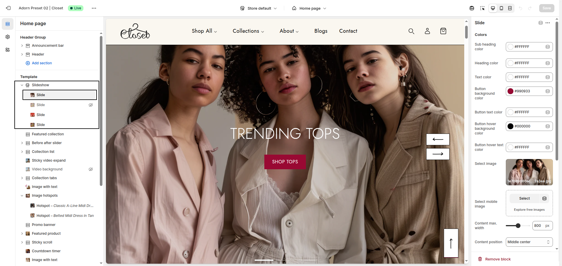
1. Block Color Configuration
- Sub Heading color: Select the color for the sub heading text to match your design style.
- Heading color: Define the color for the main heading to ensure strong visibility.
- Button background color: Choose the background color of the button to highlight your call-to-action.
- Button text color: Select the text color inside the button for clear contrast.
- Button hover background color: Set the button background color when hovered to enhance interactivity.
- Button hover text color: Choose the text color on hover to maintain readability and style.
2. Slideshow Image Configuration
- Select Image: Click "Upload images" to add your own image, or choose "Select image" or "Explore free images" to pick one from the library.
- Choose an image file that matches the recommended dimensions (1200x1200px) for optimal quality.
- Ensure no file issues appear during the upload process.
3. Set Content Layout
- Conten width: Set the maximum width of the slide content.
- Content position: Choose where the content appears on the slide.
- Text alignment: Align text to the Left, Center, or Right.
4. Configure Text Content
- Sub heading: Enter a short phrase.
- Heading : Enter a title for the slide.
- Text: Include descriptive text about the product or offer.
5. Add a Link and Button
- Configure the Button Label.
- Set the Link to direct users to a specific page.
6. Add and remove New slide
- Adding a New slide: To add a new slide, simply click on the Add slide button to add a new slide.
- Removing a slide: Select an existing slide and click the Remove Block button to delete it.