
Collection Slider
The Collection slider section in our theme offers a sleek, scrollable layout to showcase selected collections. This section helps streamline navigation by allowing customers to browse key categories without going through the menu.
Unlike a traditional Collection slider page, the Collection Slider lets you handpick which collections to feature, making it ideal for highlighting seasonal, trending, or promotional categories. It’s a visually engaging way to guide customers toward your store’s main offerings with minimal clicks.
How To Add the Collection slider section
- Login to your Customizer and navigate to the page you would like to display this section.
- You'll see a list of available sections on the left-hand side. Locate the Add section button and click on it.
- From the list of available sections, find and select Collection slider.
How To Edit the Collection slider section
Here are the steps to configure the options mentioned for the Collection slider section in your Adorn Shopify theme:
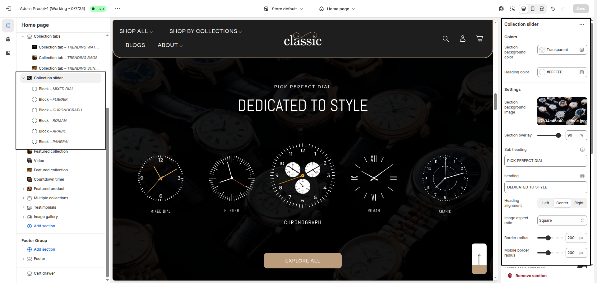
1. Set Section Color Scheme
- Section background color: Use this option to set the background color of the entire Collection slider section.
- Heading color: Choose the main heading color to define the color of the section title.
2. Set Section background image
- Section Background Image:
Upload a background image by clicking Upload images or choose from Explore free
images.
To display an image as the section background, make sure to select or upload one here. Leaving it empty will result in no image being shown. - Section Overlay: Use a value from 0–100 to control the dark overlay on top of the background image.
3. Section Heading Setting
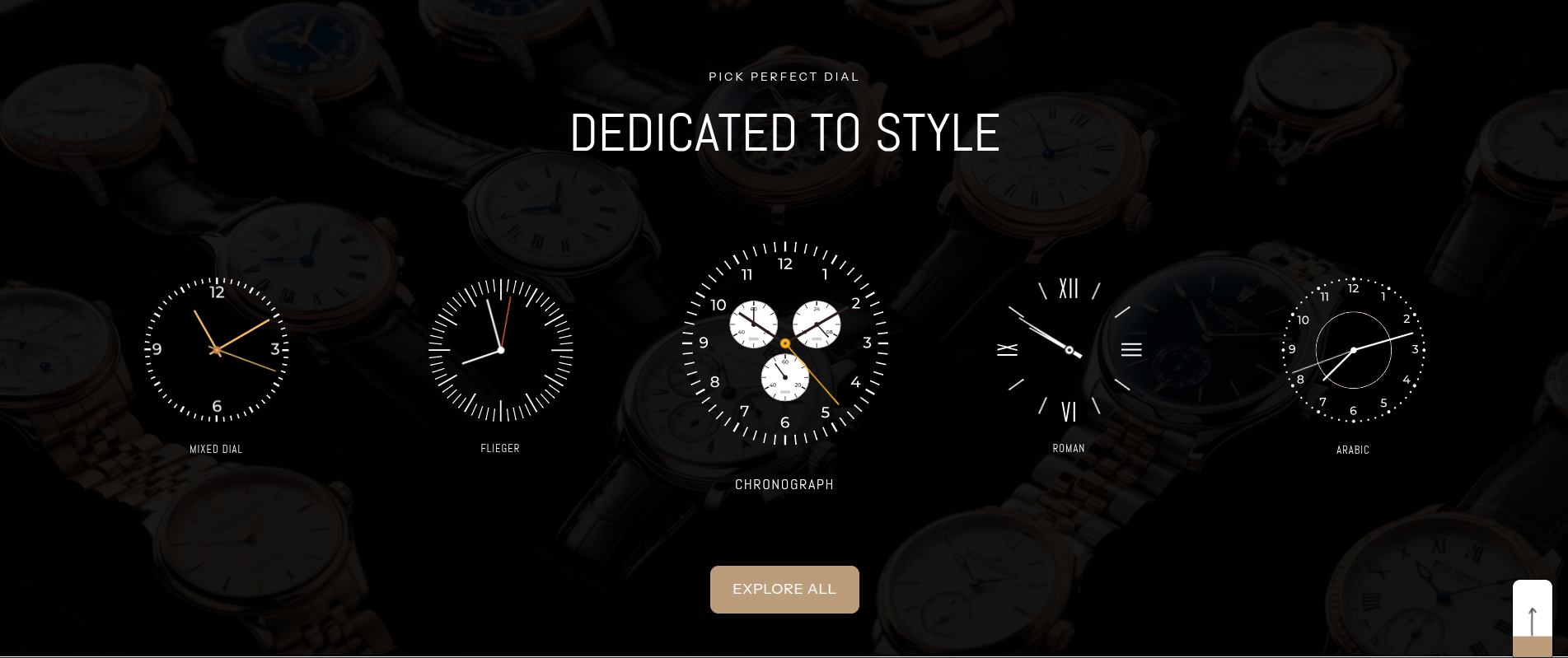
- Sub Heading: Enter the subheading text. Example: PICK PERFECT DIAL.
- Use the Section Heading field to enter a custom title for the section.
- Set Heading Alignment: Choose your preferred alignment: Left, Center, or Right.
4. Configure Image Ratio
Under Image Ratio, select one of the following options:
- Adapt to image: Keeps the original image ratio.
- Portrait: Displays images in a portrait ratio.
- Square: Crops images into a square format.
5. Explore Adtional setting
- Border Radius: Enter a value (e.g., 200) to round the image corners on desktop.
- Mobile Border Radius: Set a separate corner radius for mobile view (e.g., 200).
- Enable Scale Animation: Toggle this option to enable zoom-in animation on image hover or scroll.
- Scale Intensity: Define the intensity of the zoom effect (e.g., 70).
6. Configure Section Button Setting
- Show "View All" Button: Enable this setting to display a button beneath the content.
- Button Label: Customize the button text.
- Button Link: Paste the URL or select a page to link the button.
7. Configure the Image Block Settings
- Adding a New slide: To add a new slide, simply click on the Add block block button to add a new slide.
- Select Image: Click on Upload images to add an image from your computer. You can also click Explore free images to browse Shopify’s free image library.
- Enter SVG Code: If you want to use a custom SVG instead of an image, paste your SVG code in the provided field.
- Add Title: Enter the title text that you want to display with the image block. This is usually a heading or label.
- Add Link: Paste a URL into the link field to make the image or title clickable. This allows you to redirect customers to a product, collection, or any other page.