Category Grid
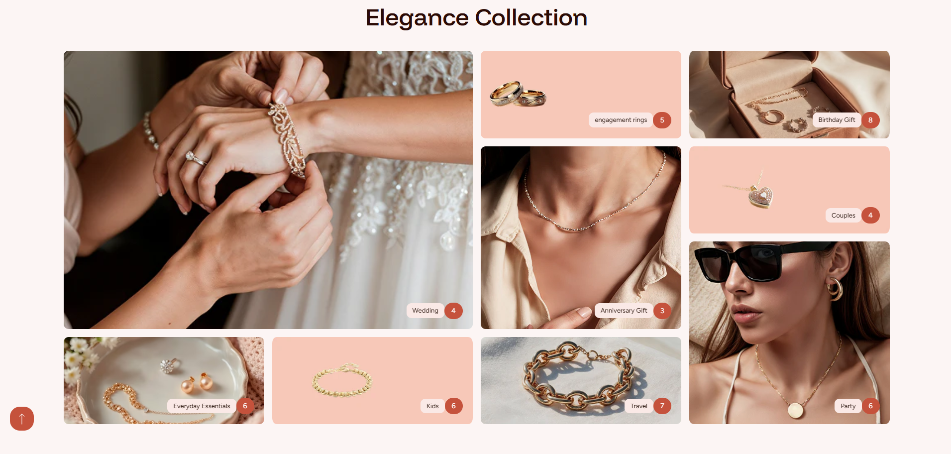
The Category Grid section in the Dynamic theme is an animated layout designed to showcase collections in an eye-catching and interactive way. As customers scroll or interact with the section, subtle animations bring each category tile to life, creating a dynamic browsing experience.
This section helps highlight key categories using a clean grid structure combined with smooth motion effects, encouraging exploration while keeping the layout modern, engaging, and easy to navigate.
How To Add the Category Grid section
- Login to your Customizer and navigate to the page you would like to display this section.
- You'll see a list of available sections on the left-hand side. Locate the Add section button and click on it.
- From the list of available sections, find and select Category Grid.
How To Edit the Category Grid section
Here are the steps to configure the options mentioned for the Category Grid section in your Dynamic Shopify theme:
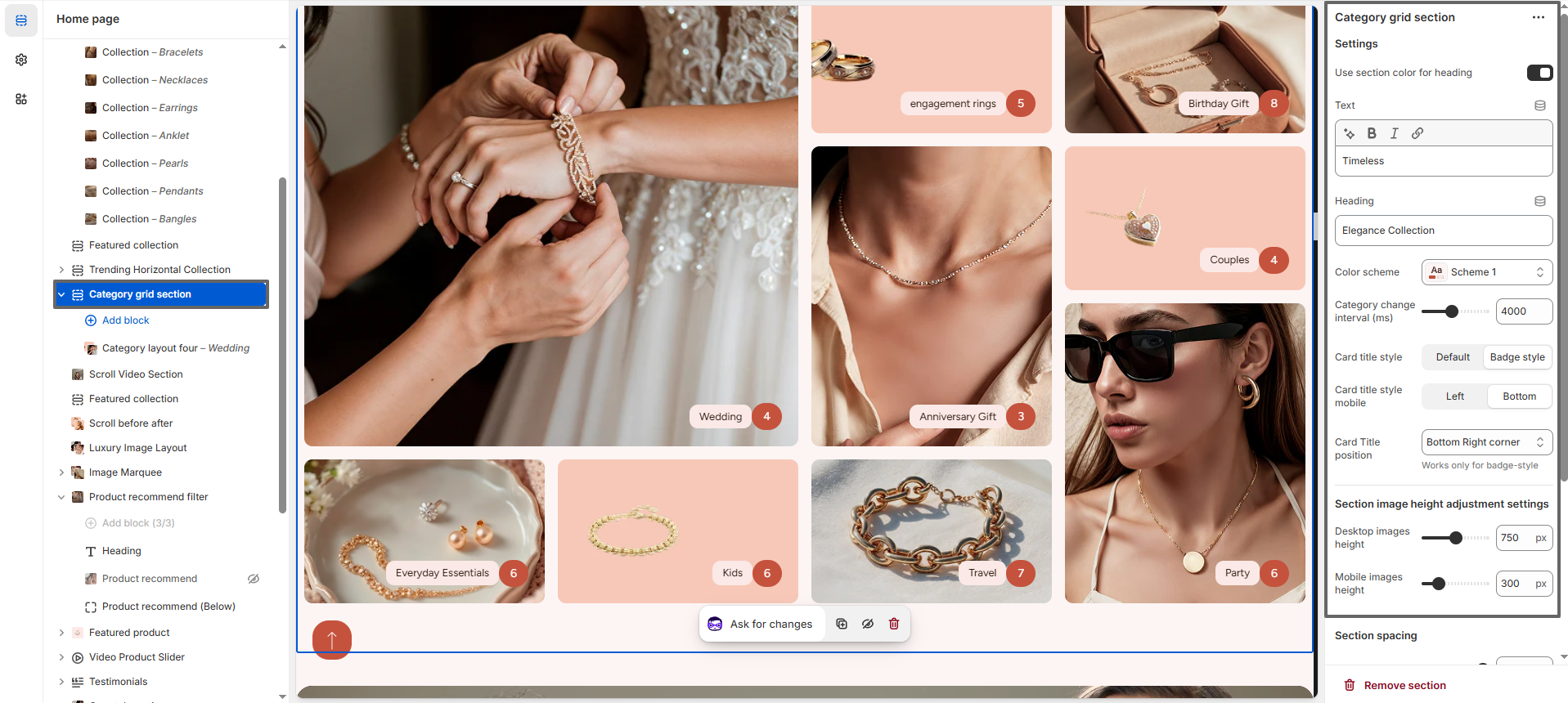
- Text: Add a short introductory line that appears above the main heading.
- Heading: Enter the main title for the section to highlight your featured categories.
- Color Scheme: Select a predefined color scheme to control the background, text, and accent colors of the Category Grid section.
- Category Change Interval: Set the time interval (in milliseconds) for how often categories animate or rotate automatically (e.g., 4000ms).
- Card Title Style: Chooses the visual style of the category card title, such as default text or badge-style label.
- Card Title Style (Mobile): Controls how the card title is displayed on mobile devices (e.g., positioned at the bottom or left).
- Card Title Position: Determines the position of the title on the card (e.g., bottom-right corner). Note: Works only with badge-style titles.
- Desktop Images Height: Adjusts the height of category images on desktop screens (e.g., 750px).
- Mobile Images Height: Adjusts the height of category images on mobile devices (e.g., 300px).
- Section Border Radius: Set the border radius to round the corners of the entire Category Grid section for a smooth, modern look. (Applies to the entire section, including the image cards.)
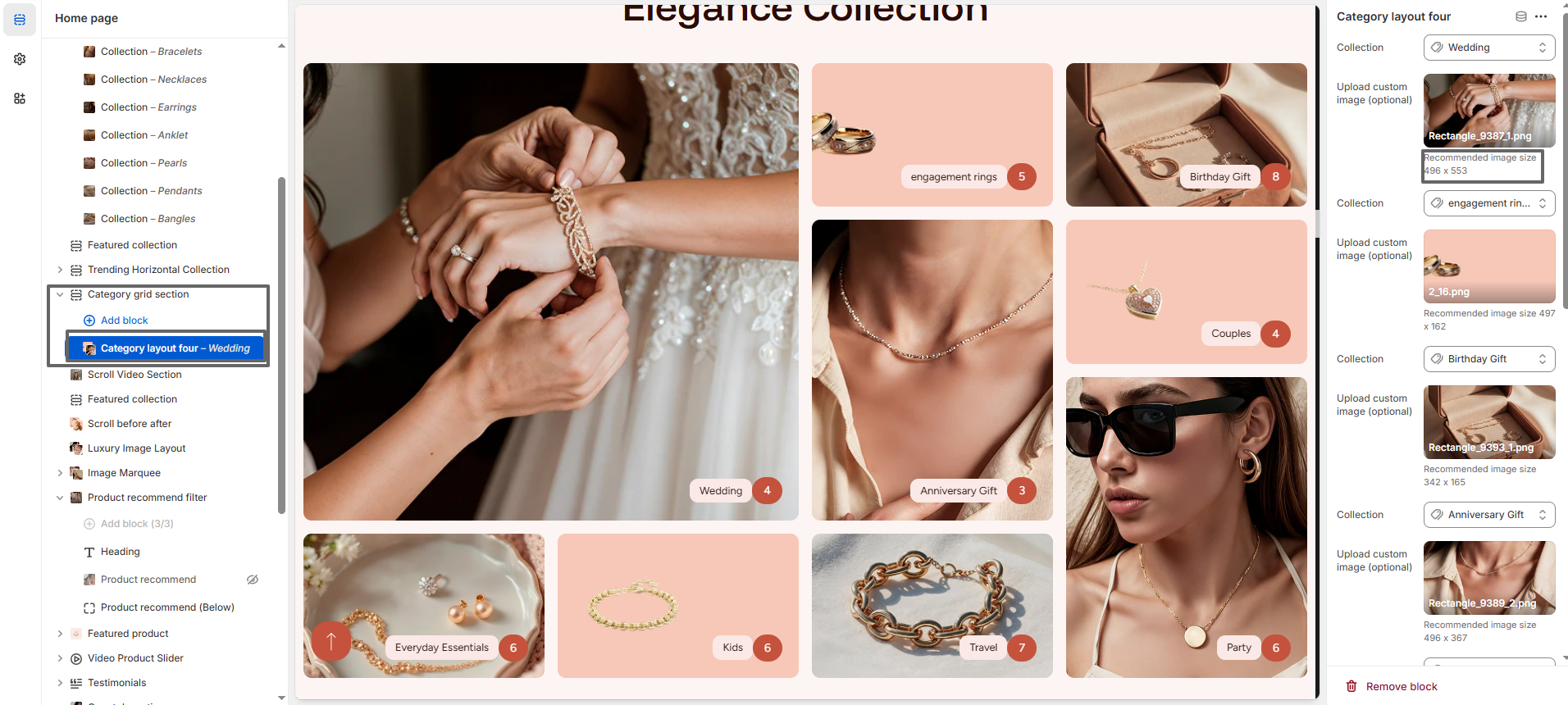
Configure the Category layout Block Settings
- Add a New Category Layout Block: Click the Add block button. There are three different category layout styles available—choose the layout that best fits your design.
- Select Collection: Choose the collection you want to feature from the Select collection dropdown.
-
Select Image:
- Click Upload images to add a custom category thumbnail from your device.
- Or select Explore free images to use images from Shopify's free image library.
- If no image is selected, the collection's default image will be displayed automatically.
- Recommended Image Size: Each category layout provides its own recommended image dimensions in the settings panel (as shown next to the image upload option). It is important to follow these suggested sizes for each block to ensure the best visual appearance and proper alignment. Using the exact or similar dimensions will help maintain a consistent and well-structured grid layout across all devices.