
Image Slider
The Image Slider section is a sleek, horizontal carousel designed for brand showcases, interactive galleries, or highlighting a series of impactful images. It features customizable overlays with text that can appear on interaction, providing a perfect balance between visual storytelling and call-to-action messaging.

Adding the Image Slider section
- Open the Customizer and go to the page where you want to add the "Image slider" section.
- On the left-hand side, click the "Add section" button.
- From the available options, choose "Image slider" to add it to your page.
How To Configure Image Slider section
Steps for Configuring the "Image slider" Section in the Dynamic Theme
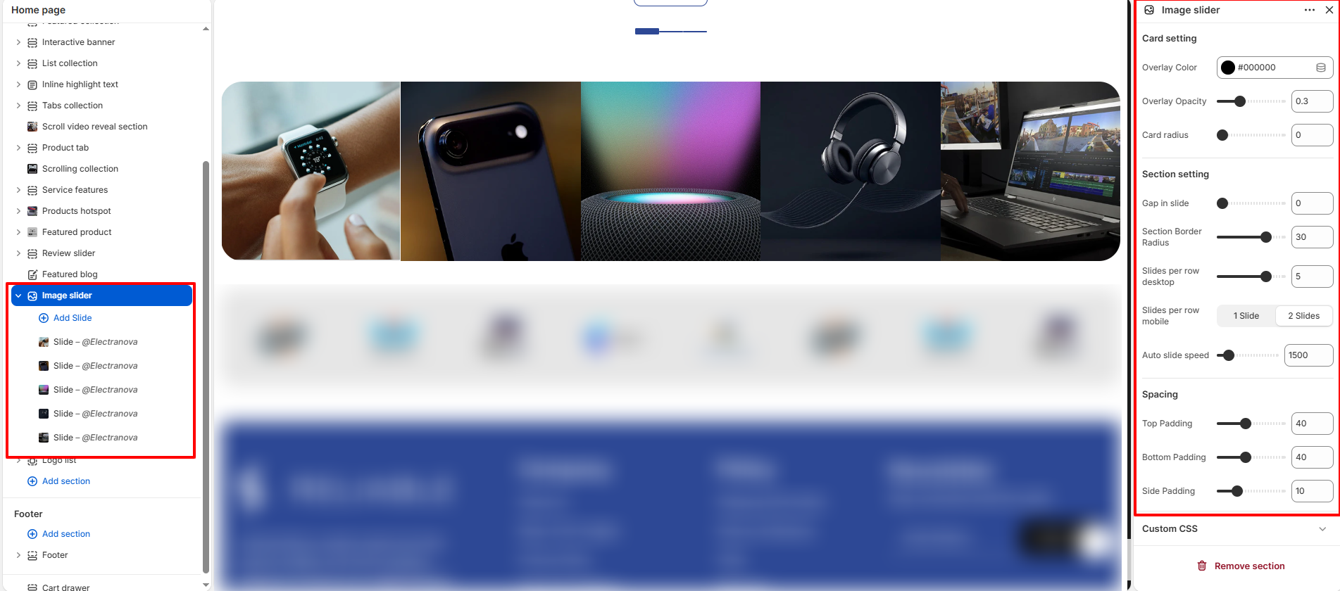
- Card setting:
- Overlay Color: Choose a color for the image overlay (e.g., #000000).
- Overlay Opacity: Adjust the transparency level of the overlay mask.
- Card radius: Set the corner roundness of each individual slide.
- Section setting:
- Gap in slide: Set the amount of space between adjacent slides.
- Section Border Radius: Set the corner squareness of the entire gallery container.
- Slides per row desktop: Determine how many images are visible at once on desktop.
- Slides per row mobile: Choose between "1 Slide" or "2 Slides" for mobile devices.
- Auto slide speed: Adjust the transition speed for automatic carousel scrolling.
- Spacing:
- Top Padding / Bottom Padding: Set the vertical spacing above and below the section.
- Side Padding: Adjust the horizontal padding within the section container.
How To Configure Slide (Blocks):
Each block represent a single image/slide within the carousel.
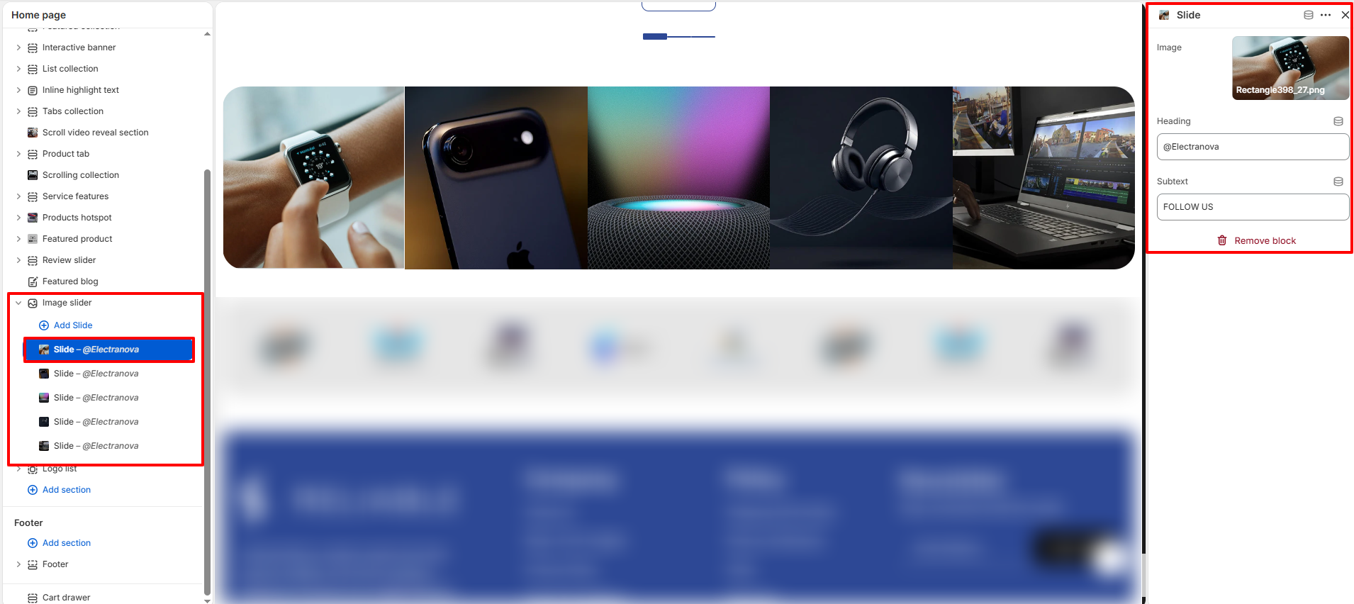
- Image: Upload the background image for the slide.
- Heading: Enter the primary text for the slide overlay (e.g., "@Electranova").
- Subtext: Enter secondary descriptive text or a call-to-action (e.g., "FOLLOW US").