
Featured Blog
The Featured Blog section allows you to showcase the latest entries from a designated blog on your online store. Keeping this section active helps update your customers with recent news, articles, and announcements, enhancing both store engagement and SEO.
Adding the Featured Blog section
- Open the Customizer and go to the page where you want to add the "Featured Blog" section.
- On the left-hand side, you'll find a list of available sections. Click the "Add section" button.
- From the available options, choose "Featured Blog" to add it to your page.
How to edit the Featured Blog section
To configure the featured blog section and related settings in your Shopify theme, Dynamic, follow these steps:
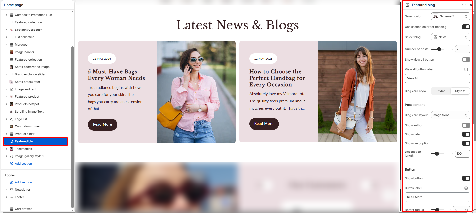
- Select Color: Select a color scheme (e.g., Scheme 5) to control the background and overall text/accent colors of the section.
- Use Section Color for Heading: Toggle this option to apply the section's active color scheme directly to the heading text.
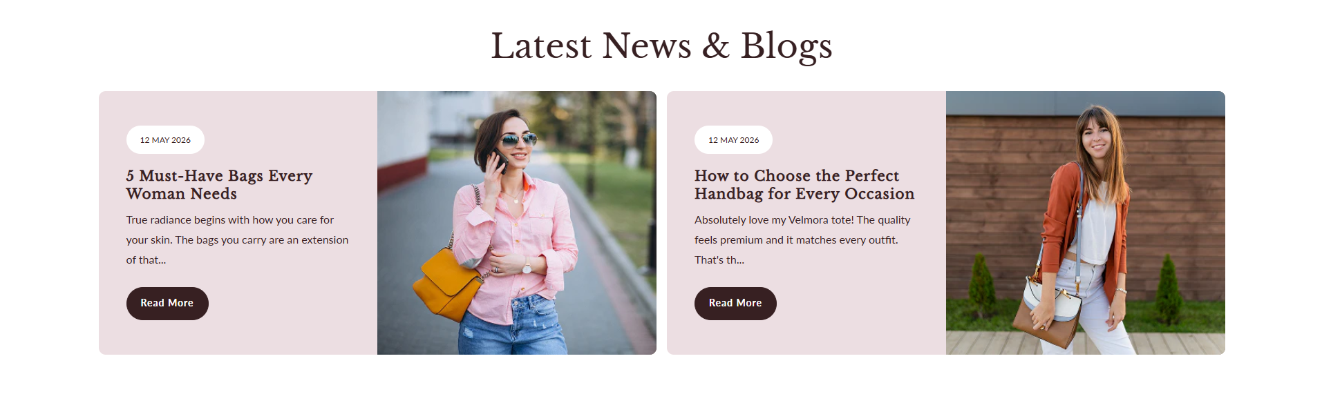
- Select Blog: Choose the blog from which you want to pull and display posts (e.g., News).
- Number of Posts: Set the maximum number of posts to display in the section (e.g., 2).
- Show View All Button: Toggle this option to display a button that redirects to the full blog page.
- View All Button Label: Customize the text label for the "View All" button (e.g., View All).
- Blog Card Style: Choose the layout style for the blog post cards. Options include Style 1 and Style 2.
-
Post Content:
Customize the visual appearance and metadata displayed on each blog card:
- Blog Card Layout: Select the image placement layout (e.g., Image front).
- Show Author: Toggle this option to display the author's name on the post cards.
- Show Date: Toggle this option to show the publishing date.
- Show Description: Toggle this option to display a short excerpt or summary of the blog post.
- Description Length: Set the character limit for the post description excerpt (e.g., 100).
-
Button:
Configure individual post card call-to-action button settings:
- Show Button: Toggle to display a "Read More" button on each card.
- Button Label: Set the text for the button (e.g., Read More).
- Border Radius: Adjust the corner roundness applied to the card content and images (e.g., 10px).
-
Heading Content:
Configure alignment and headings:
- Text Alignment: Select the alignment for the text headings (Left, Center, or Right).
- Top Heading: Add a small top heading or tagline.
- Heading: Enter the main title for the section (e.g., Latest News & Blogs).
-
Section Spacing:
Adjust the vertical spacing of the section:
- Padding Top: Set the space above the section.
- Padding Bottom: Set the space below the section.