
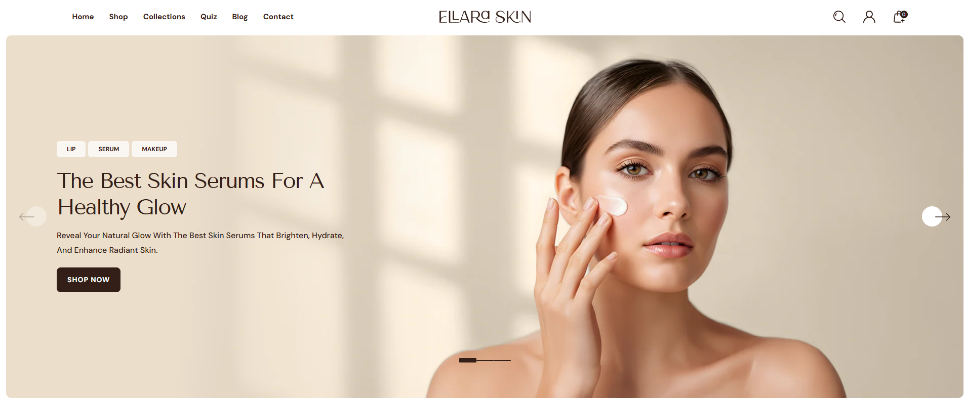
Slideshow
The Slideshow section allows you to showcase up to eight images in a rotating slideshow. It's perfect for highlighting key products, promotions, or brand messages by combining images, text, and buttons. You can choose to enable auto-rotation for a dynamic display or keep a single static slide until the customer manually navigates through the slideshow.
Adding the Slideshow section
- Open the Customizer and go to the page where you want to add the Slideshow section.
- On the left-hand side, you'll find a list of available sections. Click the "Add section" button.
- From the available options, choose "Slideshow" to add it to your page.
Steps to Configure the Slideshow in Your Shopify Theme, Dynamic
Here are the steps to configure the options mentioned for the Slideshow section in your Dynamic Shopify theme:
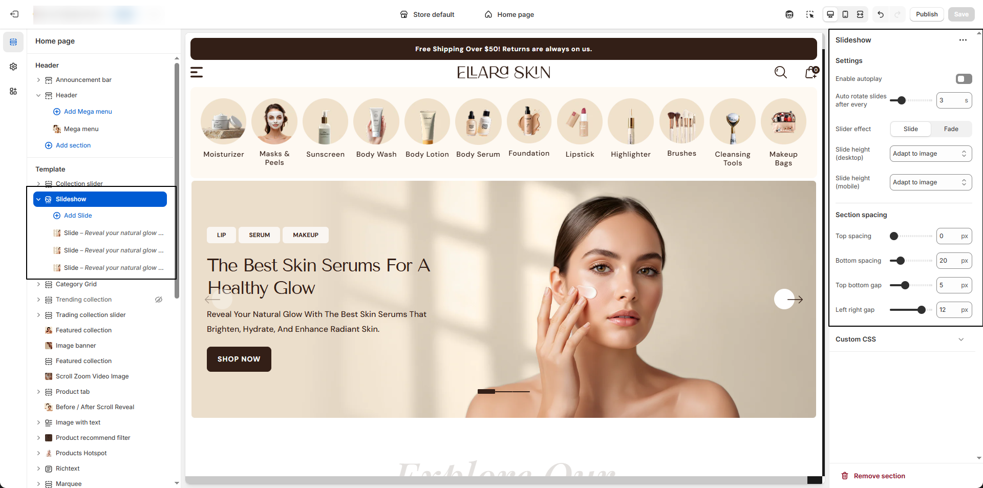
- Enable Autoplay: Enable this option to automatically cycle through slides.
- Autoplay Speed: Set the time delay (in seconds) between each slide transition.
-
Slider Effect: Choose how slides transition.
- Slide: Slides move smoothly in a horizontal or vertical direction..
- Fade: Slides transition with a soft fade-in and fade-out effect.
-
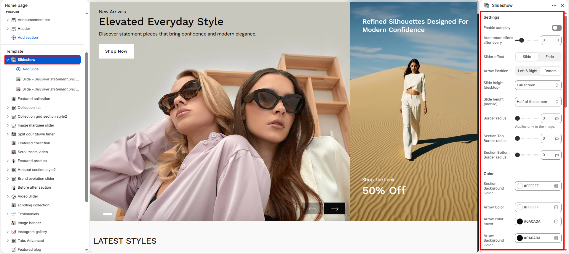
Arrow Position: Choose where the navigation arrows appear on
the slideshow.
- Left & Right: Displays arrows on the left and right sides.
- Bottom: Displays arrows at the bottom of the slideshow.
-
Slide Height: Adjust the slider height for desktop and mobile
views.
- Half of the screen: Displays the slider at 50% of the screen height.
- One third of the screen: Displays the slideshow at approximately 33% of the screen height.
- Two third of the screen: Displays the slider at roughly 66% of the screen height.
- Full screen: Expands the slideshow to take up the full screen height
- Adapt to first image height: Automatically adjusts the height based on the height of the first uploaded image. Ideal for image-driven layouts.
- Border Radius: Adjust the roundness of the slideshow images (in pixels).
- Section Top Border Radius: Set the top corner radius of the slideshow section.
- Section Bottom Border Radius: Set the bottom corner radius of the slideshow section.
- Section Background Color: Choose a background color for the slideshow section.
- Arrow Color: Set the default color of the navigation arrows.
- Arrow Hover Color: Set the arrow color when hovered.
- Arrow Background Color: Set the background color of the arrows.
- Arrow Background Hover Color: Set the background color of arrows on hover.
- Show Video Section: Enable this option to display a video within the slideshow.
- Video Position: Choose the position of the video (Left or Right).
- Video: Upload or select a video to display in the slide.
- Fallback Image: Select an image to display if the video cannot be played.
- Video Overlay: Adjust the overlay opacity applied on the video.
- Overlay Color: Choose the overlay color for the video.
- Top Information: Add a short text displayed at the top of the slide.
- Heading Text:Add heading text which display over video.
- Text:Add a caption text that appears over the video, ideal for promotional messages or product highlights.
Configure the Slider Block Settings
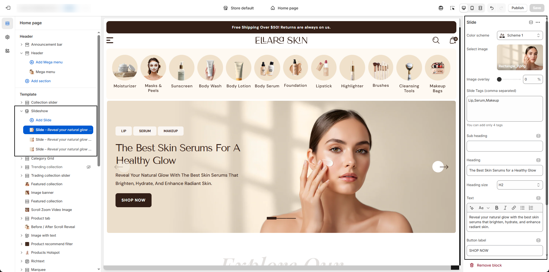
- Color Scheme: Select a predefined color scheme to control the banner background, text, and button colors.
- Select Image : Upload or choose your desktop banner image using the image picker.
- Image Overlay: Adjust the overlay opacity (0–100) to darken or lighten the banner image for better text visibility.
- Subheading: Enter an optional short text above the main heading.
- Heading: Add the main title for your banner.
- Heading Size: Choose the heading style (e.g., H1) to control text size.
- Text: Enter descriptive banner content or promotional messaging.
- Button Label: Add the call-to-action button text (e.g., SHOP NOW).
- Button Link: Select or paste the URL for the button (e.g., link to a collection like Beachwear). Enable “Open link in a new tab” if needed.
- Content Position: Choose where the banner content should appear (e.g., Bottom Left).
- Text Alignment: Set the text alignment (Left, Center, Right).