Featured Product
The Featured Product section allows you to highlight a single product in a visually focused layout. It's ideal for promoting new launches, best-sellers, or special offers by placing key product details front and center. This section helps capture customer attention, encourage engagement, and drive conversions by showcasing your most important product prominently.
How to add a Featured product section
- Login to your Customizer and navigate to the page you would like to display this section.
- You'll see a list of available sections on the left-hand side. Locate the Add section button and click on it
- Locate Featured product
How to edit the Featured product section
Steps for Configuring the Featured Product Section
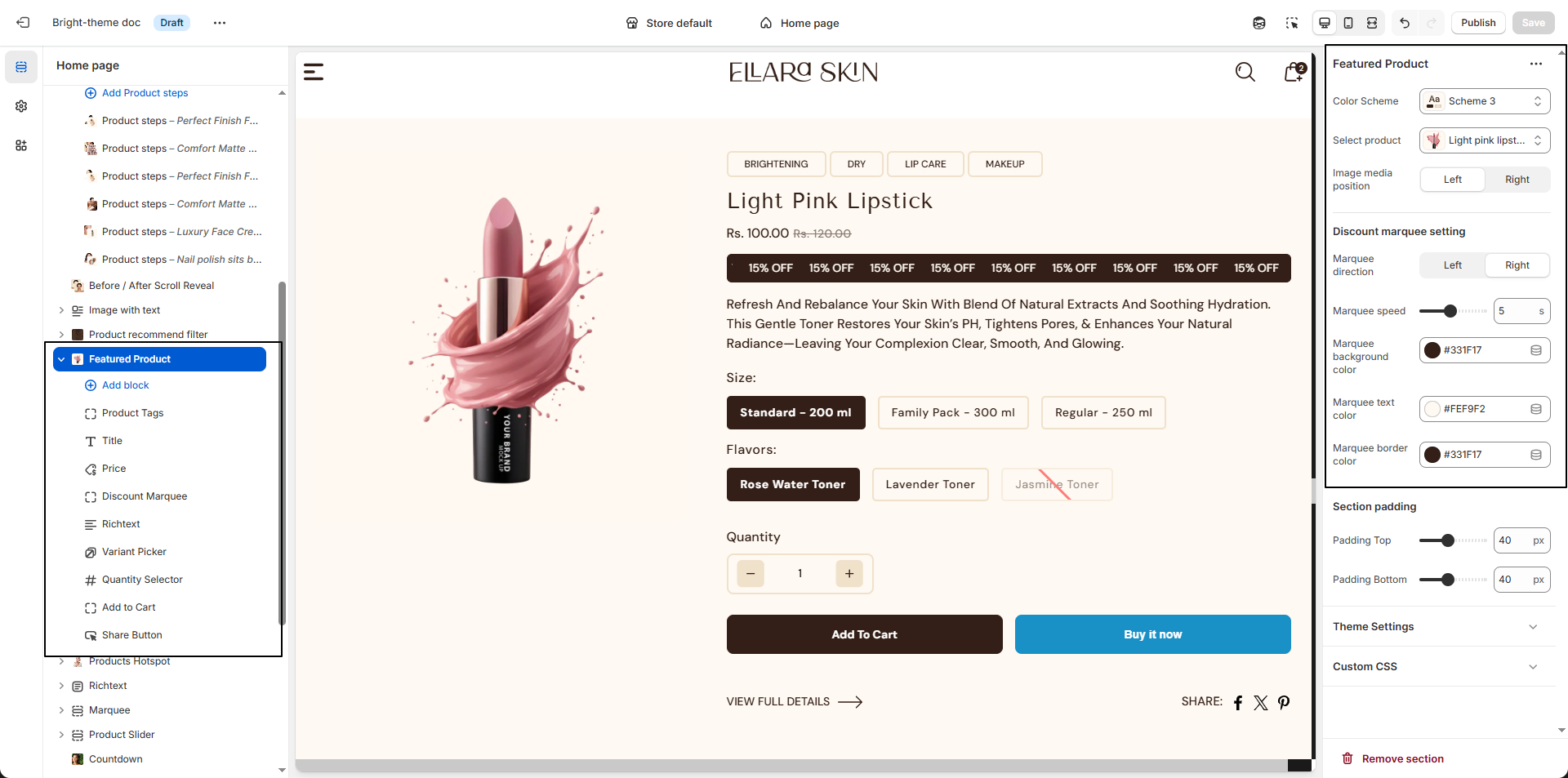
- Color Scheme: Choose a predefined color scheme (e.g., Scheme 3) to control the background, text, and accent colors of the Featured Product section.
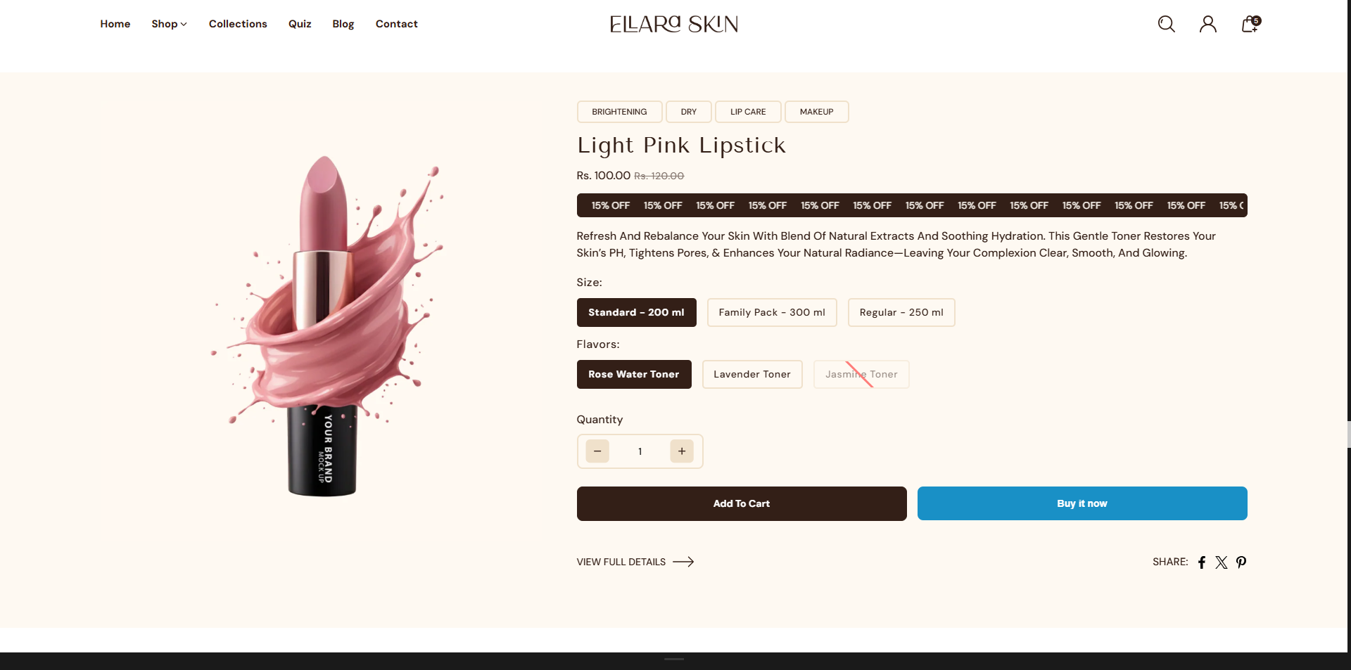
- Select Product: Pick the product you want to highlight in this section (e.g., Light Pink Lipstick). The selected product's images, pricing, and details will be displayed automatically.
-
Image Media Position:
Decide where the product media appears:
- Left: Displays the product image on the left side.
- Right: Displays the product image on the right side.
-
Discount Marquee Settings:
Customize the scrolling discount banner to highlight offers or promotions.
- Marquee Direction: Choose whether the text scrolls from left or right.
- Marquee Speed: Adjust the scrolling speed (e.g., 5) for smooth animation.
- Marquee Background Color: Set the background color of the marquee.
- Marquee Text Color: Define the text color for readability.
- Marquee Border Color: Choose a border color to match your theme styling.
Product Information
In the Dynamic theme, Blog Content Blocks let you present articles, announcements, and stories in a clean, visually appealing layout. You can combine text, images, videos, and links to highlight important details and guide readers smoothly through your content. These flexible blocks make it easy to organize posts, improve readability, and create an engaging blogging experience for your audience.
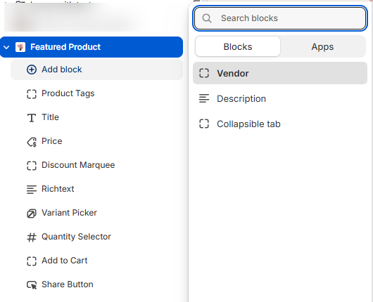
- Vendor: Display the product's brand or supplier name to build trust and brand recognition.
- Product Tags: Use this block to display product tags within the Featured Product section. It helps highlight key attributes such as "“New”", “Best Seller”, or “Limited Edition” to attract customer attention.
- Title: Show the product name clearly and prominently on the product page.
- Price: Display the product price, which updates automatically when customers select different variants.
-
Discount Marquee:
Display a promotional scrolling label on the product card to highlight special offers or
discounts.
-
Enable/Disable: Control whether the discount marquee appears on
product cards.
- Enable: Shows the scrolling discount label on the product card.
- Disable: Hides the discount marquee from the product card.
-
Discount Text: Add the promotional text from
Theme Settings ? Product Card Block.
- Text Field: Enter your custom message (e.g., “15% OFF”). This text will appear as a scrolling or highlighted discount label.
-
Enable/Disable: Control whether the discount marquee appears on
product cards.
- Rich Text: Use this block to add custom content such as product details, care instructions, or promotional messages. You can format text and insert links using the built-in rich text editor.
-
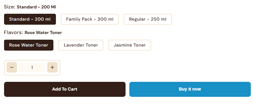
Variant Picker: Allow customers to choose between different product
options
such as size, color, or material.
-
Options Type: Select how variants are displayed:
- Button: Shows variants as clickable buttons, ideal for quick selection and visual clarity.
- Dropdown: Displays variants in a compact dropdown list, suitable for products with many options.
-
Options Type: Select how variants are displayed:
- Description: Display the product description on the product page. You can control how many lines are shown to keep the layout clean and focused.
- Quantity Selector: Enable this block to allow customers to select the number of items they want to purchase before adding the product to the cart.
-
Add to Cart Button: Show the primary action button that lets customers
add
products to their cart.
-
Show Dynamic Checkout Button: Turn this on to display express
payment
options such as Apple Pay or Google Pay, helping customers complete purchases
faster.
Refer to Shopify documentation: Dynamic checkout buttons
-
Show Dynamic Checkout Button: Turn this on to display express
payment
options such as Apple Pay or Google Pay, helping customers complete purchases
faster.
-
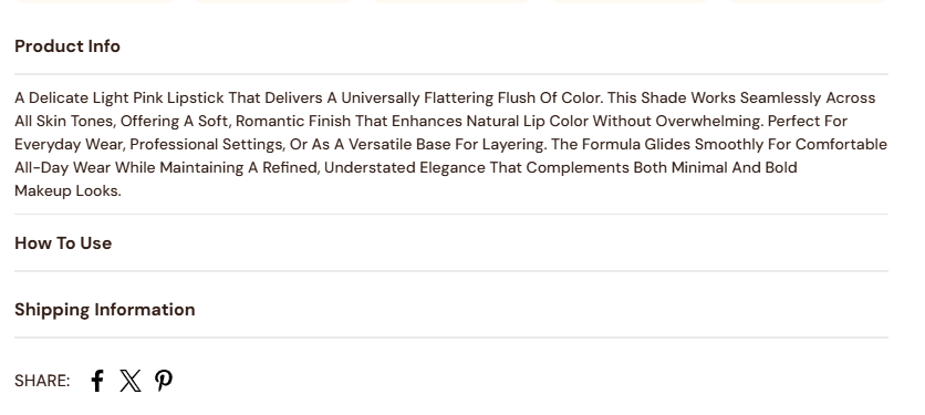
Collapsible Tab:
Use this block to organize additional product details into expandable accordion tabs. This
helps keep the product page clean while allowing customers to view more information when
needed.
- Title: Enter the heading for the tab (e.g., “Product Info”, “Shipping & Returns”, “Care Instructions”).
- Content: Add the detailed information that will appear when the tab is expanded. This can include text, lists, or formatted content.
- Show Description: Enable this option to automatically include the product description inside the tab.
- Keep Tab Open by Default: Toggle this on if you want the tab to remain expanded when the page loads.