
Spotlight Collection
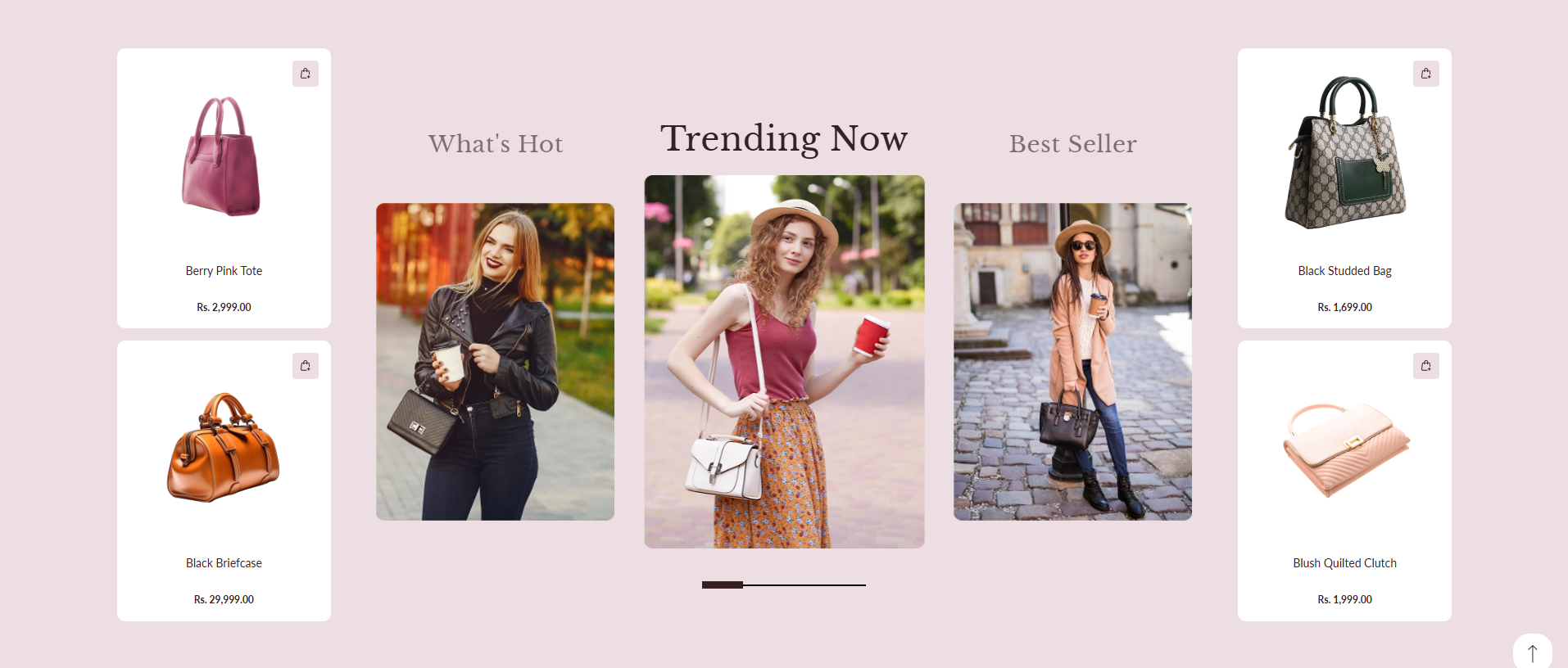
The Spotlight Collection section allows you to showcase curated collections using a centerpiece slider flanked by two columns of customizable product grids. This layout provides an editorial, visual-first presentation, making it perfect for presenting styling suggestions, seasonal highlights, or trending collections alongside related products.
How To Add the Spotlight Collection section
- Login to your Customizer and navigate to the page where you want to display this section.
- On the left sidebar, click the Add section button.
- From the available sections list, select Spotlight Collection.
How To Edit the Spotlight Collection settings
Adjust the styling, color schemes, and slider behavior using the section settings:
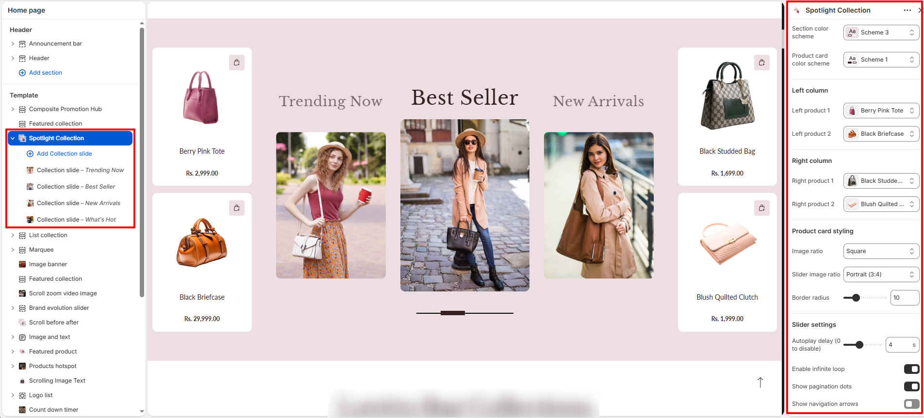
- Section color scheme: Select a color scheme to control the background and text colors of the section.
- Product card color scheme: Select a color scheme specifically for the product cards.
- Left column: Choose product cards (e.g. Left product 1, Left product 2) to display on the left side.
- Right column: Choose product cards (e.g. Right product 1, Right product 2) to display on the right side.
-
Product card styling:
- Image ratio: Choose how product images fit in the card (e.g. Square).
- Slider image ratio: Set the image ratio for centerpiece collection slides (e.g. Portrait 3:4).
- Border radius: Set the rounded corners styling for cards and images.
-
Slider settings:
- Autoplay delay: Set duration in seconds between slide transitions (0 to disable).
- Enable infinite loop: Allow the slider to loop back to the first slide continuously.
- Show pagination dots: Toggle display of pagination controls at the bottom of the slider.
- Show navigation arrows: Toggle display of navigation arrows for browsing slides manually.
- Slides per view (Mobile): Set number of slides shown at once on mobile viewports.
- Slides per view (Tablet): Set number of slides shown at once on tablet viewports.
- Slides per view (Desktop): Set number of slides shown at once on desktop viewports.
-
Section padding:
- Padding top & Padding bottom: Control top and bottom spacing of the section.
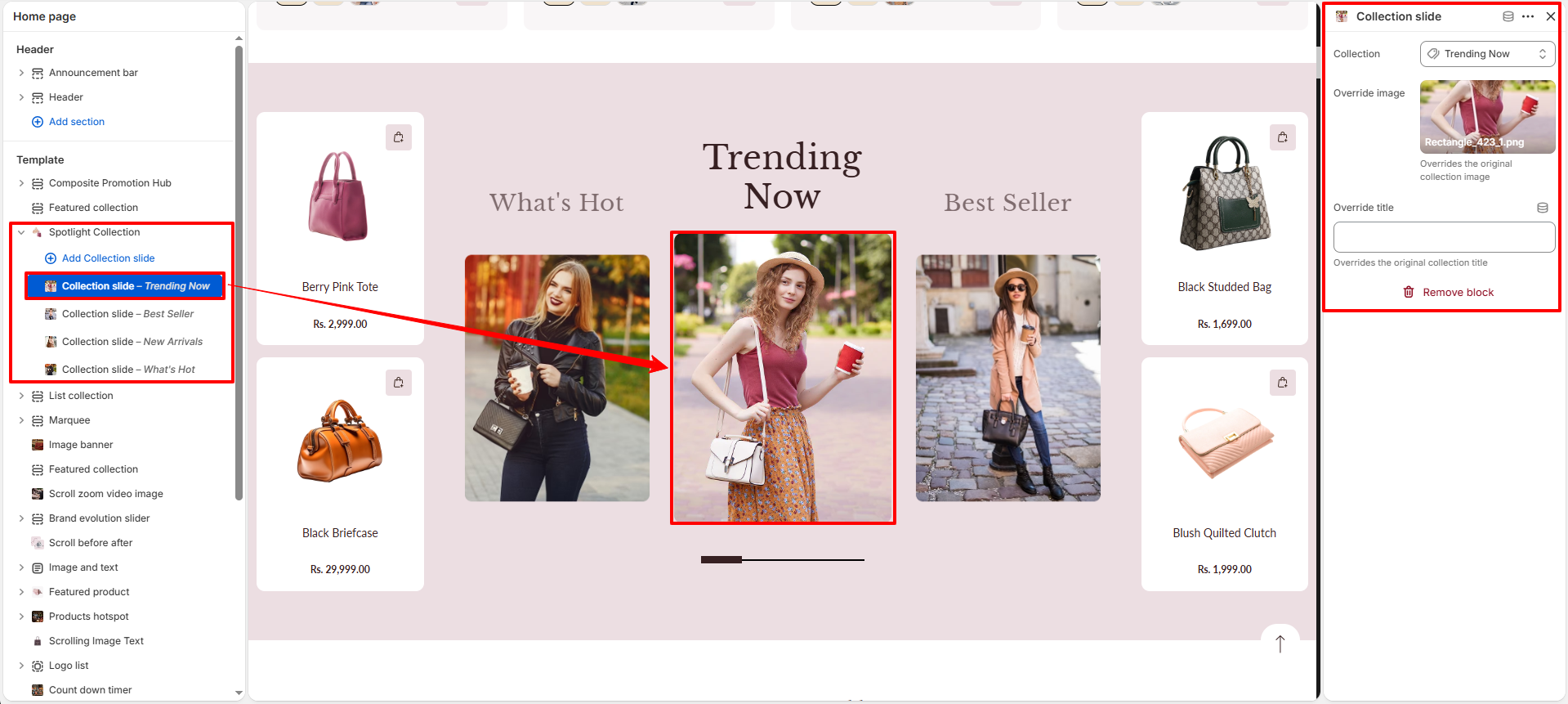
Configure the Collection Slide block settings
- Add Collection slide: Add a new slide block inside the Spotlight Collection.
- Collection: Choose which collection's products/cover are displayed in the current slide.
- Override Image: Upload a custom cover image to replace the default image of the chosen collection.
- Override title: Set a custom slide title to override the original name of the chosen collection.