
Product Tab
The Product Tab section helps you organize product information in a structured and user-friendly way. Using tabs, you can display detailed product descriptions along with full-width images, making it easy for customers to explore features, ingredients, usage instructions, or brand stories without scrolling endlessly.
This section is ideal for presenting rich content such as detailed descriptions, visual explanations, and high-quality images side by side. By separating content into tabs, the Product Tab section keeps the product page clean, informative, and visually engaging while allowing customers to dive deeper when needed.
Adding the Product Tab section
- Open the Customizer and go to the page where you want to add the "Product Tab" section.
- On the left-hand side, you'll find a list of available sections. Click the "Add section" button.
- From the available options, choose "Product Tab" to add it to your page.
How to edit the Product Tab section
Steps for Configuring the "Product Tab" Section in the Dynamic Theme
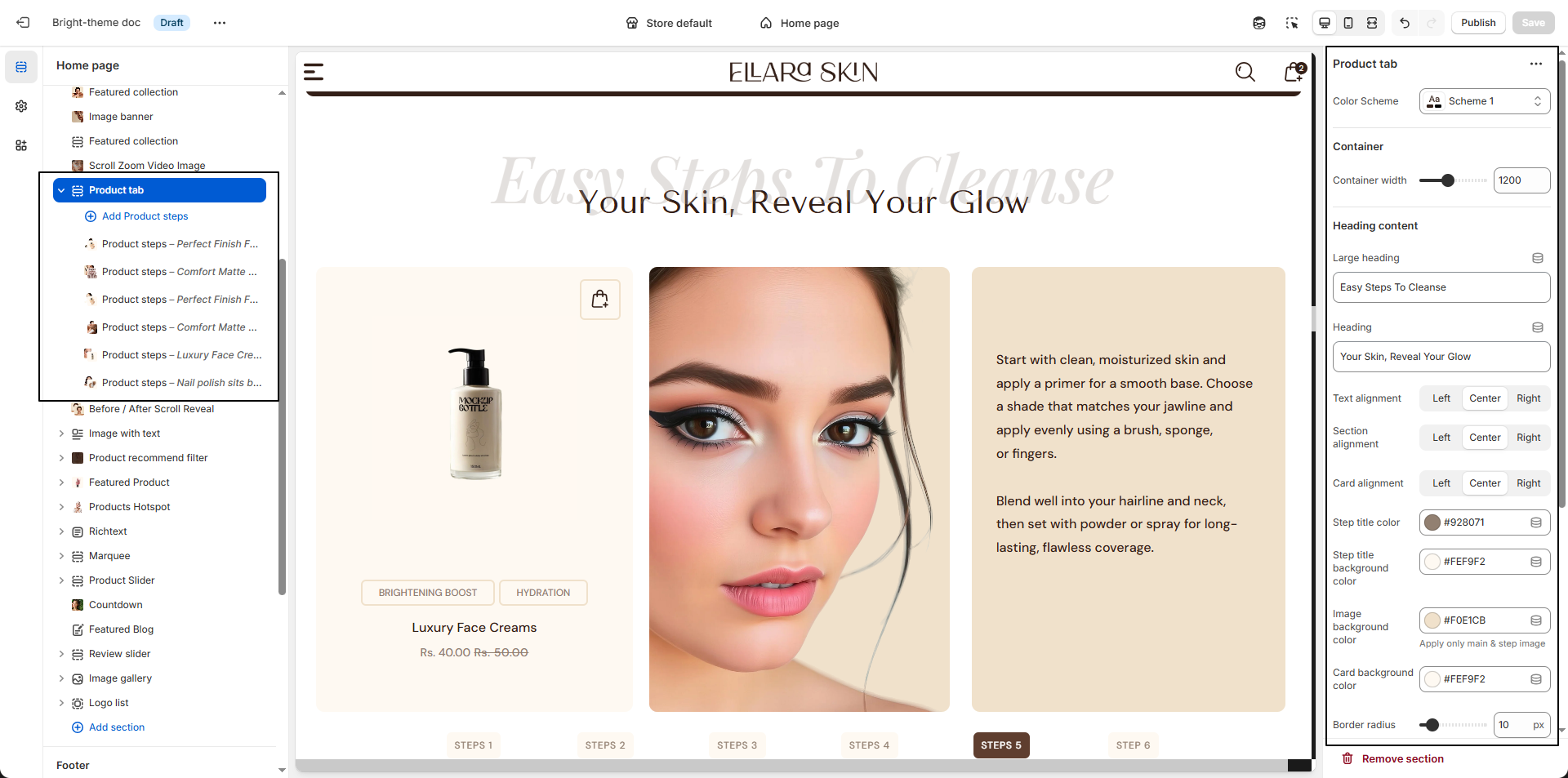
- Color Scheme: Select a color scheme to control the background, text, and accent colors used throughout the Product Tab section.
- Container Width: Set the maximum width of the section content to control how wide the tabs and images appear.
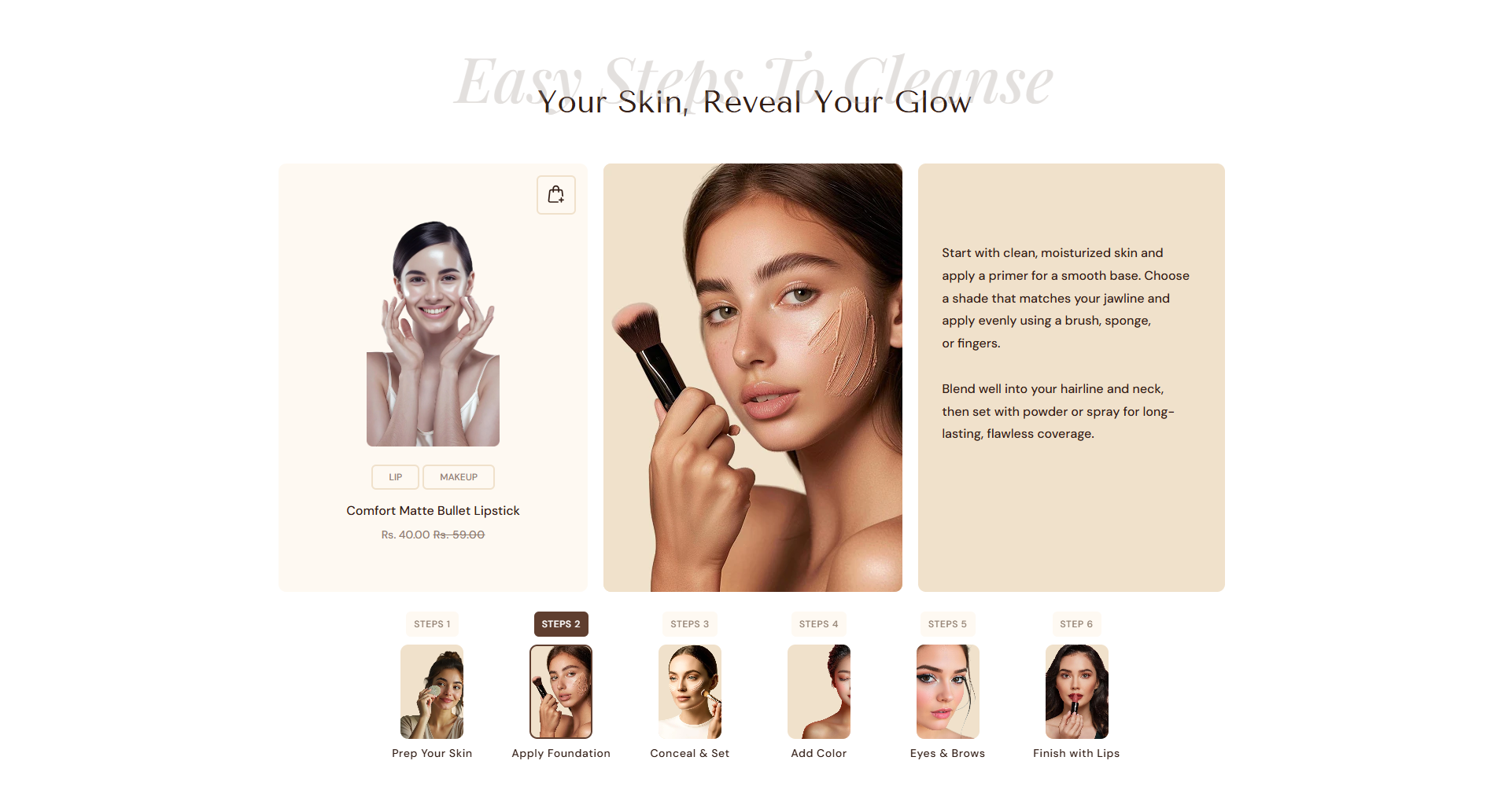
- Large Heading: Add a bold, eye-catching heading displayed at the top of the section (e.g., “Easy Steps To Cleanse”).
- Heading: Enter a supporting title or subtitle that appears below the large heading.
-
Card Alignment:
Set the alignment of individual tab cards and their content.
- Left: Content aligns to the left
- Center: Content is centered
- Right: Content aligns to the right
- Step Title Color: Choose the text color for each step title to ensure readability and visual contrast.
- Step Title Color (Active): Select the text color applied when a step is active or selected.
- Step Title Background Color: Set a background color for step titles to highlight each step clearly.
- Step Title Background Color (Active): Define the background color for the currently active step.
- Content Background Color: Choose the background color for the step content area.
- Content Text Color: Set the text color used inside the step description/content area.
- Product Card Background Color: Set the background color for the linked product card displayed within the section.
- Product Card Text Color: Choose the text color for each tab card to maintain a clean and consistent layout.
- Border Radius: Adjust the corner rounding (e.g., 10px) applied to cards and images for a softer, modern look.
Configure the Block Settings
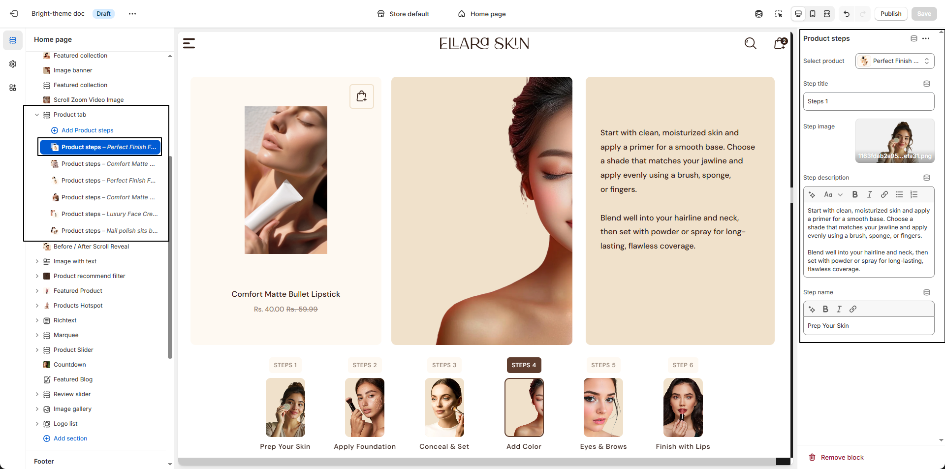
- Select Product: Choose the product you want to associate with this step. This helps customers clearly understand which product the step applies to.
- Step Title: Enter a short title for the step (for example, Step 1, Step 2) to guide users through the process in a clear sequence.
-
Step Image:
Upload an image that visually represents the step.
- Click Upload images to add an image from your device.
- You can also choose from previously uploaded images.
- This image helps customers better understand how to use the product.
- Step Description: Add detailed instructions or explanations for this step. Use this space to describe how the product should be applied or used for best results.
- Step Name: Enter a short label or name for the step (for example, Prep, Apply, Blend) to make the process more intuitive.